An Angular material is an amazing UI for the Angular framework, it has lots of pre-built components like cards, modals, and more, and the Angular Material expansion panel or Material tooltip is one of them.
We have a few objectives in this tutorial, but three main objectives in this tutorial on
- Learn how to implement the Material tooltip component
- Styling the Material Tooltip
- Different Material design tooltip attributes to customize Material tooltip component. Let get started
Setting up and configuring Angular material tooltip
Let’s first demonstrate the Material design tooltip example here we listed the abstract step of adding the Angular material design tooltip.
- Step 1: Create Angular tooltip project
- Step 2: Add the Angular material library to our Angular project.
- Step 3: Import MatTooltipModule to our project.
- Step 4: Add matTooltip directive to create a tooltip in the component template
What is the Angular Material tooltip?
Angular Material design tooltip is small pop-up text information or message that appears when the user moves the mouse pointer over an element like an image, button, anchor tag, div, etc. Angular Material design tooltip provides a text label that is displayed when the user hovers over or long presses an element. To implement the Material Tooltip component, we need the following directive and modules.
- MatTooltipModule: Without this module, we can’t use the Material Tooltip component, which we need to import into the app.module.ts
- matTooltip selector: Attribute to display the tooltip when the user hovers over an element or long presses elements on mobile devices.
Setting up and configuring the Material tooltip project
Let’s first create our Angular material design tooltip project. In our previous articles, we had articles on how to install and the best approach to configuring Angular material in our project. Run the following command to create and add Angular Material to our project.
ng new matTooltipApp
cd matTooltipApp
ng add @angular/material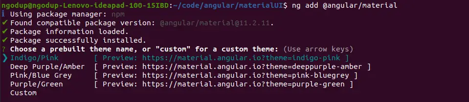
While running the 3rd command will ask you the select theme, material typography, and animation, press yes on all. To use the Angular material design tooltip component, we have to import the MatTooltipModule module into the app.module.ts file and we also added a few Material modules to demonstrate the tooltip with Angular form.
import { NgModule } from '@angular/core';
import { BrowserModule } from '@angular/platform-browser';
import { AppRoutingModule } from './app-routing.module';
import { AppComponent } from './app.component';
import { BrowserAnimationsModule } from '@angular/platform-browser/animations';
import { MatButtonModule } from '@angular/material/button';
import { MatInputModule } from '@angular/material/input';
import { MatSelectModule } from '@angular/material/select';
import { MatTooltipModule } from '@angular/material/tooltip';

@NgModule({
  declarations: [
    AppComponent
  ],
  imports: [
    BrowserModule,
    AppRoutingModule,
    BrowserAnimationsModule,
    MatInputModule,
    MatButtonModule,
    MatSelectModule,
    MatTooltipModule
  ],
  providers: [],
  bootstrap: [AppComponent]
})
export class AppModule { }
We need to add the Angular material button to demonstrate the material tooltip directive.
Angular Material Tooltip example
We have completed our configuration of the material tooltip project. Now let’s demonstrate an example of a material design tooltip on the button, anchor tag, and paragraph element. Here is the syntax of the Material design tooltip component
<element matTooltip="Material Tooltip syntax">
Material Tooltip Syntax
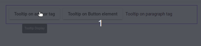
</element>Where elements can be HTML elements like Button, paragraphs, or any other HTML element, here is a screenshot of Mattooltip’s first example screenshot.
Let’s edit the app.component.html template to add a material tooltip example.
<section>
  <span>
   <a mat-raised-button matTooltip matTooltip="Tooltip Display"
     aria-label="Displays a tooltip">
        Tooltip on anchor tag
   </a>
  </span>

  <span>
   <button mat-raised-button matTooltip="Tooltip Display"
     aria-label="Displays a tooltip">
      Tooltip on Button element
   </button>
 </span>

 <span>
  <p matTooltip="Tooltip Display" aria-label="Displays a tooltip">
     Tooltip on paragraph tag
  </p>
 </span>
</section>
Material tooltip attribute
Material Tooltip component has a number of attributes and options available to customize tooltip behavior. We can control and configure material design tooltip position, delay, style, and more. Here we have listed the material design attributes of this library.
| Attribute name | Description |
| matToolTip | In this attribute, we assign what text information we want to pop up. |
| matTooltipPosition | The position of the tooltip. It can have values after, before, above, below, right, and left. By default, the position value is below. |
| matTooltipShowDelay | The delay is in milliseconds before showing the tooltip. |
| matTooltipHideDelay | The delay is in milliseconds before closing the tooltip. |
| matTooltipClass | We can add the CSS class name to this attribute to customize the tooltip design. |
Material tooltip position using the matTooltipPosition
We have discussed that matTooltipPosition is attributed to position material tooltip. We can use this attribute to dynamically change the direction of the tooltip. By default value of the position is below and we can assign the following values on matTooltipPostion.
- left
- right
- after
- before
- above
- below

<button mat-raised-button color="accent" matTooltip="Tooltip after" matTooltipPosition="after">
   Tooltip position after
</button>

<button mat-raised-button color="accent" matTooltip="Tooltip before" matTooltipPosition="before">
    Tooltip position before
</button>

<button mat-raised-button color="accent" matTooltip="Tooltip above" matTooltipPosition="above">
    Tooltip position above
</button>

<button mat-raised-button color="accent" matTooltip="Tooltip below" matTooltipPosition="below">
    Tooltip position below
</button>

<button mat-raised-button color="accent" matTooltip="Tooltip left" matTooltipPosition="left">
    Tooltip position left
 </button>

 <button mat-raised-button color="accent" matTooltip="Tooltip right" matTooltipPosition="right">
    Tooltip position right
 </button>
Delay show and hide Material Tooltip component
In the above example, we use the matTooltip position to control its position, we can use Tooltip attributes matTooltipShowDelay and matTooltipHideDelay to control the timing of showing and hiding to tooltip timing. The matTooltipShowDelay attribute delays the appearance of Tooltip on screen in a millisecond and matTooltipHideDelay delays the hiding of Tooltip component after a certain millisecond away from it.
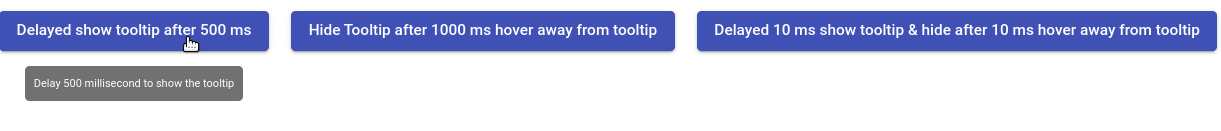
In the first example, we delay the tooltip after 500 milliseconds and the second example delays the hiding of the tooltip after 1000 milliseconds of it hovering away from the button.
<button
  mat-raised-button
  color="primary"
  matTooltip="Delay 500 millisecond to show the tooltip"
  matTooltipHideDelay="500"
>
  Delayed show tooltip after 500 ms
</button>

<button
  mat-raised-button
  color="primary"
  matTooltip="Hide Tooltip after 1000 millisecond after hover away from tooltip"
  matTooltipHideDelay="1000"
>
  Hide Tooltip after 1000 ms hover away from tooltip
</button>

<button
  mat-raised-button
  color="primary"
  matTooltip="Delayed 10 ms show tooltip & hide after 10 ms hover away from it"
  matTooltipShowDelay="10"
  matTooltipHideDelay="10"
>
  Delayed 10 ms show tooltip & hide after 10 ms hover away from tooltip
</button>
Angular Material tooltip CSS style customization
We can use the matTooltipClass attribute to add customized class names on the tooltip so that we can style the material design tooltip. Here is a screenshot of our Material tooltip CSS style.
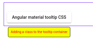
Here we add a class name to the Material Tooltip element using matTooltip with the class name, now we can use this class name to change the Tooltip font color, size, background, and more.
<button mat-raised-button matTooltip="Adding a class to the tooltip container" matTooltipClass="tooltip">
      Angular material tooltip CSS
</button>
Once we have added the CSS class name on the matToolTip attribute, we can now customize the tooltip style in style.css or style.scss file.
.tooltip {
    font-size: 11px;
    color: red !important;
    background-color:yellow;
    border: 1px solid black;
}
Disabled Mattooltip using matTooltipDisabled attribute
We can use the matTooltipDisabled attribute to disable the tooltip and you can use it as follow
<button mat-raised-button   matTooltip="Disable tooltip" matTooltipDisabled="true">
  Disable Material Tooltip
</button>
I uploaded the above Tooltip example on stackblitz.com for reference, if you want you can check it.
Conclusion
We have completed our material tooltip directive with a few examples. I hope you have got some idea on how to use the matToolTip directive in Angular. I hope you had learned something. Follow me on my GitHub collection, I had code on Angular, react, and Ionic framework.
Related Post
- How to implement Angular material form in Angular?
- How to install Angular material?
- Angular Radio button |angular material radio button?
- Angular material checkbox: color, label direction
- How to implement Angular checkbox input in Angular?
- Angular Material input components and directives
- Angular material autocomplete example
- How to implement Angular material dropdown | select .?
- Angular Material button: Color, Size, toggle button
- How to implement Angular material accordion in Angular .?
- How to implement Angular material tabs?
- How to implement angular material snackbar | toast in Angular?
- How to implement Angular material dialog .?
- How to implement Angular material grid .?
- How to implement Angular material list in Angular .?
- How to implement Angular material card in Angular?
- How to implement angular material datepicker in Angular .?
- How to implement the Angular material table?