Angular Material dialog is a popover UI that slides into the screen over the page content and is often used for notifications, alerts, login/registration forms, composing messages, or presenting app configuration options for example.
An angular material modal dialog can also use for Angular material alert, we don’t have a separate Material module for alert and dialog. The MatDialogModule is a module that we can use to create Angular material alerts and dialog. A dialog can have detailed text, images,s or any other content.
In this tutorial, we have three main goals behind this chapter. First, we will learn how to use Material dialog component. Secondly, how to send data to|form Angular material modal. At last, we will learn how to add style to our custom material component. Let’s get started.
Introduction to Angular Material Modal | Dialog component
Angular Material Modal is called Dialog component in Material library, we can use it to create Modal or Alert component. We have seen some popups that are used to collect information or to give some notification are Dialog components. Angular Material Dialog component we can use in the following scenario.
- Confirming either cancel or accept.
- To give some notification or alert
- Collecting information.
Material Dialogs can come in handy when we need to collect input from the user, but when we don’t want to lose the current screen. We can add form input where we can collect user information. What we are learning here
- How to create a Material Dialog?
- How to send and retrieve data to|from the Material Dialog component?
- How to style Material Dialog component background color, color, and other styles.
- How to create Alert component using Material Dialog component
Step 1: Setup and configure the Angular material dialog project
In angular material, the dialog component is also called as Angular material modal. Let’s first create a Material Dialog project, we need to install the angular material library. Let’s create and install the angular material library.
ng new materialDialogApp
cd materialDialogApp
ng add @angular/material
While running the 3rd command will ask you the select theme, material typography, and animation, press yes on all. To use the Angular material component, we have to import it into our app module. Let’s create a module and import all material components on it.
ng g m ng-material
We’ll demonstrate three examples of Angular material modal, let’s create three-component to demonstrate alert, confirm dialog, and last Material Dialog input prompt.
ng g component ng-material/matAlert
ng g component ng-material/matConfirm
ng g component ng-material/matInputPrompt
Open src/app/ng-material/ng-material.module.ts and replace the existing code with the code shown below.
import { NgModule } from '@angular/core';
import { CommonModule } from '@angular/common';
import { MatDialogModule } from '@angular/material/dialog';
import { MatButtonModule } from '@angular/material/button';
import { MatFormFieldModule } from '@angular/material/form-field';
import { MatInputModule } from '@angular/material/input';
import { MatIconModule } from '@angular/material/icon';
import { MatSelectModule } from '@angular/material/select';
import { MatCheckboxModule } from '@angular/material/checkbox';
import { MatAlertComponent } from './mat-alert/mat-alert.component';
import { MatConfirmComponent } from './mat-confirm/mat-confirm.component';
import { MatInputPromptComponent } from './mat-input-prompt/mat-input-prompt.component';
import { ReactiveFormsModule } from '@angular/forms';

const MaterialModules = [
    MatDialogModule,
    MatButtonModule,
    MatFormFieldModule,
    MatInputModule,
    MatIconModule,
    MatSelectModule,
    MatCheckboxModule
];
@NgModule({
  declarations: [
    MatAlertComponent,
    MatConfirmComponent,
    MatInputPromptComponent
  ],
  imports: [
    CommonModule,
    ReactiveFormsModule,
    MaterialModules
  ],
  exports: [
    MaterialModules
  ],
})
export class NgMaterialModule {}
We are importing all the required modules in our custom material module file and also import the ReactFormsModule to add an input prompt on the Material dialog. Now we need to import our material module in the src/app/app.module.ts file.
import { NgModule } from '@angular/core';
import { BrowserModule } from '@angular/platform-browser';
import { AppRoutingModule } from './app-routing.module';
import { AppComponent } from './app.component';
import { BrowserAnimationsModule } from '@angular/platform-browser/animations';
import { NgMaterialModule } from './ng-material/ng-material.module';

@NgModule({
  declarations: [
    AppComponent
  ],
  imports: [
    BrowserModule,
    AppRoutingModule,
    BrowserAnimationsModule,
    NgMaterialModule
  ],
  providers: [],
  bootstrap: [AppComponent]
})
export class AppModule { }
Step 2: Angular material dialog example or Angular Material alert
We have completed the material configuration, let us demonstrate our first example to demonstrate Angular material alert. In the app.component.html template, we have three buttons to demonstrate three different examples of Angular material modal.
Material dialog, provide the following directive to create material dialog. Let’s learn and look at what are material directives for Material Dialog.
| Name | Description |
| mat-dialog-title | Tile for dialog directive can be applied to HTML heading element like(h1,h2) etc. |
| mat-dialog-content | Primary scrollable content of the dialog. |
| mat-dialog-actions | This directive can apply to containers containing action buttons and usually at the bottom of the dialog component. |
| mat-dialog-clos | We can use this directive on buttons, icons, and actions. This directive closes a material modal. |
Edit the app.component.html template and add three buttons to invoke material dialog.
<section class="mat-button-container">
  <h2>Angular Material dialog</h2>
  <div class="example-button-row">
    <button mat-raised-button (click)="alertDialog()">
      Angular Material Alert
    </button>
    <button mat-raised-button color="primary" (click)="confirmDialog()">
      Confirm
    </button>
    <button mat-raised-button color="accent" (click)="showPrompt()">
      Prompt Input
    </button>
  </div>
</section>
<router-outlet></router-outlet>
Here is a screenshot of our first example of an Angular material alert.
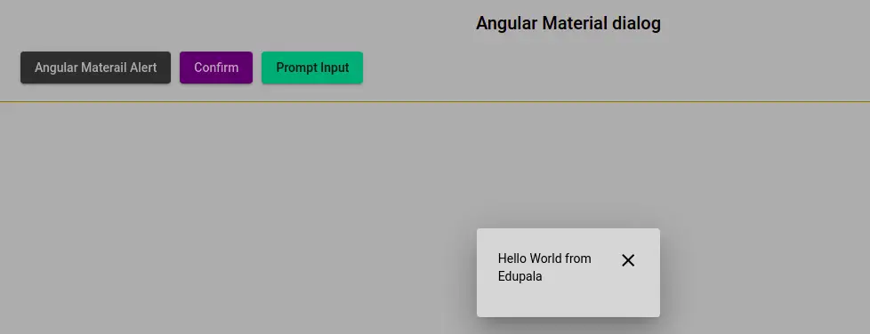
When the user clicks on the Angular material alert, it will popup MatAlertComponent, this component has a message property containing data from the app component and a close icon to close the Angular material alert component. Edit the app.component.ts file.
import { Component } from '@angular/core';
import { MatDialog, MatDialogRef } from '@angular/material/dialog';
import { MatAlertComponent } from './ng-material/mat-alert/mat-alert.component';

@Component({
  selector: 'app-root',
  templateUrl: './app.component.html',
  styleUrls: ['./app.component.scss']
})
export class AppComponent {
  title = 'matDialog';

  constructor(private dialog: MatDialog) { }

  alertDialog() {
    const dialogRef = this.dialog.open(MatAlertComponent, {
      data: {
        message: 'Hello World from Edupala',
      },
    });
  }
}
Send data from component to Angular material dialog
We need to import and inject the MatDialog object, we can use an open method on the MatDialog to open the dialog component. The data object in this object will allow you to send data to the dialog component. In our example, we are sending a message property containing a string value.
Retrieve data into modal component
In MatAlertComponent we have to retrieve message data that is sent from the app component. Let edit the mat-alert.component.ts
import { Component, Inject } from '@angular/core';
import { MatDialogRef, MAT_DIALOG_DATA } from '@angular/material/dialog';

@Component({
  selector: 'app-mat-alert',
  templateUrl: './mat-alert.component.html',
  styleUrls: ['./mat-alert.component.scss']
})
export class MatAlertComponent {
  message: string = '';

  constructor(private dialogRef: MatDialogRef<MatAlertComponent>,
    @Inject(MAT_DIALOG_DATA) data: { message: string }) {
    this.message = data ? data.message : '';
  }

  closeAlert() {
    this.dialogRef.close();
  }
}
We have to import and inject MatDialogRef and MAT_DIALOG_DATA to retrieve data message data. We also have the closeAlert method to close our Material dialog, let’s edit the mat-alert.component.html.
<div class="alert">
    <mat-icon aria-hidden="false"(click)="closeAlert()">
      close
    </mat-icon>
    <p>{{ message }}</p>
</div>
Angular material confirms the Dialog example
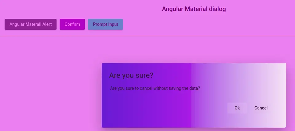
Let’s demonstrate the second example to show the material modal with confirm and cancel button. Here is a screenshot of our example.
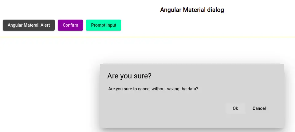
Let’s add the following code to existing the app.component.ts file to invoke or open the MatConfirmComponent component.
  confirmDialog() {
    const ref: MatDialogRef<MatConfirmComponent> =
    this.dialog.open(MatConfirmComponent, {
      width: '600px',
      height: '210px',
      data: {
        message: 'Are you sure to cancel without saving the data?'
      },
      backdropClass: 'confirmDialogComponent',
      hasBackdrop: true
    });
  }
We can configure our material dialog components like height, width, background color, style, and more. In this example, we have used width, height, hasBackdrop, and backdropClass. We will learn how to apply CSS style for the Material Dialog component.
Let edit the mat-confirm.component.ts to retrieve message data.
import { Component, Inject, OnInit } from '@angular/core';
import { MatDialogRef, MAT_DIALOG_DATA } from '@angular/material/dialog';

@Component({
  selector: 'app-mat-confirm',
  templateUrl: './mat-confirm.component.html',
  styleUrls: ['./mat-confirm.component.scss'],
})
export class MatConfirmComponent {
  message = '';

  constructor(
    private dialogRef: MatDialogRef<MatConfirmComponent>,
    @Inject(MAT_DIALOG_DATA) data: { message: string }) {
         this.message = data ? data.message : '';
    }
}
Let’s edit the mat-confirm.component.html template to two-button for confirming and canceling.
<div class="confirm-container">
    <h1 mat-dialog-title>
        Are you sure?
    </h1>
    <div mat-dialog-content>
         {{ message }}
    </div>

    <div mat-dialog-actions style="float:right;margin:20px;">
        <button mat-button [mat-dialog-close]="{clicked:'Ok'}">Ok</button>
        <button mat-button [mat-dialog-close]="{clicked:'Cancel'}">Cancel</button>
    </div>
</div>
How to apply CSS style to Angular material dialog?
We have used backdropClass: ‘confirmDialogComponent’ in the MatDialog object open method. The backdropClass property allows us to add a custom CSS class name. Here we have applied CSS class and style to our MatConfirmComponent to change its background and overlay color.
Here is a screenshot to change the Angular material dialog background color.
In the src/style.scss we need to add CSS style for our Angular material modal, let’s add style.
/* You can add global styles to this file, and also import other style files */
...

.mat-dialog-container  {
    box-shadow: 0px 11px 15px -7px rgb(0 0 0 / 20%),
                0px 24px 38px 3px rgb(0 0 0 / 14%),
                0px 9px 46px 8px rgb(0 0 0 / 12%);
    color: black;
    opacity: 0.8;
    background: linear-gradient(90deg, rgb(30, 0, 201) 1%,
                rgb(248, 255, 248) 100%);
}

.confirmDialogComponent {
    background-color: rgba(190, 11, 226, 0.5);
}
Where mat-dialog-container will apply CSS style to all material dialog components.
Angular material dialog Input prompt
In the previous example, we have not used any material input field on the material dialog component. We can add images, input, videos, and any HTML element inside the material dialog. To add material input we need to import material from the field and material input, which we already imported before.
Get data from Angular material dialog component
In previous examples, we have sent data to the material dialog component, we can also receive data from the material dialog component. In our example, we are getting form data from the dialog component and displaying it on the app component. Let’s edit the app.component.ts file.
 dataFromDialog : any;
 ....
 showPrompt(): void {
    const dialogRef = this.dialog.open(MatInputPromptComponent,
      { width: '350px', height: '400px' });

    dialogRef.afterClosed().subscribe((data) => {
      this.dataFromDialog = data.form;
      if (data.clicked === 'submit') {
        console.log('Sumbit button clicked')
      }
    });
  }
The MatDialog object has afterClosed method, we can subscribe to this method to get data from the dialog component. In the app.component.html display form data as.
<h2 *ngIf="dataFromDialog">
  Data from Angular material dialog : {{ dataFromDialog |json }}
</h2>
Let’s edit the mat-input-prompt.component.ts to add form and send data back to modal.
import { Component, Inject } from '@angular/core';
import { FormGroup, FormBuilder, Validators, NgForm } from '@angular/forms';
import { MAT_DIALOG_DATA, MatDialogRef } from '@angular/material/dialog';

@Component({
  selector: 'app-mat-input-prompt',
  templateUrl: './mat-input-prompt.component.html',
  styleUrls: ['./mat-input-prompt.component.scss']
})
export class MatInputPromptComponent {
  form: FormGroup;

  constructor(
    private fb: FormBuilder,
    @Inject(MAT_DIALOG_DATA) data: { message: string },
    public dialogRef: MatDialogRef<MatInputPromptComponent>
  ) {
    this.form = this.fb.group({
      name: ['', Validators.required],
      address: ['', Validators.required],
      country: ['']
    });
  }


  submit(form: NgForm) {
    this.dialogRef.close({
      clicked: 'submit',
      form: form
    });
  }
}
The MatDialogRef object had a close method, where we can send back data to the app component and we are sending form data and clicked event as a string.
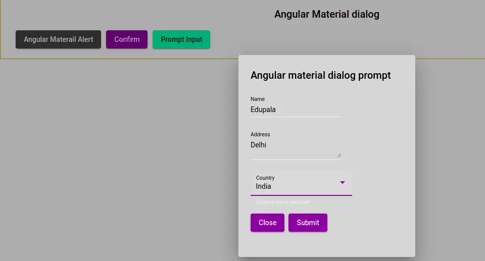
Let’s edit the mat-input-prompt.component.html template to add a material form field.
<div class="form-container">
    <h2 mat-dialog-title>
        Angular material dialog prompt
    </h2>
    <mat-dialog-content>
        <form [formGroup]="form">
            <mat-form-field appearance="standard">
                <mat-label>Name</mat-label>
                <input matInput placeholder="Enter your name" formControlName="name">
            </mat-form-field>

            <mat-form-field appearance="standard">
                <mat-label>Address</mat-label>
                <textarea matInput placeholder="Address" formControlName="address"></textarea>
            </mat-form-field>

            <mat-form-field appearance="fill" hintLabel="Country name required">
                <mat-label>Country</mat-label>
                <mat-select matNativeControl name="country" formControlName="country">
                    <mat-option value="india">India</mat-option>
                    <mat-option value="france">France</mat-option>
                    <mat-option value="germany">Germany</mat-option>
                    <mat-option value="japan">Japan</mat-option>
                    <mat-option value="Mongolia">Mongolia</mat-option>
                </mat-select>
            </mat-form-field>
        </form>
    </mat-dialog-content>
    <mat-dialog-actions>
        <button mat-raised-button (click)="dialogRef.close(false)" color="primary">
            Close
        </button>
        <button mat-raised-button color="primary" (click)="submit(form.value)">
            Submit
        </button>
    </mat-dialog-actions>
</div>
The submit button will invoke submit method, which in turn closes the material dialog and sent data to the component.
All our previous examples of Angular Material Modal, I added on stackblitz.com and you can live view code and preview it.
Conclusion
We have completed our Angular material alert or dialog or Angular material modal, all are the same. We have learned how to send| and receive through material dialog. I hope you got some idea of how to use the Material dialog component.
Related Articles
Related Articles
- How to install Angular material?
- Angular Radio button |angular material radio button?
- Angular material checkbox: color, label direction
- How to implement Angular checkbox input in Angular?
- How to use Angular Material tooltip in Angular?
- Angular Material input components and directives
- Angular material autocomplete example
- How to implement Angular material dropdown | select .?
- Angular Material button: Color, Size, toggle button
- How to implement Angular material accordion in Angular .?
- How to implement Angular material tabs?
- How to implement angular material snackbar | toast in Angular?
- How to implement Angular material grid .?
- How to implement Angular material list in Angular .?
- How to implement Angular material card in Angular?
- How to implement angular material date picker in Angular .?
- How to implement the Angular material table?