We will make series of tutorials on Angular material components and in the article, we will explore how to implement Angular material table in our Angular project. We have discussed what is the best way to install and configure Angular material in our Angular project, check our previous tutorial on it.
We have three objectives behind this tutorial, first will learn how to use the Angular material table, and second, we’ll look at how used different material table components like mat-table, pagination, sorting, and search filtering. Last how to apply animation on material table row expandable action. Let’s get started.
What is angular material table ?
Angular material table component provides Material Design styled table and we can use these components and attributes to display rows of data. We can easily use it, material table also provides extra functionalities like search filter, pagination, sort, and expandable row, which are not available on the native HTML table elements.
Step 1: Setting up and configure angular material table project.
Let first create our Angular material table project. Run the following command to create and add Angular Material to our project.
ng new angularMaterialTableApp
cd angularMaterialTableApp
ng add @angular/material
While running the 3rd command will ask you the select theme, material typography, and animation, press yes on all. To use the Angular material component, we have to import it into our app module. Let create a module and import all material components on it.
ng g m ng-material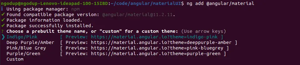
Open src/app/ng-material/ng-material.module.ts and replace the existing code with the code shown below.
import { NgModule } from '@angular/core';
import { CommonModule } from '@angular/common';
import { MatNativeDateModule } from '@angular/material/core';
import { MatDatepickerModule } from '@angular/material/datepicker';
import { MatFormFieldModule } from '@angular/material/form-field';
import { MatInputModule } from '@angular/material/input';
import { MatSortModule } from '@angular/material/sort';
import { MatTableModule } from '@angular/material/table';
import { MatIconModule } from '@angular/material/icon';
import { MatSelectModule } from '@angular/material/select';
import { MatRadioModule } from '@angular/material/radio';
import { MatButtonModule } from '@angular/material/button';
import { MatToolbarModule } from '@angular/material/toolbar';
import { MatPaginatorModule } from '@angular/material/paginator';

@NgModule({
    declarations: [],
    imports: [
        CommonModule,
        MatTableModule,
        MatSortModule,
        MatFormFieldModule,
        MatInputModule,
        MatDatepickerModule,
        MatNativeDateModule,
        MatInputModule,
        MatIconModule,
        MatSelectModule,
        MatRadioModule,
        MatButtonModule,
        MatToolbarModule,
        MatPaginatorModule,
        MatSortModule
    ],
    exports: [
        CommonModule,
        MatTableModule,
        MatSortModule,
        MatFormFieldModule,
        MatInputModule,
        MatDatepickerModule,
        MatNativeDateModule,
        MatInputModule,
        MatIconModule,
        MatSelectModule,
        MatRadioModule,
        MatButtonModule,
        MatToolbarModule,
        MatPaginatorModule,
        MatSortModule
    ]
})
export class NgMaterialModule { }
We are importing all the required modules in our custom material module file. By keeping separate modules for Angular material will make the application easy to maintain. Now we need to import our material module, HttpClientModule, and ReactiveFormModule in our src/app/app.module.ts file.
import { NgMaterialModule } from './ng-material/ng-material.module';
@NgModule({
...
imports: [
   ...
  ReactiveFormsModule,
  HttpClientModule,
  NgMaterialModule,
],
})
Creating data source for Angular material table
We need dummy data so that we can use it in our Angular material table example. Create a folder called data in the assets folder and add a file called countries.json inside the data folder. Inside the assets/data/countries.json let add country name, flag, area, population.
[
{
"name": "Russia",
"flag": "f/f3/Flag_of_Russia.svg",
"area": 17075200,
"population": 146989754,
"description": "Russia, the largest country in the world, occupies one-tenth of all the land on Earth."
},
{
"name": "France",
"flag": "c/c3/Flag_of_France.svg",
"area": 640679,
"population": 64979548,
"description": "France, the largest country in Western Europe, has long been a gateway between the continent's northern and southern regions."
},
{
"name": "Germany",
"flag": "b/ba/Flag_of_Germany.svg",
"area": 357114,
"population": 82114224,
"description": "Germany is a country located in the heart of Western Europe."
},
{
"name": "Portugal",
"flag": "5/5c/Flag_of_Portugal.svg",
"area": 92090,
"population": 10329506,
"description": "Portugal is a country full of wonders — charming castles, pristine beaches, and a metropolitan capital spattered in remnants of the past."
},
{
"name": "Canada",
"flag": "c/cf/Flag_of_Canada.svg",
"area": 9976140,
"population": 36624199,
"description": "Canada is a vast and rugged land. From north to south it spans more than half the Northern Hemisphere."
},
{
"name": "Vietnam",
"flag": "2/21/Flag_of_Vietnam.svg",
"area": 331212,
"population": 95540800,
"description": "Vietnam is a long, narrow nation shaped like the letter s. It is in Southeast Asia on the eastern edge of the peninsula known as Indochina."
},
{
"name": "Brazil",
"flag": "0/05/Flag_of_Brazil.svg",
"area": 8515767,
"population": 209288278,
"description": "Brazil is the largest country in South America and the fifth largest nation in the world. "
},
{
"name": "Mexico",
"flag": "f/fc/Flag_of_Mexico.svg",
"area": 1964375,
"population": 129163276,
"description": "Mexico is a land of extremes, with high mountains and deep canyons in the center of the country, sweeping deserts in the north, and dense rain forests in the south and east."
},
{
"name": "United States",
"flag": "a/a4/Flag_of_the_United_States.svg",
"area": 9629091,
"population": 324459463,
"description": "The United States of America is the world's third largest country in size and nearly the third largest in terms of population."
},
{
"name": "India",
"flag": "4/41/Flag_of_India.svg",
"area": 3287263,
"population": 1324171354,
"description": "India (Hindi: Bhārat), officially the Republic of India (Hindi: Bhārat Gaṇarājya) is a country in South Asia."
},
{
"name": "Indonesia",
"flag": "9/9f/Flag_of_Indonesia.svg",
"area": 1910931,
"population": 263991379,
"description": "Background: Indonesia is the largest archipelago in the world. It consists of five major islands and about 30 smaller groups."
},
{
"name": "Tuvalu",
"flag": "3/38/Flag_of_Tuvalu.svg",
"area": 26,
"population": 11097,
"description": "Tuvalu, formerly known as the Ellice Islands, is located midway between Hawaii and Australia in the South Pacific Ocean. "
},
{
"name": "China",
"flag": "f/fa/Flag_of_the_People%27s_Republic_of_China.svg",
"area": 9596960,
"population": 1409517397,
"description": "It is the world's most populous country, with a population of around 1.404 billion."
}
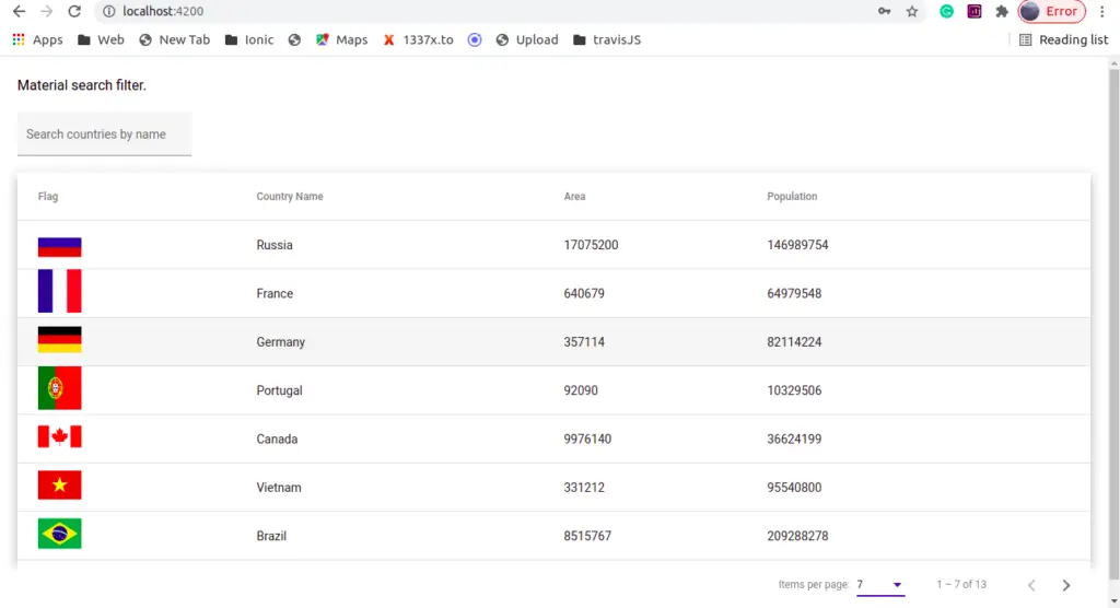
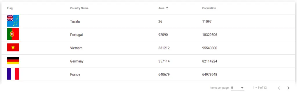
]Here is our screenshot of the angular material table example.
Step 2: Example of Angular material table
To demonstrate the Angular material table example. We have imported HttpClientModule, we need the httpClient module to fetch data from the source, the source can be a server or local static data. Angular 4.3 introduces an Angular httpClient module to request a call to the HTTP request. Let edit our component typescript to add the following code to fetch, sort, pagination, and search filter activities.
import { HttpClient } from '@angular/common/http';
import { AfterViewInit, Component, OnInit, ViewChild } from '@angular/core';
import { MatPaginator, PageEvent } from '@angular/material/paginator';
import { MatSort } from '@angular/material/sort';
import { MatTableDataSource } from '@angular/material/table';
import { animate, state, style, transition, trigger} from '@angular/animations';

interface Country {
  name: string;
  flag: string;
  area: number;
  population: number;
}
@Component({
  selector: 'app-table',
  templateUrl: './table.component.html',
  styleUrls: ['./table.component.scss'],
  animations: [
    trigger('detailExpand', [
      state('collapsed', style({height: '0px', minHeight: '0'})),
      state('expanded', style({height: '*'})),
      transition('expanded <=> collapsed', animate('225ms cubic-bezier(0.4, 0.0, 0.2, 1)')),
    ]),
  ],
})
export class TableComponent implements OnInit, AfterViewInit {
  @ViewChild(MatPaginator) paginator: MatPaginator;
  // MatPaginator Output
  pageEvent: PageEvent;
  pageSize = 3;
  pageSizeOptions: number[] = [3, 5, 7];
  countries: Country[] = [];

  displayedColumns: string[] = ['Flag', 'Name', 'Area', 'Population'];
  dataSource: MatTableDataSource<any> = new MatTableDataSource()
  @ViewChild(MatSort) sort: MatSort;

  constructor(private http: HttpClient) { }

  ngOnInit(): void {
    this.http.get<Country[]>('./assets/data/countries.json')
      .subscribe((data: any) => {
        //Is important
        this.dataSource = new MatTableDataSource(data);
        this.dataSource.paginator = this.paginator;
      });
  }

  ngAfterViewInit(): void {

    this.dataSource.sort = this.sort;
  }

  filterCountries(value: string) {
    this.dataSource.filter = value.trim().toLocaleLowerCase();
    const filterValue = value;
    this.dataSource.filter = filterValue.trim().toLowerCase();
  }

  setPageSizeOptions(setPageSizeOptionsInput: string) {
    if (setPageSizeOptionsInput) {
      this.pageSizeOptions = setPageSizeOptionsInput.split(',').map(str => +str);
    }
  }

  onMatSortChange() {
    this.dataSource.sort = this.sort;
  }
}
We have added all table activities at once, and will discuss them one by one later in the articles. Let edit the app.component.html file to include our Angular material table component.
<div class="material-table">
  <h3>Material search filter.</h3>
  <mat-form-field appearance="fill">
    <mat-label>Search countries by name</mat-label>
    <input matInput (keyup)="filterCountries($event.target.value)" placeholder="Search country by name">
  </mat-form-field>

  <table mat-table [dataSource]="dataSource" matSort (matSortChange)="onMatSortChange()" matSortDirection="asc"
    multiTemplateDataRows class="mat-elevation-z8">

    <!-- Position Column -->
    <ng-container matColumnDef="Flag">
      <th mat-header-cell *matHeaderCellDef>Flag</th>
      <td mat-cell *matCellDef="let element">
        <img [src]="'https://upload.wikimedia.org/wikipedia/commons/' + element.flag" height="50" width="50"
          alt="country flag">
      </td>
    </ng-container>

    <!-- Position Column -->
    <ng-container matColumnDef="Name">
      <th mat-header-cell *matHeaderCellDef mat-sort-header="name">
        Country Name
      </th>
      <td mat-cell *matCellDef="let element"> {{ element.name }} </td>
    </ng-container>

    <!-- Name Column -->
    <ng-container matColumnDef="Area">
      <th mat-header-cell *matHeaderCellDef mat-sort-header="area"> Area </th>
      <td mat-cell *matCellDef="let element"> {{element.area }} </td>
    </ng-container>

    <!-- Weight Column -->
    <ng-container matColumnDef="Population">
      <th mat-header-cell *matHeaderCellDef mat-sort-header="population">Population</th>
      <td mat-cell *matCellDef="let element"> {{element.population }} </td>
    </ng-container>


    <!-- Expanded Content Column - The detail row is made up of this one column that spans across all columns -->
    <ng-container matColumnDef="expandedDetail">
      <td mat-cell *matCellDef="let element" [attr.colspan]="displayedColumns.length">
        <div class="example-element-detail" [@detailExpand]="element == expandedElement ? 'expanded' : 'collapsed'">
          <div class="example-element-diagram">
            <div class="example-element-name">
              <img [src]="'https://upload.wikimedia.org/wikipedia/commons/' + element.flag" height="100" width="100"
                alt="country flag">
            </div>
            <div class="example-element-weight"> {{element.name}} </div>
          </div>
          <div class="example-element-description">
            {{element.description}}
            <span class="example-element-description-attribution"> -- Wikipedia </span>
          </div>
        </div>
      </td>
    </ng-container>

    <tr mat-header-row *matHeaderRowDef="displayedColumns"></tr>
    <tr mat-row *matRowDef="let element; columns: displayedColumns;"
        class="example-element-row"
        [class.example-expanded-row]="expandedElement === element"
        (click)="expandedElement = expandedElement === element ? null : element">
    </tr>
    <tr mat-row *matRowDef="let row; columns: ['expandedDetail']" class="example-detail-row"></tr>
  </table>


  <mat-paginator #paginator [pageSize]="pageSize" [pageSizeOptions]="pageSizeOptions" (page)="pageEvent = $event"
    aria-label="Select page">
  </mat-paginator>
</div>
In first we have a material form field to perform an angular table search filter. In our component template, we have performed the following activities.
- Add mat-table component on HTML table element, so that we can make this table to material design table style.
- dataSource: To supply data to the table, we have assigned our country’s array data object to dataSource on the table element.
- matColumnDef: Our Angular material table example data have four fields, we need to define a column for each by using matColumnDef. Here we can define a unique name for each column containing header and row cell content.
- mat-header-row & mat-row: Once we have defined your columns, we need to tell the table which columns will be rendered in the header and data rows.
Step3 : Applying style to Angular material table
By default, angular material table width is not 100% and when we add material expandable row it didn’t hide by default. Let adds style to the material table in our component style.
div.material-table {
    margin: 20px;
    table {
        width: 100%;
      }

      tr.example-detail-row {
        height: 0;
      }

      tr.example-element-row:not(.example-expanded-row):hover {
        background: whitesmoke;
      }

      tr.example-element-row:not(.example-expanded-row):active {
        background: #efefef;
      }

      .example-element-row td {
        border-bottom-width: 0;
      }

      .example-element-detail {
        overflow: hidden;
        display: flex;
      }

      .example-element-diagram {
        min-width: 80px;
        padding: 8px;
        font-weight: lighter;
        margin: 8px 0;
        height: 104px;
      }

      .example-element-symbol {
        font-weight: bold;
        font-size: 40px;
        line-height: normal;
      }

      .example-element-description {
        padding: 16px;
      }

      .example-element-description-attribution {
        opacity: 0.5;
      }
}
Step 4: How to apply Angular Material table search filter ?
In this section, we will learn how we can integrate search filters on the Angular material table. In our component template, we had to add the mat-form-field with input.
 <mat-form-field appearance="fill">
   <mat-label>Search countries by name</mat-label>
   <input matInput (keyup)="filterCountries($event.target.value)"
      placeholder="Search country by name">
</mat-form-field>
In this input filter, we type our search filter query on countries’ names by calling the filter Countries method on keyup event. In our typescript file of components, we will implement Angular Material table search filter functionalities.
  filterCountries(filterValue: string) {
    this.dataSource.filter = filterValue.trim().toLowerCase();
  }
Note: If your material table filter is not working, then it is important to add a new MatTableDataSource on your data source when we retrieve our data from HTTP get method.
// When declaring datasource
dataSource: MatTableDataSource<any> = new MatTableDataSource()
// When assign data to datasource
ngOnInit(): void {
this.http.get<Country[]>('./assets/data/countries.json')
.subscribe((data: any) => {
//Is important to add new MatTableDataSource
this.dataSource = new MatTableDataSource(data);
});
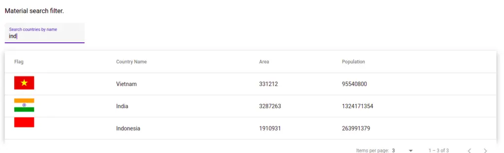
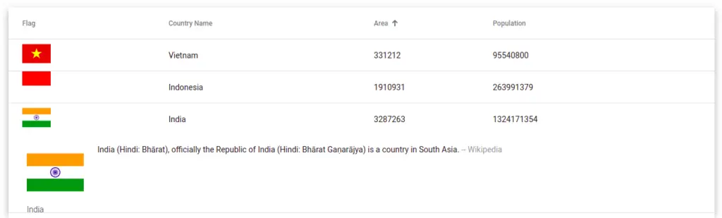
}Here is a screenshot of our Angular material table search filter.
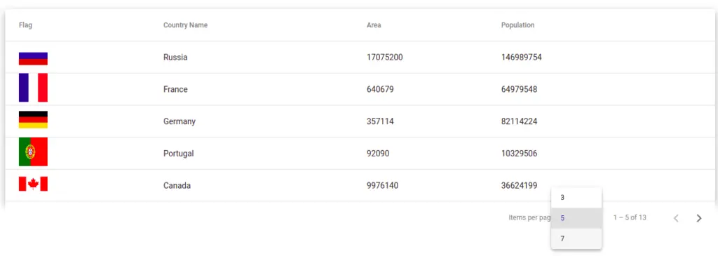
Step 5: How to apply Angular Material paginatiion ?
To implement Angular material pagination, we have to import the mat-paginator module in our custom material module, we have already added it to this module. In the Angular material paginator component, we have declared two attributes as.
- pageSize: Here we have to add the default page size, as we have declared its value in typescript as 3.
- pageSizeOptions: This is an array containing a list of possible page size values for Angular material pagination.
Syntax of our Angular material table pagination.
 <mat-paginator #paginator [pageSize]="pageSize"
    [pageSizeOptions]="pageSizeOptions" (page)="pageEvent = $event"
    aria-label="Select page">
</mat-paginator>
To make pagination work, we need to add a reference binding on our mat-paginator component by using #paginator. You can name it anything. In typescript to access this material paginator component, we need to import and use @ViewChild decorator.
import { ..., ViewChild } from '@angular/core';
import { MatPaginator } from '@angular/material/paginator';

...
@ViewChild(MatPaginator) paginator: MatPaginator;
Here we are linking the viewChild decorator paginator to our template mat-paginator component.
ngOnInit(): void {
 this.http.get<Country[]>('./assets/data/countries.json')
   .subscribe((data: any) => {
    //Is important add new MatTableDataSource
     this.dataSource = new MatTableDataSource(data);
     this.dataSource.paginator = this.paginator;
   });
 }
Step 6: How to apply Angular Material table sorting ?
In this section, we will learn how to apply sorting functionalities on the data table, and to make any column sortable we need to add a mat-sort-header with a unique name on it. To the table, we have to add the matSort attribute. To use matSort, we need to import the MatSortModule, which we have already added to our custom material module.
In our component typescript file, we need to import MatSort from the @angular/material/sort and have to link to the matSort attribute by using viewChild decorator.
import { MatSort } from '@angular/material/sort';
...

@ViewChild(MatSort) sort: MatSort;

 ngAfterViewInit(): void {
    this.dataSource.sort = this.sort;
 }
Step 7: How to add material table expandable row ?
To create a material table expandable row, we add added animation while clicking and displaying the expandable row. To create an expandable row we have to follow the steps.
- Create an expandable row template in the component template.
- Need click event on row to show|hide expand the row.
- Need an import animation for expanding row activity.
First, we need to add the multiTemplateDataRows attribute to our material table and we have added a template for expandable rows before mat-header-row & mat-row:
 <!-- Expanded Content Column -
     The detail row is made up of this one column that spans across all columns -->

<ng-container matColumnDef="expandedDetail">
  <td mat-cell *matCellDef="let element"[attr.colspan]="displayedColumns.length">
   <div class="example-element-detail" [@detailExpand]="element ==
    expandedElement ? 'expanded' : 'collapsed'">
    <div class="example-element-diagram">
     <div class="example-element-name">
      <img [src]="'https://upload.wikimedia.org/wikipedia/commons/' +
       element.flag" height="100" width="100" alt="country flag">
      </div>
      <div class="example-element-weight"> {{element.name}} </div>
     </div>
     <div class="example-element-description">
       {{element.description}}
        <span class="example-element-description-attribution"></span>
     </div>
    </div>
   </td>
 </ng-container>
On clicking on each row, we are toggle expand and collapse of that row. We had imported some animation elements from the @angular/animation, it has nothing to do with the Material design module.
.....
import { animate, state, style, transition, trigger} from '@angular/animations';

@Component({
  selector: 'app-table',
  templateUrl: './table.component.html',
  styleUrls: ['./table.component.scss'],
  animations: [
    trigger('detailExpand', [
      state('collapsed', style({height: '0px', minHeight: '0'})),
      state('expanded', style({height: '*'})),
      transition('expanded <=> collapsed',
        animate('225ms cubic-bezier(0.4, 0.0, 0.2, 1)')),
    ]),
  ],
})
Conclusion
We have completed our Angular material table example tutorial, and we have learned how to use the material table component like mat-table, mat-pagination, and more. At last, we have demonstrated one more example on the Angular material table to perform filtering, sorting, and expandable of a row of a material table. I hope, you have got some idea.
Related Articles
When you searched ‘Ind’, how vietnam showed up??