Angular radio button input allows the user to select only one option from a list of choices. Angular doesn’t have a radio button component, we can use a native HTML radio button or Angular material radio button, or any other UI library radio button. Angular Material UI library has a radio input component called mat-radio-group and mat-radio-button.
We have three main objectives in this tutorial on the Angular Radio button
- How to create an Angular radio button using Angular material, Bootstrap UI library, or native radio input.
- Implementing Radio button in Angular Template and reactive form.
- Default Color Configuration for Angular Material mat-radio-group color
What is the radio input element in Angular?
In HTML have different input element, Checkboxes and radio buttons are written with the HTML tag <input>. The native HTML radio is an input element with a type attribute radio. Here is the syntax of HTML radio input.
<input type="radio" id="html" name="fav_language" value="HTML">
<label for="html">HTML</label>
<input type="radio" id="css" name="fav_language" value="CSS">
<label for="css">CSS</label>
The HTML Radio buttons are elements of type radio that are generally used in radio groups: collections of radio buttons describing a set of related options. We can group the radio button using a common name among all related radio buttons.
The selection of radio buttons is mutually exclusive, meaning the user may only select one choice from a group of radio buttons. Here we have used name=”fav_language” for two radio buttons and we can select either one of them only. The HTML radio buttons are typically rendered as small circles, which are filled or highlighted when selected.
<mat-radio-button> provides the same functionality as a native <input type="radio"> enhanced with Material Design styling and animations.
Setting up and configuring Angular material radio button
Let’s first demonstrate the Angular radio button input using the material design radio component, here we had listed the abstract step of adding the Angular mat-radio-group
- Create an Angular material radio button project.
- Add Angular material library to our Angular project.
- Import MatRadioModule, FormsModule, and ReactiveFormsModule to our project.
- Defining form group and form control for the radio button.
- Add angular mat-radio-group and mat-radio-button components in the component template.
Step 1 to 3: Setup and configure angular material radio button project
Let’s first create an Angular material radio button project, we need to install the angular material library. We have a complete tutorial on adding the material library to the Angular project.
ng new radioApp
cd new radioApp
ng add @angular/material
Here is a screenshot of an angular material radio button.
The material radio allows us to select only one option among lists of options and it provides this functionality with Material Design look and feels and behavior. To use the Angular material radio we need to import MatRadioModule in our app module. Let’s import it into our app.component.ts file.
import { NgModule } from '@angular/core';
import { BrowserModule } from '@angular/platform-browser';
import { AppRoutingModule } from './app-routing.module';
import { AppComponent } from './app.component';
import { BrowserAnimationsModule } from '@angular/platform-browser/animations';
import { FormsModule, ReactiveFormsModule } from '@angular/forms';
import { MatFormFieldModule } from '@angular/material/form-field';
import { MatInputModule } from '@angular/material/input';
import { MatRadioModule } from '@angular/material/radio';
import { MatIconModule } from '@angular/material/icon';

@NgModule({
  declarations: [
    AppComponent
  ],
  imports: [
    BrowserModule,
    AppRoutingModule,
    BrowserAnimationsModule,
    FormsModule,
    ReactiveFormsModule,
    MatFormFieldModule,
    MatInputModule,
    MatRadioModule,
    MatIconModule
  ],
  providers: [],
  bootstrap: [AppComponent]
})
export class AppModule { }
We have also imported a few material modules in our Angular project, to demonstrate the Angular material radio button with a reactive form with other fields.
| Name | Description |
| mat-radio-group | Is the root component for all related mat-radio-button subcomponents. The radio group has a value property that reflects the currently selected the radio-button inside of the group. We have used ngModel as a value property to get the selected radio button |
| mat-radio-button | The mat-radio-button provides the same functionality as a native <input type="radio"> enhanced with Material Design styling and animations |
Implementing Angular radio button in Template-driven form
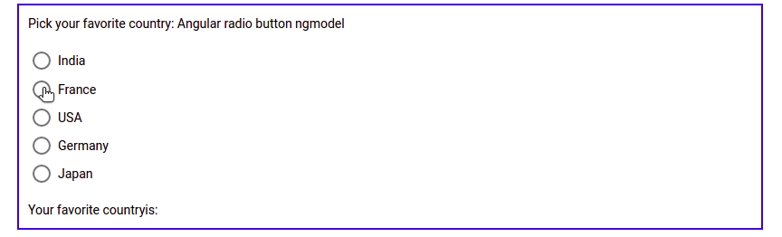
To understand how to use the Angular material radio, let’s demonstrate an example of it in Angular template form. Here is a screenshot of our example.
Let first define any string array containing a list of countries names in our component typescript file.
countries: Array<any> = [
{ name: 'India', value: 'india' },
{ name: 'France', value: 'france' },
{ name: 'USA', value: 'USA' },
{ name: 'Germany', value: 'germany' },
{ name: 'Japan', value: 'Japan' }
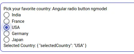
];In our component template, we can define the Angular material radio button component using the angular mat-radio-group and its subcomponent mat-radio-button. The <mat-radio-group> is compatible with @angular/forms and supports both FormsModule and ReactiveFormsModule. All related radio buttons are subcomponents of mat-radio-group of the same name and we can select only one out of all others.
<section>
 <form #f="ngForm" (ngSubmit)="submit()">
   <label id="example-radio-group-label">
    Pick your favorite country: Angular radio button ngmodel
   </label>
   <mat-radio-group aria-labelledby="example-radio-group-label"
    class="example-radio-group" [(ngModel)]="selectedCountry" name="selectedCountry">
     <mat-radio-button class="example-radio-button"
       *ngFor="let country of countries" [value]="country.name">
         {{ country.name }}
     </mat-radio-button>
     </mat-radio-group>
  </form>
 <div>Selected Country: {{ f.value |json }}</div>
</section>
we have used material component mat radio button with ngmodel.
Implmenting Angular radio button input in Reactive form
In our second example, we’ll demonstrate the Angular material radio button in the reactive form and we’ll also add reactive form validation to it. The submit button is disabled when a reactive form is invalid. Here is a screenshot of your Angular material radio button with reactive form.
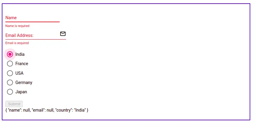
Angular material radio button validation
Let first define reactive form and its form control elements in the app.component.ts file. We will also add Angular radio button validation.
import { Component } from '@angular/core';
import { FormBuilder, FormGroup, Validators } from '@angular/forms';

@Component({
  selector: 'app-root',
  templateUrl: './app.component.html',
  styleUrls: ['./app.component.scss']
})
export class AppComponent {
  form: FormGroup;

  countries: Array<any> = [
    { name: 'India', value: 'india' },
    { name: 'France', value: 'france' },
    { name: 'USA', value: 'USA' },
    { name: 'Germany', value: 'germany' },
    { name: 'Japan', value: 'Japan' }
  ];

  constructor(fb: FormBuilder) {
    this.form = fb.group({
      name: [null, [Validators.required, Validators.minLength(10)]],
      email: [null, [Validators.required, Validators.pattern("^[a-z0-9._%+-]+@[a-z0-9.-]+\\.[a-z]{2,4}$")]],
      country: [null, [Validators.required]],
    });
  }

  changeCountry(event: any) {
    console.log(event.value);
  }

  submit() {
    console.log(this.form.value);
  }
}
We defined country name as one of the form control fields of the reactive form and add a validator as required. Now let’s add our Angular material radio button component and other fields in our component template.
<section>
  <form [formGroup]="form" (ngSubmit)="submit()">
    <div class="form-group">
      <mat-form-field appearance="standard">
        <mat-label>Name</mat-label>
        <input matInput maxlength="15" inputmode="tel" placeholder="Type name" formControlName="name" #nameInput>
        <mat-hint>Mini character 10: {{ nameInput.value.length }}/10</mat-hint>
        <mat-error>Name is required</mat-error>
        <mat-error *ngIf="form.controls['name'].errors?.['minlength']">
          Please enter more than 10 character
        </mat-error>
      </mat-form-field>
     </div>

     <div class="form-group">
      <mat-form-field appearance="legacy">
        <mat-label>Email Address:</mat-label>
        <input matInput type="email" formControlName="email" placeholder="Your email">
         <mat-icon matSuffix>mail_outline</mat-icon>
         <mat-hint>Input the fully qualified email address</mat-hint>
         <mat-error *ngIf="form.controls['email'].errors?.['required']">
           Email is required
         </mat-error>
         <mat-error *ngIf="form.controls['email'].errors?.['pattern']">
           Please enter valid email
        </mat-error>
         </mat-form-field>
      </div>

     <div class="example-section">
       <mat-radio-group formControlName="country"
        aria-labelledby="example-radio-group-label" class="example-radio-group">
        <mat-radio-button class="example-radio-button"
         *ngFor="let country of countries" [value]="country.name" (change)="changeCountry($event)">
             {{ country.name }}
        </mat-radio-button>
       </mat-radio-group>
    </div>
    <button mat-raised-button color="accent" [disabled]="form.invalid">Submit</button>
   </form>
   <p>{{ form.value | json }}</p>
 </section>
 <router-outlet></router-outlet>
We had added a design on our material radio button, let’s add CSS style in component style files.
.example-radio-group {
  display: flex;
  flex-direction: column;
  margin: 15px 0;
}

.example-radio-button {
   margin: 5px;
 }
Default Color Configuration for Angular mat-radio-group
We can configure the default color for the angular mat-radio-group component in the provider option using MAT_RADIO_DEFAULT_OPTIONS and we can assign material colors like primary, warn accent, and others. Let’s add angular mat-radio-group color primarily, we need to add the color in the app.module.ts file as follows.
...
@NgModule({
  declarations: [
    AppComponent
  ],
  imports: [ ....  ],
  providers: [{
    provide: MAT_RADIO_DEFAULT_OPTIONS,
    useValue: { color: 'primary' },
}],
  bootstrap: [AppComponent]
})
export class AppModule { }
We can also change the label position of the angular mat-radio-group component by using the directive labelPosition value before or after and by default it is after.
<mat-radio-button labelPosition="before" ......>
</mat-radio-button>
Angular radio button using native HTML radio button
We have learned that Angular doesn’t have a radio button component, we have used the Angular material radio button component. Let’s demonstrate an example of a radio button using HTML input with attribute type radio.
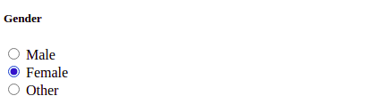
<div>
  <h5>Gender</h5>
  <label>
    <input type="radio" value="male" name="gender">Male
  </label><br />
  <label>
    <input type="radio" value="female" name="gender">Female
  </label><br />
  <label>
    <input type="radio" value="other" name="gender">Other
  </label>
</div>
Angular radio button default value
We can set a default value of the Angular radio button checked using the checked attribute in radio input.
<input type="radio" value="male" name="gender" checked>MaleAngular radio button using bootstrap UI
We can use the bootstrap CSS class name on the Angular radio button input. Here is a screenshot of our example.
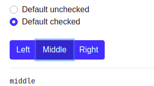
To use bootstrap, we need to install the ng-bootstrap in our Angular project. Run the following command to add bootstrap to our Angular project.
ng add @ng-bootstrap/ng-bootstrap <div class="custom-control custom-radio">
<input type="radio" class="custom-control-input" id="defaultUnchecked" name="defaultExampleRadios" mdbInput>
<label class="custom-control-label" for="defaultUnchecked">Default unchecked</label>
</div>
<!-- Default checked -->
<div class="custom-control custom-radio">
<input type="radio" class="custom-control-input"
id="defaultChecked" name="defaultExampleRadios" checked mdbInput>
<label class="custom-control-label" for="defaultChecked">Default checked</label>
</div>
<br />
<div class="btn-group btn-group-toggle"
ngbRadioGroup name="radioBasic" [(ngModel)]="model">
<label ngbButtonLabel class="btn-primary">
<input ngbButton type="radio" value="left"> Left
</label>
<label ngbButtonLabel class="btn-primary">
<input ngbButton type="radio" value="middle"> Middle
</label>
<label ngbButtonLabel class="btn-primary">
<input ngbButton type="radio" value="right"> Right
</label>
</div>I had added both Radio button implementation in template and reactive form in stackblitz.com, if you want you can take reference on it.
Conclusion
We learned how to use Angular radio button input. We have plenty of choices to use checkbox input from Angular material radio button, native HTML radio input, and bootstrap radio input also. I hope you had learned something, if so then please share it with others and on social networks, this will encourage me to add more content. Follow me on my GitHub collection, I had code on Angular, react and Ionic framework.
Related Articles
- How to install Angular material?
- How to implement Angular material form in Angular?
- Angular material checkbox: color, label direction
- How to implement Angular checkbox input in Angular?
- How to use Angular Material tooltip in Angular?
- Angular Material input components and directives
- Angular material autocomplete example
- How to implement Angular material dropdown | select .?
- How to implement Angular material accordion in Angular .?
- How to implement Angular material tabs?
- How to implement angular material snack bar | toast in Angular?
- How to implement Angular material dialog .?
- How to implement Angular material grid .?
- How to implement Angular material list in Angular .?
- How to implement Angular material card in Angular?
- How to implement angular material date picker in Angular .?
- How to implement the Angular material table?
- Angular material button: Color, Size, toggle button