To use Angular material inputs, we have to understand different Angular material directives and components that are used with Angular form. Angular has a matInput directive that is supported by some of HTML native input but not all native HTML inputs. We used the input field to collect data from users.
We have three objectives behind this tutorial, first will learn how to use Angular material input directive matInput, where we can used it. Second we’ll look how used different material component like material form field, material hint, error , date picker, material select and material radio buttons. Last Angular material input design or appearance.
Setting up and configuring Angular material Input project
Let’s first create our Angular material input project. In our previous articles, we had articles on how to install and the best approach to configuring Angular material in our project. Run the following command to create and add Angular Material to our project.
ng new materialInputExample
cd materialInputExample
ng add @angular/material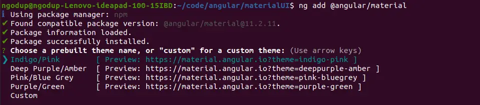
While running the 3rd command will ask you the select theme, material typography, and animation, press yes on all. To use the Angular material component, we have to import it into our app module. Let create a module and import all material components on it.
ng g m ng-materialOpen src/app/ng-material/ng-material.module.ts and replace the existing code with the code shown below.
import { NgModule } from '@angular/core';
import { CommonModule } from '@angular/common';
import { MatFormFieldModule } from '@angular/material/form-field';
import { MatIconModule } from '@angular/material/icon';
import { MatButtonModule } from '@angular/material/button';
import { MatNativeDateModule } from '@angular/material/core';
import { MatDatepickerModule } from '@angular/material/datepicker';
import { MatInputModule } from '@angular/material/input';
import { MatRadioModule } from '@angular/material/radio';
import { MatSelectModule } from '@angular/material/select';

@NgModule({
  declarations: [],
  imports: [
    CommonModule,
    MatFormFieldModule,
    MatInputModule,
    MatRadioModule,
    MatButtonModule,
    MatSelectModule,
    MatIconModule,
    MatDatepickerModule,
    MatNativeDateModule
  ],
  exports: [
    MatFormFieldModule,
    MatInputModule,
    MatRadioModule,
    MatButtonModule,
    MatSelectModule,
    MatIconModule,
    MatDatepickerModule,
    MatNativeDateModule
  ]
})
export class NgMaterialModule { }
We are importing all the required modules in our custom material module file and keeping separate modules for Angular material will make the application easy to maintain. Now we need to import our material module in our src/app/app.module.ts file.
...
import { NgMaterialModule } from './ng-material/ng-material.module';

@NgModule({
  declarations: [
    AppComponent
  ],
  imports: [
    ...
    NgMaterialModule
  ],
  providers: [],
  bootstrap: [AppComponent]
})
export class AppModule { }
Angular material Input example
We have completed our configuration of the material input project. To use Angular material input design, we need to use the Angular material matInput directive with mat-form-field. The matInput directive is enclosed in the mat-form-field component with mat-label.
The syntax of mat-form-field with matInput
<mat-form-field appearance="legacy">
   <mat-label>Color</mat-label>
   <input type="Name of Input type" matInput>
</mat-form-field>
We can’t use matInput directive on all HTML input types, Angular material matInput directive is supported in the following types of inputs:
- text
- password
- tel
- url
- number
- search
- color
- date
- datetime-local
- month
- time
- week
- textarea
Angular material input color example
Here we demonstrated a few examples of Angular material input examples.
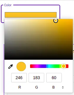
<mat-form-field class="example-full-width" appearance="outline">
   <mat-label>Color</mat-label>
   <input type="color" matInput value="#f6b73c">
</mat-form-field>
We can’t use the mat-form-field component on all inputs. The mat-form-field encapsulates the appearance, floating labels, hint text, and placeholders. We used Angular material input color with appearance outline.
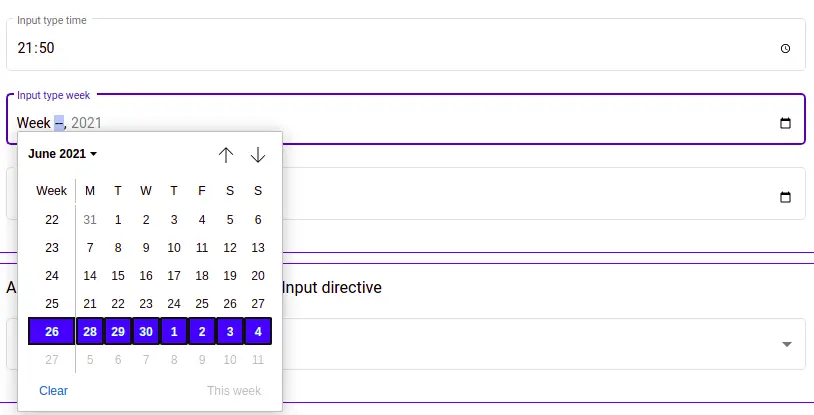
Angular material input week and time
The second example we have an Angular material input example with input type week and time.
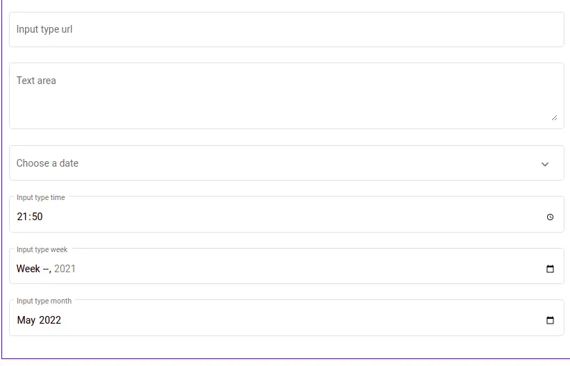
Angular material input example
We have demonstrated a few examples of Angular material input types, now let’s demonstrate all input that supports matInput directive. Here is a screenshot of our example.
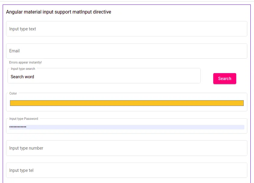
  <section>
    <h3>Angular material input support matInput directive</h3>

    <mat-form-field class="example-full-width" appearance="outline">
      <mat-label>Input type text</mat-label>
      <input matInput placeholder="Enter textarea">
    </mat-form-field>
    <mat-form-field class="example-full-width" appearance="outline">

      <mat-label>Email</mat-label>
      <input type="email" matInput placeholder="Ex. [email protected]">
      <mat-hint>Errors appear instantly!</mat-hint>
    </mat-form-field>

    <div class="search">
      <mat-form-field appearance="outline" class="search">
        <mat-label>Input type search</mat-label>
        <input type="search" matInput style="display: inline;">
      </mat-form-field>
      <button mat-raised-button color="accent" style="display: inline;">Search</button>
    </div>

    <mat-form-field class="example-full-width" appearance="outline">
      <mat-label>Color</mat-label>
      <input type="color" matInput value="#f6b73c">
    </mat-form-field>

    <mat-form-field class="example-full-width" appearance="outline">
      <mat-label>Input type Password</mat-label>
      <input type="password" matInput>
    </mat-form-field>

    <mat-form-field class="example-full-width" appearance="outline">
      <mat-label>Input type number</mat-label>
      <input type="number" matInput min="10" max="100">
    </mat-form-field>

    <mat-form-field class="example-full-width" appearance="outline">
      <mat-label>Input type tel</mat-label>
      <input type="tel" matInput id="phone" name="phone" placeholder="Enter mobile number">
    </mat-form-field>

    <mat-form-field class="example-full-width" appearance="outline">
      <mat-label>Input type url</mat-label>
      <input type="url" matInput name="url" id="url" placeholder="https://example.com" pattern="https://.*" size="30">
    </mat-form-field>

    <mat-form-field appearance="outline">
      <mat-label>Text area</mat-label>
      <textarea matInput rows="4" placeholder="Textarea"></textarea>
    </mat-form-field>

    <mat-form-field class="example-full-width" appearance="outline">
      <mat-label>Choose a date</mat-label>
      <input matInput [matDatepicker]="picker">
      <mat-datepicker-toggle matSuffix [for]="picker">
        <mat-icon matDatepickerToggleIcon>keyboard_arrow_down</mat-icon>
      </mat-datepicker-toggle>
      <mat-datepicker #picker></mat-datepicker>
    </mat-form-field>

    <mat-form-field appearance="outline">
      <mat-label>Input type time</mat-label>
      <input type="time" matInput name="week" min="09:00" max="18:00">
    </mat-form-field>

    <mat-form-field appearance="outline">
      <mat-label>Input type week</mat-label>
      <input type="week" matInput name="week" id="camp-week" min="2021-W18" max="2021-W26">
    </mat-form-field>

    <mat-form-field appearance="outline">
      <mat-label>Input type month</mat-label>
      <input type="month" matInput min="2021-11" value="2022-05">
    </mat-form-field>
  </section>
Here we have listed some of the HTML input that doesn’t support the matInput directive.
- file
- image
- checkbox
- hidden
- radio
- range
- reset
- submit
Angular material input appearance attribute
The mat-form-field component supports some attributes, the appearance attribute has four values as follows the outline, fill, standard, and legacy. Here is a screenshot of the Angular material input appearance.
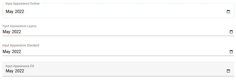
<section>
 <mat-form-field appearance="outline">
   <mat-label>Input Appearance Outline</mat-label>
   <input type="month" matInput min="2021-11" value="2022-05">
 </mat-form-field>

 <mat-form-field appearance="legacy">
   <mat-label>Input Appearance Legacy</mat-label>
   <input type="month" matInput min="2021-11" value="2022-05">
 </mat-form-field>

  <mat-form-field appearance="standard">
    <mat-label>Input Appearance Standard</mat-label>
    <input type="month" matInput min="2021-11" value="2022-05">
  </mat-form-field>

  <mat-form-field appearance="fill">
    <mat-label>Input Appearance Fill</mat-label>
    <input type="month" matInput min="2021-11" value="2022-05">
  </mat-form-field>
</section>
We can also use the Angular material input float label attribute, it has three values float is the default, none, and always.
<mat-form-field floatLabel="never" appearance="outline">
   <mat-label>Input Appearance Outline</mat-label>
   <input type="month" matInput min="2021-11" value="2022-05">
</mat-form-field>

<mat-form-field floatLabel="always" appearance="legacy">
  <mat-label>Input Appearance Legacy</mat-label>
  <input type="month" matInput min="2021-11" value="2022-05">
</mat-form-field>
We have a tutorial on Angular material reactive form with validation, where we have used mat-hint and mat-error on field validation.
Conclusion
We have completed Angular material input with a few examples. I hope you have got some idea on how to use the matInput directive in Angular form. We also have other inputs where mat-form-field and matInput are not supported and here is the link.