An Angular material is an amazing UI for the Angular framework, it has lots of pre-built components like cards, modals, and more, and the Angular material expansion panel or Angular material accordion is one of them.
We have three objectives behind this tutorial, first will learn how to use the Angular material expansion panel component, and second how to add images. Last how to apply a style to Angular material accordion component like the background color to header. Let’s get started.
What is an Angular Material Accordion?
Angular Material accordion – or we can also call Angular material expansion panel component is the same. This component is a seamless vertically collapsible panel accordion. We can group a list of related items in an accordion panel, each item in the accordion has an item header and body. Item is expanded its body only when we particular item header is clicked.
Step 1: Setup and configure the Angular Material Accordion project
Let’s first create an Angular material expansion panel project, we need to install the angular material library and we don’t have any dependency on another library. Let’s install the angular material library.
ng new matAccordionApp
cd matAccordionApp
ng add @angular/material
While running the 3rd command will ask you the select theme, material typography, and animation, press yes on all. To use the Angular material component, we have to import it into our app module. Let’s create a module and import all material components on it.
ng g m ng-material
We also need to add two custom component lists and the nextPanel to demonstrate the Angular material accordion example. Let’s add this component using the following commands.
ng g component ng-material/list
ng g component ng-material/nextPanel
To use the Angular material accordion, we need to import MatExpansionModule into our custom module. It is up to you to add all material modules in a separate custom module or root module app. We are adding all material modules in a custom module, it containing only the material module.
Open src/app/ng-material/ng-material.module.ts and replace the existing code with the code shown below we need the following material component for our example.
import { NgModule } from '@angular/core';
import { CommonModule } from '@angular/common';
import { MatExpansionModule } from '@angular/material/expansion';
import { MatButtonModule } from '@angular/material/button';
import { MatInputModule } from '@angular/material/input';
import { MatIconModule } from '@angular/material/icon';
import { MatDatepickerModule } from '@angular/material/datepicker';
import { MatGridListModule } from '@angular/material/grid-list'
import { MatNativeDateModule } from '@angular/material/core';
import { CdkAccordionModule } from '@angular/cdk/accordion';
import { ListComponent } from './list/list.component';
import { NextPanelComponent } from './next-panel/next-panel.component';

@NgModule({
  declarations: [
    ListComponent,
    NextPanelComponent
  ],
  imports: [
    CommonModule,
    MatExpansionModule,
    MatButtonModule,
    MatIconModule,
    MatInputModule,
    MatDatepickerModule,
    MatNativeDateModule,
    MatGridListModule,
    CdkAccordionModule
  ],
  exports: [
    MatExpansionModule,
    MatButtonModule,
    MatIconModule,
    MatInputModule,
    MatDatepickerModule,
    MatNativeDateModule,
    MatGridListModule,
    CdkAccordionModule,

    ListComponent,
    NextPanelComponent
  ]
})
export class NgMaterialModule { }
We are importing all the required modules in our custom material module file and keeping separate modules for Angular material will make the application easy to maintain. Now we need to import our material module in the src/app/app.module.ts file.
...
import { NgMaterialModule } from './ng-material/ng-material.module';

@NgModule({
  declarations: [
    AppComponent
  ],
  imports: [
   ...
    NgMaterialModule,
  ],
  providers: [],
  bootstrap: [AppComponent]
})
export class AppModule { }
To demonstrate the material list we need dummy data, create folder data in the assets and countries.json file and add the following dummy data.
[
    {
        "name": "France",
        "flag": "c/c3/Flag_of_France.svg",
        "area": 640679,
        "population": 64979548,
        "description": "France, the largest country in Western Europe, has long been a gateway between the continent's northern and southern regions."
    },
    {
        "name": "India",
        "flag": "4/41/Flag_of_India.svg",
        "area": 3287263,
        "population": 1324171354,
        "description": "India (Hindi: Bhārat), officially the Republic of India (Hindi: Bhārat Gaṇarājya) is a country in South Asia."
    },
    {
        "name": "Germany",
        "flag": "b/ba/Flag_of_Germany.svg",
        "area": 357114,
        "population": 82114224,
        "description": "Germany is a country located in the heart of Western Europe."
    }
]
We also need a model for our country to make strict types in our angular project. Create folder model and country.model.ts file and add the following code.
export interface ICountry {
    name: string;
    flag: string;
    area: number;
    population: number;
    description: string;
}
Step 2: An Example of Angular Material Accordion example
We have completed the material configuration, let us demonstrate our first example that uses most of the components and directives needed for creating an Angular material expansion panel. Here is a screenshot of our first example.
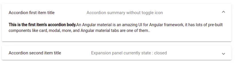
In the above image, we have used two mat-expansion-panel components, let’s edit the app.component.html template to add our Angular material expansion panel.
  <mat-accordion>
    <mat-expansion-panel>
      <mat-expansion-panel-header>
        <mat-panel-title>
          Accordion first item title
        </mat-panel-title>
        <mat-panel-description>
          Accordion summary without toggle icon
        </mat-panel-description>
      </mat-expansion-panel-header>

      <p> <b>This is the first item's accordion body.</b>
        An Angular material is an amazing UI for Angular framework, it
        has lots of pre-built components like card, modal, more, and Angular
        material tabs are one of them.
      </p>
    </mat-expansion-panel>

    <mat-expansion-panel (opened)="secondPanelOpenState = true"
      (closed)="secondPanelOpenState = false">
      <mat-expansion-panel-header>
        <mat-panel-title>
          Accordion second item title
        </mat-panel-title>
        <mat-panel-description>
          Expansion panel currently state :
          {{ secondPanelOpenState ? 'open' : 'closed' }}
        </mat-panel-description>
      </mat-expansion-panel-header>
      <p> <b>This is the first item's accordion body.</b>
        Second item expansion is open
      </p>
    </mat-expansion-panel>
  </mat-accordion>
In our app component typescript, we need to add a secondPanelState property value to initialize false.
secondPanelOpenState: boolean = false;Angular Material accordion component, sub-components, and directives
Here we have listed components and directives used in the Angular material expansion panel.
| Name | Description |
| mat-accordion | The mat-accordion is a root container containing a list of expansion panels. |
| mat-expansion-panel | In accordion, we have a list of expansion panels as items. Each expansion panel can contain a header and expandable panel. |
| mat-expansion-panel-header | Its header component of mat-expansion-panel, on clicking on it will expand its detail panel. |
| mat-panel-title | It titles the section of each expansion panel and is a sub-component of the panel header. |
| mat-panel-description | It is a child component of the expansion panel header, we can add an abstract or summary containing our panel. |
| mat-action-row | It is a container where we can add a list of buttons or a button. |
| hideToggle | It is a directive we can add on the mat-expansion-panel to hide icons up and down on the header section. |
| [expanded] | If we set this attribute value to true, mat-expansion-panel is set to open, by default is value is false. |
Angular Material Accordion open by default
We have learned that we can use hideToggle attribute to make the Angular material accordion open by default. Let’s edit our first example template to add hideToogle attribute.
<div class="container">
  <mat-accordion>
    <mat-expansion-panel hideToggle [expanded]="true">
      <mat-expansion-panel-header>
      ....
      </mat-expansion-panel-header>
      ...
    </mat-expansion-panel>

    <mat-expansion-panel>
      <mat-expansion-panel-header>
        <mat-panel-title>
          Accordion second item title
        </mat-panel-title>
        .....
    </mat-expansion-panel>
  </mat-accordion>
Angular Material Expansion panel example 2
In our second example, we’ll add an image on the material expansion panel item. We are using the countries array object to iterate through each country using the *ngFor loop directive. Here is a screenshot of our second example.
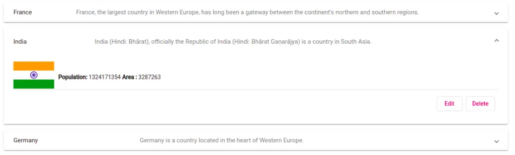
In this example, we’ll also demonstrate how to add buttons inside the mat-action-row. Now let’s edit the list.component.ts file to retrieve our dummy countries using fetch API.
import { Component, OnInit } from '@angular/core';
import { ICountry } from 'src/app/models/country.model';

@Component({
  selector: 'app-list',
  templateUrl: './list.component.html',
  styleUrls: ['./list.component.scss']
})
export class ListComponent implements OnInit {
  countries: ICountry[] = [];
  constructor() { }

  ngOnInit(): void {
    fetch('./assets/data/countries.json').then(res => res.json())
      .then(json => {
        this.countries = json;
      });
  }
}
Once we have the country’s object, we can iterate through countries’ array objects inside our angular material expansion panel component and edit the list.component.html template file.
<mat-accordion>
    <mat-expansion-panel *ngFor="let country of countries; let i = index;">
        <mat-expansion-panel-header>
            <mat-panel-title>
                {{ country.name }}
            </mat-panel-title>
            <mat-panel-description>
                  {{ country.description }}
            </mat-panel-description>
        </mat-expansion-panel-header>
        <div class="content">
            <img [src]="'https://upload.wikimedia.org/wikipedia/commons/' +
            country.flag" height="100" width="100" alt="country flag">
            <div class="content-text">
                <b>Population: </b>{{ country.population }}
                <b>Area : </b>{{ country.area }}
            </div>
             <mat-action-row>
                <button mat-stroked-button color="accent">Edit</button>
                <button mat-stroked-button color="accent"> Delete</button>
            </mat-action-row>
        </div>
    </mat-expansion-panel>
</mat-accordion>
How to add background color to active Angular Material Expansion panel header
In this example, we will demonstrate how to add background color to the Angular material panel header over the hover effect and background color to activate or expand the panel header. We will use the same countries array, here we have done the following step to add Angular material expansion panel header background color.
- Add selectedIndex as property variable, initial set to undefine and it can contain a current active index of Angular material panel.
- We have used the expansionPanelIndex method to set selectedIndex of the active index panel.
- Used ngStyle to add a condition by comparing the index with selectedIndex to add background color only to the activated panel.
Let’s edit the list.component.ts file to add code for the first and second steps.
import { Component, OnInit } from '@angular/core';
import { ICountry } from 'src/app/models/country.model';

@Component({
  selector: 'app-list',
  templateUrl: './list.component.html',
  styleUrls: ['./list.component.scss']
})
export class ListComponent implements OnInit {
  selectedIndex: number | undefined;   // Step 1
  countries: ICountry[] = [];

  constructor() { }

  ngOnInit(): void {
    fetch('./assets/data/countries.json').then(res => res.json())
      .then(json => {
        this.countries = json;
      });
  }

  expansionPanelIndex(index: number) { // Step 2
    this.selectedIndex = index;
  }

}
In the list.component.html template let’s add the ngStyle directive to compare the index with selectedIndex to add background color only to activate the Angular expansion panel header.
<mat-accordion>
    <mat-expansion-panel *ngFor="let country of countries; let i = index;">
        <mat-expansion-panel-header (click)="expansionPanelIndex(i)"
           [style.background]="selectedIndex == i ? '#f79804' : '#ffffff'">

           // Same code as countries list
        </mat-expansion-panel-header>
        <div class="content">
           // Same code as countries list
        </div>

    </mat-expansion-panel>
</mat-accordion>
To add background color to Angular material expansion panel header when hover effect. Then we need to add the following CSS style to our component scss file.
mat-expansion-panel-header:hover {
    background: rgb(68, 137, 13) !important;
}
Creating Angular Material Accordion using cdk-accordion
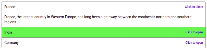
In all our previous examples, we used the Angular material expansion panel component, Angular material also provides us with to create an Angular material accordion using the cdk-accordion component.
To use this component we need to import CdkAccordionModule, we already import this module in our custom material module. Here is a screenshot of our Angular accordion example using the CDK accordion module.
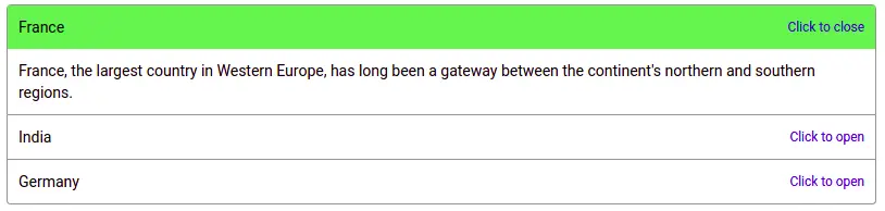
We have used the same countries array variable, let’s edit our component template.
  <cdk-accordion class="accordion">
    <cdk-accordion-item *ngFor="let country of countries; let index = index;" #accordionItem="cdkAccordionItem"
      class="accordion-item">
      <div class="accordion-item-header" (click)="accordionItem.toggle()">
        {{ country.name }}
        <span class="accordion-item-description">
          Click to {{ accordionItem.expanded ? 'close' : 'open' }}
        </span>
      </div>
      <div class="accordion-item-body" [style.display]="accordionItem.expanded ? '' : 'none'">
      {{ country.description }}
      </div>
    </cdk-accordion-item>
  </cdk-accordion>
To apply CSS style for our CDK accordion, let’s add the following CSS style in the component scss file.
.accordion {
    display: block;
    max-width: 800px;
  }

  .accordion-item {
    display: block;
    border: solid 1px rgb(150, 147, 147);
  }

  .accordion-item + .accordion-item {
    border-top: none;
  }

  .accordion-item-header {
    display: flex;
    align-content: center;
    justify-content: space-between;
  }

  .accordion-item-description {
    font-size: 0.85em;
    color: #202cd6;
  }

  .accordion-item-header,
  .accordion-item-body {
    padding: 10px;
  }

  .accordion-item-header:hover {
    cursor: pointer;
    background-color: rgb(143, 221, 78);
  }

  .accordion-item:first-child {
    border-radius: 4px 4px 0 0;
  }
  .accordion-item:last-child  {
    border-radius: 0 0 4px 4px;
  }
The mat-expansion-panel opens all by default & multiple expansions open
In this example, we want to open all material expansions by default and want to open multiple expansions when we click on the individual mat-expansion panel. Clicking on one of the new mat-expansion will default to close the open material expansion panel. Here is a screenshot of our example.
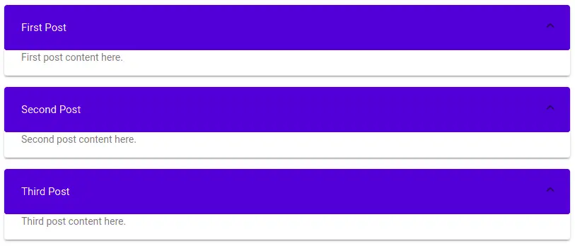
In the component, typescript adds a list of posts, as follows.
posts = [
    { title:'First Post', content: 'First post content here.'},
    { title:'Second Post', content: 'Second post content here.'},
    { title:'Third Post', content: 'Third post content here.'}
];
Add multip=”true” to make multiple open of the material expansion.
<mat-accordion multi="true">
  <mat-expansion-panel [expanded]="true" *ngFor="let post of posts">
    <mat-expansion-panel-header>
        {{ post.title }}
    </mat-expansion-panel-header>
    <mat-panel-description>
        {{ post.content }}
    </mat-panel-description>
 </mat-expansion-panel>
</mat-accordion>
Conclusion
We have completed our Angular material accordion. This material component is useful for showing a list of vertically expandable related items. I hope you got some idea of how to use the Angular material dialog component. If so then please share it with others and on social networks, this will encourage me to add more content. Follow me on my GitHub collection, I had code on Angular, react, and Ionic framework.
Related Articles
- How to install Angular material?
- Angular Radio button |angular material radio button?
- Angular material checkbox: color, label direction
- How to implement Angular checkbox input in Angular?
- How to use Angular Material tooltip in Angular?
- Angular Material input components and directives
- Angular material autocomplete example
- How to implement Angular material dropdown | select .?
- Angular Material button: Color, Size, toggle button
- How to implement Angular material accordion in Angular .?
- How to implement Angular material tabs?
- How to implement angular material snackbar | toast in Angular?
- How to implement Angular material dialog .?
- How to implement Angular material grid .?
- How to implement Angular material list in Angular .?
- How to implement Angular material card in Angular?
- How to implement angular material datepicker in Angular .?
- How to implement the Angular material table?