We have started a series of tutorials on Angular material design components. In this article, we’ll explore and learn the Angular material datepicker component. In our previous articles, we learned how to implement an Angular Material form with an input component. Angular Material library is built specifically for Angular, it has a large number of ready-made components that confined to the Material Design look and feel
In this tutorial, we have three objectives, first, learn how to use the Angular material Datepicker component, secondly how to add our own custom date format for the material Date picker, and last add date filters like min and max attributes of Angular material.
Setting up and configuring Angular Material Datepicker project
Let’s first create our Angular material datepicker project. In our previous articles, we learned how to install and the best approach to configuring Angular material in our project. Run the following command to create and add Angular Material to our project.
ng new angularMaterialDateApp
cd angularMaterialDateApp
ng add @angular/material

// Add this two libraries
npm install moment --save
npm i @angular/material-moment-adapter
In this project, we have used following libraries
- Material library for adding Material datapicker component
- Moment.js: Momemt.js JavaScript date library for parsing, validating, manipulating, and formatting dates.
- @angular/material-moment-adapter: To use MatDatepickerModule we need both moment and material-moment-adapter
While running the 3rd command will ask you the select theme, material typography, and animation, press yes on all. To use the Angular material component, we have to import it into our app module. It is good practice to have a separate module for Angular material. Let’s create a module and import all material components on it.
ng g m ng-material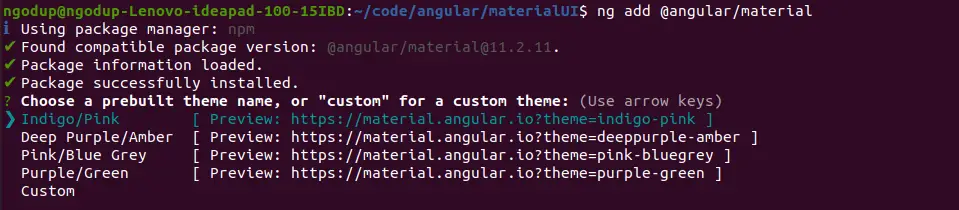
Open src/app/ng-material/ng-material.module.ts and replace the existing code with the code shown below.
import { NgModule } from '@angular/core';
import { CommonModule } from '@angular/common';
import { MAT_DATE_FORMATS } from '@angular/material/core';
import { MatDatepickerModule } from '@angular/material/datepicker';
import { MatFormFieldModule } from '@angular/material/form-field';
import { MatInputModule } from '@angular/material/input';
import { MatButtonModule } from '@angular/material/button'
import { MatMomentDateModule } from '@angular/material-moment-adapter';

const materialModules = [
  MatDatepickerModule,
  MatFormFieldModule,
  MatDatepickerModule,
  MatFormFieldModule,
  MatInputModule,
  MatButtonModule,
  MatDatepickerModule,
  MatFormFieldModule,
  MatInputModule,
  MatButtonModule,
  MatMomentDateModule,
];
@NgModule({
  declarations: [],
  imports: [CommonModule, materialModules],
  exports: [materialModules],
})
export class NgMaterialModule {}
MatDatepickerModule module: To use the Material Datpicker, we need to import this module and it contains the Angular Material components and directives for the Material Design datepicker.
We are importing all the required modules in our custom material module file. Now we need to import our material module and ReactiveFormModule in the /app/app.module.ts file.
import { NgMaterialModule } from './ng-material/ng-material.module';
@NgModule({
...
imports: [
   ...
  ReactiveFormsModule,
  NgMaterialModule,
],
})
How to use Angular Material Datepicker?
We had successfully configured the Angular material Datepicker application, now we can use the material date picker component in our Angular project. Datepicker is a commonly used element in a form and the Material date picker component is used with mat-form-field, and input fields. In the Material date picker component, we can easily switch between, year, and month.
To use the Material design date picker we have to follow the following steps
- Create Angular project
- Install required library Material library, moment, and material-moment-adapter library.
- Create a separate module for material or import MatDatepickerModule in the app.module.ts In the above section we already cover and we created a separate material module.
- Step 4 used Material Datepicker components and directive with an input field and we are covering it below example.
Angular Material Datepicker example
We will demonstrate a few examples of the material date pickers, let’s first demonstrate a simple example. Here we can see that the date icon can position prefix or suffix by using either matSuffix directive to add an icon at the right side of the input box and matPrefix to add an icon at starting of input.
In our app.component.ts file, we have created a form and let add a code form field.
...
import * as moment from 'moment';
...
export class AppComponent {
  dateMaxDate = new Date(2000, 0, 1);
  dateMinDate = new Date(2050,0,1);

  form: FormGroup = new FormGroup({});

  constructor(private fb: FormBuilder) {}

  ngOnInit(): void {
    this.form = this.fb.group({
      dob: new FormControl(new Date()),
    });
  }
  onSubmit(): void {
    console.log(this.form.value)
  }
}
In our component template, let’s add the material date picker component.
 <form [formGroup]="form" (ngSubmit)="onSubmit()">
  <mat-form-field appearance="outline">
    <mat-label>Datepicker example</mat-label>
    <input matInput [max]="dateMaxDate" [min]="dateMinDate"
    [matDatepicker]="matDatePicker" formControlName="dob" />
    <mat-datepicker-toggle matPrefix [for]="matDatePicker">
    </mat-datepicker-toggle>
    <mat-datepicker #matDatePicker></mat-datepicker>
  </mat-form-field>
</form>
The material datepicker comes with a calendar icon, we don’t need to add an icon. Material date picker has the following components.
| Component Name | Description |
| mat-datepicker | The datepicker component allows users to enter a date either through text input or by choosing a date from the calendar. |
| mat-datepicker-toggle | This component is optional that gives the user an easy way to open the datepicker pop-up. |
| input | A datepicker is composed of text input and a calendar pop-up, connected via the matDatepicker property on the text input. |
Angular material datepicker format
By default material, the date picker has a date format of M/d/yyyy, we can add our own custom date format. Angular Material provides MAT_DATE_FORMATS object and it is a collection of formats used by Datepicker to parse and display dates. To use our own custom Angular material datepicker format, we have to override the default format of MAT_DATE_FORMATS.
Let’s create a class called custom-date-formats.ts inside our ng-material folder src/app/ng-material/custom-date-formats.ts
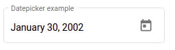
export const CUSTOM_DATE_FORMATS = {
    parse: {
        dateInput: 'LL',
      },
      display: {
        dateInput: 'LL',
        monthYearLabel: 'MMM YYYY',
        dateA11yLabel: 'LL',
        monthYearA11yLabel: 'MMMM YYYY',
      },
};
Now we have to add our custom date format class in the provider, let’s add this in our material module, ng-material/ng-material.module.ts file as.
....
import { MAT_DATE_FORMATS } from '@angular/material/core';
import { CUSTOM_DATE_FORMATS } from './custom-date-formats';

@NgModule({
  declarations: [],
  imports: [
   ...
  ],
  exports: [
    ...
  ],
  providers: [
    { provide: MAT_DATE_FORMATS, useValue: CUSTOM_DATE_FORMATS }
  ],
})
export class NgMaterialModule { }
When working with material datepicker, we have to import two modules.
- MatDatePickerModule: For material datepicker UI control.
- MatNativeDateModule: It use javascript date object implementation.
We have installed two libraries along with Material. The moment is a popular javascript library for implementing date and time. Angular Material uses DateAdapter of the following options NativeDateAdapter, MomentDateAdapter, or custom DateAdapter. The JavaScript default implementation does not include all locales around the world. Hence we have imported MatMomentDateModule.
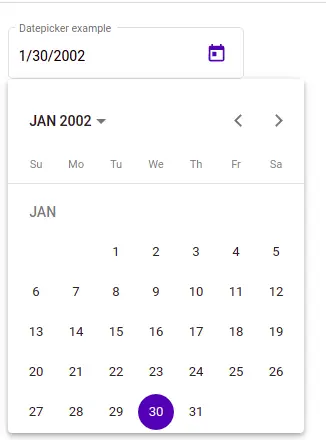
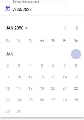
How to add min and max properties
The min and max properties allow us to add data validation to the date picker input. These properties will disable all dates in the calendar that are before the min and after the max value.
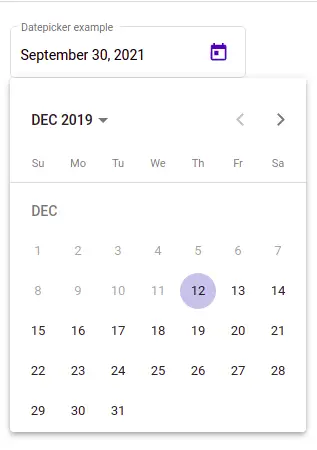
We can see that date before Dec 12, 2019, but we can’t select it. Because we had added min and max properties on the material date picker. Let’s edit our typescript to add value for min and max.
dateMaxDate = new Date();
dateMinDate = new Date('12.12.2019')
form = new FormGroup({});

constructor(private fb: FormBuilder) {}

ngOnInit(): void {
  this.form = this.fb.group({
    date3: new Date(),
   });
}
In our component template let’s add datepicker component and min, and max properties.
<mat-form-field appearance="outline">
  <mat-label>Datepicker example</mat-label>
   <input matInput [max]="dateMaxDate" [min]="dateMinDate"
     [matDatepicker]="matDate3Picker" formControlName="date3" />
   <mat-datepicker-toggle matSuffix [for]="matDate3Picker"></mat-datepicker-toggle>
  <mat-datepicker #matDate3Picker></mat-datepicker>
</mat-form-field>
Angular Material Datepicker switcher
The mat-datepicker component, have three different date switcher, it allows us easily change the date between, day, month, or year.
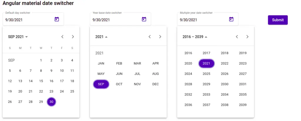
We can see different Angular material datepicker switcher, the first is the default, the second is based on month and the last is based on year.
....
export class AppComponent {
  form = new FormGroup({});

  constructor(private fb: FormBuilder) { }

  ngOnInit(): void {
    this.form = this.fb.group({
      date1: new FormControl(new Date()),
      date2: new FormControl(new Date()),
      date3: new Date(),
    });
  }

  onSubmit() {
    console.log(this.form.value);
  }
}
<div class="container">
<h2>Angular material date switcher</h2>
<form [formGroup]="form" (ngSubmit)="onSubmit()">
<mat-form-field appearance="outline">
<mat-label>Default day switcher</mat-label>
<input matInput [matDatepicker]="datepicker" formControlName="date1">
<mat-datepicker-toggle matSuffix [for]="datepicker"></mat-datepicker-toggle>
<mat-datepicker #datepicker [opened]="true"></mat-datepicker>
</mat-form-field>
<mat-form-field appearance="outline">
<mat-label>Year base date switcher</mat-label>
<input matInput [matDatepicker]="matDatepicker" formControlName="date2">
<mat-datepicker-toggle matSuffix [for]="matDatepicker"></mat-datepicker-toggle>
<mat-datepicker #matDatepicker startView="year" [opened]="true"></mat-datepicker>
</mat-form-field>
<mat-form-field appearance="outline">
<mat-label>Multiple year date switcher</mat-label>
<input matInput [matDatepicker]="matDate3Picker" formControlName="date3" />
<mat-datepicker-toggle matSuffix [for]="matDate3Picker"></mat-datepicker-toggle>
<mat-datepicker #matDate3Picker [opened]="true"></mat-datepicker>
</mat-form-field>
<button mat-raised-button color="primary" type="submit">
Submit
</button>
</form>
</div>Angular Material Datepicker default value
Let’s demonstrate the Angular Material Datepicker default value, which we have already shown in the previous example of the Material Datepicker switcher example. Let’s add custom default dates 06/07/2000 on the date1 form field and all other codes are the same except we need to add some default dates to the form field of date input.
import * as moment from 'moment';
...

ngOnInit(): void {
    this.form = this.fb.group({
      date1: new FormControl(moment('7-06-2000', 'MM-DD-YYYY')),
    });
  }
Angular Material Datepicker with time
The material design doesn’t have a Date picker with time, we have to depend on a third-party library to use time with the Datepicker component. We need to install @angular-material-components/datetime-picker library and let install it first.
npm install --save @angular-material-components/datetime-pickerHere is a screenshot of the Angular Material Datepicker with time.
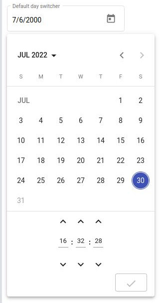
Once we install above library, we need to import and configure it in the app.module.ts file.
// some import
import {
  NgxMatDatetimePickerModule,
  NgxMatNativeDateModule,
  NgxMatTimepickerModule,
} from '@angular-material-components/datetime-picker';
@NgModule({
  declarations: [AppComponent],
  imports: [
    ....
    NgxMatDatetimePickerModule,
    NgxMatTimepickerModule,
    NgxMatNativeDateModule
  ],
  providers: [],
  bootstrap: [AppComponent],
})
export class AppModule {}
In the app.component.html file, let add the Datepicker with time.
 <mat-form-field>
    <input  matInput [ngxMatDatetimePicker]="picker"
      placeholder="Choose a date"  formControlName="date1" [min]="minDate" [max]="maxDate"
    />
    <mat-datepicker-toggle matSuffix [for]="$any(picker)"></mat-datepicker-toggle>
    <ngx-mat-datetime-picker
      #picker
      [showSpinners]="showSpinners"
      [showSeconds]="showSeconds"
    >
    </ngx-mat-datetime-picker>
  </mat-form-field>
In the component typescript let define min, max, showSpinners and showSeconds for Date and time picker.
maxDate = new Date();
  minDate = new Date('12.12.2019');
  form: FormGroup = new FormGroup({});

  showSpinners = true;
  showSeconds = true;
I added Angular Material Datepicker Switcher between day, month, and year on stackblitz.com
Conclusion
We have completed our Angular material datepicker tutorial, and we have learned how to use the material datepicker component and its properties. I hope you have got some ideas and If you learn something, then please share it with others and on the social network. This will encourage me to add content in more detail and deep.
Related Articles on Angular material
- How to install Angular material?
- How to implement Angular material form in Angular?
- Angular Radio button |angular material radio button?
- Angular material checkbox: color, label direction
- How to implement Angular checkbox input in Angular?
- How to use Angular Material tooltip in Angular?
- Angular Material input components and directives
- Angular material autocomplete example
- How to implement Angular material dropdown | select .?
- Angular material button: Color, Size, toggle button
- How to implement Angular material accordion in Angular .?
- How to implement Angular material tabs?
- How to implement angular material snackbar | toast in Angular?
- How to implement Angular material dialog .?
- How to implement Angular material grid .?
- How to implement Angular material list in Angular .?
- How to implement Angular material card in Angular?
- How to implement the Angular material table?
Thanks for your article.
Small correction: you have:
npm install @angular/material/moment-adapter –save
This should be :
npm install @angular/material-moment-adapter –save
Thanks for pointing it.
I’m missing the styles what should I do?