We will make a series of tutorials on Angular material components and in the article, we will explore how to implement Angular material cards.
The angular material card is a flexible and extensible content container. It has optional to include headers and footers, and we can add a wide variety of content.
Angular Materials provide the developer with reusable UI components that help the developer to use ready-made components, fast development, and one best UI design.
The card is a flexible and extensible content container. We can easily configure a card by adding an optional subcomponent like ion-card-content, ion-card-header, ion-card-title, and ion-card-subtitle.
We have three objectives behind this tutorial, first will learn how to use Angular material card and second we’ll look how how to add image in material card. Last we will learn how to add background color and box shadown on Angular material card.
Step 1: Setting up and configuring Angular material card project
Let’s first create our Angular material card project. In our previous articles, we learned how to install and the best approach for configuring Angular material in our project. Run the following command to create and add Angular Material to our project.
ng new angularCardpp
cd angularMaterialCardApp
ng add @angular/material
While running the 3rd command will ask you the select theme, material typography, and animation, press yes on all. To use the Angular material component, we have to import it into our app module. Let create a module and import all material components on it.
ng g m ng-material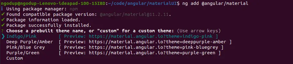
Open src/app/ng-material/ng-material.module.ts and replace the existing code with the code shown below.
import { NgModule } from '@angular/core';
import { CommonModule } from '@angular/common';
import { MatCardModule } from '@angular/material/card';
import { MatButtonModule } from '@angular/material/button';
import { MatIconModule } from '@angular/material/icon';
import { AppRoutingModule } from '../app-routing.module';

@NgModule({
  declarations: [],
  imports: [
    CommonModule,
    MatCardModule,
    MatButtonModule,
    MatIconModule,
    AppRoutingModule,
  ],
  exports: [
    CommonModule,
    MatCardModule,
    MatButtonModule,
    MatIconModule
  ]
})
export class NgMaterialModule { }
We are importing all the required modules in our custom material module file and keeping separate modules for Angular material will make the application easy to maintain. Now we need to import our material module and ReactiveFormModule in our src/app/app.module.ts file.
import { NgMaterialModule } from './ng-material/ng-material.module';
@NgModule({
...
imports: [
   ...
  ReactiveFormsModule,
  NgMaterialModule,
],
})
Step 2: Angular material card basic example
We have completed our configuration of material form, now let’s demonstrate the Angular material card basic example.
Here is a screenshot of our Angular material card basic example.
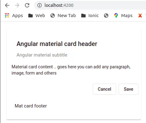
Let’s add the Angular material card component in the app.component.html file.
<div class="container">
  <mat-card class="example-card">
     <mat-card-header>
      <mat-card-title>
        <h2>Angular material card header</h2>
      </mat-card-title>
      <mat-card-subtitle>
       <h4> Angular material subtitle</h4>
      </mat-card-subtitle>
    </mat-card-header>

    <mat-card-content>
      Material card content .. goes here you can add any paragraph,
      image, form and others
    </mat-card-content>

    <mat-card-actions align="end">
      <button mat-stroked-button> Cancel </button>
      <button mat-stroked-button> Save</button>
    </mat-card-actions>

    <mat-card-footer>
     <h4>Mat card footer</h4>
    </mat-card-footer>
  </mat-card>
</div>
An angular material cards, can have sub optional components. In the above, we have used all Angular material card optional components. Let’s discuss and list all material card sub-component.
| S.no | Card subcomponent| | Description |
| 1 | mat-card | Is the root component for all the card content. All inside it are its child component. |
| 2 | mat-card-header | Header component of the material card. Here we can include mat-card-title and mat-card-subtitle as a subcomponent of it. |
| 3 | mat-card-title | Angular card titles for the material cards. |
| 4 | mat-card-subtitle | Card section subtitles, both title and subtitle are optional. |
| 5 | mat-card-content | Card body content, Here we add text and any other HTML element |
| 6 | mat-card-actions | Here we can add buttons, like to share or to invoke some methods. |
| 7 | mat-card-footer | Is optional is the last bottom section of the material card. |
Angular Material card with an image
An Angular material card component can contain text, a list, a video, and images. In the example below, we will demonstrate how to add an image of an avatar in the header and material content.
Here is a screenshot of the Angular material card with an image.
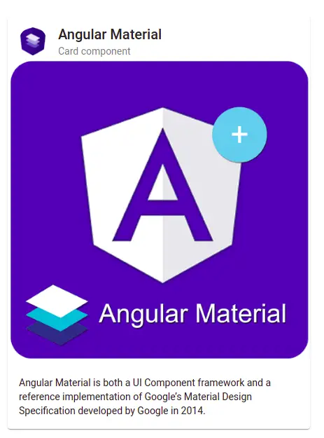
To add an image on an avatar in the header and content, let’s edit our component template. Here we used the mat-card-avatar directive in the material header component and applied the image via CSS class.
<mat-card class="image-card">
    <mat-card-header>
      <div mat-card-avatar class="header-image-avatar"></div>
      <mat-card-title>Angular Material</mat-card-title>
      <mat-card-subtitle>Card component</mat-card-subtitle>
    </mat-card-header>
    <mat-card-content>
      <p>
        <img mat-card-image src="../assets/images/material-image.png"
         alt="Angular material Card">
           Angular Material is both a UI Component framework and a reference
           implementation of Google’s Material Design Specification developed by
           Google in 2014.
    </mat-card-content>
 </mat-card>
mat-card-avatar: This is an Angular material directive, used to add an avatar image to our card header.
In our style component file let’s add an image for our mat-card-avatar. edit component scss file.
div.container {
  margin: 20px;

  .image-card {
    max-width: 450px;
  }

  .header-image-avatar {
    background-image: url('../assets/images/material-logo.png');
    background-size: cover;
  }
}
How to apply Angular material card background color to header and footer ?
In the previous example, we demonstrated how to add images in the div header and content. In this example, we will learn how to add background color to the Angular material cards. We can apply color through CSS style.
We have also applied Angular material shadow color using mat-elevation- class on the mat-card tag. The value of mat-elevation-24 can range from 0 to 24.
  <mat-card class="basic-card mat-elevation-z24">
     <mat-card-header>
      <mat-card-title>
        <h2>Angular material card header</h2>
      </mat-card-title>
      <mat-card-subtitle>
        <h4> Angular material subtitle</h4>
      </mat-card-subtitle>
    </mat-card-header>

    <mat-card-content>
      Material card content .. goes here you can add any paragraph, image, form and others
    </mat-card-content>

    <mat-card-footer>
      <h4>Mat card footer</h4>
    </mat-card-footer>
  </mat-card>
We have to apply background color in component style as.
div.container {
  margin: 50px;

  mat-card.basic-card {
    background-color: blue;
    max-width: 550px;
    margin:0;
    padding:0 !important;


    mat-card-header {
      background: yellow;
      padding: 5px !important;
      margin-top: -20px !important;
    }

    mat-card-content {
      background: blue;
      padding:15px !important;
    }
    mat-card-actions {
      padding:20px;
      float: right;
    }

    mat-card-footer {
      background: red;
      margin:0;
      padding: 20px;
    }
  }
}
How to apply Angular material card shadow
We have learned that we can add Angular material card shadow using mat-elevation- class and we have demonstrated in the above example. We can also use CSS shadow properties to add shadow to Angular material.
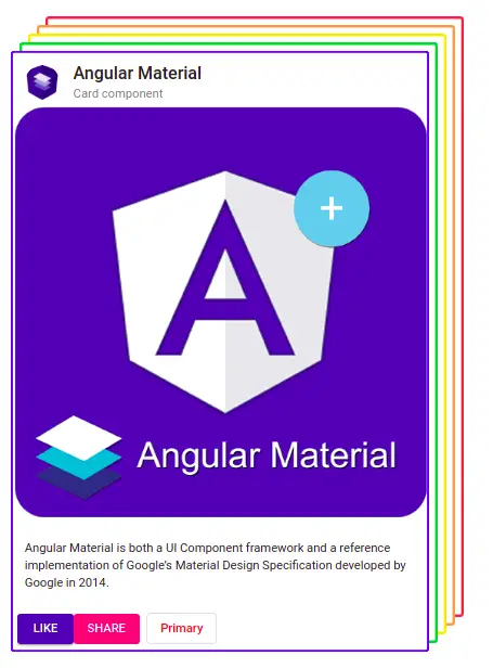
  <mat-card class="image-card">
    <mat-card-header>
      <div mat-card-avatar class="header-image-avatar"></div>
      <mat-card-title>Angular Material</mat-card-title>
      <mat-card-subtitle>Card component</mat-card-subtitle>
    </mat-card-header>
    <mat-card-content>
      <p>
        <img mat-card-image src="../assets/images/material-image.png" alt="Angular material Card">
        Angular Material is both a UI Component framework and a reference implementation of Google’s Material Design
        Specification developed by Google in 2014.
    </mat-card-content>
    <mat-card-actions>
      <button mat-raised-button color="primary">LIKE</button>
      <button mat-flat-button color="accent">SHARE</button>
      <button mat-stroked-button color="warn">Primary</button>
    </mat-card-actions>
  </mat-card>
In our component style let’s add shadow value for our card.
mat-card:not([class*=mat-elevation-z]) {
    box-shadow: blue 0px 0px 0px 2px inset, rgb(255, 255, 255) 10px -10px 0px -3px,
    rgb(31, 193, 27) 10px -10px, rgb(255, 255, 255) 20px -20px 0px -3px,
    rgb(255, 217, 19) 20px -20px, rgb(255, 255, 255) 30px -30px 0px -3px,
    rgb(255, 156, 85) 30px -30px, rgb(255, 255, 255) 40px -40px 0px -3px,
    rgb(255, 85, 85) 40px -40px;
}
Angular material card list example
We can loop through the angular material card list, we can use swiperjs or any other third library to make sliding cards with images. Here we demonstrate a simple example to loop through a card list.
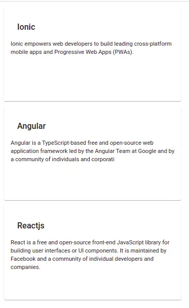
Let’s first create a list item in our component typescript as below.
export class AppComponent {
  items =
    {
      header: 'Ionic',
      content: 'Ionic empowers web developers to build leading cross-platform mobile apps and Progressive Web Apps (PWAs).'
    },
    {
      header: 'Angular ',
      content: 'Angular is a TypeScript-based free and open-source web application framework led by the Angular Team at Google and by a community of individuals.'
    },
    {
      header: 'Reactjs',
      content: 'React is a free and open-source front-end JavaScript library for building user interfaces or UI components. It is maintained by Facebook and a community of individual developers and companies.'
     },
  ];
}In our component template let loop and add a list of angular material cards.
<div class="container">
  <mat-card *ngFor="let item of items">
     <mat-card-header>
      <mat-card-title>
        <h2>{{ item.header }}</h2>
      </mat-card-title>
    </mat-card-header>
    <mat-card-content>
      {{ item.content }}
    </mat-card-content>
  </mat-card>
</div>
Conclusion
We have completed our Angular material card example and demonstrated a few examples of how to add images and shadows. I hope you have got some idea of how to use the Angular material cards.
Related Articles