We have made series of tutorials on Angular material components and in the article, we will explore how to implement Angular material list. Angular lists allow the developer to group a set of related items in lists. The angular material list is made up of multiple rows of items that can contain buttons, text, icons, toggles, thumbnails, and much more. Angular lists generally contain items with similar data content, such as images and text.
Angular Materials provide the developer with reusable UI components that help the developer to use ready-made components, fast development, and one best UI design.
In this tutorial, we’ll are learning on Material list component, but we have three main objective in this tutorial are.
- How to use Material list with its different child components ?.
- Material list with icon, avatars, navigation and more.
- Learn how to customize Material list component.
Here is our first example of Angular material list screenshot.
How to Create Angular Material List project ?
Here I had list abstract steps of how we are going to used Material list in Angular project.
- Step 1: Create Angular project for Material List
- Step 2: Install Material library
- Step 3: Create custom Material Module file ng-material.module.ts and import MatListModule module
- Step 4: In component template used tag with tag for create list with item.
Setup and configure Angular material list project
Let first create an Angular material list project, we need to install the angular material library and we don’t have any dependency on another library. Let’s create and install the angular material library.
ng new listMaterialApp
cd listMaterialApp
ng add @angular/material
While running the 3rd command will ask you the select theme, material typography, and animation, press yes on all. To use the Angular material component, we have to import it into our app module. Let create a module and import all material components on it.
ng g m ng-material
Open src/app/ng-material/ng-material.module.ts and replace the existing code with the code shown below.
import { NgModule } from '@angular/core';
import { CommonModule } from '@angular/common';
import { MatButtonModule } from '@angular/material/button';
import { MatListModule } from '@angular/material/list';
import { MatIconModule } from '@angular/material/icon';

const sharedModule = [
  MatButtonModule,
  MatListModule,
  MatIconModule,
]

@NgModule({
  declarations: [],
  imports: [
    CommonModule,
    sharedModule
  ],
  exports : [
    sharedModule
  ]
})
export class NgMaterialModule { }
We are importing all the required modules in our custom material module file and keeping separate modules for Angular material will make the application easy to maintain. Now we need to import our material module in the src/app/app.module.ts file.
import { NgModule } from '@angular/core';
import { BrowserModule } from '@angular/platform-browser';
import { AppRoutingModule } from './app-routing.module';
import { AppComponent } from './app.component';
import { BrowserAnimationsModule } from '@angular/platform-browser/animations';
import { FormsModule } from '@angular/forms';
import { NgMaterialModule } from './ng-material.module';

@NgModule({
  declarations: [
    AppComponent
  ],
  imports: [
    BrowserModule,
    AppRoutingModule,
    FormsModule,
    BrowserAnimationsModule,
    NgMaterialModule,
  ],
  providers: [],
  bootstrap: [AppComponent]
})
export class AppModule { }
To demonstrate the material list we need dummy data, create folder data in assets and countries.json file and add the following dummy data.
[
    {
        "name": "France",
        "flag": "c/c3/Flag_of_France.svg",
        "area": 640679,
        "population": 64979548,
        "description": "France, the largest country in Western Europe, has long been a gateway between the continent's northern and southern regions."
    },
    {
        "name": "India",
        "flag": "4/41/Flag_of_India.svg",
        "area": 3287263,
        "population": 1324171354,
        "description": "India (Hindi: Bhārat), officially the Republic of India (Hindi: Bhārat Gaṇarājya) is a country in South Asia."
    },
    {
        "name": "Germany",
        "flag": "b/ba/Flag_of_Germany.svg",
        "area": 357114,
        "population": 82114224,
        "description": "Germany is a country located in the heart of Western Europe."
    }
]
We also need a model for our country to make strict types in our angular project. Create folder models/country.model.ts file and add the following code.
export interface ICountry {
    name: string;
    flag: string;
    area: number;
    population: number;
    description: string;
}
Step 2 : An Example of Angular material list
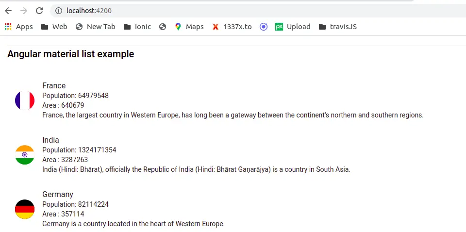
We have completed the material configuration, let us demonstrate our first example that we have all components and directives needed for creating an Angular material list. Here is a screenshot of our first example.
In the above image, we have used a material list component with a material list item component and matListAvatar and matLine directives. All these components and directives are part of the Angular material list module and we have listed all.
| Name | Description |
| mat-list | mat-list is a container or root component for all items in the list. As the base list component, it provides Material Design styling, but no behavior of its own. |
| mat-action-list | We can use mat-list or mat-action-list or mat-nav-list as the root components of the list. As the base list component, it provides Material Design styling, but no behavior of its own. |
| mat-nav-list | We can use mat-list or mat-action-list or mat-nav-list as the root components of the list. We can add a navigation link inside the nav list item. |
| mat-list-item | Individual items in the list can contain elements like images, div, paragraphs, videos, and more. |
| mat-list-item | Individual items in the list can contain an element like an image, div, paragraph, video, and more. |
| matLine | For lists that require multiple lines per item, annotate each line with an attribute or directive. |
| matListAvatar | This directive show image in avatar format. |
We had learned all material list components, and now let’s create a material list containing an Angular material list avatar. Edit the app.component.ts file to fetch our dummy data.
import { Component } from '@angular/core';
import { ICountry } from './model/country.model';

@Component({
  selector: 'app-root',
  templateUrl: './app.component.html',
  styleUrls: ['./app.component.scss']
})
export class AppComponent {
  countries: ICountry[] = [];

  constructor() { }

  ngOnInit(): void {
    fetch('./assets/data/countries.json').then(res => res.json())
      .then(json => {
        this.countries = json;
      });
  }
}
Edit app component template, to add a material list.
<div class="container">
  <h2>Angular material list example</h2>
  <mat-list>
    <mat-list-item *ngFor="let country of countries">
       <img [src]="'https://upload.wikimedia.org/wikipedia/commons/' + country.flag" matListAvatar alt="">
        <div matLine>{{ country.name }}</div>
         <div matLine>Population: {{ country.population }}</div>
          <div matLine>Area : {{ country.area }}</div>
      <div matLine>{{ country.description }}</div>
    </mat-list-item>
  </mat-list>
</div>
Angular material action list : Angular material navigation list
In our example one, we only show the list of items, it doesn’t have any action. If the user once navigates or clicks, the hover action will highlight the corresponding item in the list. We can add an angular material navigation list to the mat-action list.
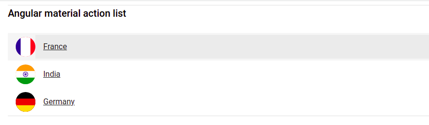
We have used the same countries array object, let’s add a material action list containing an anchor tag to navigate to another component.
  <h2>Angular material action list</h2>
  <mat-action-list>
    <mat-list-item *ngFor="let country of countries">
      <img [src]="'https://upload.wikimedia.org/wikipedia/commons/' + country.flag" matListAvatar alt={{country.name}}>
      <a mat-list-item routerLink="#">{{ country.name }}</a>
    </mat-list-item>
  </mat-action-list>
Instead of mat-action-list, we can use the mat-nat-list component, to add links or buttons inside our list.
  <mat-nav-list>
    <mat-list-item *ngFor="let country of countries">
      <a matLine routerLink="#">{{ country.name }}</a>
      <button mat-icon-button (click)="showInfo(country)">
        <mat-icon>Info</mat-icon>
      </button>
    </mat-list-item>
  </mat-nav-list>
Angular material list examples with selection
We can also have a selection of items in a list like a checkbox element of HTML. Here we have a screenshot of the Angular material selection list.
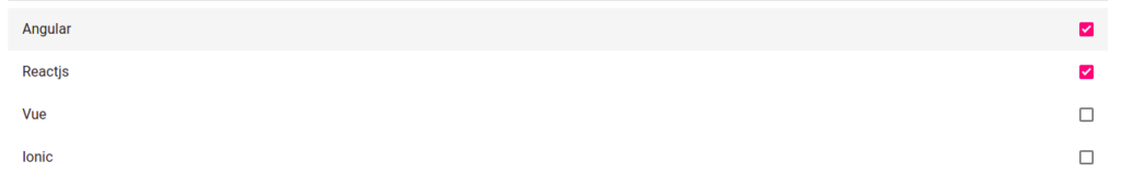
We have an array object containing a list of frameworks and add a framework array objects in our component.
  // In typescript
framworks: any = [
    { name: "Angular", selected: false },
    { name: "Reactjs", selected: true },
    { name: "Vue", selected: false },
    { name: "Ionic", selected: false }
  ];

// In component template let add
  <mat-selection-list (selectionChange)="onSelectionChange($event)" class="list">
    <mat-list-option *ngFor="let framwork of framworks"
      [selected]="framwork.selected" disabled="false"
      [value]="framwork.name">
      {{ framwork.name }}
    </mat-list-option>
  </mat-selection-list>
Angular material icon list with custom style
We have a material list containing a list of material icons and apply different colors for each icon in the material list. Let add iconList array object containing material icon name and color.
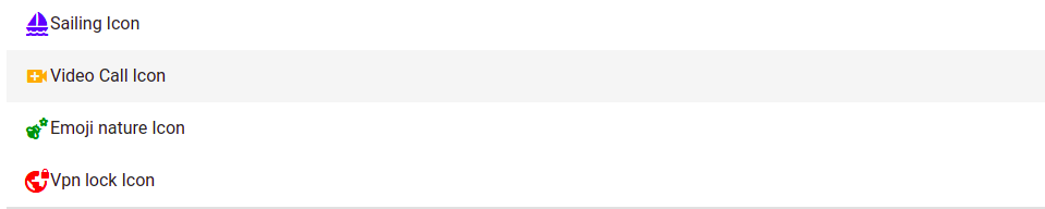
  iconList: any = [
    {
      name: 'Sailing Icon',
      icon: 'sailing',
      color: 'blue-icon'
    },
    {
      name: 'Video Call Icon',
      icon: 'video_call',
      color: 'orange-icon'
    },
    {
      name: 'Emoji nature Icon',
      icon: 'emoji_nature',
      color: 'green-icon'
    },
    {
      name: 'Vpn lock Icon',
      icon: 'vpn_lock',
      color: 'red-icon'
    },
  ];
In our app component template let iterate through the list to demonstrate material icon items.
  <mat-nav-list>
    <mat-list-item *ngFor="let item of iconList">
      <mat-icon [class]="item.color">{{ item.icon }}</mat-icon>
      <span>{{ item.name }}</span>
    </mat-list-item>
  </mat-nav-list>
To apply color to each material icon we have to add CSS style for it.
.container {
    .blue-icon {
        color: blue;
    }
    .orange-icon {
        color:orange;
    }
    .green-icon {
        color: green;
    }
    .red-icon {
        color: red;
    }
}
Conclusion
We have completed our Angular material list containing its components and directives. I hope you have got some idea of how to use the Angular material list. We have articles on how to add an Angular material card list, I have tried to add cards in the material list mat-list component but it didn’t work well, instead, you iterate material cards directly.
I hope you had learned something, if so then please share it with others and on social networks, this will encourage me to add more content. Follow me on my GitHub repositories I had code on Angular, react and Ionic framework.
Related Articles
- How to install Angular material?
- Angular Radio button |angular material radio button?
- Angular material checkbox: color, label direction
- How to implement Angular checkbox input in Angular?
- How to use Angular Material tooltip in Angular?
- Angular Material input components and directives
- Angular material autocomplete example
- How to implement Angular material dropdown | select .?
- Angular material button: Color, Size, toggle button
- How to implement Angular material accordion in Angular .?
- How to implement Angular material tabs?
- How to implement angular material snackbar | toast in Angular?
- How to implement Angular material dialog .?
- How to implement Angular material grid .?
- How to implement Angular material card in Angular?
- How to implement angular material datepicker in Angular .?
- How to implement the Angular material table?
- How to implement Angular material form in Angular?