The angular material dropdown input or Angular material select component provides material design style and allows us to select an item from the drop-down list. An Angular material is an amazing UI and built specifically for Angular framework, it has lots of pre-built components like card, modal, more, and Angular material select is one of them.
We have fews objective in this tutorial, but three main objectives we are learning are,
- How to Material use dropdown | select component in Angular project ?
- Adding Angular Material muti select dropdown.
- How to use Material dropdown in Tempelate or Reactive Form ?
How do you use Angular Material Dropdown ?
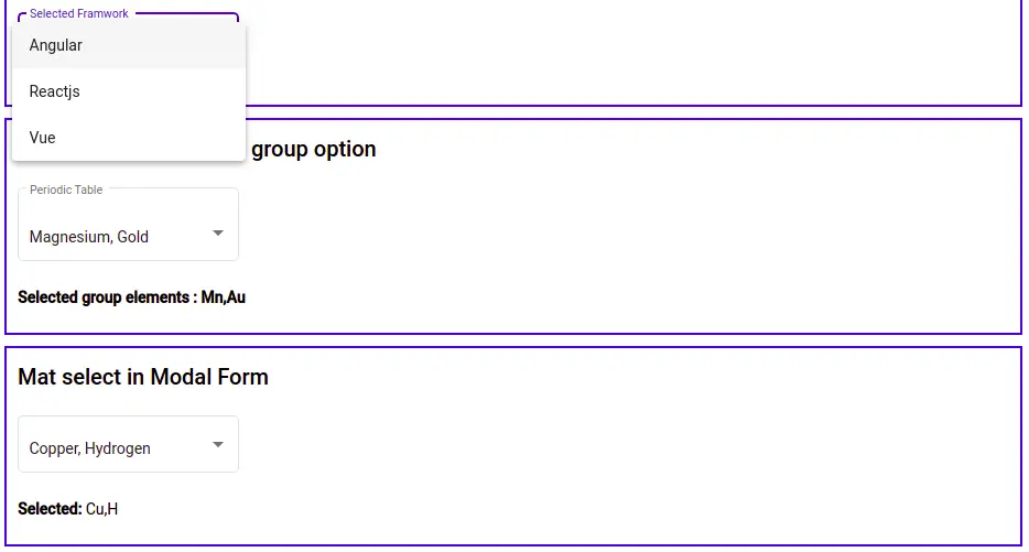
In the above screenshot, we have three example of Material Dropdown componente, single dropdown example , Material multi select dropdown and Group Material selection example. Here is the abstract steps, we are going to use to implement Material dropdown in Angular project.
- Create a Angular project for Dropdown example
- Install Material UI library in our project.
- Import MatSelectModule and other material components like MatFormFieldModule or MatInputModule from Material library.
- Demonstrate example of Material Dropdown.
Step 1 : Setup and configure Material dropdown project
Let first create an Angular material select project, we need to install the angular material library.
ng new matSelectApp
cd new matSelectApp
ng add @angular/material
Angular material select component allows us to select single or multiple items among lists of related options. It provides select option functionality with Material Design look and feels.
To use the material select component, we need to import MatSelectModule in our app module. We also need material input and form-field to use Angular material dropdown in form. The material select component is wrapped inside the mat-form-field component. Let import it in our app.component.ts file
import { NgModule } from '@angular/core';
import { BrowserModule } from '@angular/platform-browser';
import { AppRoutingModule } from './app-routing.module';
import { AppComponent } from './app.component';
import { BrowserAnimationsModule } from '@angular/platform-browser/animations';
import { FormsModule, ReactiveFormsModule } from '@angular/forms';
import { MatSelectModule } from '@angular/material/select'
import { MatFormFieldModule } from '@angular/material/form-field'
import { MatInputModule } from '@angular/material/input'

@NgModule({
  declarations: [
    AppComponent
  ],
  imports: [
    BrowserModule,
    AppRoutingModule,
    BrowserAnimationsModule,
    FormsModule,
    ReactiveFormsModule,
    MatInputModule,
    MatFormFieldModule,
    MatSelectModule
  ],
  providers: [],
  bootstrap: [AppComponent]
})
export class AppModule { }
Step 2 : Angular material select example
Let first demonstrate a basic example of the material select component. We had already Let take a basic example screenshot.
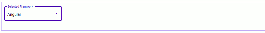
Let add our first Angular material dropdown example in the app.component.html template.
  <section>
    <mat-form-field appearance="outline">
      <mat-label>Selected Framwork</mat-label>
      <mat-select [formControl]="selectedFW">
        <mat-option *ngFor="let framwork of frameworks" [value]="framwork">
        {{ framwork }}
       </mat-option>
      </mat-select>
    </mat-form-field>
  </section>
We need to add frameworks array object and need to define formControl in our component typescript.
import { Component } from '@angular/core';
import { FormControl } from '@angular/forms';

@Component({
  selector: 'app-root',
  templateUrl: './app.component.html',
  styleUrls: ['./app.component.scss']
})
export class AppComponent {
  selectedFW = new FormControl();
  frameworks: string[] = ['Angular', 'Reactjs', 'Vue'];
}
Angular material select component, sub-components and attributes
Angular material select components have subcomponents and attributes, which makes the dropdown list and we can add attributes like multiple on it.
| Name | Description |
| mat-select | The mat-select is a root container containing a list of options. We can add data binding and formControl on it. |
| mat-option | Sub-component of mat-select and we add individual option item of unique value on it. |
| mat-optgroup | Optional sub-component of mat-select and we can group related options. |
| mat-select-trigger | It is an optional sub-component of mat-select, it adds a custom trigger label that can be different from mat-option. |
| multiple | This attribute adds multiple selection options on the Angular material dropdown list. |
Angular mat-select-trigger sub-component
We have demonstrated an Angular material multi select dropdown example using the mat-select-trigger component in our first example.
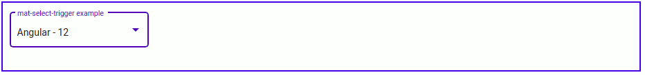
In the previous example, both option and selected label on select input are the same but in the case of mat-select-trigger, we can have a different label on option and trigger label. When we select the Angular option but when we select it will display Angular- 12 and let us edit the app component template.
<section>
<mat-form-field appearance="outline">
<mat-label>mat-select-trigger example</mat-label>
<mat-select [formControl]="selectedFW">
<mat-select-trigger>
{{ selectedFW.value ? selectedFW.value : ''}}
<span *ngIf="selectedFW.value">
<span *ngIf="selectedFW.value[0] == 'A'">
- 14
</span>
<span *ngIf="selectedFW.value[0] == 'R'">
- 18
</span>
<span *ngIf="selectedFW.value[0] == 'V'">
- 4
</span>
</span>
</mat-select-trigger>
<mat-option *ngFor="let framwork of frameworks" [value]="framwork">
{{ framwork }}
</mat-option>
</mat-select>
</mat-form-field>
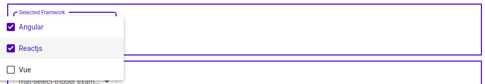
</section>Adding multiple attribute on mat-select
Angular material dropdown we can select multiple elements by adding multiple attributes on a mat-select component. Let edit our previous example code in app component template.
  <section>
    <mat-form-field appearance="outline">
      <mat-label>Selected Framwork</mat-label>
      <mat-select [formControl]="selectedFW" multiple>
        <mat-option *ngFor="let framwork of frameworks" [value]="framwork">
         {{ framwork }}
        </mat-option>
      </mat-select>
    </mat-form-field>
  </section>
Angular material select grouping
Material selection has the mat-optgroup sub-component which allows us to group the option items. We have used this optional sub-component to group periodic table elements into different groups like Alkaline Earth Metals and Transition Metals and let us edit our components.
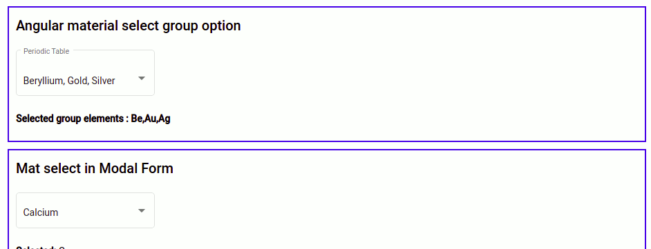
  <section>
    <h2>Angular material select group option</h2>
    <mat-form-field appearance="outline">
      <mat-label>Periodic Table</mat-label>
        <mat-select placeholder="Periodic table"
        [(value)]="selectedElementGroup" multiple>
        <mat-option>None</mat-option>
          <mat-optgroup label="Alkaline Earth Metals">
          <mat-option value="Be">Beryllium</mat-option>
          <mat-option value="Ca">Calcium</mat-option>
          <mat-option value="Mn">Magnesium</mat-option>
        </mat-optgroup>

        <mat-optgroup label="Transition Metals">
          <mat-option value="Au">Gold</mat-option>
          <mat-option value="Ag">Silver</mat-option>
          <mat-option value="Cu">Copper</mat-option>
        </mat-optgroup>
      </mat-select>
    </mat-form-field>
    <p><b>Selected group elements : {{ selectedElementGroup }}</b></p>
  </section>
.....
export class AppComponent {
selectedElementControl = new FormControl();
selectedElementGroup: string[] = [];
}Adding Angular material dropdown in form
Let’s add our material select component in our Angular template and reactive form. Here is a screenshot of our example.
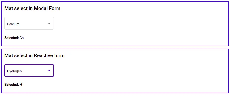
  <section>
    <h2>Mat select in Modal Form</h2>
    <mat-form-field appearance="outline">
      <mat-select name="periodicElement"
      [(value)]="selectedElement" placeholder="Periodic Element">
        <mat-option [value]="'Ca'">Calcium</mat-option>
        <mat-option [value]="'Cu'">Copper</mat-option>
        <mat-option [value]="'H'">Hydrogen</mat-option>
        <mat-option [value]="'Li'">Lithium</mat-option>
        <mat-option [value]="'O'">Oxygen</mat-option>
        <mat-option [value]="'T'">Titanium</mat-option>
      </mat-select>
    </mat-form-field>
    <p><b>Selected: </b>{{ selectedElement }}</p>
  </section>

  <section>
    <h2>Mat select in Reactive form</h2>
    <mat-form-field appearance="outline">
      <mat-select name="periodicElement"
       [formControl]="selectedElementControl" placeholder="Periodic Element">
        <mat-option [value]="'Ca'">Calcium</mat-option>
        <mat-option [value]="'Cu'">Copper</mat-option>
        <mat-option [value]="'H'">Hydrogen</mat-option>
        <mat-option [value]="'Li'">Lithium</mat-option>
        <mat-option [value]="'O'">Oxygen</mat-option>
        <mat-option [value]="'T'">Titanium</mat-option>
      </mat-select>
    </mat-form-field>

    <p><b>Selected: </b>{{ selectedElementControl.value }}</p>
</section>.....
export class AppComponent {
selectedElement: string = "Ca";
selectedElementControl = new FormControl();
selectedElementGroup: string[] = [];
}Angular Material Dropdown with search
We can use Material autocomplete component to have search with dropdown option, Here is a screenshot of Dropdown with search.
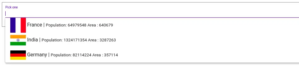
If you want above example, then please check my previous complete tutorial of Material dropdown with search in Angular material autocomplete article.
Conclusion
We have completed our Angular material dropdown component. We can use multiple attributes to select multiple items from a list. I hope you got some idea how to impialement Material Select component, Follow me on my GitHub collection, I had code on Angular, react and Ionic framework.
Related Articles
- How to implement Angular material form in Angular?
- How to install Angular material?
- Angular Radio button |angular material radio button?
- Angular material checkbox: color, label direction
- How to implement Angular checkbox input in Angular?
- Angular Material input components and directives
- Angular material autocomplete example
- Angular Material button: Color, Size, toggle button
- How to implement Angular material accordion in Angular .?
- How to implement Angular material tabs?
- How to implement angular material snackbar | toast in Angular?
- How to implement Angular material dialog .?
- How to implement Angular material grid .?
- How to implement Angular material list in Angular .?
- How to implement Angular material card in Angular?
- How to implement angular material datepicker in Angular .?
- How to implement the Angular material table?
- How to use Angular Material tooltip in Angular?