Angular material grid components allow us to create a list or two-dimension lists. Angular material grid is composed of mat-grid-list, mat-grid-tile, and a few optional subcomponents for creating a grid-based layout. We used a material grid to create a list or table to display our data.
In this articles, we’ll explore who to used Angular material grid and we’ll demonstrated few example of how to create different list. Let’s get started.
Step 1 : Setup and configure Angular material grid project
Let first create an Angular material grid project, we need to install the angular material library and we don’t have any dependency on another library. Let’s create and install the angular material library.
ng new gridMaterialApp
cd gridMaterialApp
ng add @angular/material
While running the 3rd command will ask you the select theme, material typography, and animation, press yes on all. To use the Angular material component, we have to import it into our app module. Let create a module and import all material components on it.
ng g m ng-material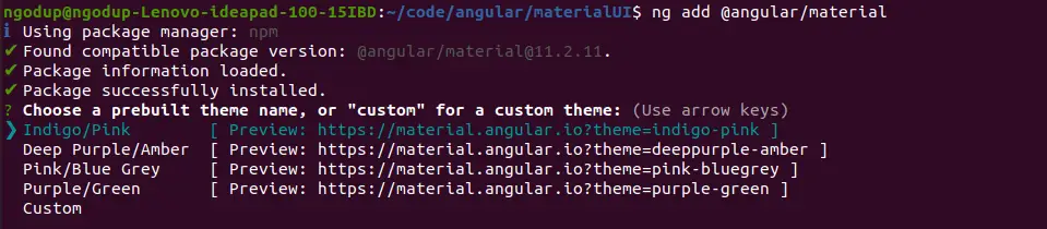
Open src/app/ng-material/ng-material.module.ts and replace the existing code with the code shown below.
import { NgModule } from '@angular/core';
import { CommonModule } from '@angular/common';
import { MatGridListModule } from '@angular/material/grid-list';
import { MatDividerModule } from '@angular/material/divider';


@NgModule({
    declarations: [],
    imports: [
        CommonModule,
        MatGridListModule,
        MatDividerModule,
    ],
    exports: [
        CommonModule,
        MatGridListModule,
        MatDividerModule,
    ],
})
export class NgMaterialModule { }
We are importing all the required modules in our custom material module file and keeping separate modules for Angular material will make the application easy to maintain. Now we need to import our material module in the src/app/app.module.ts file.
...
import { HttpClientModule } from '@angular/common/http';
import { NgMaterialModule } from './material-design/material.module';

@NgModule({
  declarations: [
  ...
  ],
  imports: [
    ....
    HttpClientModule,
    NgMaterialModule,
  ],
  providers: [],
  bootstrap: [AppComponent]
})
export class AppModule { }
To demonstrate the Angular material grid we need dummy data, create folder data in assets and countries.json file and add the following dummy data.
[
  {
    "name": "France",
    "flag": "c/c3/Flag_of_France.svg",
    "area": 640679,
    "population": 64979548,
    "description": "France, the largest country in Western Europe, has long been a gateway between the continent's northern and southern regions."
  },
  {
    "name": "India",
    "flag": "4/41/Flag_of_India.svg",
    "area": 3287263,
    "population": 1324171354,
    "description": "India (Hindi: Bhārat), officially the Republic of India (Hindi: Bhārat Gaṇarājya) is a country in South Asia."
  },
  {
    "name": "Germany",
    "flag": "b/ba/Flag_of_Germany.svg",
    "area": 357114,
    "population": 82114224,
    "description": "Germany is a country located in the heart of Western Europe."
  },
  {
    "name": "Portugal",
    "flag": "5/5c/Flag_of_Portugal.svg",
    "area": 92090,
    "population": 10329506,
    "description": "Portugal is a country full of wonders — charming castles, pristine beaches, and a metropolitan capital spattered in remnants of the past."
  },
  {
    "name": "Canada",
    "flag": "c/cf/Flag_of_Canada.svg",
    "area": 9976140,
    "population": 36624199,
    "description": "Canada is a vast and rugged land. From north to south it spans more than half the Northern Hemisphere."
  },
  {
    "name": "Brazil",
    "flag": "0/05/Flag_of_Brazil.svg",
    "area": 8515767,
    "population": 209288278,
    "description": "Brazil is the largest country in South America and the fifth largest nation in the world. "
  },
  {
    "name": "Mexico",
    "flag": "f/fc/Flag_of_Mexico.svg",
    "area": 1964375,
    "population": 129163276,
    "description": "Mexico is a land of extremes, with high mountains and deep canyons in the center of the country, sweeping deserts in the north, and dense rain forests in the south and east."
  },
  {
    "name": "United States",
    "flag": "a/a4/Flag_of_the_United_States.svg",
    "area": 9629091,
    "population": 324459463,
    "description": "The United States of America is the world's third largest country in size and nearly the third largest in terms of population."
  },
  {
    "name": "Tuvalu",
    "flag": "3/38/Flag_of_Tuvalu.svg",
    "area": 26,
    "population": 11097,
    "description": "Tuvalu, formerly known as the Ellice Islands, is located midway between Hawaii and Australia in the South Pacific Ocean. "
  }
]
We also need a model for our country to make strict types in our angular project. Create folder model and country.model.ts file and add the following code.
export interface ICountry {
    name: string;
    flag: string;
    area: number;
    population: number;
    description: string;
}
Step 2: Angular material grid example one
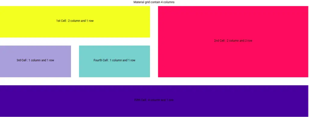
We have completed the material configuration, let us demonstrate our first example that we have all components and directives needed for creating an Angular material list. Here is a screenshot of our first example.
In the above example, we have added four-column for each row, material grid has cols attribute to set custom column numbers for our grid row.
Angular material grid had the following components and directives to make a grid list and here we have listed them.
| Name | Description |
| mat-grid-list | mat-grid-list is a container or root component for all items in the grid. As the base list component, it provides Material Design styling. |
| cols | The cols attribute sets the number of columns in the grid. |
| rowHeight-ratio | This ratio is column-width:row-height, and must be passed in with a colon, not a decimal (e.g. 4:3). |
| rowHeight – fixed | The height can be in px, em, or rem. If no units are specified, px units are assumed. |
| rowHeight – fit | This mode automatically divides the available height by the number of rows. |
| gutterSize | The gutter is the space between tiles. By default, a 1px value is set between tiles. |
| mat-grid-tile-header | The header is an optional sub-component we can add inside the mat-grid-title. |
| mat-grid-tile-footer | Like the header, the footer is an optional subcomponent we can add to each item in the grid and we can add footer inside mat-grid-title, |
| colspan | As the grid is two-dimensional, we can set colspan attribute. This colspan must not exceed the number of cols in the mat-grid-list. |
| rowspan | We can set rowspan for Angular material grid. |
We had learned all material grid components and attribute, now let’s create a material grid list containing four columns and edit the app.component.ts file.
import { Component } from '@angular/core';
import { ICountry } from './model/country.model';

@Component({
  selector: 'app-root',
  templateUrl: './app.component.html',
  styleUrls: ['./app.component.scss']
})
export class AppComponent {
  materialGrids = [
    {text: '1st Cell : 2 column and 1 row', cols: 2, rows: 1, color: '#FBEC39'},
    {text: '2nd Cell : 2 column and 2 row', cols: 2, rows: 2, color: '#F6546A'},
    {text: '3rd Cell : 1 column and 1 row', cols: 1, rows: 1, color: '#A4ACDA'},
    {text: 'Fourth Cell : 1 column and 1 row', cols: 1, rows: 1, color: '#88CCCC'},
    {text: 'Fifth Cell : 4 column and 1 row', cols: 4, rows: 1, color: '#2A009D'},
  ];
}
Edit the app component template, to add a material grid list example.
 <h1>Material grid contain 4 columns</h1>
 <mat-grid-list cols="4" rowHeight="261px" gutterSize="66px">
  <mat-grid-tile *ngFor="let item of materialGrids" [colspan]="item.cols"
    [rowspan]="item.rows" [style.background]="item.color">
            <h1>{{item.text}}</h1>
  </mat-grid-tile>
 </mat-grid-list>
Angular material grid example two
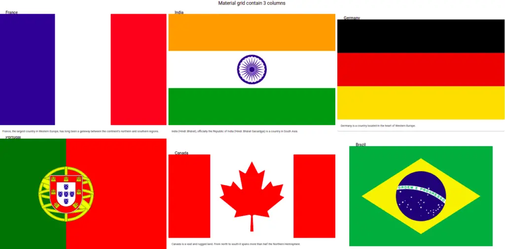
In our example one, we only show the angular material grid of items, it doesn’t have any image. In the second example, we’ll use our dummy data containing images. Here is a screenshot of our second grid example.
Let’s edit the app component typescript file.
import { HttpClient } from '@angular/common/http';
import { Component, OnInit } from '@angular/core';
import { ICountry } from 'src/app/models/country.model';

@Component({
  selector: 'app-root',
  templateUrl: './app.component.html',
  styleUrls: ['./app.component.scss']
})
export class AppComponent {
  countries: ICountry[] = [];

  constructor(
    private http: HttpClient,
    private bottomSheet: MatBottomSheet
  ) { }

  ngOnInit(): void {
    this.http.get<ICountry[]>('./assets/data/countries.json')
      .subscribe((data: any) => {
        this.countries = data;
      });
  }
}
We have used countries array object, in material grid iterate through each country.
    <h1>Material grid contain 3 columns</h1>
    <mat-grid-list cols="3" rowHeight="4:3" gutterSize='10px'>
        <!-- <mat-grid-tile [colspan]="i === 0 ? 2 : 1" [rowspan]="i === 0 ? 2 : 1"
            *ngFor="let country of countries; let i=index"> -->
        <mat-grid-tile *ngFor="let country of countries; let i=index">
            <mat-card class="image-card">
                <mat-card-header>
                    <mat-card-title>{{ country.name }}</mat-card-title>
                </mat-card-header>
                <mat-card-content>
                    <div>
                        <img mat-card-image [src]="'https://upload.wikimedia.org/wikipedia/commons/' + country.flag"
                            alt="country flag">
                    </div>
                    <p>{{ country.description }}</p>
                </mat-card-content>
            </mat-card>
        </mat-grid-tile>
</mat-grid-list>Conclusion
We have completed our Angular material grid containing its components and attributes. I hope you have got some idea of how to use the Angular material grid.
Related Articles