An Angular material is an amazing UI for the Angular framework, it has lots of pre-built components like cards, modal, more, and Angular material tabs are one of them.
We have three objectives behind this tutorial, first will learn how to use Angular material tabs component, and second how to add material icon on tab. Last how to apply a style to material tabs. Let’s get started.
What is Angular material tabs ?
Angular material tabs component displays a group of related buttons in a horizontal row. They are mostly used inside the main content and provide a tab of the Material Design UI specifications
Angular material tabs are often used to organize multiple views on a page and the content of views is separated into sections or categories. Material tabs can have multiple numbers tabs, each tab has a label and content. The functionality of material tabs allows us to select the one tab that will deselect all other tabs and we can toggle between each tab.
Step 1: Setup and configure Angular material tabs project
Let first create an Angular material tabs project, we need to install the angular material library and we don’t have any dependency on another library. Let’s install the angular material library.
ng new tabMaterialApp
cd tabMaterialApp
ng add @angular/material
While running the 3rd command will ask you the select theme, material typography, and animation, press yes on all. To use the Angular material component, we have to import it into our app module. Let’s create a module and import all material components on it.
ng g m ng-material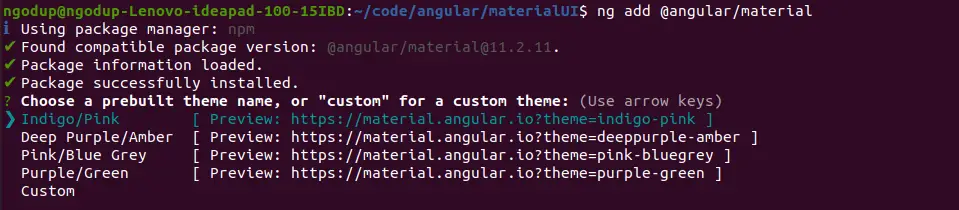
We also need to add two custom component tabs and a country list to demonstrate Angular material tabs. Let add this component using the following commands.
ng g component ng-material/tabs
ng g component ng-material/countryList
To use Angular material tabs, we need to import MatTabsModule into our custom module. Open src/app/ng-material/ng-material.module.ts and replace the existing code with the code shown below we need the following material component for our example.
import { NgModule } from '@angular/core';
import { CommonModule } from '@angular/common';
import { MatTabsModule } from '@angular/material/tabs';

import { MatButtonModule } from '@angular/material/button';
import { MatIconModule } from '@angular/material/icon';
import { MatDividerModule} from '@angular/material/divider';
import { MatListModule} from '@angular/material/list';
import { TabsComponent } from './tabs/tabs.component'
import { CountryListComponent } from './country-list/country-list.component';


@NgModule({
  declarations: [
    TabsComponent,
    CountryListComponent
  ],
  imports: [
    CommonModule,
    MatTabsModule,
    MatDividerModule,
    MatIconModule,
    MatListModule,
    MatButtonModule
  ],
  exports: [
    MatTabsModule,
    MatDividerModule,
    MatIconModule,
    MatListModule,
    MatButtonModule,

    TabsComponent,
    CountryListComponent
  ]
})
export class NgMaterialModule { }
We are importing all the required modules in our custom material module file and keeping separate modules for Angular material will make the application easy to maintain. Now we need to import our material module in the src/app/app.module.ts file.
...
import { NgMaterialModule } from './ng-material/ng-material.module';


@NgModule({
  declarations: [
    AppComponent
  ],
  imports: [
.....
    NgMaterialModule
  ],
  providers: [],
  bootstrap: [AppComponent]
})
export class AppModule { }
To demonstrate the material list we need dummy data, create folder data in the assets and countries.json file and add the following dummy data.
[
    {
        "name": "France",
        "flag": "c/c3/Flag_of_France.svg",
        "area": 640679,
        "population": 64979548,
        "description": "France, the largest country in Western Europe, has long been a gateway between the continent's northern and southern regions."
    },
    {
        "name": "India",
        "flag": "4/41/Flag_of_India.svg",
        "area": 3287263,
        "population": 1324171354,
        "description": "India (Hindi: Bhārat), officially the Republic of India (Hindi: Bhārat Gaṇarājya) is a country in South Asia."
    },
    {
        "name": "Germany",
        "flag": "b/ba/Flag_of_Germany.svg",
        "area": 357114,
        "population": 82114224,
        "description": "Germany is a country located in the heart of Western Europe."
    }
]
Step 2: An Example of Angular material tabs
We have completed the material configuration, let us demonstrate our first example that we have all components and directives needed for creating an Angular material list. Here is a screenshot of our first example.

In the above image, we have used a material tabs component with mat-tab-group and mat-tab component. All these components and directives are part of the Angular material list module and we have listed all.
Here we have listed components used in Angular material tabs.
| Name | Description |
| mat-tab-group | Is container component for tabs component |
| mat-tab | Here we add a tab container inside it and also add a label attribute to add a label or heading for the tab. |
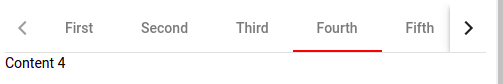
Let’s demonstrate the first basic Angular material tabs, here we have used the above two tabs component.
 <mat-tab-group>
   <mat-tab label="First"> Content 1 </mat-tab>
   <mat-tab label="Second"> Content 2 </mat-tab>
   <mat-tab label="Third"> Content 3</mat-tab>
   <mat-tab label="Fourth"> Content 4 </mat-tab>
   <mat-tab label="Fifth"> Content 5 </mat-tab>
   <mat-tab label="Six"> Content 6 </mat-tab>
 </mat-tab-group>
In the app.component.html we need to add our custom tab component as follows.
<app-tabs></app-tabs>
<router-outlet></router-outlet>
In the same example, we can paginate on tabs, this will happen when the list of tab labels exceeds the width of the header, and pagination controls appear to let the user scroll left and right across the labels.
Angular material tabs example with mat-icon
In our second example, we will be doing the following extra tasks.
- To add a material icon on the Angular material tab.
- Add Angular material tab event.
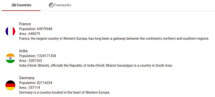
Here is a screenshot of the Angular material tab with an icon.
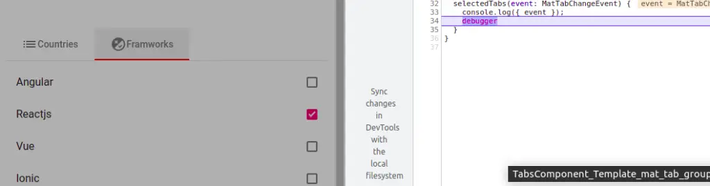
Let’s edit the tabs.component.html, to add material icon and event of material tabs.
<mat-tab-group class="countries" (selectedTabChange)="selectedTabs($event)">
  <mat-tab>
     <ng-template mat-tab-label>
        <mat-icon>list</mat-icon>Countries
     </ng-template>
     <app-country-list></app-country-list>
  </mat-tab>

  <mat-tab>
    <ng-template mat-tab-label>
       <mat-icon>flaky</mat-icon>Framworks
    </ng-template>

    <mat-selection-list class="list">
       <mat-list-option *ngFor="let framwork of framworks
         [selected]="framwork.selected" disabled="false"
         [value]="framwork.name">
             {{ framwork.name }}
       </mat-list-option>
    </mat-selection-list>
  </mat-tab>
 </mat-tab-group>
We have used a mat-tab-label directive on the ng-template to add a material icon on a material tab label. Here we have two tabs, the first containing our custom component countries list.
To demonstrate the countries list, we have to use the Angular material list, let’s edit the country-list.component.ts file to retrieve our dummy data using fetch API.
import { Component, OnInit } from '@angular/core';

interface ICountry {
  name: string;
  flag: string;
  area: number;
  population: number;
  description: string;
}

@Component({
  selector: 'app-country-list',
  templateUrl: './country-list.component.html',
  styleUrls: ['./country-list.component.scss']
})
export class CountryListComponent implements OnInit {
  countries: ICountry[] = [];
  constructor() { }

  ngOnInit(): void {
    fetch('./assets/data/countries.json').then(res => res.json())
      .then(json => {
        this.countries = json;
      });
  }
}
In the country list component template, let iterate through the countries object array using Angular material list.
<mat-list>
    <mat-list-item *ngFor="let country of countries">
        <img [src]="'https://upload.wikimedia.org/wikipedia/commons/'
           + country.flag" matListAvatar alt="">
        <div matLine>{{ country.name }}</div>
        <div matLine>Population: {{ country.population }}</div>
        <div matLine>Area : {{ country.area }}</div>
        <div matLine>{{ country.description }}</div>
    </mat-list-item>
</mat-list>
In our second tab section, we have a selection list on the framework string array, let’s add the string array and material tab selection event. Let the edit the tabs.component.ts file.
import { Component } from '@angular/core';
import { MatTabChangeEvent } from '@angular/material/tabs';

@Component({
  selector: 'app-tabs',
  templateUrl: './tabs.component.html',
  styleUrls: ['./tabs.component.scss']
})
export class TabsComponent {
  framworks: any = [
    { name: "Angular", selected: false },
    { name: "Reactjs", selected: true },
    { name: "Vue", selected: false },
    { name: "Ionic", selected: false }
  ];

  constructor() { }

  selectedTabs(event: MatTabChangeEvent) {
    console.log({ event });
  }
}
How to apply CSS style to Angular material tabs
We can customise the style of Angular material tabs, here is a screenshot of the material tabs style we had applied.
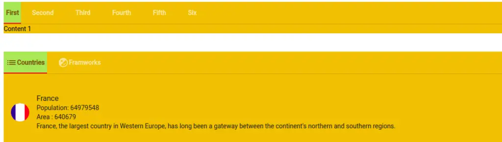
We need to add the following CSS style code in our tabs.component.scss file to apply color to our Angular material tabs.
::ng-deep .mat-ink-bar {
    background-color:#ee2925 !important;
}

::ng-deep .mat-tab-group {
    background-color: rgb(238, 180, 23) !important;
}

::ng-deep .mat-tab-label.mat-tab-label-active {
    min-width: 25px !important;
    padding: 5px;
    background-color: #9cec8c;
    color: rgb(43, 26, 26);
    font-weight: 700;
}
::ng-deep .mat-tab-label {
    min-width: 25px !important;
    padding: 5px;
    background-color: transparent;
    color: rgb(255, 255, 255);
    font-weight: 700;
}Conclusion
We have completed our Angular material snackbar or Angular material toast. I hope you got some idea of how to use the Angular material dialog component.
Related Articles
- How to install Angular material ?
- How to implement Angular material form in Angular 11 | 12?
- How to implement Angular material table in Angular 12 .?
- How to implement angular material datepicker in Angular 12 .?
- How to implement Angular material grid .?
- How to implement angular material list in Angular 12 .?
- How to implement Angular material card in Angular 12.?
- How to implement Angular material dialog .?
- How to implement angular material snackbar | toast in Angular 12 ?