Angular checkbox input allows the user to select one or more options from a list of choices. Angular doesn’t have a checkbox component, we can either use a native HTML checkbox or a material checkbox. Angular Material UI library has a checkbox component called mat-checkbox.
In this tutorial, we’ll learn how to add and use checkbox input. We’ll demonstrate an example native HTML checkbox with reactive form. We’ll use a checkbox with bootstrap CSS styles. Let’s get started.
Setting up and configuring Angular checkbox
Let’s first demonstrate the Angular checkbox using native HTML checkbox input, here we had listed the abstract step of adding an Angular material checkbox.
- Step 1: Create a checkbox project
- Step 2: Import ReactiveFormsModule to our project.
- Step 3: Defining the formGroup and form control for a checkbox.
The native HTML checkbox is an input element with a type attribute checkbox. Here is syntax of HTML checkbox input.
<input type="checkbox">Step 1: Create an Angular checkbox project
We can use a single stand-alone checkbox element to toggle content show or hide or we can it as a binary value for accepting conditions like agreement etc. The checkbox can also use to select multiple-choice from a list of choices. Let’s create an Angular checkbox example project.
ng new checkboxApp
cd checkboxApp
Import Reactive Forms module
To demonstrate Angular checkbox input in form with a form control element, then we need to import ReactiveFormsModule in the app.module.ts file.
...
import { ReactiveFormsModule } from '@angular/forms';

@NgModule({
  declarations: [
    AppComponent
  ],
  imports: [
    ...
    ReactiveFormsModule
  ],
  providers: [],
  bootstrap: [AppComponent]
})
export class AppModule { }
Create form and form control element
We need a form to demonstrate checkbox input with reactive form. Let’s create a form and form control element using FormBuilder. Angular has a helper Class called FormBuilder to help us to build a form model with less code. FormBuilder allows us to explicitly declare forms in our components and formBuilder has methods like group(), control(), and array() that returns FormGroup, FormControl, and FormArray respectively.
In our example, we have added a form control array called selectedCountries to list all selected country names from the checkbox input. Let’s edit the app.component.ts file to add form and formBuilder.
import { Component } from '@angular/core';
import { FormGroup, FormBuilder, FormArray, FormControl } from '@angular/forms';
@Component({
selector: 'app-root',
templateUrl: './app.component.html',
styleUrls: ['./app.component.scss']
})
export class AppComponent {
form: FormGroup;
countries: Array<any> = [
{ name: 'India', value: 'india' },
{ name: 'France', value: 'france' },
{ name: 'USA', value: 'USA' },
{ name: 'Germany', value: 'germany' },
{ name: 'Japan', value: 'Japan' }
];
constructor(fb: FormBuilder) {
this.form = fb.group({
selectedCountries: new FormArray([])
});
}
onCheckboxChange(event: any) {
const selectedCountries = (this.form.controls['selectedCountries'] as FormArray);
if (event.target.checked) {
selectedCountries.push(new FormControl(event.target.value));
} else {
const index = selectedCountries.controls
.findIndex(x => x.value === event.target.value);
selectedCountries.removeAt(index);
}
}
submit() {
console.log(this.form.value);
}
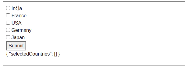
}To loop through the Angular checkbox list we used the *ngFor directive to iterate through each country object.
<section>
  <form [formGroup]="form" (ngSubmit)="submit()" novalidate>
    <div *ngFor="let country of countries; let i=index">
      <input type="checkbox" formArrayName="selectedCountries" [value]="country.value" (change)="onCheckboxChange($event)"
      />
      {{ country.name}}
    </div>
    <button type="submit">Submit</button>
  </form>

  <p>{{ form.value | json }}</p>
</section>
Angular material checkbox input example
An Angular material has lots of pre-built components like cards, modals, and more, and the Angular material expansion panel or Angular material checkbox is one of them. We have demonstrated the same above example using the mat-checkbox component.
Angular material checkbox example with color, label direction.
Angular checkbox list
In the previous example, we used checkbox input with reactive form and in this example, we’ll demonstrate the Angular checkbox list using template form.
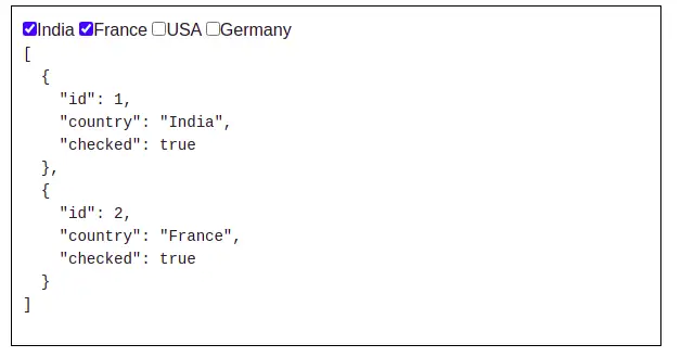
<section>
  <div>
    <span *ngFor="let item of list">
      <input type="checkbox" [(ngModel)]="item.checked"
       (change)="changeCheckbox($event)">{{ item.country }}
    </span>
  </div>
  <pre>{{this.result | json}}</pre>
</section>
In our component template, we have Angular checkbox checked event change, we invoke this event with a method changeCheckbox when the user clicks on a checkbox input. In our component typescript let’s add list array object and definition of method changeCheckbox.
import { Component, OnInit } from '@angular/core';
import { FormGroup, FormBuilder, FormArray, FormControl } from '@angular/forms';

@Component({
  selector: 'app-root',
  templateUrl: './app.component.html',
  styleUrls: ['./app.component.scss']
})
export class AppComponent implements OnInit {
  list: any[] = [];

  ngOnInit() {
    this.list = [
      {
        id: 1,
        country: 'India',
        checked: true,
      },
      {
        id: 2,
        country: 'France',
        checked: false,
      },
      {
        id: 3,
        country: 'USA',
        checked: true,
      },
      {
        id: 4,
        country: 'Germany',
        checked: false,
      },
    ]
  }

  get result() {
    return this.list.filter(item => item.checked);
  }

  changeCheckbox(event: Event) {
    console.log(event.target);
  }
}
Angular checkbox checked default and disabled
Like any other HTML input field, we can disable checkbox input and also set the Angular checkbox checked initially.
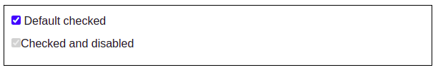
<section>
<div>
<label>
<input type="checkbox" checked> Default checked
</label>
</div>
<div>
<label for="">
<input type="checkbox" checked disabled>Checked and disabled
</label>
</div>
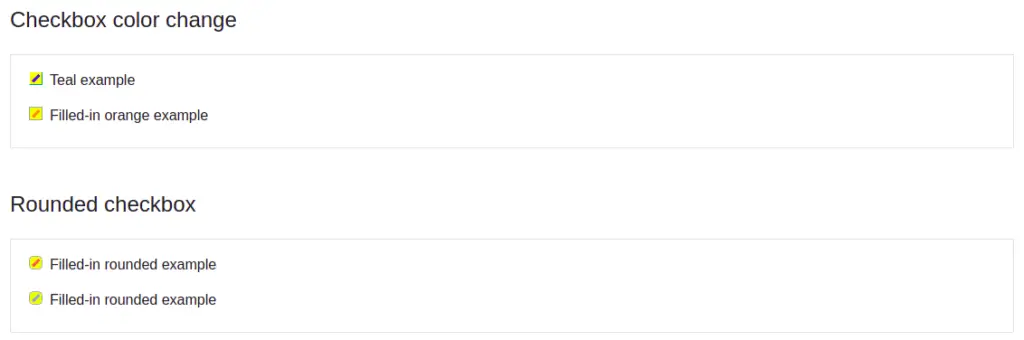
</section>Angular checkbox color change using bootstrap library
In the last example, we’ll demonstrate how to change the checkbox background color using Bootstrap UI. This style will not work on the above example, as we need to add Bootstrap library and CSS style for a checkbox.
Here is a screenshot of our example of checkbox input using bootstrap.
To use the bootstrap checkbox CSS style, we need to install a bootstrap library in our angular project.
ng add @ng-bootstrap/ng-bootstrapLet’s add checkbox input with the bootstrap CSS class name in the component template.
  <section class="border py-3">
    <!-- Teal example -->
    <div class="form-check checkbox-teal mb-2">
      <input type="checkbox" class="form-check-input" id="tealExample" checked>
      <label class="form-check-label" for="tealExample">Teal example</label>
    </div>

    <!-- Filled-in orange example -->
    <div class="form-check checkbox-warning-filled">
      <input type="checkbox" class="form-check-input filled-in" id="orangeExample" checked>
      <label class="form-check-label" for="orangeExample">Filled-in orange example</label>
    </div>
  </section>

  <h4 class="h4 dark-grey-text mt-5 mb-4">Rounded checkbox</h4>
  <section class="border py-3">
    <!-- Filled-in rounded example -->
    <div class="form-check checkbox-rounded checkbox-living-coral-filled mb-2">
      <input type="checkbox" class="form-check-input filled-in" id="roundedExample2" checked>
      <label class="form-check-label" for="roundedExample2">Filled-in rounded example</label>
    </div>

    <!-- Filled-in rounded example -->
    <div class="form-check checkbox-rounded checkbox-cerulean-blue-filled">
      <input type="checkbox" class="form-check-input filled-in" id="roundedExample3" checked>
      <label class="form-check-label" for="roundedExample3">Filled-in rounded example</label>
    </div>
  </section>
To apply custom background to Angular checkbox input, then we need to add CSS style for it in the component style file.
input[type="checkbox"]:checked + label::after {
  content: '';
  position: absolute;
  width: 1.2ex;
  height: 0.4ex;
  background: rgba(0, 0, 0, 0);
  top: 0.9ex;
  left: 0.4ex;
  border: 3px solid blue;
  border-top: none;
  border-right: none;
  -webkit-transform: rotate(-45deg);
  -moz-transform: rotate(-45deg);
  -o-transform: rotate(-45deg);
  -ms-transform: rotate(-45deg);
  transform: rotate(-45deg);
}

input[type="checkbox"] {
   position: absolute;
   left: -999em;
}

input[type="checkbox"] + label {
   position: relative;
   overflow: hidden;
   cursor: pointer;
}

input[type="checkbox"] + label::before {
  content: "";
  display: inline-block;
  height: 15px;
  width: 15px;
  background-color: white;
  border: 1px solid rgb(166, 166, 166);
  // border-radius: 4px;
  box-shadow:20px 20px 50px 10px yellow inset;
  margin-right: 0.5em;
}

.checkbox-teal [type="checkbox"]:checked+label:before {
    border-color: transparent #009688 #009688 transparent;
  }

  .checkbox-warning-filled [type="checkbox"][class*='filled-in']:checked+label:after {
    border-color: #FF8800;
    background-color: #FF8800;
  }

  .checkbox-rounded [type="checkbox"] +label::before {
    border-radius: 30% !important;
  }

  .checkbox-living-coral-filled [type="checkbox"][class*='filled-in']:checked+label:after {
    border-color: #FF6F61;
    background-color: #FF6F61;
  }

  .checkbox-cerulean-blue-filled [type="checkbox"][class*='filled-in']:checked+label:after {
    border-color: #92aad0;
    background-color: #92aad0;
}Conclusion
We learned how to use Angular checkbox input. We have plenty of choices to use checkbox input from Angular material checkbox, native HTML checkbox input, and bootstrap checkbox input also. I hope you had learned something, if so then please share it with others and on social networks, this will encourage me to add more content. Follow me on my GitHub collection, I had code on Angular, react, and Ionic framework.
Related Articles