Angular Material Dnackbar component can be used to display notification information for a short period of time using Angular material SnackBarModule. Angular Material Snackbar or Angular material toast is useful for showing alert and notification messages.
We have three main objectives for this tutorial on Angular material toast or snackbar
- Exploring how to implement Angular material toast | snackbar and how to configure its color and position.
- How to apply style or customize the style to Angular material toast | snackbar.
- Using Angular material snackbar service to keep single code for the whole application, allow us to code reusabilities among different component.
Setup and configure the Angular Material Snackbar project
Let’s demonstrate the Angular Material Snackbar, here I had listed the abstract step of how to implement this project.
- Step 1: Create a project and install a material library
- Step 2: Import MatSnackBarModule and other needed materials modules in our custom material module to our project.
- Step 3: Create snack bar service, thus allowing code reusabilities.
- Step 4: Import snackbar service in required components and use it to implement snackbar.
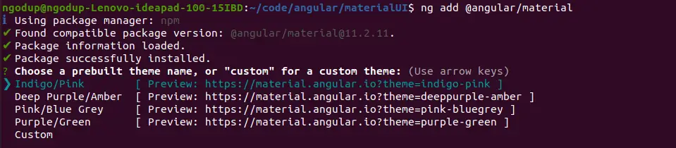
Step 1: Let’s first create an Angular material snack project, we need to install the angular material library. Let’s create and install the angular material library.
ng new snackMaterialApp
cd snackMaterialApp
ng add @angular/material
While running the 3rd command will ask you the select theme, material typography, and animation, press yes on all. To use the Angular material component, we have to import it into our app module. Let’s create a module and import all material components on it.
ng g m ng-material
ng g c ng-material/snackBar
We also need to create a component to demonstrate how to pass data to Snackbar components and how to add material icons in Angular material toast.
Step 2: Open src/app/ng-material/ng-material.module.ts and replace the existing code with the code shown below.
import { NgModule } from '@angular/core';
import { CommonModule } from '@angular/common';
import { MatSnackBarModule } from '@angular/material/snack-bar';
import { MatButtonModule } from '@angular/material/button';
import { MatIconModule } from '@angular/material/icon';
import { SnackBarComponent } from './snack-bar/snack-bar.component';

@NgModule({
  declarations: [
    SnackBarComponent
  ],
  imports: [
    CommonModule,
    MatSnackBarModule,
    MatButtonModule,
    MatIconModule
  ],
  exports: [
    MatSnackBarModule,
    MatButtonModule,
    MatIconModule
  ]
})
export class NgMaterialModule { }
We are importing all the required modules in our custom material module file and keeping separate modules for Angular material will make the application easy to maintain. Now we need to import our material module in the src/app/app.module.ts file.
...
import { NgMaterialModule } from './ng-material/ng-material.module';

@NgModule({
  declarations: [
    AppComponent
  ],
  imports: [
     ...
    NgMaterialModule
  ],
  providers: [],
  bootstrap: [AppComponent]
})
export class AppModule { }
How to implement Angular Material Snackbar?
In our first Angular Material Snackbar example, we are using the MatSnackBar object directly in our component. In the second example, we’ll create a toast service. We are displaying an angular material toast at different positions on the page, and adding an action button on the snackbar.
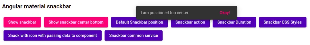
Let’s edit the app.component.html template to add a button to demonstrate the Angular material snackbar position and action button.
<div class="container">
  <h2>Angular material snackbar</h2>
  <button mat-raised-button color="accent" (click)="showBasicSnack()">Show snackbar</button>
  <button mat-raised-button color="accent" (click)="snackPositionTopCenter()">Show snackbar center bottom</button>

  <button mat-raised-button color="primary" (click)="defaultSnackbar()">
    Default Snackbar position
  </button>
  <button mat-raised-button color="primary"
    (click)="showSnackbarAction()">
    Snackbar action
  </button>

  <button mat-raised-button color="primary" (click)="showSnackbarDuration()">
    Snackbar Duration
  </button>

  <button mat-raised-button color="primary" (click)="showSnackbarCssStyles()">
    Snackbar CSS Styles
  </button>

  <button mat-raised-button color="primary" (click)="passDataToSnackComponent()">
    Snack with icon with passing data to component
  </button>

  <button mat-raised-button color="primary" (click)="callSnackService()">
    Snackbar common service</button>

  <router-outlet></router-outlet>
</div>
One with highlighted button, which we will implement later in the tutorial.
We need to import and inject the MatSnackBar object and we can call the open method to open snackbar. Let’s edit the app.component.ts file.
import { Component } from '@angular/core';
import { MatSnackBar } from '@angular/material/snack-bar';
import { SnackBarComponent } from './ng-material/snack-bar/snack-bar.component';
import { SnackBarService } from './services/snack-bar.service';

@Component({
  selector: 'app-root',
  templateUrl: './app.component.html',
  styleUrls: ['./app.component.scss']
})
export class AppComponent {

  constructor(
    private snackBarService: SnackBarService,
    private matSnackBar: MatSnackBar) { }

  showBasicSnack() {
    this.matSnackBar.open("Update successful", "Okay");
  }

  snackPositionTopCenter() {
    this.matSnackBar.open("I am positioned top center", "Okay!", {
      duration: 5000,
      horizontalPosition: "center",
      verticalPosition: "top",
      // direction: "rtl"
    });
  }

  defaultSnackbar() {
    this.matSnackBar.open('Default snackbar postion !');
  }

  showSnackbarAction() {
    let snack = this.matSnackBar.open('Snackbar with action button', 'Ok');

    snack.onAction().subscribe(() => {
      alert("This will be called when snackbar Done button clicked");
    });

    snack.afterDismissed().subscribe(() => {
      alert("This will be shown after snackbar disappeared");
    });
  }

  showSnackbarDuration() {
    this.matSnackBar.open("Snack duration, we set to 5 milliseconds",
    'Dismiss', { duration: 5000 });
  }
}
The snackBar object has an open method, we can pass configuration for our angular material toast by using the following attributes.
| Attribute name | Description |
| duration | A number of milliseconds before the toast is dismissed. |
| panelClass | An array containing the list of CSS classes that can be applied in a toast. |
| horizontalPosition | Position the snackBar on page screen and it can have values of “start” or “left”, “center”, “end” or “right”. |
How to apply Angular Material Snackbar color?
We can apply CSS classes to our Angular material toast, by using the CSS custom class name to panelClass attribute and we can add style and in our let change the background color.
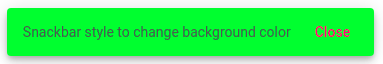
Let’s add the CSS class name to our snackbar using panelClass, and edit the app.component.ts file.
  showSnackbarCssStyles() {
    let snackBarColor = this.matSnackBar.open("Snackbar style to change background color", 'Close', {
      duration: 4000,
      panelClass: ["snack-style"]
    });
    snackBarColor.onAction().subscribe(() => {
      snackBarColor.dismiss();
    });
  }
We had to add one class called snack-style, now let’s add different background colors to the Angular material alert and edit the app.component.scss file.
::ng-deep .snack-style{
    background-color:rgb(72, 236, 39);
    color: rgb(82, 82, 82);
}
We have used ng-deep with custom class names to apply Angular material snackbar color.
How to apply to add a Material icon to the Angular Snackbar component?
In this example, we’ll demonstrate how to send data to snackbar component, we also added a material icon on Angular material toast. Edit the app.component.ts file to open our custom SnackBarComponent. Here we are sending data from component to snackbar component using MatSnackBar data attribute.
passDataToSnackComponent() {
    this.matSnackBar.openFromComponent(SnackBarComponent, {
      data: 'Hi from Edupala',
      duration: 12000,
      panelClass: ["snack-notification"],
      horizontalPosition: "center",
      verticalPosition: "top",
    });
  }
Edit the snack-bar.component.ts to retrieve data from the component.
import { Component, Inject, OnInit } from '@angular/core';
import { MatSnackBarRef, MAT_SNACK_BAR_DATA } from '@angular/material/snack-bar';
@Component({
selector: 'app-snack-bar',
templateUrl: './snack-bar.component.html',
styleUrls: ['./snack-bar.component.scss']
})
export class SnackBarComponent {
constructor(
public sbRef: MatSnackBarRef<SnackBarComponent>,
@Inject(MAT_SNACK_BAR_DATA) public data: any
) {}
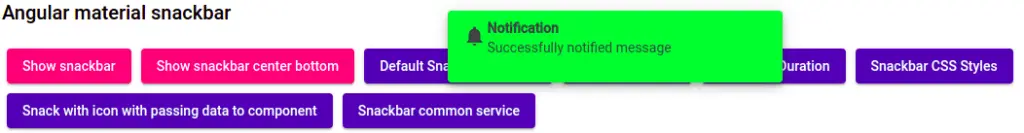
}Let’s edit the snack-bar.component.html to the material icon in an alert component.
<div>
    <mat-icon aria-hidden="false" aria-label="Example home icon">
       notifications
    </mat-icon>
    <p class="information">
        <strong>Notification</strong><br>
        {{ data }}
    </p>
</div>
Here is our screenshot of the Material snackbar component.
How to implement Angular Material Snackbar using the service?
In application, toast, snackbar can apply on different pages | components. Is a good practice to create a common service where we add all our common codes. In our case, we will create a material toast service. Let add code in the snack-bar.service.ts
import { Injectable } from '@angular/core';
import { MatSnackBar } from '@angular/material/snack-bar';

@Injectable({
  providedIn: 'root'
})
export class SnackBarService {

  constructor(private matSnackBar: MatSnackBar) { }

  openSnackBar(message: string, action: string,
    hPosition?: any, vPosition? : any,
    className?: any ) {
    this.matSnackBar.open(message, action, {
      duration: 5000,
      horizontalPosition: hPosition ? hPosition : 'center',
      verticalPosition: vPosition ? vPosition : 'top',
      panelClass: className
      // direction: "rtl"
    });
  }
}
In the SnackBarService we can import and inject the matSnackBar object, we have only one method called openSnackBar with a few parameters of non-optional and optional parameters.
We can pass our custom message, action, position, and CSS class to our reusable service. To call this service we need to inject this service into our corresponding component. Let’s inject our custom SnackBarService into the app.component.ts file.
import { Component } from '@angular/core';;
import { SnackBarService } from './services/snack-bar.service';

@Component({
  selector: 'app-root',
  templateUrl: './app.component.html',
  styleUrls: ['./app.component.scss']
})
export class AppComponent {

  constructor(
    private snackBarService: SnackBarService) { }

  ....
  callSnackService() {
    this.snackBarService.openSnackBar(
      'Common code to implement using service',
      'Okey', 'center', 'top', 'snack-style');
  }
}Now we can call any number of our custom snackBar service in any component we want.
Conclusion
We have completed our Angular material snackbar or Angular material toast. I hope you got some idea of how to use the Angular material snackbar component.
Related Articles
- How to install Angular material?
- Angular Radio button |angular material radio button?
- Angular material checkbox: color, label direction
- How to implement Angular checkbox input in Angular?
- How to use Angular Material tooltip in Angular?
- Angular Material input components and directives
- Angular material autocomplete example
- How to implement Angular material dropdown | select .?
- Angular Material button: Color, Size, toggle button
- How to implement Angular material accordion in Angular .?
- How to implement Angular material tabs?
- How to implement Angular material form in Angular?
- How to implement Angular material dialog .?
- How to implement Angular material grid .?
- How to implement Angular material list in Angular .?
- How to implement Angular material card in Angular?
- How to implement angular material datepicker in Angular .?
- How to implement the Angular material table?