Angular material buttons provide material design style and ink ripples on native HTML buttons or anchor elements. We can control the button style easily by using pre-built material button attributes.
The HTML button element allows us to trigger actions on our project, by invoking uploading the form data to the server, routing to different components and loading modal components, and more.
We are covering the main aspect and three main objectives in this tutorial on the Material Button as follows
- How to implement the Material button
- Customize Material button styles
- Material button with icon and tex.
Setup and configure the Angular material button project
Let’s first create an Angular material button project, we need to install the angular material library. Let’s create and install the angular material library.
ng new buttonApp
cd buttonApp
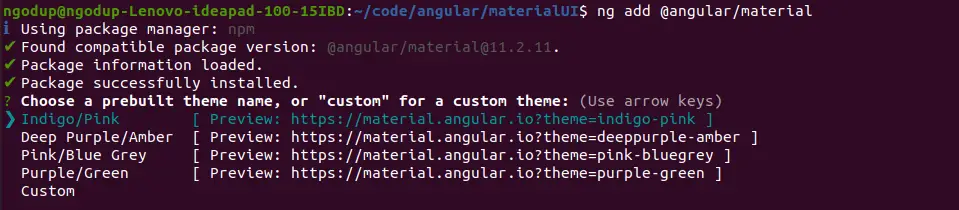
ng add @angular/materialWhile running the 3rd command will ask you the select theme, material typography, and animation, press yes on all. To use the Angular material component, we have to import it into our app module. Let’s create a module and import all material components on it.
ng g m ng-materialHere we had a screenshot of how to select a theme from the Angular material themes option below.
To use the Angular material button we need to import MatButtonModule, and MatIconModule. Open src/app/ng-material/ng-material.module.ts and replace the existing code with the code shown below.
import { NgModule } from '@angular/core';
import { CommonModule } from '@angular/common';
import { MatButtonModule } from '@angular/material/button';
import { MatIconModule } from '@angular/material/icon'
import { MatButtonToggleModule } from '@angular/material/button-toggle';
import { MatSlideToggleModule } from '@angular/material/slide-toggle';
@NgModule({
  declarations: [],
  imports: [
    CommonModule,
    MatButtonModule,
    MatIconModule,
    MatButtonToggleModule,
    MatSlideToggleModule
  ],
  exports: [
    MatButtonModule,
    MatIconModule,
    MatButtonToggleModule,
    MatSlideToggleModule
  ]
})
export class NgMaterialModule { }
Now we need to import our custom material module in the src/app/app.module.ts file.
.....
import { NgMaterialModule } from './ng-material/ng-material.module';
import { FormsModule } from '@angular/forms';

@NgModule({
  declarations: [
    AppComponent
  ],
  imports: [
    ....
    FormsModule,
    NgMaterialModule
  ],
  providers: [],
  bootstrap: [AppComponent]
})
export class AppModule { }
Angular Material button example
We have completed the material configuration, let us demonstrate our first example that we have all components and directives needed for creating an Angular material list. Here is a screenshot of our first example containing the HTML button elements with and without material button directives.

We can see that the mat-button directive from the material button module had added material design style and action look. Let’s edit the app.component.html template to demonstrate the first example.
<div class="container">
  <section>
    <h2>Angular button without material</h2>
    <div class="example-button-row">
      <button>Basic</button>
      <button color="primary">Primary</button>
      <button color="accent">Accent</button>
      <button color="warn">Warn</button>
      <button disabled>Disabled</button>
    </div>
  </section>

  <section>
    <h2>Angular material button with mat-button</h2>
    <div class="example-button-row">
      <button mat-button>Basic</button>
      <button mat-button color="primary">Primary</button>
      <button mat-button color="accent">Accent</button>
      <button mat-button color="warn">Warn</button>
      <button mat-button disabled>Disabled</button>
      <a mat-button href="https://www.google.com/" target="_blank">Link</a>
      <a mat-button color="primary">Primary on Anchor tag</a>
      <a mat-button color="accent">Accent on Anchor tag</a>
    </div>
  </section>
Angular Material button types or options
We have seen Angular material buttons without borders using the mat-button attribute directive. Angular MatButtonModule provides us few options or types for the material button of different designs. Here we have listed Angular material button types using the material button attribute directive.
| Name | Description |
| mat-button | Text Buttons without borders, have a less important type and are generally used for low significant actions. |
| mat-stroked-button | Button with an only outline or border and we can use it for medium significant actions. |
| mat-flat-button | The button with filled with color, but doesn’t have a box shadow and we can use it for important actions. |
| mat-raised-button | A button with filled color and box shadow can be used for important actions. |
| mat-fab | Floating action buttons using the material button with icons. It can be used for the most important button on the page and circle form. |
| mat-mini-fab | Floating action buttons using a material button with an icon. Same as mat-fab, the only difference is size. |
| mat-icon-button | Material button with material icon only, we can use it for menu, navigation list, and inside section element. |
Angular Material button color: using stroked, flat, and raised attribute directive
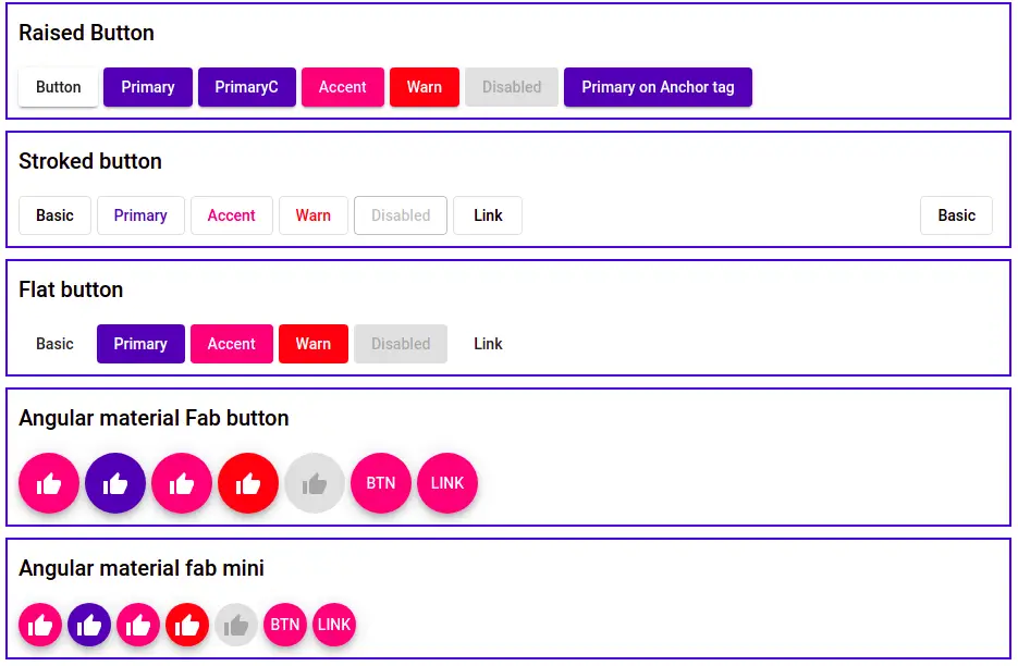
In our second Angular material button example, we will demonstrate buttons using mat-stroked-button, mat-flat-button, and mat-raised button attribute directives. Here is a screenshot of the Angular material button color and different button attributes.
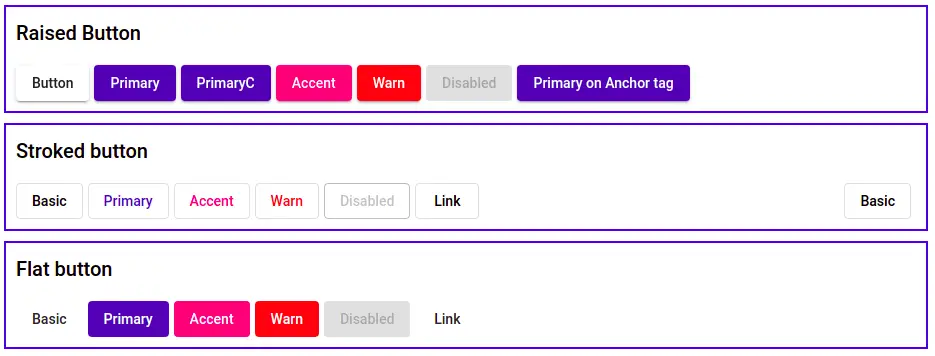
Let’s edit the app component template to add the above buttons’ example code.
<div class="container">
 <section class="raised-button">
    <h2>Raised Button</h2>
    <button mat-raised-button>Button</button>
    <button mat-raised-button color="primary">Primary</button>
    <button mat-raised-button color="primary">PrimaryC</button>
    <button mat-raised-button color="accent">Accent</button>
    <button mat-raised-button color="warn">Warn</button>
    <button mat-raised-button disabled>Disabled</button>
    <a mat-raised-button color="primary">Primary on Anchor tag</a>
  </section>

  <section>
    <h2>Stroked button</h2>
    <div class="example-button-row">
      <button mat-stroked-button>Basic</button>
      <button mat-stroked-button color="primary">Primary</button>
      <button mat-stroked-button color="accent">Accent</button>
      <button mat-stroked-button color="warn">Warn</button>
      <button mat-stroked-button disabled>Disabled</button>
      <a mat-stroked-button href="https://www.google.com/" target="_blank">Link</a>
      <button mat-stroked-button style="float: right;">Basic</button>
    </div>
  </section>

  <section>
    <h2>Flat button</h2>
    <div>
      <button mat-flat-button>Basic</button>
      <button mat-flat-button color="primary">Primary</button>
      <button mat-flat-button color="accent">Accent</button>
      <button mat-flat-button color="warn">Warn</button>
      <button mat-flat-button disabled>Disabled</button>
      <a mat-flat-button href="https://www.google.com/" target="_blank">Link</a>
    </div>
  </section>
</div>
Angular material icon button & angular material button with icon and text
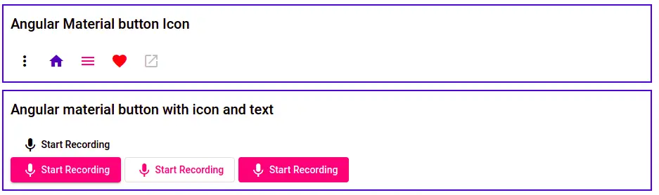
We can create an Angular material button with icons only and also we can have an Angular material button with icons and text by using the mat-icon-button attribute. Here is a screenshot of our example button with icons.
Here we have our Angular button with icon code, let’s add this to the app component template.
<div class="container">
  <section>
    <h2>Angular Material button Icon</h2>
    <div class="example-button-row">
      <div class="example-flex-container">
        <button mat-icon-button aria-label="">
          <mat-icon>more_vert</mat-icon>
        </button>
        <button mat-icon-button color="primary" aria-label="">
          <mat-icon>home</mat-icon>
        </button>
        <button mat-icon-button color="accent" aria-label="">
          <mat-icon>menu</mat-icon>
        </button>
        <button mat-icon-button color="warn" aria-label="">
          <mat-icon>favorite</mat-icon>
        </button>
        <button mat-icon-button disabled aria-label="">
          <mat-icon>open_in_new</mat-icon>
        </button>
      </div>
    </div>
  </section>

  <section>
    <h2>Angular material button with icon and text</h2>
    <button mat-button>
      <mat-icon>mic</mat-icon> Start Recording
    </button>
    <br />
    <button mat-raised-button color="accent">
      <mat-icon>mic</mat-icon> Start Recording
    </button>
    <button mat-stroked-button color="accent">
      <mat-icon>mic</mat-icon> Start Recording
    </button>
    <button mat-flat-button color="accent">
      <mat-icon>mic</mat-icon> Start Recording
    </button>
  </section>
</div>
Angular material fab button
At last, we will demonstrate an example of button type using mat-fab. The fab button can have two types fab and min-fab and the only difference is the Angular material fab button size.
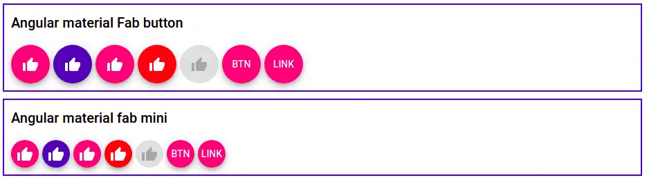
Here we have added Angular material fab buttons to our app template.
<div class="container">
  <section>
    <h2>Angular material Fab button</h2>
    <button mat-fab>
      <mat-icon>thumb_up</mat-icon>
    </button>
    <button mat-fab color="primary">
      <mat-icon>thumb_up</mat-icon>
    </button>
    <button mat-fab color="accent">
      <mat-icon>thumb_up</mat-icon>
    </button>
    <button mat-fab color="warn">
      <mat-icon>thumb_up</mat-icon>
    </button>
    <button mat-fab disabled>
      <mat-icon>thumb_up</mat-icon>
    </button>
    <button mat-fab>BTN</button>
    <a mat-fab>LINK</a>
  </section>

  <section>
    <h2>Angular material fab mini</h2>
    <button mat-mini-fab>
      <mat-icon>thumb_up</mat-icon>
    </button>
    <button mat-mini-fab color="primary">
      <mat-icon>thumb_up</mat-icon>
    </button>
    <button mat-mini-fab color="accent">
      <mat-icon>thumb_up</mat-icon>
    </button>
    <button mat-mini-fab color="warn">
      <mat-icon>thumb_up</mat-icon>
    </button>
    <button mat-mini-fab disabled>
      <mat-icon>thumb_up</mat-icon>
    </button>
    <button mat-mini-fab>BTN</button>
    <a mat-mini-fab>LINK</a>
  </section>
</div>
Angular Material button right align
We can use align attribute or use CSS float right to align the Angular material button to right.

  <section class="pull-right" align="end">
    <button mat-stroked-button color="warn"> Cancel </button>
    <button mat-stroked-button color="accent"> Save </button>
  </section>
Applying CSS style to Angular Material button
We can use the material button attribute class to apply a style to our material button and the example below we have used on material raised button type. We only need to add our custom CSS style properties in the component scss file.
// Angular material button size && radius border
.mat-raised-button {
    padding: 0 6px 0 6px;
    margin: 6px 8px 6px 8px;
    min-width: 100px;
    border-radius: 0px;
    font-size: 14px;
    text-align: center;
    text-transform: uppercase;
    text-decoration:none;
    border: none;
    outline: none;
 }
Angular Material toggle button
We have an Angular material toggle button, to use it we need to import MatButtonToggleModule for the toggle button and MatSlideToggleModule for the mat-slide-toggle button. Here is a screenshot of the Angular material toggle button example.
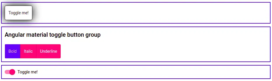
First, is the single toggle button, we had applied CSS Style for hover and box-shadow for it. The second example is the group of toggle buttons and the last is an example of the mat-slide-toggle button.
<div class="container">
section>
    <mat-button-toggle [checked]="isTrue" (change)="isTrue = $event.source.checked">
      Toggle me!
    </mat-button-toggle>
  </section>

  <section>
    <h2>Angular material toggle button group</h2>
    <mat-button-toggle-group name="fontStyle" aria-label="Font Style">
      <mat-button-toggle value="bold">Bold</mat-button-toggle>
      <mat-button-toggle value="italic">Italic</mat-button-toggle>
      <mat-button-toggle value="underline">Underline</mat-button-toggle>
    </mat-button-toggle-group>
  </section>

  <section>
    <mat-slide-toggle [(ngModel)]="slideToggle">
      Toggle me!
    </mat-slide-toggle>
</div>
Note: I had also created most of the Angular material button examples in Stackblitz, where you can check it.
Conclusion
We have completed our Angular material buttons. In Angular, we can also third-party libraries like ng-bootstrap to add UI on the Angular button but if you are using material UI, then the Angular material button is built specifically for it. If you learn something and think the content is good, please share it. Follow me on my GitHub collection, I had code on Angular, react, and Ionic framework.
Related Articles
- How to install Angular material?
- How to implement Angular material form in Angular?
- Angular material checkbox: color, label direction
- How to implement Angular checkbox input in Angular?
- How to use Angular Material tooltip in Angular?
- Angular Material input components and directives
- Angular material autocomplete example
- How to implement Angular material dropdown | select .?
- Angular Radio button |angular material radio button?
- How to implement Angular material accordion in Angular .?
- How to implement Angular material tabs?
- How to implement angular material snack bar | toast in Angular?
- How to implement Angular material dialog .?
- How to implement Angular material grid .?
- How to implement Angular material list in Angular .?
- How to implement Angular material card in Angular?
- How to implement angular material date picker in Angular .?
- How to implement the Angular material table?