An Angular material is an amazing UI for the Angular framework, it has lots of pre-built components like cards, modal, more, and the Angular material expansion panel or Angular material checkbox is one of them.
We have three objectives behind this tutorial, first will learn how to use Angular material checkbox component, and second how make checkbox group, Lastly. Let’s get started.
Abstract step of adding Angular material checkbox
Adding material checkbox is easy in our Angular project, here we had listed the abstract step of adding Angular material checkbox.
- Step 1: Create a material checkbox project
- Step 2: Add the Angular material library to our Angular project.
- Step 3: Import MatCheckboxModule and ReactiveFormsModule to our project.
- Step 4: Defining formGroup and form control for a checkbox.
- Step 5: Adding mat-checkbox component in component template.
Steps 1 to 3: Setup and configure the Angular material checkbox project
Let’s first create an Angular material expansion checkbox project, we need to install the angular material library.
ng new matCheckboxApp
cd new matCheckboxApp
ng add @angular/material
The material checkbox allows us to select multiple options among lists of options and it provides this functionality with Material Design look and feels and behavior. To use the material checkbox we need to import MatCheckboxModule into our app module. Let’s import it into our app.component.ts file.
import { NgModule } from '@angular/core';
import { BrowserModule } from '@angular/platform-browser';
import { AppRoutingModule } from './app-routing.module';
import { AppComponent } from './app.component';
import { BrowserAnimationsModule } from '@angular/platform-browser/animations';
import { FormsModule, ReactiveFormsModule } from '@angular/forms';
import { MatCheckboxModule } from '@angular/material/checkbox';
import { MatFormFieldModule } from '@angular/material/form-field';
import { MatInputModule } from '@angular/material/input';
import { MatSlideToggleModule } from '@angular/material/slide-toggle';

@NgModule({
  declarations: [
    AppComponent
  ],
  imports: [
    BrowserModule,
    AppRoutingModule,
    BrowserAnimationsModule,
    FormsModule,
    ReactiveFormsModule,
    MatCheckboxModule,
    MatFormFieldModule,
    MatInputModule,
    MatSlideToggleModule
  ],
  providers: [],
  bootstrap: [AppComponent]
})
export class AppModule { }
We have also imported MatSlideToggleModule, to demonstrate the same functionalities as the Angular material checkbox. Here is a screenshot of our mat checkbox example.
Step 4 to 5 Define Material checkbox in Reactive form.
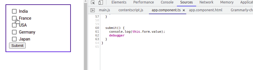
To understand how to use the Angular material checkbox, let’s demonstrate an example of it in Angular reactive form. Here is a screenshot of our example.
Define FormGroup and formcontrol for checkbox input
We have to define the form element and we added one form control called selectedCountries, which contains the list of selected countries’ names.
import { Component, OnInit } from '@angular/core';
import { FormArray, FormBuilder, FormControl, FormGroup } from '@angular/forms';

@Component({
  selector: 'app-root',
  templateUrl: './app.component.html',
  styleUrls: ['./app.component.scss']
})
export class AppComponent {
  form: FormGroup;
  countries: Array<any> = [
    { name: 'India', value: 'india' },
    { name: 'France', value: 'france' },
    { name: 'USA', value: 'USA' },
    { name: 'Germany', value: 'germany' },
    { name: 'Japan', value: 'Japan' }
  ];

  constructor(fb: FormBuilder) {
    this.form = fb.group({
      selectedCountries: new FormArray([])
    });

  }

  onCheckboxChange(name: string, event: any) {
    const selectedCountries = (this.form.controls.selectedCountries as FormArray);
    if (event.checked) {
      selectedCountries.push(new FormControl(name));
    } else {
      const index = selectedCountries.controls.findIndex(x => x.value === name);
      selectedCountries.removeAt(index);
    }
  }

  submit() {
    console.log(this.form.value);
  }
}
In the countries array object, containing a list of countries name with value. We’ll iterate each country item in our template using the *ngFor directive.
Define Angular material checkbox element
In our component template, we have added a checkbox using the mat-checkbox component of Material design. As countries is an array containing a list of countries’ names and values. We can iterate through each in the mat-checkbox component. The checkbox has a change event, it will invoke when the user changes or clicks on the checkbox input.
<section>
 <form [formGroup]="form" (ngSubmit)="submit()">
   <div class="example-section" *ngFor="let country of countries">
     <mat-checkbox formArrayName="selectedCountries"
       (change)="onCheckboxChange(country.name, $event)">
          {{ country.name }}
     </mat-checkbox>
   </div>
   <button mat-raised-button color="accent">Submit</button>
 </form>
</section>
On change event on a checkbox will invoke the onCheckboxChange method, where we pass two arguments. The first argument contains the country name and the second argument contain the event.
We can use the event to determine whether a checkbox input is checked or not, if checked then we add a country name to selectedCountries form control. If not then we remove a country name from selectedCountries form control.
Angular material checkbox example 2
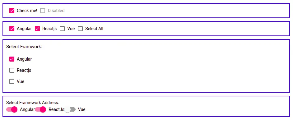
Let first demonstrate a basic example of the material checkbox component. We had already seen images containing all over mat checkbox examples. Let’s take a basic example screenshot.

Let’s edit the app.component.html to add the mat checkbox first example.
<div class="container">
  <section class="example-section">
    <mat-checkbox [(ngModel)]="checkMe>
     Check me!
     </mat-checkbox>
    <mat-checkbox class="example-margin" [disabled]="true">
     Disabled
    </mat-checkbox>
  </section>
</div>
Angular material checkbox properties
Angular material checkbox component provides a list of properties that will us to configure the checkbox components. Here have listed some of the mat checkbox component properties.
| Attribute | Description |
| disabled | Attribute value true will disable the toggle of the mat checkbox. |
| color | Angular material color themes to set checkbox color. |
| labelPosition | By default, the label is set after the checkbox. We can use “before” to show the label first and the check box afterward. |
| required | Same as any other angular form field. |
| disableRipple | Boolean value to set animation ripple effect on the checkbox. |

<section>
    <mat-checkbox color="primary">Checkbox primary color</mat-checkbox>
    <mat-checkbox labelPosition="before">
      Checkbox Label before
    </mat-checkbox>
    <mat-checkbox labelPosition="after">
      Checkbox Label After
    </mat-checkbox>
</section>
Mat checkbox select all option
In this example, we have a checkbox to select|unselect all material mat checkbox in an array object. Here is a screenshot of our example.

import { Component } from '@angular/core';

interface IFramework {
  name: string,
  checked: boolean
}

@Component({
  selector: 'app-root',
  templateUrl: './app.component.html',
  styleUrls: ['./app.component.scss']
})
export class AppComponent {
  frameworks: IFramework[] = [
    { name: "Angular", checked: true },
    { name: "Reactjs", checked: true },
    { name: "Vue", checked: false }
  ];

  selectAll = false;

  toggleAllChecked() {
    if (this.selectAll === true) {
      this.frameworks.map((framwork) => {
        framwork.checked = true;
      });

    } else {
      this.frameworks.map((framework) => {
        framework.checked = false;
      });
    }
  }
}
In our component template let iterate through frameworks array object.
  <section>
    <mat-checkbox *ngFor="let framework of frameworks; let i = index"
     [(ngModel)]="framework.checked">
      {{ i+1 }}. {{ framework.name }}
    </mat-checkbox>
    <mat-checkbox [(ngModel)]="selectAll" [ngModelOptions]="{standalone: true}"
     (change)="toggleAllChecked()">
      Select All
    </mat-checkbox>
  </section>
Angular material checkbox change event and form Group
We can call the change event when the user clicks on the material checkbox component. We also need to group related material checkboxes.
Here we can see the Angular material checkbox event value. Let’s edit the app component typescript to add checkbox groups.
import { Component } from '@angular/core';
import { FormBuilder, FormGroup } from '@angular/forms';
import { MatCheckboxChange } from '@angular/material/checkbox';
@Component({
selector: 'app-root',
templateUrl: './app.component.html',
styleUrls: ['./app.component.scss']
})
export class AppComponent {
fGroupFramworks: FormGroup;
constructor(fb: FormBuilder) {
this.fGroupFramworks = fb.group({
angular: false,
reactjs: false,
vue: false
});
}
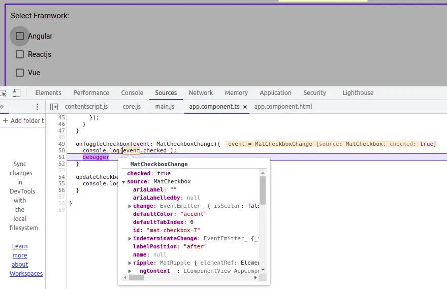
onToggleCheckbox(event: MatCheckboxChange){
console.log(event.checked );
debugger
}
updateCheckbox(event: Event) {
console.log(event);
}
}Let’s edit our app component template to add our mat checkbox with the change event.
  <section class="example-section" [formGroup]="fGroupFramworks">
    <h4>Select Framwork:</h4>
    <p>
      <mat-checkbox formControlName="angular" (change)="onToggleCheckbox($event)">
        Angular
      </mat-checkbox>
    </p>
    <p>
      <mat-checkbox formControlName="reactjs" (change)="onToggleCheckbox($event)">
       Reactjs
      </mat-checkbox>
    </p>
    <p>
      <mat-checkbox formControlName="vue" (change)="onToggleCheckbox($event)">
        Vue
      </mat-checkbox>
    </p>
  </section>
Angular material checkbox using toggle switch component
In Angular material, both checkbox and toggle switch components do the same functionalities of selecting from a list of available options. Both of these components are different only in the design outlook. Here is a screenshot of the Angular material toggle switch component example.

We have the same form group as the previous example, only different in the component template. We use a material toggle switch instead of a material checkbox component.
  <section>
    Select Framework
    <mat-label>Address:</mat-label>
     <div [formGroup]="fGroupFramworks">
      <mat-slide-toggle formControlName="angular">Angular</mat-slide-toggle>
      <mat-slide-toggle formControlName="reactjs">ReactJs</mat-slide-toggle>
      <mat-slide-toggle formControlName="vue">Vue</mat-slide-toggle>
    </div>
  </section>
Conclusion
We have completed the Angular material checkbox component. We can either use the Angular material checkbox or toggle switch component to select options from a list of related items.
Related Articles
- How to install Angular material ?
- How to implement Angular material form in Angular 11 | 12?
- How to implement the Angular material table in Angular 12 .?
- How to implement the angular material date picker in Angular 12 .?
- How to implement Angular material grid .?
- How to implement angular material list in Angular 12 .?
- How to implement Angular material card in Angular 12.?
- How to implement Angular material dialog .?
Would be great to have the stylesheets included.