In these articles, we will learn how to implement React form, will demonstrate a few examples and the last react form validation example. React doesn’t have any form module as Angular has. Adding form validation is a little challenging, it is not easy and as simple as Angular form validation.
In this tutorial, we’ll explore how to create a form in React from scratch, and learn what issues we’ll face while adding input fields without common input components. In the second example learn form validation with common input components and issues of using it. Last we’ll use the most popular React form library with validation, resetting the form, and default value.
What to know while implementing react form?
React, we create a form using the HTML form element, which provides basic features for displaying forms, validating entered values, and buttons to submit form data.
Most React applications are Single page applications, where we do not reload every time when we navigate from one page to another and or submit a form. While submitting a form in React we have to prevent the default reload of the page by adding the following code in the form handler function.
  const handleSubmit = (event) => {
    even.preventDefault();
    ... some more code
  };
Form in React can be of type uncontrolled and controlled, form element have some internal state. In uncontrolled form, where React components don’t control the form state or input values, it is a normal HTML form.
The controlled form is using the state, value attribute, and event features to handle the form in the component, here React component controls the form state and the way to update the form state object. React Form state can be set only by using the setState function in control.
React component that renders a form also controls what happens in that form on subsequent user input. An input form element controlled value by React is called a controlled component.
We can use React useRef hook to avoid re-rendering of components, it is not needed, we can use useState hooks to update the state, but is important to know how useEffect is working, by knowing it we can avoid unnecessary calls to API while typing input. The form input render is the nature of React to reflect what user input, it is should bother you.
React form Example
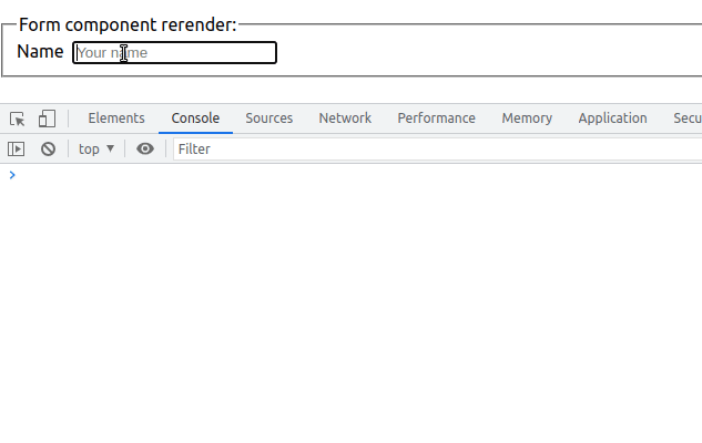
Let’s first demonstrate react form with some normal input, here in this example we are not using any component for the input field. We are making a form using normal HTML with a controlled form with the state, event, and value attribute on form input. Here is a screenshot of our first react form example. To make a controlled form we need to attribute the value attribute to the state variable, adding this allows React component to control the form input.
Here we haven’t used any form input component, when working with React, Angular is all about components, we can create common input components for almost all input elements. I guess we need to create separate input components for radio and select as these inputs have different structures than other inputs. We will create on shareable common input component for our input.
In this example, is very difficult to validate the form, I guess needs extra and lots of additional coding. We will demonstrate a React form validation in our second example.
import './formExample.css';
import { useState } from 'react';

const FormExample = () => {
  const [formData, setFormData] = useState({
    name: '',
    address: '',
    email: '',
    dob: false,
    country: '',
    gender: 'female',
    agree: false,
  });

  const onSubmit = (event) => {
    event.preventDefault();
    //Reset form
    setFormData({
      name: '',
      address: '',
      email: '',
      dob: false,
      country: '',
      gender: 'female',
      agree: false,
    });
  };

  const handleChange = (event) => {
    const { name, value, type } = event.target;
    const isCheckbox = type === 'checkbox';

    setFormData({
      ...formData,
      [name]: isCheckbox ? event.target.checked : value,
    });
  };

  return (
    <div className='formContainer'>
      <form onSubmit={onSubmit}>
        <div className='inputField'>
          <label>
            <span>Enter name</span>
          </label>
          <input
            type='text'
            name='name'
            onChange={handleChange}
            placeholder='Your name'
            value={formData.name}
          />
        </div>
        <div className='inputField'>
          <label>
            <span>Enter email</span>
          </label>
          <input
            type='email'
            name='email'
            onChange={handleChange}
            placeholder='Your email'
            value={formData.email}
          />
        </div>

        <div className='inputField'>
          <label>
            <span>Address</span>
          </label>
          <textarea
            onChange={handleChange}
            placeholder='Address'
            value={formData.address}
            name='address'
          ></textarea>
        </div>

        <div className='inputField'>
          <label>Country</label>
          <select
            name='country'
            value={formData.country}
            onChange={handleChange}
          >
            <option value='india'>India</option>
            <option value='france'>France</option>
            <option value='usa'>USA</option>
          </select>
        </div>

        <div className='radioButtonContainer'>
          <div>
            <span>Gender:</span>
            <div className='radioInputs'>
              <input type='radio' name='gender' value='Male' />
              <label>Male</label>
              <input type='radio' name='gender' value='Female' />
              <label>Female</label>
              <input type='radio' name='gender' value='Other' />
              <label>Other</label>
              <br />
            </div>
          </div>
        </div>

        <div className='agreeCheckedBox'>
          <input
            type='checkbox'
            checked={formData.agree}
            name='agree'
            onChange={handleChange}
          />
          <label>Terms an condition I agree with the rules</label>
        </div>
        <button type='submit'>Submit</button>
      </form>
    </div>
  );
};

export default FormExample;
React form validation example with Input Component
In our previous example, we added all input in the form, we don’t have a common shareable input component. Here in our second React form example, we create a common Input component for all input like text, email, password, and text area. We need to create separate shareable components for Select, Radio, and text input, as they have different input formats, I guess.
What we are achieving in this second React form example.
- Adding React form validation for common input components is easy.
- Creating common shareable the inputField component, as React is all about components, it is best to have reusable components. This avoids rerendering the React form components while typing input characters. As InputField components are separate and independent, has their own state.
- This type of form can use for login, registration, and forms after submit navigate to different components. It has one difficulty of resetting the form.
Let’s first create React project, then create folder components/shareable and add a folder called FieldInput. In this folder, we add FieldInput.js for the component and fieldInput.css to add style for our input component.
Step 1: Create a reusable Input component
Let’s add the following code for the src/components/shareable/FieldInput/FieldInput.js file.
import { useState } from "react";
import "./fieldInput.css";

const FieldInput = (props) => {
  const [focused, setFocused] = useState(false);
  const { label, errorMessage, onChange, type, ...inputProps } = props;

  const onHandleFocus = (e) => {
    setFocused(true);
  };

  return (
    <div className="input-container">
      <label>{label}</label>
      {type === "textarea" ? (
        <textarea
          {...inputProps}
          onChange={onChange}
          onBlur={onHandleFocus}
          focused={focused.toString()}
        />
      ) : (
        <input
          type={type}
          {...inputProps}
          onChange={onChange}
          onBlur={onHandleFocus}
          focused={focused.toString()}
        />
      )}
      <span className="error-msg">{errorMessage}</span>
    </div>
  );
};

export default FieldInput;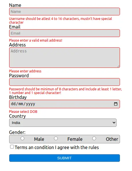
In this FieldInput component, we are passing props, containing information about the input field, first, we are destructing label, errorMessage, type, and onChange from props.
To avoid all errors which we face above, we’ll use the popular third-party form library in react.
We have to check if it is the textarea element or normal input, as textarea, we need to add rows and columns.
The error-msg to display, react form validation input message, by default we hide this message by display none.
When the input is invalid then we are displaying an error message, and onBlur handler we set focused to true, this enables us to show the error message only when the user first moves away from input. Let’s add style in the fieldInput.css file
span.error-msg {
    display: none;
}

textarea:invalid[focused='true'] ~ span.error-msg,
input:invalid[focused='true'] ~ span.error-msg {
    display: block;
    font-size: 12px;
    color:red;
}

input:invalid[focused='true'],
textarea:invalid[focused='true'] {
    border: 1px solid red;
}
Step 2: Create a Form and use a reusable Input component
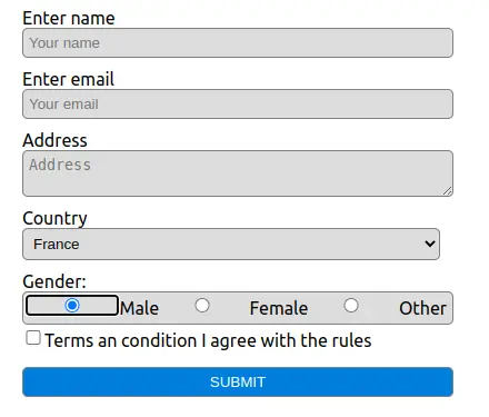
Let’s create a form component, we are using a reusable FieldInput component for most of our input except for radio, select, and checkbox input. Here we have an input array containing each input information like the label, type, validation information, and error message and we are looping through each using the map function and passing data to our common input Field component.
import "./form.css";
import { useState } from "react";
import FieldInput from "../../components/shared/FieldInput/FieldInput";

const inputs = [
  {
    id: 1,
    name: "username",
    label: "Name",
    type: "text",
    placeholder: "Name",
    pattern: "^[A-Za-z0-9]{4,20}$",
    required: true,
    errorMessage:
      "Username should be atlest 4 to 16 characters, mustn't have special character",
  },
  {
    id: 2,
    name: "email",
    label: "Email",
    type: "email",
    placeholder: "Email",
    required: true,
    errorMessage: "Please enter a valid email address!",
  },
  {
    id: 3,
    name: "address",
    label: "Address",
    type: "textarea",
    placeholder: "Address",
    rows: "4",
    cols: "50",
    required: true,
    errorMessage: "Please enter address ",
  },
  {
    id: 4,
    name: "password",
    type: "text",
    label: "Password",
    required: true,
    pattern: `^(?=.*[0-9])(?=.*[a-zA-Z])(?=.*[!@#$%^&*])[a-zA-Z0-9!@#$%^&*]{8,20}$`,
    errorMessage:
      "Password should be minimun of 8 characters and include at least 1 letter, 1 number and 1 special character!"
  },
  {
    id: 5,
    name: "birthday",
    label: "Birthday",
    type: "date",
    placeholder: "Birthday",
    required: true,
    errorMessage: "Please select DOB",
  },

];

const Form = () => {
  const [formData, setFormData] = useState({
    username: "",
    address: "",
    email: "",
    dob: false,
    password: "",
    country: "",
    gender: "female",
    agree: false,
  });

  const onSubmit = (event) => {
    event.preventDefault();
    console.log(formData)
  };


  const onChange = (event) => {
    const { name, value, type } = event.target;
    const isCheckbox = type === "checkbox";

    setFormData({
      ...formData,
      [name]: isCheckbox ? event.target.checked : value,
    });
  };

  return (
    <div className="formContainer">
      <form onSubmit={onSubmit}>
      {inputs.map((input) => (
          <FieldInput
            key={input.id}  {...input} value={input[input.name]}
            onChange={onChange}
          />
        ))}

        <div className="inputField">
          <label>Country</label>
          <select name="country" value={formData.country}
            onChange={onChange} >
            <option value="india">India</option>
            <option value="france">France</option>
            <option value="usa">USA</option>
          </select>
        </div>

        <div className="radioButtonContainer">
          <div>
            <span>Gender:</span>
            <div className="radioInputs">
              <input type="radio" name="gender" value="Male" />
              <label>Male</label>
              <input type="radio" name="gender" value="Female" />
              <label>Female</label>
              <input type="radio" name="gender" value="Other" />
              <label>Other</label>
              <br />
            </div>
          </div>
        </div>

        <div className="agreeCheckedBox">
          <input type="checkbox" checked={formData.agree}
            name="agree" onChange={onChange} value="agree" />
          <label>Terms an condition I agree with the rules</label>
        </div>
        <button type="submit">Submit</button>
      </form>
    </div>
  );
};

export default Form;
Here main issues, I’m learning the stage of React, I thought it is easy to validate form like in Angular, but not in react. Here in our second example, I faced an issue with form reset using reusable components. Let’s solved the all above issue using react hook form or you can use the formik or redux-form.
React hook form validation
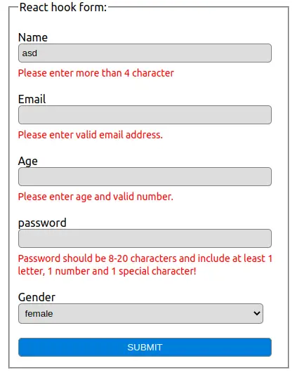
Last we’ll use one of the most popular React form libraries, React hook form with validation. This library is easy to use, validate, add a default value and reset form. Let here is a screenshot of our react hook form example.
We have normal HTML, with react hook form, you can use popular React UI libraries like React material Tailwind or others.
I can notice typing on the input field will not rerender in most cases and resetting the form is also easy. But default error messages are shown only when we submit the form, at first I thought react-hook-form errors not working.
This is the default nature of React hook form, we can add mode: “onBlur”, this will allow us to show an error message on blur on the input field.
Let’s first create React project and install react hook form by running the command below in your project root folder.
npm i react-hook-form --saveOur Form component lets us add form and input fields with validation using React hook form.
import { useForm } from "react-hook-form";
import { useEffect } from "react";
import "./form.css";

const Form = () => {
  const {
    register,
    handleSubmit,
    formState: { errors },
  } = useForm({
    mode: "onBlur",
    defaultValues: {
      age: 20,
    },
  });

  useEffect(() => {
    console.log("rerender");
  });

  const onSubmit = (data, event) => {
    console.log(data);
    event.target.reset();
  };

  return (
    <div className="wrapper">
      <form onSubmit={handleSubmit(onSubmit)}>
        <fieldset>
          <legend>React hook form:</legend>

          <div className="formInput">
            <label>Name</label>
            <input
              {...register("firstName", {
                required: "This is required",
                minLength: {
                  value: 5,
                  message: "Please enter more than 4 character",
                },
              })}
            />
            <span className="errorMsg">{errors.firstName?.message}</span>
          </div>

          <div className="formInput">
            <label>Email</label>
            <input
              type="email"
              {...register("email", {
                required: "This is required",
                pattern: /^\w+([\.-]?\w+)*@\w+([\.-]?\w+)*(\.\w{2,3})+$/,
              })}
            />
            <span className="errorMsg">
              {errors.email && "Please enter valid email address."}
            </span>
          </div>

          <div className="formInput">
            <label>Age</label>
            <input
              type="number"
              {...register("age", {
                required: true,
                pattern: /^[0-9]*$/,
              })}
            />

            <span className="errorMsg">
              {errors.age && "Please enter age and valid number."}
            </span>
          </div>

          <div className="formInput">
            <label>password</label>
            <input
              type="password"
              {...register("password", {
                required: true,
                pattern: /^(?=.*\d)(?=.*[a-z])(?=.*[A-Z]).{8,20}$/,
              })}
            />
            <span className="errorMsg">
              {errors.password &&
                "Password should be 8-20 characters and include at least 1 letter, 1 number and 1 special character!"}
            </span>
          </div>

          <div className="formInput">
            <label>Gender</label>
            <select {...register("gender")}>
              <option value="female">female</option>
              <option value="male">male</option>
              <option value="other">other</option>
            </select>
          </div>

          <button type="submit">Submit</button>
        </fieldset>
      </form>
    </div>
  );
};

export default Form;
One of the key concepts in React Hook Form is to register your component into the hook. This will make its value available for both the form validation and submission. Once we register the input field, we can add validation like required, minLength, and pattern to add react form validation on each individual input field.
To display and hide error messages we have to add the following CSS style in form.css
.wrapper {
    padding: 5px 20px;
    height: 100vh;
    display: flex;
    justify-content: center;
    align-items: center;
}

.wrapper .formInput {
    margin: 20px 0;
}

.errorMsg {
    color: red;
    font-size: 14px;
}

form {
    display: flex;
    flex-direction: column;
}
Related Post