We will make a series of tutorials on Angular material components and in the article, we will explore how to implement Angular material form in the Angular project. Angular Materials provide the developer with reusable UI components that help the developer to use ready-made components, fast development, and one best UI design. In Angular, we can use different UI libraries, but Angular Material is one of the best UI component libraries that are made specifically for Angular.
We have three objectives behind this tutorial, first will learn how to use Angular material form in reactive form and second we’ll look how used different material component like material form field, material hint, error , date picker, material select and material radio buttons. Last how to apply material icon on these material inputs. Let’s get started.
Step 1: Setting up and configuring Angular material form the project
Let’s first create our Angular material form project. In our previous articles, we learned how to install and the best approach for configuring Angular material in our project. Run the following command to create and add Angular Material to our project.
ng new angularMaterialFormApp
cd angularMaterialFormApp
ng add @angular/material
While running the 3rd command will ask you the select theme, material typography, and animation, press yes on all. To use the Angular material component, we have to import it into our app module. Let’s create a module and import all material components on it.
ng g m ng-material
Open src/app/ng-material/ng-material.module.ts and replace the existing code with the code shown below.
import { NgModule } from '@angular/core';
import { CommonModule } from '@angular/common';
import { MatNativeDateModule } from '@angular/material/core';
import { MatDatepickerModule } from '@angular/material/datepicker';
import { MatFormFieldModule } from '@angular/material/form-field';
import { MatInputModule } from '@angular/material/input';
import { MatSortModule } from '@angular/material/sort';
import { MatTableModule } from '@angular/material/table';
import { MatIconModule } from '@angular/material/icon';
import { MatSelectModule } from '@angular/material/select';
import { MatRadioModule } from '@angular/material/radio';
import { MatButtonModule } from '@angular/material/button';

@NgModule({
    declarations: [],
    imports: [
        CommonModule,
        MatTableModule,
        MatSortModule,
        MatFormFieldModule,
        MatInputModule,
        MatDatepickerModule,
        MatNativeDateModule,
        MatIconModule,
        MatSelectModule,
        MatRadioModule,
        MatButtonModule,
    ],
    exports: [
        CommonModule,
        MatTableModule,
        MatSortModule,
        MatFormFieldModule,
        MatInputModule,
        MatDatepickerModule,
        MatNativeDateModule,
        MatIconModule,
        MatSelectModule,
        MatRadioModule,
        MatButtonModule
    ]
})
export class NgMaterialModule { }
We are importing all the required modules in our custom material module file and keeping separate modules for Angular material will make the application easy to maintain. Now we need to import our material module and ReactiveFormModule in our src/app/app.module.ts file.
import { NgMaterialModule } from './ng-material/ng-material.module';
@NgModule({
...
imports: [
   ...
  ReactiveFormsModule,
  NgMaterialModule,
],
})
Step 2: Angular material form example
We have completed our configure of material form, now let’s demonstrate the Angular material form example. We have learned that Angular has two different types of forms, template-driven, and reactive forms. We are using the Reactive form to demonstrate the Angular material form example. If you have no idea how to use these forms please check our previous tutorial on them, as in this tutorial we are only focused on how to implement material forms.
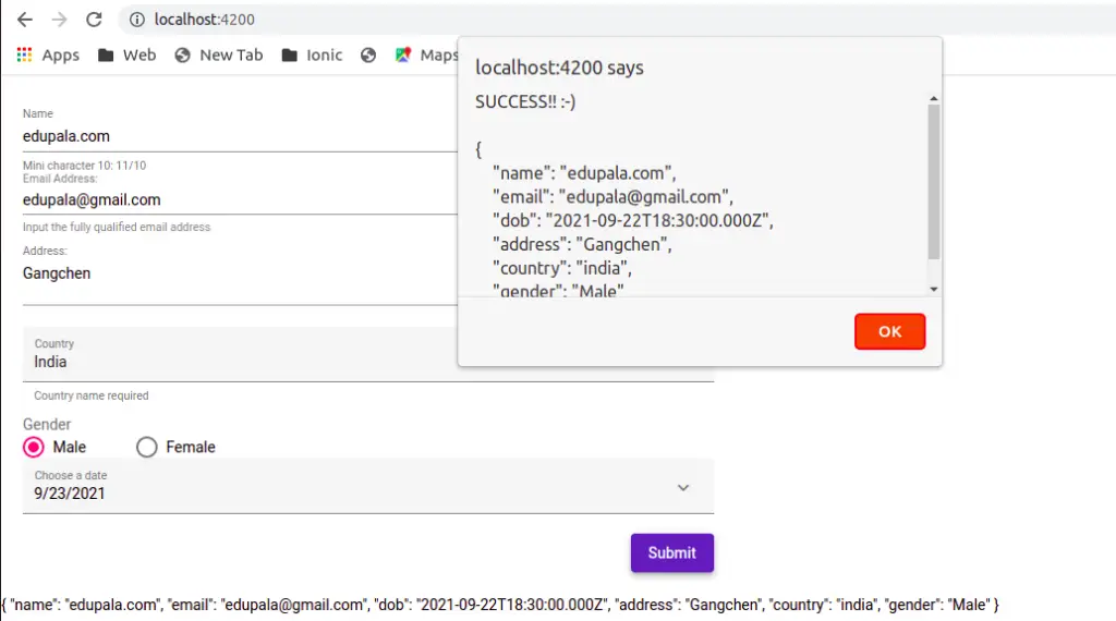
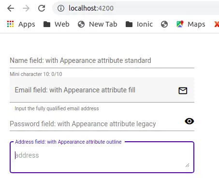
Here is a screenshot of our Angular material form example
Step 3: Initialize form and add Angular material form validation rule
In our component typescript, we need to add Angular material form validation rules, like required, email validation, min and max length of the input, etc. Now let’s create a form and add validation in the app.component.ts file
import { Component, OnInit } from '@angular/core';
import { FormGroup, FormBuilder, Validators } from '@angular/forms';

@Component({
  selector: 'app-form',
  templateUrl: './form.component.html',
  styleUrls: ['./form.component.scss']
})
export class FormComponent implements OnInit {
  form: FormGroup = new FormGroup({});

  constructor(private fb: FormBuilder) { }

  ngOnInit(): void {
    this.form = this.fb.group({
      name: [null, [Validators.required, Validators.minLength(10)]],
      email: [null, [Validators.required, Validators.pattern("^[a-z0-9._%+-]+@[a-z0-9.-]+\\.[a-z]{2,4}$")]],
      dob: [null, [Validators.required]],
      address: [null],
      country: [null],
      gender: [null]
    });
  }

  saveDetails(form: any) {
    alert('SUCCESS!! :-)\n\n' + JSON.stringify(form.value, null, 4));
  }
}- required: This attribute is used to specify a value that must be provided.
- minlength: This attribute is used to specify a minimum number of characters.
- maxlength: This attribute is used to specify a maximum number of characters. This type of validation cannot be applied directly to form elements because it conflicts with the HTML5 attribute of the same name. It can be used with model-based forms.
- pattern: This attribute is used to specify a regular expression that the value provided by the user must match.
Here we don’t have to do anything related to material form, as material components are declared and used inside our component template. We have declared form rules and if the form is valid, then we output it through the alert function.
Step 4: Adding material form component in Angular material form template.
Now we will add material form components in our component template, we have used mat-form-field, mat-label, mat-select, mat-radio-button, mat-datepicker-toggle, mat-hint, and mat-error. Here we have listed and uses of material components.
| Material component | Description |
| mat-form-field | The component is used to wrap several Angular Material components and apply common text field styles such as the underline, floating label, and hint messages. |
| mat-label | The label component allows indicating a form field as optional by using the optional input property. |
| mat-select | The mat-select is a form control for selecting a value from a set of options. |
| mat-radio-button | Provide the same functionality of radio buttons with material design styles. |
| mat-datepicker-toggle | The date picker allows users to enter a date either through text input or by choosing a date from the calendar. |
| mat-hint | Is optional, we can add hints for the input field for validation. |
| mat-error | .how form validation error with this component without any styling |
| mat-button | Same HTML button with material design style. |
Let’s edit our material form, in the app.component.html file.
<div class="container">
    <form [formGroup]="form" (ngSubmit)="saveDetails(form)">
        <mat-form-field appearance="standard">
            <mat-label>Name</mat-label>
            <input matInput maxlength="15" inputmode="tel" placeholder="Type name" formControlName="name" #nameInput>
            <mat-hint>Mini character 10: {{ nameInput.value.length }}/10</mat-hint>
            <mat-error>Name is required</mat-error>
            <mat-error *ngIf="form.controls['name'].errors?.['minlength']">
                Please enter more than 10 character
            </mat-error>
        </mat-form-field>

        <mat-form-field appearance="legacy">
            <mat-label>Email Address:</mat-label>
            <input matInput type="email" formControlName="email" placeholder="Your email">
            <mat-icon matSuffix>mail_outline</mat-icon>
            <mat-hint>Input the fully qualified email address</mat-hint>
            <mat-error *ngIf="form.controls['email'].errors?.['required']">Email is required</mat-error>
            <mat-error *ngIf="form.controls['email'].errors?.['pattern']">Please enter valid email</mat-error>
        </mat-form-field>

        <mat-form-field appearance="standard">
            <mat-label>Address:</mat-label>
            <textarea matInput placeholder="address" formControlName="address"></textarea>
        </mat-form-field>

        <mat-form-field appearance="fill" hintLabel="Country name required">
            <mat-label>Country</mat-label>
            <mat-select matNativeControl name="country" formControlName="country">
                <mat-option value="india">India</mat-option>
                <mat-option value="france">France</mat-option>
                <mat-option value="germany">Germany</mat-option>
                <mat-option value="japan">Japan</mat-option>
                <mat-option value="Mongolia">Mongolia</mat-option>
            </mat-select>
        </mat-form-field>

        <div style="margin-top:10px;">
            <div style="margin-right:3%; color:#6b6b6b;">
                <mat-label>Gender</mat-label>
            </div>
            <mat-radio-group formControlName="gender">
                <mat-radio-button value="Male">Male</mat-radio-button>
                <mat-radio-button value="Female">Female</mat-radio-button>
            </mat-radio-group>
        </div>

        <mat-form-field class="example-full-width" appearance="fill">
            <mat-label>Choose a date</mat-label>
            <input matInput [matDatepicker]="picker" formControlName="dob">
            <mat-datepicker-toggle matSuffix [for]="picker">
                <mat-icon matDatepickerToggleIcon>keyboard_arrow_down</mat-icon>
            </mat-datepicker-toggle>
            <mat-datepicker #picker></mat-datepicker>
        </mat-form-field>
        <div mat-dialog-actions align="end">
            <button mat-raised-button color="primary" type="submit" [disabled]="!form.valid">Submit</button>
        </div>
    </form>
    <div>{{ form.value | json }}</div>
</div>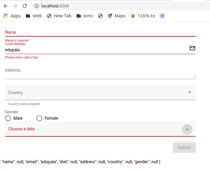
The angular material library has a mat-form-field component, which we have used extensively in Material form. This mat-form-field component wraps several material subform components inside it and applies common Text field styles such as the underline, floating label, and hint message on the following form controls.
- Input text
- Select text field: mat-select
- Text area
- Chip or tags input: mat-chip
- Date picker
The text input in our component template uses the matInput directive to add material design looks and feel.
How do we validate Angular material form elements?
As we are using a reactive form, we can access each individual form element in our template. Angular form control elements have different states like touched, dirty, errors, valid, invalid, untouched, and pristine. We can access individual elements using the form.get() method with the name of the individual form control element and then we can check its control status.
We have validated, and require minLength and email patterns like this in our template.
<mat-error *ngIf="form.controls['email'].errors?.['required']">
  Email is required
</mat-error>

<mat-error *ngIf="form.controls['email'].errors?.['pattern']">
  Please enter valid email
</mat-error>

<mat-error *ngIf="form.controls['name'].errors?.['minlength']">
  Please enter more than 10 character
</mat-error>
How to implement an Angular material login form?
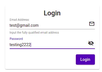
We have learned how to configure and use Angular material form components in angular projects. Let now demonstrate an example of an angular material login form. Here is a screenshot of our angular material login form example.
Let’s edit the app.component.ts file to include the reactive form module, form group, and form builder for the angular material login form.
import { Component, OnInit } from '@angular/core';
import { FormGroup, FormBuilder, Validators } from '@angular/forms';

@Component({
  selector: 'app-form',
  templateUrl: './form.component.html',
  styleUrls: ['./form.component.scss']
})
export class FormComponent implements OnInit {
  form: FormGroup = new FormGroup({});
  flag: boolean = true;

  constructor(private fb: FormBuilder) { }

  ngOnInit(): void {
    this.form = this.fb.group({
      email: [null, [Validators.required, Validators.pattern("^[a-z0-9._%+-]+@[a-z0-9.-]+\\.[a-z]{2,4}$")]],
      password: [null, [Validators.required, Validators.minLength(6)]],
    });
  }

  saveDetails(form: any) {
    alert('SUCCESS!! :-)\n\n' + JSON.stringify(form.value, null, 4));
  }
}
In our component template, we have used another material component called material card, you need to import MatCardModule in our material module. We also have matSuffix, and matPrefix attributes to set mat-icon at the end or start. As the name suggests that matPrefix adds an icon at the start of input and matSuffix at end of the input.
We have used visibility on and off to see and make password type text visible or password by the toggle flag button. Let’s edit the app.component.html file.
<mat-card>
    <mat-card-title>Login</mat-card-title>
    <mat-card-content>
        <form [formGroup]="form" (ngSubmit)="saveDetails(form)" autocomplete="off">
            <div>
                <mat-form-field appearance="legacy">
                    <mat-label>Email Address:</mat-label>
                    <input matInput type="email" formControlName="email" placeholder="Your email">
                    <mat-icon matSuffix>mail_outline</mat-icon>
                    <mat-hint>Input the fully qualified email address</mat-hint>
                    <mat-error *ngIf="form.controls['email'].errors?.['required']">Email is required</mat-error>
                    <mat-error *ngIf="form.controls['email'].errors?.['pattern']">Please enter valid email</mat-error>
                </mat-form-field>
            </div>

            <div>
                <mat-form-field appearance="standard">
                    <mat-label>Password </mat-label>
                    <input matInput [type]="flag ? 'password' : 'text'" placeholder="Enter your password"
                        formControlName="password">
                    <mat-icon (click)="flag=!flag" matSuffix>{{ flag ? 'visibility' : 'visibility_off' }}</mat-icon>
                    <mat-error>Name is required</mat-error>
                    <mat-error *ngIf="form.controls['password'].errors?.['minlength']">
                        Please enter more than 6 character
                    </mat-error>
                </mat-form-field>
            </div>

            <div>
                <button mat-raised-button color="primary" type="submit" [disabled]="!form.valid">Login</button>
            </div>

        </form>
    </mat-card-content>
</mat-card>
Like before we have added angular material login form validation, when all login inputs are valid, then we will enable the login button.
Angular material input field appearance attribute
Angular material form field component mat-form-field component have appearance attribute, that allows us to apply different appearance on an input field. The mat-form-field have the following four different value we can apply to the appearance attribute.
- Fill
- Outline
- Standard
- Legacy
How to set autosize to Text area?
We can add the matInput directive on textarea element. The HTML Textarea element has a row attribute to add and configure the numbers of rows on textarea input. But the row attribute is static, we can’t increment or decrement on running the application. The <textarea> elements can be made to automatically resize by using the cdkTextareaAutosize directive available in the CDK.
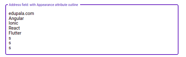
<mat-form-field appearance="outline">
    <mat-label>Address field: with Appearance attribute outline</mat-label>
    <textarea cdkTextareaAutosize cdkAutosizeMinRows="2"
    cdkAutosizeMaxRows="10" matInput placeholder="address"
    formControlName="address"></textarea>
</mat-form-field>Conclusion
We have completed our Angular material form tutorial, and we have learned how to use the material form field and Angular material form validation. At last, we have one more example on the Angular material login form to perform password visibility and matPrefix and matSuffix to align icons on input. I hope you had learned something, if so then please share it with others and on social networks, this will encourage me to add more content. Follow me on my GitHub collection, I had code on Angular, react, and Ionic framework.
Related Articles
- How to install Angular material?
- Angular Radio button |angular material radio button?
- Angular material checkbox: color, label direction
- How to implement Angular checkbox input in Angular?
- How to use Angular Material tooltip in Angular?
- Angular Material input components and directives
- Angular material autocomplete example
- How to implement Angular material dropdown | select .?
- Angular material button: Color, Size, toggle button
- How to implement Angular material accordion in Angular .?
- How to implement Angular material tabs?
- How to implement angular material snackbar | toast in Angular?
- How to implement Angular material dialog .?
- How to implement Angular material grid .?
- How to implement Angular material list in Angular .?
- How to implement Angular material card in Angular?
- How to implement angular material datepicker in Angular .?
- How to implement the Angular material table?
Hi, I do believe this is an excellent website. I stumbledupon it 😉
I will come back yet again since i have saved as a favorite
it. Money and freedom is the greatest way to change, may you be rich and continue to help others.
Thank you very much. I am glad, my site is benefiting someone.
Please let me know if you’re looking for a writer
for your blog. You have some really good posts and I think I would be a good asset.
If you ever want to take some of the load off, I’d absolutely love
to write some material for your blog in exchange for a link back to mine.
Please blast me an e-mail if interested. Thank you!
Hi, thanks. Please send me your email at [email protected]. We’ll discuss what we can do best to benefit both. Looking forward to hearing from you.
You really make it seem so easy with your presentation but I find this matter to
be actually something which I think I would never understand.
It seems too complicated and extremely broad for me.
I’m looking forward for your next post, I’ll
try to get the hang of it!
This post presents clear idea in favor of the new viewers of blogging, that
actually how to do blogging and site-building.
Building an Angular Material form was a challenging but rewarding experience. I began by researching the different components available in the Angular Material library, such as the input, select, and checkbox elements.
Once I had a good understanding of the options available, I started designing the layout of the form in my mind. I wanted it to be user-friendly, with clear labels and consistent spacing between elements.
Next, I began implementing the form in my Angular project. I utilized the Angular Forms module to handle form validation and created custom form controls to handle specific functionality. As I built out each section of the form, I made sure to test it thoroughly to ensure that it was functioning as expected.
As I worked through the building process, I encountered a few roadblocks, but I was able to find solutions by diving deeper into the Angular Material documentation and seeking help from online resources.