An angular modal component is a form of temporary UI that slides onto the screen, over the page content, and is often used for login/registration forms, selecting options from lists, composing messages, or presenting app configuration options for example. We can dismiss the modal manual, dismiss after a certain time lapse, or use dismiss or close method on the modal.
In this tutorial, we have three goals behind this chapter. First, we will see the different ways we can use the Angular modal component. Secondly, we’ll demonstrate an example of a modal dialog using the ngx-simple-modal and bootstrap Modal. Let’s get started.
Different options for implementing Angular Modal component
We can have a few options for using Angular modal dialog in our application. These libraries provide modal functionality plus some of their own design. Here I have listed some popular Angular modal dialogs.
| Name | Description |
| Angular Material Dialog | If you are using Angular material for UI, then it is the best approach to use Angular material Dialog. |
| ng-bootstrap modal | If you are using Twitter bootstrap UI for your project, then it is best to approach using the bootstrap modal using ng-bootstrap. |
| ngx-simple-modal | It is a library to make modals easier in Angular, has no dependencies, but plays well with bootstrap or other frameworks. It has a size of 535 kB. |
Setting up and configuring Angular Modal dialog project.
Let’s first create our modal project and we’ll demonstrate two examples of the modal. Before starting an angular project you need to install Nodejs and Angular CLI in your system.
ng new modalAppAngular modal example using material design
Angular Material is one of the best UI component libraries that are made specifically for Angular. Let’s first demonstrate an example of an Angular modal using Material Modals known as dialog components. We have to follow the following step for using material dialog in our project.
Step 1: Let’s create and add material to our Angular project. We have a full tutorial on how to add material to our angular project.
ng add @angular/materialStep 2. Create a separate module for angular material by running the following command.
ng g m ng-materialStep 3: First example of Basic Angular material dialog
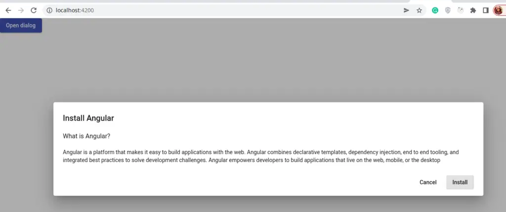
Let’s generate a component called material Basic modal component to demonstrate a basic example of Angular material modal. Here is the screenshot of our example 1.
This modal display is from our component Basic Modal, let’s create it.
ng g component ng-material/matBasicIn our component, we have to import dialog, button module in the ng-material.module.ts
import { NgModule } from '@angular/core';
import { CommonModule } from '@angular/common';
import { MatBasicComponent } from './mat-basic/mat-basic.component';
import { MatDialogModule } from '@angular/material/dialog';
import {MatButtonModule} from '@angular/material/button';

@NgModule({
  declarations: [
    MatBasicComponent
  ],
  imports: [
    CommonModule,
    MatDialogModule,
    MatButtonModule,
  ], exports: [
    MatDialogModule,
    MatButtonModule
  ]
})
export class NgMaterialModule { }
Step 4: Import our custom material module in the app.module.ts file.
...
import { BrowserAnimationsModule } from '@angular/platform-browser/animations';
import { NgMaterialModule } from './ng-material/ng-material.module';


@NgModule({
  declarations: [
    AppComponent
  ],
  imports: [
     ...
    BrowserAnimationsModule,
    NgMaterialModule
  ],
  providers: [],
  bootstrap: [AppComponent]
})
export class AppModule { }
Design our basic material modal
Now we have completed the Material modal or dialog configuration, let’s now design our material basic modal example. Let edit the src/ng-material/mat-basic/mat-basic.component.html file.
<h2 mat-dialog-title>Install Angular</h2>
<mat-dialog-content class="mat-typography">
  <h3>What is Angular?</h3>

  <p>Angular is a platform that makes it easy to build applications with the web. Angular
    combines declarative templates, dependency injection, end to end tooling, and integrated
    best practices to solve development challenges. Angular empowers developers to build
    applications that live on the web, mobile, or the desktop</p>
</mat-dialog-content>

<mat-dialog-actions align="end">
  <button mat-button mat-dialog-close>Cancel</button>
  <button mat-button [mat-dialog-close]="true" cdkFocusInitial>Install</button>
</mat-dialog-actions>
In our basic modal example, we have some text and two buttons to cancel or close the modal. We need an event to open our modal, let’s edit the app.component.ts file to invoke the opening event for the basic modal component.
import { Component } from '@angular/core';
import { MatDialog } from '@angular/material/dialog';
import { MatBasicComponent } from './ng-material/mat-basic/mat-basic.component';

@Component({
  selector: 'app-root',
  templateUrl: './app.component.html',
  styleUrls: ['./app.component.scss']
})
export class AppComponent {
  constructor(public dialog: MatDialog) {}

  openDialog() {
    const dialogRef = this.dialog.open(MatBasicComponent);

    dialogRef.afterClosed().subscribe(result => {
      console.log(`Dialog result: ${result}`);
    });
  }
}
At last, we need a button to invoke our openDialog method and let edit the app.component.html file.
<button mat-raised-button color="primary" (click)="openDialog()">Open dialog</button>

<router-outlet></router-outlet>
In above example we demostrate simple Material Modal using Material design. We have covered a complete tutorial on Angular material dialog of sending/receiving data to| from modal component and also covered how to edit material dialog design.
Angular modal dialog using Bootstrap
Here we will demonstrate the second example, using the ng-bootstrap library. This library has lots of bootstrap components built specifically for Angular and it doesn’t have a dependency on bootstrap javascript and jquery:
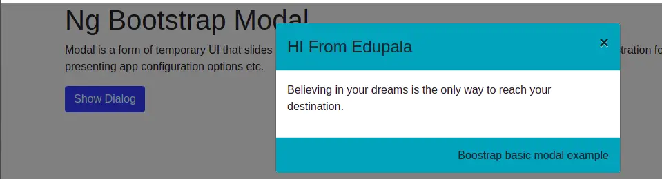
Here is a screenshot of our Angular bootstrap modal
We had articles on how to install and configure ng-bootstrap in our Angular project. If you want to know then you check on it. Let’s create a bootstrap basic modal component and install the ng-bootstrap library by running the following command.
ng add @ng-bootstrap/ng-bootstrap
ng g component components/modal
Here we only demonstrate the basic modal for displaying modal using bootstrap. Let edit the app.component.ts file to open are basic modal.
import { Component } from '@angular/core';
import { NgbModal } from '@ng-bootstrap/ng-bootstrap';
import { ModalComponent } from './components/modal/modal.component';
@Component({
  selector: 'app-root',
  templateUrl: './app.component.html',
  styleUrls: ['./app.component.scss']
})
export class AppComponent {
  constructor(private modalService: NgbModal) { }

  openModal() {
    const modalRef = this.modalService.open(ModalComponent);
  }
}
Edit the app.component.html template to add a /button to call the method to open the modal.
<div class="container">
  <h1>Ng Bootstrap Modal</h1>
  <p>
    Modal is a form of temporary UI that slides into the screen, over the page content, and is often used for
    login/registration forms, composing messages, or presenting app configuration options etc.
  </p>
  <button class="btn btn-primary" (click)="openModal()">Show Dialog</button>
</div>

<router-outlet></router-outlet>
Ng bootstrap modal design
In our bootstrap basic modal, we applied background color to the modal header and footer. Let edit the modal.component.ts file
import { Component, OnInit } from '@angular/core';
import { NgbModal, ModalDismissReasons, NgbActiveModal } from '@ng-bootstrap/ng-bootstrap';

@Component({
  selector: 'app-modal',
  templateUrl: './modal.component.html',
  styleUrls: ['./modal.component.scss']
})
export class ModalComponent implements OnInit {
  closeResult = '';

  constructor(
    public activeModal: NgbActiveModal
  ) { }

  ngOnInit(): void {
    throw new Error('Method not implemented.');
  }
}
In our modal component template, we have a header, modal content, and footer. Let’s add this to the modal component template.
<div class="modal-header bg-info">
<h4 class="modal-title">HI From Edupala</h4>
<button type="button" class="close" aria-label="Close" (click)="activeModal.dismiss('Cross click')">
<span aria-hidden="true">×</span>
</button>
</div>
<div class="modal-body">
<p>Believing in your dreams is the only way to reach your destination.</p>
</div>
<div class="modal-footer bg-info">
<h6>Boostrap basic modal example</h6>
</div>Angular modal dialog using ngx-simple-modal
We’ll demonstrate modal dialog using the third-party library ngx-simple-modal. Here we first need to install this library in our project by following the command.
npm i ngx-simple-modal --saveHere is a screenshot of our first example of a modal component
Install the ngx-simple-modal and create the modal component
Once we have created our modal project, let us know to install and create a modal component by running the following command.
npm i ngx-simple-modal --save
ng g component components/modal/basic
The above command will install our modal component and it will create modal component basic inside the folder app/components/modal/basic. The ngx-simple-modal library provides the following features.
- Create clear and reusable modal components.
- It makes managing modals painless and clearer.
- Draggable modals – Our above example is a draggable modal component.
- Extend the ModalComponent class and implement any content you want.
Import Simple modal module
To use the ngx-simple-modal library we need to import the Simple module inside our application. We can import this module into the application in either the root module or anyone module where we want to use it. In our case let at this module at the root module i.e the app.module.ts file.
import { NgModule } from '@angular/core';
import { BrowserModule } from '@angular/platform-browser';

import { AppRoutingModule } from './app-routing.module';
import { AppComponent } from './app.component';
import { BasicComponent } from './components/modal/basic/basic.component';
import { SimpleModalModule } from 'ngx-simple-modal';


@NgModule({
  declarations: [
    AppComponent,
    BasicComponent
  ],
  imports: [
    BrowserModule,
    AppRoutingModule,
    SimpleModalModule.forRoot({container:document.body})
  ],
  providers: [],
  bootstrap: [AppComponent]
})
export class AppModule { }
In the app module, we can simply import SimpleModule, but we need to use the draggable feature of SimpleModule. An optional second parameter takes a global object of type SimpleModalOptions (all fields required).
To use SimpleModule style, then we can import its style, which is optional and its CSS already provides a transparency overlay, opacity, and slide animation. If you are using scss file like me then import it scss file in style.scss as follows.
@import '../node_modules/ngx-simple-modal/styles/simple-modal.scss';
If you are using CSS for your component style, then inside your angular-cli.json update your styles sections to include our CSS
"styles": [
  "styles.css",
  "../node_modules/ngx-simple-modal/styles/simple-modal.css"
],
Angular modal dialog example
Now we had completed all configurations for SimpleModal, let’s now add a button in the app component template to open the modal.
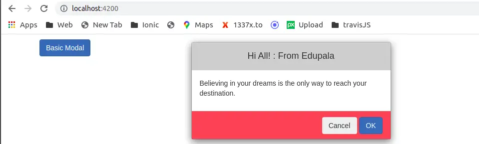
<div class="container">
  <button type="button" class="btn btn-primary" (click)="basicModal()">
   Basic Modal
  </button>
  <router-outlet></router-outlet>
</div>
Let open our basic modal, pass data from our component to the calling modal, and edit the app.component.ts file.
import { Component } from '@angular/core';
import { SimpleModalService } from 'ngx-simple-modal';
import { BasicComponent } from './components/modal/basic/basic.component';

@Component({
  selector: 'app-root',
  templateUrl: './app.component.html',
  styleUrls: ['./app.component.scss']
})
export class AppComponent {
  constructor(
    private SimpleModalService: SimpleModalService
  ) { }

  basicModal(): void {
    this.SimpleModalService.addModal(BasicComponent, {
      title: 'Hi All! : From Edupala',
      message: 'Believing in your dreams is the only way to reach your destination. '
    }, {
      draggable: true
    }).subscribe((isConfirmed) => {
      //We get modal result
      if (isConfirmed) {
        alert('accepted');
      }
      else {
        alert('declined');
      }
    });
  }
}
We have to import and inject simpleModalService inside our constructor. We can pass data to our modal, and in modal objects, we have to pass what modal we are calling. In our case, BasicComponent is our modal and we want to pass title and message string data to the modal.
Angular Modal to retrieve data
Once we click on the basic modal button, it will open our basic modal. In the basic modal, we can display data we received from our component. In ngx-simple-modal we have different options to implement modal, we are using AlertModel and you can check more options on the ngx-simple-modal site.
Let edit the basic.component.ts file to implement the AlertModal example.
import { Component} from '@angular/core';
import { SimpleModalComponent } from 'ngx-simple-modal';

export interface AlertModel {
  title?: string;
  message: string;
}
@Component({
  selector: 'app-basic',
  templateUrl: './basic.component.html',
  styleUrls: ['./basic.component.scss']
})
export class BasicComponent extends SimpleModalComponent<AlertModel, null> implements AlertModel {
  title: string = '';
  message: string = '';
  constructor() {
    super();
  }

  confirm() {
    this.close();
  }

}
Let’s edit our basic modal template to display our data and the button to dismiss the modal.
<div class="modal-content">
    <div class="modal-header">
        <h4>{{ title || 'Default title.'}}</h4>
    </div>
    <div class="modal-body">
        <p>{{ message || 'Default modal message.'}}</p>
    </div>
    <div class="modal-footer">
        <button type="button" class="btn btn-outline-danger" (click)="close()">
          Cancel
        </button>
        <button type="button" class="btn btn-primary" (click)="confirm()">
         OK
        </button>
    </div>
</div>
How to apply Angular modal header and footer background-color
We can see that we had applied background color to the header and footer of the modal. Let’s add background color in style.scss file. We also added code to change Angular modal window size by assigning CSS styles,
/* You can add global styles to this file, and also import other style files */
@import '../node_modules/ngx-simple-modal/styles/simple-modal.scss';

  .modal-content {
    max-width: 400px;
  }

  .modal-content-size-m {
    max-width: 992px;
  }

  .modal-content-size-l {
    max-width: 1200px;
  }

  .modal-footer, .modal-header {
    height: 56px;
    padding: 0 16px;
  }

  .modal-header {
    background-color: #cecece;
    border-bottom: 1px solid #cecece;
  }

  .modal-body {
    padding: 16px;
  }

  .modal-footer {
    background-color: #ee6060;
    border-top: 1px solid #ee6060;
  }

  .btn:hover {
    background: #3cb0fd;
    text-decoration: none;
  }
We have aligned our basic modal at the center of our page, this can be achieved by applying the following CSS style to the host element of the basic components. Edit basic.component.scss file as follows.
:host {
    top: -200px;
    display: flex;
    align-items: center;
    justify-content: center;
    min-height: 100vh;
}
To demonstrate Angular Material Modal, I added an example of it on stackblitz.com and you can live view code and preview it.
Conclusion
We complete our Angular modal component tutorial, and we have demonstrated two examples of the modal components. I hope you have got some idea on how to use modal in the Angular project.
Related Articles