React Tabs allow switching between entities for each tab that are organize in horizontal fashion and selected tab content is displayed, other unselected tab content is hidden on the screen. We can also use tabs with the router to navigate between different components. Tabs are often used to organize multiple views on a page.
We have three main objectives in this tutorial on React Tabs
- Creating React tabs using the react-tabs library.
- Creating our own custom tabs component without any library.
- Tabs styling by applying different colors and backgrounds for active tabs.
What are React tabs?
Reactjs is a free and open-source front-end JavaScript library for building user interfaces based on UI components. To implement tabs in React, we can use the following based on our UI and requirement.
- React Material MUI tabs
- Bootstrap tabs
- React-tabs library
- Other UI libraries like Tailwind, which provide tabs component
- Create our own custom tabs component by applying
React material tabs component displays a group of related buttons in a horizontal row. They are mostly used inside the main content and provide a tab of the Material Design UI specifications
Tabs are often used to organize multiple views on a page and the content of views is separated into sections or categories. In Tabs components allow us to select the one tab that will deselect all other tabs and we can toggle between each tab.
React Tabs example using react-router library
Let’s first demonstrate the Tabs example using react-tabs, it has around 517,864 weekly downloads, but we can create our own custom Tabs component. Here is a screenshot of our first example of tabs using the react-tabs library.
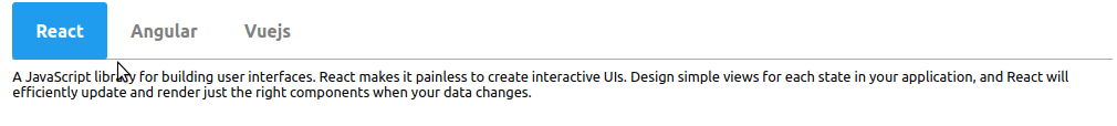
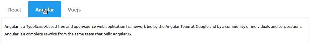
In the above example, we have three tabs, we can easily switch between different tabs. Here is the abstract steps, we are going to use to implement tabs using react-tabs library.
- Create a React project for Tabs example
- Install the react-tabs library in our project.
- Creat separate tabs compone nt to demonstrate our first example.
npx create-react-app tabs-app
cd tabs-app
npm install react-tabs
We have completed the configuration of our tabs project, let’s create and demonstrate our first example of Tabs, we need to import Tab, Tabs, TabList, and TabPanel from the react-tabs library and also need to import its styles from react-tabs.css
In the components/TabsContainer.jsx let add code for tabs example, we have three tabs as we can see from the above example screenshot.
import React from "react";
import { Tab, Tabs, TabList, TabPanel } from "react-tabs";
import "react-tabs/style/react-tabs.css";
import "./TabsContainer.css";

const TabsContainer = () => {
  return (
    <Tabs className="tabs">
      <TabList>
        <Tab className="tab">React</Tab>
        <Tab className="tab">Angular</Tab>
        <Tab className="tab">Vuejs</Tab>
      </TabList>

      <TabPanel>
        <p>
          A JavaScript library for building user interfaces. React makes it
          painless to create interactive UIs. Design simple views for each state
          in your application, and React will efficiently update and render just
          the right components when your data changes.
        </p>
      </TabPanel>
      <TabPanel>
        <p>
          Angular is a TypeScript-based free and open-source web application
          framework led by the Angular Team at Google and by a community of
          individuals and corporations. Angular is a complete rewrite from the
          same team that built AngularJS.
        </p>
      </TabPanel>
      <TabPanel>
        <p>
          Vue.js is an open-source model–view–viewmodel front end JavaScript
          framework for building user interfaces and single-page applications.
          It was created by Evan You, and is maintained by him and the rest of
          the active core team members
        </p>
      </TabPanel>
    </Tabs>
  );
};

export default TabsContainer;
The Tabs is a parent component that can have three child components Tablist, Tab, and TabPanel. The Tablist content Tab heading and TabPanel contain Tab body.
Let now import the TabsContainer component inside our main App.js component,
import TabsContainer from "./components/TabsContainer";
import "./App.css";


function App() {
  return (
    <>
      <TabsContainer />
    </>
  );
}

export default App;
React tabs styling
In our above example, we had applied style on it, as the main Tabs are in the center, and Tab titles are gray, and selected Tabs are background blue and white font color. Let create a TabsContainer.css file inside the components folder and add the following style.
.tabs {
    margin: 20px auto;
    width: 80%;
    padding: 50px;
    border-radius: 4px;
}

.tab {
    margin: 0 0 -1px;
    padding: 20px 25px;
    color: gray;
    font-weight: 700;
    font-size: 20px;
    border-radius: 4px;
    cursor: pointer;
}

.react-tabs__tab--selected {
    background: #209cee;
    color: white !important;
    border: 1px solid #fff;
 }
React Tabs component without library
If you want to create React Tabs, we can easily create React Tabs components without depending on any third-party library. In this example, we create React Tabs component that can be reused anywhere in our Application thus allowing code reusability. The component provides reusability, create once, and reused any number of times anywhere in the application.
Here is our second example of Tabs from our own custom Tabs component.
Let create React Tabs component in the components folder and add the following code in components/Tabs.jsx
import React, { useState } from "react";
import "./Tabs.css";

const Tabs = ({ tabs }) => {
  const [activeIndex, setActiveIndex] = useState(0);

  const onSelectedIndex = (index) => {
    setActiveIndex(index);
  };

  const titles = tabs.map((tab, i) => {
    return (
      <li
        className={`tab${i === activeIndex ? " active" : ""}`}
        key={i}
        onClick={() => onSelectedIndex(i)}
      >
        {tab.title}
      </li>
    );
  });

  const contents = tabs
    .filter((tab, i) => i === activeIndex)
    .map((tab, i) => {
      return (
        <div className="tab-content" key={i}>
          {tab.content}
        </div>
      );
    });

  return (
    <div>
      <div className="tabs">
        <ul className="tab-group">{titles}</ul>
        <div className="tab-content-group">{contents}</div>
      </div>
    </div>
  );
};

export default Tabs;
In the Tabs component we get Tabs data as props from the parent component, we have an activeIndex variable to find which tabs are active and based on its applied style for active Tab. We have three functions that have the following functionalities.
- onSelectedIndex: Function to set the activeIndex from clicking on particular Tab
- titles: To display Tabs titles.
- contents: To display Tabs contents
In our App.js component, we need to import Tabs component in its parent component and pass Tabs data to Tabs component. Let edit the App.js component following code.
import Tabs from "./components/Tabs";
import "./App.css";

const tabsData = [
  {
    title: "React",
    active: true,
    content:
      "A JavaScript library for building user interfaces. React makes it painless to create interactive UIs. Design simple views for each state in your application, and React will efficiently update and render just the right components when your data changes.",
  },
  {
    title: "Angular",
    active: false,
    content:
      "Angular is a TypeScript-based free and open-source web application framework led by the Angular Team at Google and by a community of individuals and corporations. Angular is a complete rewrite from the same team that built AngularJS.",
  },
  {
    title: "Vuejs",
    active: false,
    content:
      "Vue.js is an open-source model–view–viewmodel front end JavaScript framework for building user interfaces and single-page applications. It was created by Evan You, and is maintained by him and the rest of the active core team members",
  },
];

function App() {
  return (
    <>
      <Tabs tabs={tabsData} />
    </>
  );
}

export default App;
In tabsData is an array containing tabs data, we pass tabsData as props.
React tabs styling for our custom Tabs component
For our custom Tabs component we need to apply styles for Tabs, let’s add the Tabs.css file and add the following styles in it.
.tabs {
  margin: 20px auto;
  width: 80%;
  padding: 50px;
  border-radius: 4px;
}

.tab {
  display: inline-block;
  margin: 0 0 -1px;
  padding: 20px 25px;
  text-align: center;
  color: gray;
  font-weight: 700;
  font-size: 20px;
  border: 1px solid transparent;
  border-radius: 4px;
  cursor: pointer;
}

.tab.active {
  border: 4px solid #209cee;
  background-color: #209cee;
  color: white;
  border-bottom: 1px solid #fff;
}

.tab-content {
  padding: 20px 10px;
  border: 1px solid #ddd;
  line-height: 2rem;
}
React Material Tabs example
React material tabs component displays a group of related buttons in a horizontal row. They are mostly used inside the main content and provide a tab of the Material Design UI specifications.
Here is a screenshot of two example of React Material tabs.
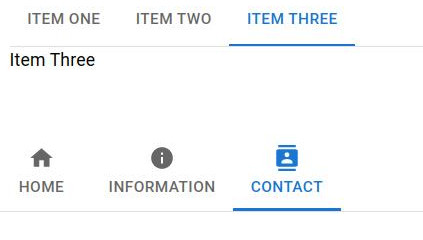
We have two example of React material tabs as follow
- Basic React Material Tabs with jsx
- React Material Tabs with icon
First we need to create React project and install Material UI library, we have complete tutorial on how to install and configure Material UI in React project. Let create two component inside components folder, let first implment components/BasicTabs.jsx
import React, { useState } from "react";
import Box from "@mui/material/Box";
import Tabs from "@mui/material/Tabs";
import Tab from "@mui/material/Tab";
import Typography from "@mui/material/Typography";
import { theme } from "./Theme";

const styles = {
  tabContent: {
    padding: theme.spacing.unit * 2,
  },
};

const BasicTabs = () => {
  const [value, setValue] = useState(0);

  const onChange = (e, value) => {
    setValue(value);
  };

  return (
    <Box sx={{ width: "90%", margin: 2 }}>
      <Box sx={{ borderBottom: 1, borderColor: "divider" }}>
        <Tabs value={value} onChange={onChange}>
          <Tab label="Item One" />
          <Tab label="Item Two" />
          <Tab label="Item Three" />
        </Tabs>

      </Box>
      {value === 0 && (
        <Typography component="div" sx={styles.tabContent}>
          Item One
        </Typography>
      )}
      {value === 1 && (
        <Typography component="div" sx={styles.tabContent}>
          Item Two
        </Typography>
      )}
      {value === 2 && (
        <Typography component="div" sx={styles.tabContent}>
          Item Three
        </Typography>
      )}
    </Box>
  );
};

export default BasicTabs;
We import MUI components like Tabs, Box and Typograph components. We also import the theme, where it has Material design configuration, let add code for components/theme.js file as.
import { createTheme } from '@mui/material/styles';

export const theme = createTheme({
  mixins: {
    toolbar: {
      minHeight: 60,
    },
  },
});
Let implement React Material tabs with icon in components/TabsIcon.jsx
import React, { useState } from 'react';
import Box from '@mui/material/Box';
import Tabs from '@mui/material/Tabs';
import Tab from '@mui/material/Tab';
import HomeIcon from '@mui/icons-material/Home';
import InfoIcon from '@mui/icons-material/Info';
import ContactsIcon from '@mui/icons-material/Contacts';

const tabsData = [
  {
    active: true,
    label: 'Home',
    content: 'Home Content',
    icon: <HomeIcon />,
  },
  {
    active: false,
    label: 'Information',
    content: 'Information Content',
    icon: <InfoIcon />,
  },
  {
    active: false,
    label: 'Contact',
    content: 'Contact Content',
    icon: <ContactsIcon />,
  },
];

const TabsIcon = () => {
  const [value, setValue] = useState(0);
  const onChange = (e, value) => {
    setValue(value);
  };

  return (
    <Box sx={{ borderBottom: 1, borderColor: 'divider' }}>
      <Tabs value={value} onChange={onChange}>
        {tabsData
          .filter((tab) => !tab.hidden)
          .map((tab) => (
            <Tab
              key={tab.label}
              disabled={tab.disabled}
              icon={tab.icon}
              label={tab.label}
            />
          ))}
      </Tabs>
    </Box>
  );
};

export default TabsIcon;
MUI Tab components has icon, label, (disabled and hidden,both have boolean value) ,
React Tabs Routing
In the example, we add React Material Tabs with router or navigation and added code to stackblitz.com. When the screen is more than 578px show React navigation using MUI tabs and for the mobile screen show navigation using the Material UI Drawer component. Here is code from stackblitz using MUI Tabs for Rect Tabs Routing.
Conclusion
In this tutorial, we learn Tabs and how to create our own custom Tabs components, we can easily add routing from react-router-dom with tabs. We also learn how to customize its styles. I hope you got some idea if you really like it please share it with others and on social networks, this will boost me to add more content. Follow me on my GitHub collection, I had code on Angular, react and Ionic framework.
Related React Tutorial
- Guide to Using and Creating React material UI grid.
- React material UI App Bar in detail with examples
- How to implement React table and its component?
- When and how to use React Context API?
- React Axios for HTTP method with REST API
- React router navigate outside component.
- How to implement React routing using react-router-dom?