In React, we can use different UI libraries but React Material is one of the best UI component libraries that are made specifically for React. React Materials provide the developer with reusable UI components that help the developer to use ready-made components, fast development, and one best UI design.
In this tutorial, we have three important goals. First, how to install and configure the material library in our React project..The second will demonstrate how to use React material components in our project like material UI Appbar and the third how to implement material UI style to a component.
What is React Material?
Is one of the most preferred and popular UI libraries for React applications. React Material UI started as a React implementation of the Material Design guidelines in 2014. Material Design is a tool for front-end frameworks, which helps you with visual, motion, and interaction design. It also helps to adopt or provide responsive designs to different devices and different screen sizes.
- Every component you need is ready for production.
- Material UI offers a comprehensive suite of UI tools to help you ship new features faster.
- Material design components make our application more consistent, fast, versatile, and responsive
How to configure and install React Material UI?
Installing and configuring material in our React project is straightforward and easy, let’s create a new material project and install the material UI library.
npx create-react-app react-material-ui
cd create-react-app react-material-ui
npm install @mui/material @emotion/react @emotion/styled
Material UI prefers and recommends using Roboto font in mind. So be sure to follow these instructions. We need to add Google Web Fonts and Google font icons in the head section of public/index.html
<link rel="stylesheet"
      href="https://fonts.googleapis.com/css?family=Roboto:300,400,500,700&display=swap"/>
<link rel="stylesheet" href="https://fonts.googleapis.com/icon?family=Material+Icons"/>
An example of a material UI component in React
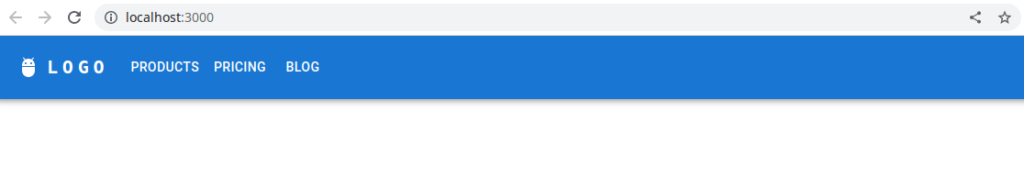
Let’s demonstrate an example of a material UI component, let’s first use the Appbar component from the material UI. Here is a screenshot of our first example material example.
In this example we have used React material icon, we also need to install the material icon library by running the following command.
npm install @mui/icons-materialLet’s create a folder called component inside our project, inside the components folder let’s add a file called Navbar.jsx and add the following code for the Navbar component.
import * as React from 'react';
import AppBar from '@mui/material/AppBar';
import Box from '@mui/material/Box';
import Toolbar from '@mui/material/Toolbar';
import IconButton from '@mui/material/IconButton';
import Typography from '@mui/material/Typography';
import Menu from '@mui/material/Menu';
import MenuIcon from '@mui/icons-material/Menu';
import Container from '@mui/material/Container';
import Button from '@mui/material/Button';
import MenuItem from '@mui/material/MenuItem';
import AdbIcon from '@mui/icons-material/Adb';

const pages = ['Products', 'Pricing', 'Blog'];

const Navbar = () => {
  const [anchorElNav, setAnchorElNav] = React.useState(null);

  const handleOpenNavMenu = (event) => {
    setAnchorElNav(event.currentTarget);
  };

  const handleCloseNavMenu = () => {
    setAnchorElNav(null);
  };

  return (
    <AppBar position="static">
      <Container maxWidth="xl">
        <Toolbar disableGutters>
          <AdbIcon sx={{ display: { xs: 'none', md: 'flex' }, mr: 1 }} />
          <Typography
            variant="h6"
            noWrap
            component="a"
            href="/"
            sx={{
              mr: 2,
              display: { xs: 'none', md: 'flex' },
              fontFamily: 'monospace',
              fontWeight: 700,
              letterSpacing: '.3rem',
              color: 'inherit',
              textDecoration: 'none',
            }}
          >
            LOGO
          </Typography>

          <Box sx={{ flexGrow: 1, display: { xs: 'flex', md: 'none' } }}>
            <IconButton
              size="large"
              aria-label="account of current user"
              aria-controls="menu-appbar"
              aria-haspopup="true"
              onClick={handleOpenNavMenu}
              color="inherit"
            >
              <MenuIcon />
            </IconButton>
            <Menu
              id="menu-appbar"
              anchorEl={anchorElNav}
              anchorOrigin={{
                vertical: 'bottom',
                horizontal: 'left',
              }}
              keepMounted
              transformOrigin={{
                vertical: 'top',
                horizontal: 'left',
              }}
              open={Boolean(anchorElNav)}
              onClose={handleCloseNavMenu}
              sx={{
                display: { xs: 'block', md: 'none' },
              }}
            >
              {pages.map((page) => (
                <MenuItem key={page} onClick={handleCloseNavMenu}>
                  <Typography textAlign="center">{page}</Typography>
                </MenuItem>
              ))}
            </Menu>
          </Box>
          <AdbIcon sx={{ display: { xs: 'flex', md: 'none' }, mr: 1 }} />
          <Typography
            variant="h5"
            noWrap
            component="a"
            href=""
            sx={{
              mr: 2,
              display: { xs: 'flex', md: 'none' },
              flexGrow: 1,
              fontFamily: 'monospace',
              fontWeight: 700,
              letterSpacing: '.3rem',
              color: 'inherit',
              textDecoration: 'none',
            }}
          >
            LOGO
          </Typography>
          <Box sx={{ flexGrow: 1, display: { xs: 'none', md: 'flex' } }}>
            {pages.map((page) => (
              <Button
                key={page}
                onClick={handleCloseNavMenu}
                sx={{ my: 2, color: 'white', display: 'block' }}
              >
                {page}
              </Button>
            ))}
          </Box>
        </Toolbar>
      </Container>
    </AppBar>
  );
};
export default Navbar;
You can check other navbar designs of material Appbar components from official material UI documentation.
Once we have the Navbar component, we can use it inside our App.jsx this component is the main component.
import './App.css';
import Navbar from './components/Navbar';

function App() {
  return (
    <div className="App">
     <Navbar />
    </div>
  );
}

export default App;
Material UI react create theme
Let’s customize React Material UI theme style, in the example below we change the color of primary and secondary which will reflect in all components that used the default primary color on its component. We need to import createTheme, ThemeProvider from @mui/material and customize material primary and secondary colors.
Here is a screenshot of the Material UI react create theme example.
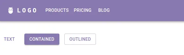
React material createTheme
Here we can see new looks of our previous material project only by changing its primary and secondary colors only. Let customize the primary color using createTheme function and ThemeProvide from the material UI.
import Stack from "@mui/material/Stack";
import Button from "@mui/material/Button";
import Navbar from "./components/Navbar";
import { createTheme, ThemeProvider } from "@mui/material";

function App() {
  const theme = createTheme({
    palette: {
      primary: {
        main: '#8879B0',
      },
      secondary: {
        main: '#FBA1A1',
      },
    },
  });

  return (
    <ThemeProvider theme={theme}>
      <div className="App">
        <Navbar />

        <Stack spacing={2} direction="row" sx={{ marginTop: 5 }}>
          <Button variant="text">Text</Button>
          <Button variant="contained">Contained</Button>
          <Button variant="outlined">Outlined</Button>
        </Stack>
      </div>
    </ThemeProvider>
  );
}

export default App;
Related Articles