In this tutorial, we’ll learn some of the best libraries for Angular grid implementation. There are plenty of libraries to choice and we might get confused about which one to select I will list some of them.
The Angular table and grid seem to same in most cases, both are two dimension layouts containing rows and columns. But Angular grid provides the functionality of page layout without using float and position and creates a responsive page layout.
Angular tables are used to render rows and columns of data and allow users to interact with sorting, filtering, and exporting data and in cell-editing.
We have a few objectives in this tutorial of Grid, three main objectives in this article are.
- Learn different available libraries for implementing Grid in the Angular project.
- Examples of Grid using Bootstrap, Angular UI grid
- Examples of the handsontable and Material grid examples from previous articles.
Some of the best Angular Grid libraries
We’ll learn some of the most popular libraries for the Angular grid. We had a list below, in which you can select a library based on your UI and requirement. We can’t say any library is best among others, each one has its own pro and cons.
| Name | Description |
| Angular material grid | Angular material comes with a grid component for creating a grid layout. If you’re using Material UI, then I guess it is the best choice to use. |
| handsontable | Handsontable is a JavaScript component that combines data grid features with spreadsheet-like UX. It has both community and enterprises. Free for a personal project, weekly download of around 89,757 and 23.4MB |
| angular-ui-grid | A data grid for AngularJS; part of the AngularUI suite. Native AngularJS implementation, no jQuery, and can perform well with large data sets; even 10,000+ rows. It has a weekly 5.01MB download of 49,457 approximately. |
| ag-grid-angular | AG Grid is a fully-featured and highly customizable JavaScript data grid. It has both a pro and a free package. The community package has all features required for the grid. It has 2.26 MB and a weekly download of 99,664 approximately. |
| Telerik KendoUI Grid | One of the real strengths of Kendo UI is the grid component. Kendo UI Core is the only open-source and the Kendo suite is released within a commercial license, |
| ng-bootstrap | The ng-bootstrap doesn’t have a dedicated grid component, we can use Bootstrap’s grid system, which uses a series of containers, rows, and columns to layout and align content. It’s built with a flexbox and is fully responsive. |
Setup and configure Angular Grid example project
Let’s first create our Angular grid project and before starting an angular project you need to install Nodejs and Angular CLI in your system. We’ll demonstrate an Angular grid example using the ag-grid-angular library.
ng new gridApp
cd gridApp
npm i --save ag-grid-community ag-grid-angular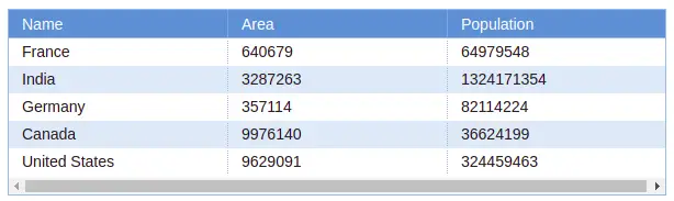
To use ag grid angular, we need to import AgGridModule in our application in the app.module.ts file.
import { NgModule } from '@angular/core';
import { BrowserModule } from '@angular/platform-browser';
import { AppRoutingModule } from './app-routing.module';
import { AppComponent } from './app.component';
import { AgGridModule } from 'ag-grid-angular';

@NgModule({
  declarations: [
    AppComponent
  ],
  imports: [
    BrowserModule,
    AgGridModule,
    AppRoutingModule
  ],
  providers: [],
  bootstrap: [AppComponent]
})
export class AppModule { }
The ag-grid Angular library provides a lot of theme options to select, to use a particular theme we need to import in style.scss In our example we use ag-theme-blue themes for this example and you can select a theme of your choice.
@import "~ag-grid-community/dist/styles/ag-grid.scss";
@import "~ag-grid-community/dist/styles/ag-theme-blue.css";
// @import "~ag-grid-community/dist/styles/ag-theme-material.css";
// @import "~ag-grid-community/dist/styles/ag-theme-bootstrap.css";
When we open node_modules of ag-grid-community we can have these option themes available to choose.
Ag grid angular example
We have completed the configuration of ag grid angular project. Let’s demonstrate an example of it by editing the app component typescript or template file.
import { Component } from '@angular/core';

@Component({
  selector: 'app-root',
  templateUrl: './app.component.html',
  styleUrls: ['./app.component.scss']
})
export class AppComponent {
  columnDefs = [
    { headerName: 'Name', field: 'name' },
    { headerName: 'Area', field: 'area' },
    { headerName: 'Population', field: 'population' }
  ];

  countries = [
    {
      name: "France",
      area: 640679,
      population: 64979548,
    },
    {
      name: "India",
      area: 3287263,
      "population": 1324171354,
    },
    {
      name: "Germany",
      area: 357114,
      population: 82114224,
    },
    {
      name: 'Canada',
      area: 9976140,
      population: 36624199
    },
    {
      name: 'United States',
      area: 9629091,
      population: 324459463
    },
  ];
}
<ag-grid-angular style="width: 55%; height: 170px;" class="ag-theme-blue"
[rowData]="countries" [columnDefs]="columnDefs">
</ag-grid-angular>In the ag-grid-angular component, we need to add the theme name in the class of this component.
Angular Bootstrap Grid Example
The ng-bootstrap doesn’t have a grid component built for Angular. But we can use the Bootstrap grid system using rows and cols class, providing full responsiveness based on device type. This is a mobile-first flexbox grid to build layouts of all shapes and sizes thanks to a twelve-column system, five default responsive tiers, Sass variables and mixins, and dozens of predefined classes.
Let’s first create an Angular project and install Bootstrap in our project to implement the Angular Bootstrap Grid example.
ng new bootstrap-grid-app
cd bootstrap-grid-app
ng add @ng-bootstrap/ng-bootstrap
The above example is responsive, we can control how much width to allocate to each column and we can control what column to display or not based on device size. In our example, we are hiding the description column small and below it.
On the small screen, we have allocated all fields with 3 column width. In the middle and larger screen, we have 2 columns for all fields except the description we allocated 4 column width.
Let’s edit the app.component.ts file to add our countries array object.
import { Component } from '@angular/core';

@Component({
  selector: 'app-root',
  templateUrl: './app.component.html',
  styleUrls: ['./app.component.scss'],
})
export class AppComponent {
  countries: any = [
    {
      name: 'France',
      flag: 'c/c3/Flag_of_France.svg',
      area: 640679,
      population: 64979548,
      description:
        "France, the largest country in Western Europe, has long been a gateway between the continent's northern and southern regions.",
    },
    {
      name: 'India',
      flag: '4/41/Flag_of_India.svg',
      area: 3287263,
      population: 1324171354,
      description:
        'India (Hindi: Bhārat), officially the Republic of India (Hindi: Bhārat Gaṇarājya) is a country in South Asia.',
    },
    {
      name: 'Germany',
      flag: 'b/ba/Flag_of_Germany.svg',
      area: 357114,
      population: 82114224,
      description:
        'Germany is a country located in the heart of Western Europe.',
    },
  ];
}
In the app.component.html template let’s add a Bootstrap grid system using rows and columns.
<section>
  <div class="row grid-title">
    <div class="col-3 col-md-2">Flag</div>
    <div class="col-3 col-md-2">Country</div>
    <div class="col-3 col-md-2">Area</div>
    <div class="col-3 col-md-2">Population</div>
    <div class="col-md-4 d-sm-none d-md-block d-sm-block">Description</div>
  </div>
  <div class="row grid-row"  *ngFor="let country of countries">
   <div class="col-3 col-md-2">
     <img [src]="'https://upload.wikimedia.org/wikipedia/commons/'+country.flag"
      style="width: 20px">
   </div>
   <div class="col-3 col-md-2">{{ country.name }}</div>
   <div class="col-3 col-md-2">{{ country.area }}</div>
   <div class="col-3 col-md-2">{{ country.population }}</div>
   <div class="col-3 col-md-4 d-none d-md-block">{{ country.description }}</div>
 </div>
</section>
We have also applied style for our bootstrap row, let’s add style for it.
div.grid-title {
    background-color: blue;
    color: white;
}

div.grid-row {
    background-color:ivory;
    border-bottom: 1px solid blue;
}
How Bootstrap grid system work?
We can use container, row, and col classes to control how many columns are shown on different devices. To make the grid responsive, there are five grid breakpoints for different device sizes.
- container: The container class act as a wrapper for the grid system. Containers provide a means to center and horizontally pad grid contents.
- row: The rows class are wrappers for columns. Each column has horizontal
padding(called a gutter) for controlling the space between them. We can create a new row in bootstrap using the row class name. - col: Content is placed inside the column, Bootstrap has 12 columns.
To make the grid responsive, there are five grid breakpoints or tiers, one for each range of devices it support. We can use the Bootstrap tier to provide responsive breakpoints. Each tier starts at a minimum viewport size and is above size. An example col-sm-4 means allocate four columns for all devices having a width larger than 576px, even medium, large and extra large also have 4 columns. The five Grid tiers are
- col-xs: The xs stand for extra small, this includes all mobile devices, and the device has a maximum width of 576px. We can use col-xs-(1-12) to allocate columns for mobile from 1 to 12.
- col-sm: The sm stands for small devices like landscape mobile, the device having a width from > 576px and <= 768px.
- col-md: The md stands for medium device like tablet, the device having a width from > 768px and <=960px
- col-lg: The lg stands for a large device like a landscape tablet and small laptops, the device having a width from > 960px and <= 1140px
- col-xl: The xl stands for an extra large device like a laptop or desktop, the device having a width from > 1140px
Let know demonstrate a second Angular Bootstrap Grid to allocate different columns for different rows, here is a screenshot of our second example.

In the first row, we have two columns for devices having sizes larger than 576px and one column having mobile devices. Here is our example code.
<div class="container">
  <div class="row grid-row">
    <div class="col-sm-6">2 cols > 576px. 1 col < 576px</div>
    <div class="col-sm-6">2 cols > 576px. 1 col < 576px</div>
  </div>
  <div class="row grid-row">
    <div class="col-sm">3 cols > 576px. 1 col < 576px</div>
    <div class="col-sm">3 cols > 576px. 1 col < 576px</div>
    <div class="col-sm">3 cols > 576px. 1 col < 576px</div>
  </div>
  <div class="row grid-row">
    <div class="col-sm-6">6 cols > 576px. 1 col < 576px</div>
    <div class="col-sm-3">3 cols > 576px. 1 col < 576px</div>
    <div class="col-sm-3">3 cols > 576px. 1 col < 576px</div>
  </div>
</div>
I uploaded the Angular Bootstrap Grid example on Stackblitz.com
We have articles on how to add an Angular grid using an Angular material grid with an example.
Handsontable Grid example
Handsontable is a JavaScript component that combines data grid features with spreadsheet-like UX.
It provides
- Data binding
- Data validation
- Filtering
- Sorting
- CRUD operations.
Here is an official example of Angular Grid using the Handsontable library.
Conclusion
We have completed our Angular grid with examples, there are plenty of libraries to choose from to create a grid in the angular project. Based on your need and UI, select the Angular grid system. I hope you had learned something, if so then please share it with others and on social networks, this will encourage me to add more content. Follow me on my GitHub collection, I had code on Angular, react, and Ionic framework.
Related Articles
- How to implement Angular material grid .?
- How to implement an Angular bootstrap table with pagination and filter?
- How to implement an Angular search filter in Angular?
- How to calculate base64 image size in Angular
- How to install Angular material
- How to implement CKEditor in Angular
- How to use to implement HighCharts Angular