React Material UI App bar component allows us to create a header, logo, title, and navigation at top of our React Application. In this article, we’ll explore how to use the Material UI App Bar component and we’ll demonstrate a few examples of how to use it. lists. What we are learning.
In this tutorial we have three objects, First, learn how to add navigation, second add a media query to hide in navigation on a small screen, and third how to style the Material UI App Bar component. Let’s get started.
Introduction to React Material UI App Bar component
Materials UI library is one of the most popular and provides the developer with reusable UI components that help the developer to use ready-made components, fast development, and one best UI designs. The App Bar component is mostly used in our application heading to display navigation, logo, action, and search related to the current screen.
App Bar component has different props like position and by adding position=’fixed’ make App Bar component at a fixed position at the top, even we scroll, the position of App Bar remain same.
Let’s first create React material project, install and configure the material UI and icon library,
npx create-react-app material-app-bar
cd material-app-bar
npm install @mui/material @emotion/react @emotion/styled
Material UI prefers and recommends using Roboto font in mind. So be sure to follow these instructions. We need to add Google Web Fonts and Google font icons in the head section of public/index.html
<link rel="stylesheet"
      href="https://fonts.googleapis.com/css?family=Roboto:300,400,500,700&display=swap"/>
<link rel="stylesheet" href="https://fonts.googleapis.com/icon?family=Material+Icons"/>
React Material UI Appbar Example
Let’s demonstrate the first example of the Material App Bar example, here is a screenshot of our basic example.
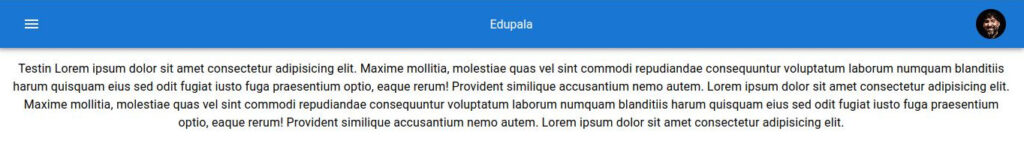
Here is an example of an App Bar component we have used material icons, Typography, Avatar, and other material components. Let’s create a component called Navbar.jsx and add the following code for our Basic Material App Bar example.
import React from 'react';
import AppBar from '@mui/material/AppBar';
import Box from '@mui/material/Box';
import Toolbar from '@mui/material/Toolbar';
import Typography from '@mui/material/Typography';
import IconButton from '@mui/material/IconButton';
import MenuIcon from '@mui/icons-material/Menu';
import Avatar from '@mui/material/Avatar';

const styles = {
  flex: {
    flex: 1,
  },
};

const Navbar = () => {
  return (
    <>
      <Box sx={styles.flex}>
        <AppBar position='sticky' disablegutters='true'>
          <Toolbar>
            <IconButton color='inherit' aria-label='Menu'>
              <MenuIcon />
            </IconButton>
            <Typography variant='title' color='inherit' sx={styles.flex}>
              Edupala
            </Typography>
            <Avatar
              sx={{ width: 40, height: 40 }}
              alt='edupala profile'
              src='https://miro.medium.com/max/1400/0*0fClPmIScV5pTLoE.jpg'
            />
          </Toolbar>
        </AppBar>
      </Box>
      <Typography m={2} spacing={2}>
        Testin Lorem ipsum dolor sit amet consectetur adipisicing elit. Maxim mollitia, molestiae quas vel sint commodi repudiandae consequuntur  voluptatum laborum numquam blanditiis harum quisquam eius sed odit fugiat iusto fuga praesentium optio, eaque rerum! Provident similique accusantium nemo autem.
      </Typography>
    </>
  );
};

export default Navbar;
In this example, we have used position props attribute value as sticky, and fixed is the default value. Material UI Appbar position props can have the following value.
- Fixed by default
- Sticky
- Static
AppBar props position with Fixed issues
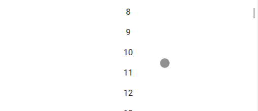
Using the AppBar component with props position fixed will make our AppBar fixed position and even if we scroll content down but AppBar will always be visible. But there is one issue, as position fixed has a higher z-index than regular content, this makes some of our top content below the AppBar will be hidden below it, and here is an example of it.

We can see that some of the content below is hidden under the Appbar component when we used the position as fixed. We can fix this problem in many different ways.
- Changing the AppBar component props position fixed to sticky as we used before.
- Second, add some top margin to our content next to the AppBar component.
We already fixed using position sticky in the first example and now let’s solved the position fixed hide issues using the Material UI Box component with some margin at the top.
....
import Box from "@mui/material/Box";

const Navbar = () => {
  return (
    <>
      <Box sx={styles.flex}>
        <AppBar position="fixed" disablegutters="true">
          <Toolbar>
              // Some content
          </Toolbar>
        </AppBar>
      </Box>
      <Box sx={(theme) => theme.mixins.toolbar} />
      <Typography m={2} spacing={2}>
        Testin Lorem ipsum dolor sit amet consectetur adipisicing elit .....

      </Typography>
    </>
  );
};

export default Navbar;
We have used Box and assigned it with mixins with toolbar from the default theme, thus it adds default style.
React Material UI AppBar color
Like any other Material UI component, we can easily change the Material UI AppBar color, in the previous example, the blue color is the primary and default color. Let’s add different colors using Material color, let’s add secondary color for AppBar component, and here is a screenshot of it.

...
<Box sx={styles.flex}>
        <AppBar color="secondary" position="fixed" disablegutters="true">
          <Toolbar>
              .....
         <Toolbar>
     </AppBar>
</Box>
Let’s add custom colors from the Material color, and change the color to orange.

import orange from "@mui/material/colors/orange";

...
const styles = {
  customColor: {
    backgroundColor: orange[500],
  },
};

const Navbar = () => {
  return (
    <>
      <Box sx={styles.flex}>
        <AppBar sx={styles.customColor} position="fixed" disablegutters="true">
          <Toolbar>
          // some code
          </Toolbar>
        </AppBar>
      </Box>
    </>
  );
};
React Material UI App bar Hide on scroll
Sometimes our application, wants the App Bar component to hide while scrolling vertically down, thus providing more space for content. With Material UI, we can easily hide in the Material UI library, while users scroll down we should listen to the scroll event of the browser window object.
Let’s create a new component Navbar2, in this component we listen to the scroll bar event and hide the AppBar component while scrolling, and here is our example screenshot.
import * as React from "react";
import PropTypes from "prop-types";
import AppBar from "@mui/material/AppBar";
import Avatar from "@mui/material/Avatar";
import Box from "@mui/material/Box";
import Container from "@mui/material/Container";
import CssBaseline from "@mui/material/CssBaseline";
import IconButton from "@mui/material/IconButton";
import MenuIcon from "@mui/icons-material/Menu";
import useScrollTrigger from "@mui/material/useScrollTrigger";
import Slide from "@mui/material/Slide";
import Toolbar from "@mui/material/Toolbar";
import Typography from "@mui/material/Typography";

function HideOnScroll(props) {
  const { children, window } = props;
  const trigger = useScrollTrigger({
    target: window ? window() : undefined,
  });

  return (
    <Slide appear={false} direction="down" in={!trigger}>
      {children}
    </Slide>
  );
}

HideOnScroll.propTypes = {
  children: PropTypes.element.isRequired,
  window: PropTypes.func,
};

const Navbar2 = (props) => {
  return (
    <React.Fragment>
      <CssBaseline />
      <HideOnScroll {...props}>
        <AppBar>
          <Toolbar>
            <IconButton color="inherit" aria-label="Menu">
              <MenuIcon />
            </IconButton>
            <Typography variant="title" color="inherit" sx={{ flexGrow: 1 }}>
              Edupala
            </Typography>
            <Avatar
              sx={{ width: 40, height: 40 }}
              alt="edupala profile"
              src="https://miro.medium.com/max/1400/0*0fClPmIScV5pTLoE.jpg"
            />
          </Toolbar>
        </AppBar>
      </HideOnScroll>
      <Toolbar />
      <Container>
        <Box sx={{ my: 2 }}>
          <div>
            {new Array(400).fill(null).map((v, i) => (
              <p key={i}>{i}</p>
            ))}
          </div>
        </Box>
      </Container>
    </React.Fragment>
  );
};

export default Navbar2;
We wrapped a custom component HideOnScroll, in this component we listen to window scrolling events, whenever scrolling happens we slide the AppBar component down using the Slide component. Our code is the same as before except we add a hide scrolling wrapper component on the AppBar component.
Material UI Navbar Or Material UI Navigation
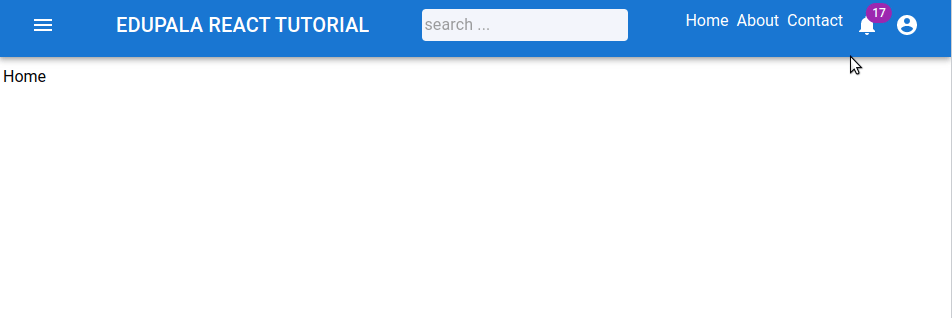
Material UI doesn’t have a Navbar component, we can use the AppBar component and add navigation to it. Let’s create a Material UI navbar example. In this example let’s create a pages folder and add three pages, Home, About, and Contact here is the screenshot of our Material UI Navigation example.
Step for adding React UI Navigation
We need to install the react-router-dom library and also need some pages. Here is a step we need to use to make Material UI Navigation.
- Let’s create a project and install Material UI and Icon libraries
- We also need react-router-dom and install it.
- Create a pages folder and add all pages, in our case Home, About, and Contact
- Create theme.jsx where we add Material theme configuration and styling.
- Custom NavBar component to Have Responsive Navigation.
npm i react-router-domCreating Pages is easy and adds some dummy data, in our App.js file we add Router configuration and import the Navbar component for Navigation.
import { BrowserRouter as Router, Routes, Route } from "react-router-dom";
import Navbar from "./components/Navbar";
import Home from "./pages/Home";
import About from "./pages/About";
import Contact from "./pages/Contact";

function App() {
  return (
    <Router>
      <Navbar />
      <Routes>
        <Route exact path="/" element={<Home />} />
        <Route path="/about" element={<About />} />
        <Route path="/contact" element={<Contact />} />
      </Routes>
    </Router>
  );
}

export default App;
In components/theme.js let’s add Material UI style configuration
import { createTheme } from "@mui/material/styles";

const white = "#ffffff";

export const theme = createTheme({
     ...
    palette: {
        common: {
            white: `${white}`
        }
      },
});
I tried to create Navigation using Material UI Tabs and the Tab component is working perfectly but assigning colors other than primary and second on textColor of shows a warning, as I was trying to add white color from theme.js. If you have some idea how to add custom color on Material Tab, please to me know in the comments. We use the Link component from React-router-dom and add our own style to it.
Add code for Material UI Navigation, we have used different Material components, I highlighted all code needed for Navigation and others are for styling and popup menu.
import React, { useState } from "react";
import AppBar from "@mui/material/AppBar";
import Button from "@mui/material/Button";
import Toolbar from "@mui/material/Toolbar";
import IconButton from "@mui/material/IconButton";
import Typography from "@mui/material/Typography";
import InputBase from "@mui/material/InputBase";
import Badge from "@mui/material/Badge";
import MenuItem from "@mui/material/MenuItem";
import Menu from "@mui/material/Menu";
import MenuIcon from "@mui/icons-material/Menu";
import AccountCircle from "@mui/icons-material/AccountCircle";
import MailIcon from "@mui/icons-material/Mail";
import NotificationsIcon from "@mui/icons-material/Notifications";
import MoreIcon from "@mui/icons-material/MoreVert";
import { styled } from "@mui/material";
import { theme } from "./Theme";
import { Box } from "@mui/material";
import { Link } from "react-router-dom";

const Search = styled("div")(({ theme }) => ({
  backgroundColor: "#f3f5fb",
  padding: "0 2px",
  borderRadius: theme.shape.borderRadius,
  width: "100%",
  position: "relative",
  "&:hover": {
    backgroundColor: theme.palette.common.blue,
  },
  [theme.breakpoints.up("sm")]: {
    marginLeft: theme.spacing.unit * 3,
    width: "auto",
  },
}));

const styles = {
  root: {
    width: "100%",
    marginBottom: "10px",
  },
  title: {
    display: "none",
    [theme.breakpoints.up("sm")]: {
      display: "block",
    },
  },
  tabContainer: {
    marginLeft: "auto",
  },
  destopContainer: {
    display: "none",
    [theme.breakpoints.up("md")]: {
      display: "flex",
    },
  },
  mobileContainer: {
    display: "flex",
    [theme.breakpoints.up("md")]: {
      display: "none",
    },
  },
};

const pages = [
  { name: "Home", url: "/" },
  { name: "About", url: "/about" },
  { name: "Contact", url: "/contact" },
];

const Navbar = () => {
  const [anchorEl, setAnchorEl] = useState(null);
  const [mobileMoreAnchorEl, setMobileMoreAnchorEl] = useState(null);

  const isMenuOpen = Boolean(anchorEl);
  const isMobileMenuOpen = Boolean(mobileMoreAnchorEl);

  const handleProfileMenuOpen = (event) => {
    setAnchorEl(event.currentTarget);
  };

  const handleMenuClose = () => {
    setAnchorEl(null);
    handleMobileMenuClose();
  };

  const handleMobileMenuOpen = (event) => {
    setMobileMoreAnchorEl(event.currentTarget);
  };

  const handleMobileMenuClose = () => {
    setMobileMoreAnchorEl(null);
  };

  const renderMenu = () => {
    return (
      <Menu
        anchorEl={anchorEl}
        anchorOrigin={{ vertical: "top", horizontal: "right" }}
        transformOrigin={{ vertical: "top", horizontal: "right" }}
        open={isMenuOpen}
        onClose={handleMenuClose}
      >
        <MenuItem onClick={handleMenuClose}>Profile</MenuItem>
        <MenuItem onClick={handleMenuClose}>My account</MenuItem>
      </Menu>
    );
  };

  const renderMobileMenu = () => {
    return (
      <Menu
        anchorEl={mobileMoreAnchorEl}
        anchorOrigin={{ vertical: "top", horizontal: "right" }}
        transformOrigin={{ vertical: "top", horizontal: "right" }}
        open={isMobileMenuOpen}
        onClose={handleMobileMenuClose}
      >
        <MenuItem>
          <IconButton color="inherit">
            <Badge badgeContent={4} color="secondary">
              <MailIcon />
            </Badge>
          </IconButton>
          <p>Messages</p>
        </MenuItem>
        <MenuItem>
          <IconButton color="inherit">
            <Badge badgeContent={11} color="secondary">
              <NotificationsIcon />
            </Badge>
          </IconButton>
          <p>Notifications</p>
        </MenuItem>
        <MenuItem onClick={handleProfileMenuOpen}>
          <IconButton color="inherit">
            <AccountCircle />
          </IconButton>
          <p>Profile</p>
        </MenuItem>
      </Menu>
    );
  };

  return (
    <Box sx={styles.root}>
      <AppBar position="static">
        <Toolbar sx={{ display: "flex", justifyContent: "space-between" }}>
          <IconButton color="inherit" aria-label="Open drawer">
            <MenuIcon />
          </IconButton>
          <Typography sx={styles.title} variant="h6" color="inherit" noWrap>
            EDUPALA REACT TUTORIAL
          </Typography>
          <Search>
            <InputBase placeholder="search ..." />
          </Search>

          <Box sx={styles.destopContainer}>
            {pages.map((page, index) => (
              <Link
                key={index}
                to={page.url}
                style={{
                  padding: "6px 4px",
                  color: "white",
                  textDecoration: "none",
                }}
              >
                {page.name}
              </Link>
            ))}

            <IconButton color="inherit">
              <Badge badgeContent={17} color="secondary">
                <NotificationsIcon />
              </Badge>
            </IconButton>
            <IconButton
              aria-owns={isMenuOpen ? "material-appbar" : undefined}
              aria-haspopup="true"
              onClick={handleProfileMenuOpen}
              color="inherit"
            >
              <AccountCircle />
            </IconButton>
          </Box>
          <Box sx={styles.mobileContainer}>
            <IconButton
              aria-haspopup="true"
              onClick={handleMobileMenuOpen}
              color="inherit"
            >
              <MoreIcon />
            </IconButton>
          </Box>
        </Toolbar>
      </AppBar>
      {renderMenu()}
      {renderMobileMenu()}
    </Box>
  );
};

export default Navbar;
Our navigation contains Menu, title, searchBar, and Navigation.
I had added React Material MUI responsive menu in stackblitz.com
Conclusion
In this tutorial, we learn the Material AppBar component, in detail and how to add different components for Logo, Avatar, action, and navigation on it. We also learn how to customize its styles. I hope you got some idea if you really like it please share it with others and on social networks, this will boost me to add more content.
Related React Tutorial