In this tutorial, we’ll learn React table, will demonstrate a few examples of tables using material table components, and examples using Bootstrap UI library. Tables elements allow web designers and developers to arrange data into rows and columns or two-dimensional with rows and columns of cells.
We have three objectives behind this tutorial, first will learn how to implement a table using React material table component, and second, implement the table using React table library. We’ll look at how used different material table components for pagination. Let’s get started.
How to create React table?
Creating a table from scratch is time-consuming and a headache for most developers. There are plenty of activities we need to implement in the Table like sorting, searching, and UI responsiveness. Luckily in React, there are plenty of libraries to implement the table, we can have the following options based on your UI library and requirement.
- Native HTML is hard you have added code for sorting, fiCSS style for responsive of Table.
- React Table library is a Lightweight and extensible data table for React.
- React material table component
- Bootstrap table component
- react-data-grid
React Material table
Let’s first demonstrate the table using React material library. React material table component provides Material Design styled table and we can use these components and attributes to display rows of data. We can easily use it, the material table also provides extra functionalities like search filter, pagination, sort, and expandable row, which are not available on the native HTML table elements.
Setting up and configuring React Material Table
Let’s first create React material table project and install the Material library.
npx create-react-app material-table-app
cd material-table-app
npm install @mui/material @emotion/react @emotion/styled
Check our previous tutorial on how to configure and install React Material in React?
React material table basic
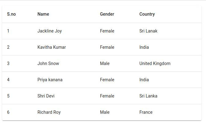
Let’s demonstrate an example of a React material table and its child components. Here is a screenshot of our first React table example.
Let’s edit the app.js to add the following code to demonstrate the React table example.
import { useState } from 'react';
import Table from '@mui/material/Table';
import TableBody from '@mui/material/TableBody';
import TableCell from '@mui/material/TableCell';
import TableHead from '@mui/material/TableHead';
import TableRow from '@mui/material/TableRow';
import Paper from '@mui/material/Paper';
import './App.css';

function App() {
  const [employees, setEmployees] = useState([
    {
      name: 'Jackline Joy',
      gender: 'Female',
      country: 'Sri Lanak',
    },
    {
      name: 'Kavitha Kumar',
      gender: 'Female',
      country: 'India',
    },
    {
      name: 'John Snow',
      gender: 'Male',
      country: 'United Kingdom',
    },
    {
      name: 'Priya kanana',
      gender: 'Female',
      country: 'India',
    },
    {
      name: 'Shri Devi',
      gender: 'Female',
      country: 'Sri Lanka',
    },
    {
      name: 'Richard Roy',
      gender: 'Male',
      country: 'France',
    },
  ]);
  return (
    <Paper sx={{ maxWidth: 650, m: 2 }}>
      <Table>
        <TableHead>
          <TableRow>
            <TableCell>S.no</TableCell>
            <TableCell>Name</TableCell>
            <TableCell>Gender</TableCell>
            <TableCell>Country</TableCell>
          </TableRow>
        </TableHead>
        <TableBody>
          {employees.map((employee, index) => {
            return (
              <TableRow key={index}>
                <TableCell component='th' scope='row'>
                  {index + 1}
                </TableCell>
                <TableCell>{employee.name}</TableCell>
                <TableCell>{employee.gender}</TableCell>
                <TableCell>{employee.country}</TableCell>
              </TableRow>
            );
          })}
        </TableBody>
      </Table>
    </Paper>
  );
}

export default App;
The data can fetch from the server, in our case an employee is an array containing the list of employee names, gender, and country. We have used the following React material component for the table.
| Component | Description |
| Table | The table component is the root component that has two children TableHead and TableBody components. |
| TableHead | The TableHead component is heading for the table has a TableRow component with several child TableCell components. |
| TableBody | The TableBody component is heading for the table has TableRow component with several child TableCell components. |
| TableRow | Component to display row and it has several TableCell child components. |
| TableCell | Component to display information in the column. |
React material table with pagination
Let’s demonstrate a second React material table with pagination, here is a screen of it.
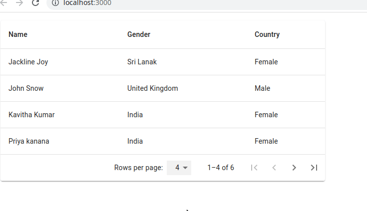
To add pagination we need to import TablePagination from React material, in our example, we can have 4 options to select a number of rows per page. Let’s create a new component called CustomPaginationActionsTable.jsx inside component pages and add following code.
import { useState } from 'react';
import PropTypes from 'prop-types';
import { useTheme } from '@mui/material/styles';
import Box from '@mui/material/Box';
import Table from '@mui/material/Table';
import TableHead from '@mui/material/TableHead';
import TableBody from '@mui/material/TableBody';
import TableCell from '@mui/material/TableCell';
import TableContainer from '@mui/material/TableContainer';
import TableFooter from '@mui/material/TableFooter';
import TablePagination from '@mui/material/TablePagination';
import TableRow from '@mui/material/TableRow';
import Paper from '@mui/material/Paper';
import IconButton from '@mui/material/IconButton';
import FirstPageIcon from '@mui/icons-material/FirstPage';
import KeyboardArrowLeft from '@mui/icons-material/KeyboardArrowLeft';
import KeyboardArrowRight from '@mui/icons-material/KeyboardArrowRight';
import LastPageIcon from '@mui/icons-material/LastPage';

function TablePaginationActions(props) {
  const theme = useTheme();
  const { count, page, rowsPerPage, onPageChange } = props;

  const handleFirstPageButtonClick = (event) => {
    onPageChange(event, 0);
  };

  const handleBackButtonClick = (event) => {
    onPageChange(event, page - 1);
  };

  const handleNextButtonClick = (event) => {
    onPageChange(event, page + 1);
  };

  const handleLastPageButtonClick = (event) => {
    onPageChange(event, Math.max(0, Math.ceil(count / rowsPerPage) - 1));
  };

  return (
    <Box sx={{ flexShrink: 0, ml: 2.5 }}>
      <IconButton
        onClick={handleFirstPageButtonClick}
        disabled={page === 0}
        aria-label='first page'
      >
        {theme.direction === 'rtl' ? <LastPageIcon /> : <FirstPageIcon />}
      </IconButton>
      <IconButton
        onClick={handleBackButtonClick}
        disabled={page === 0}
        aria-label='previous page'
      >
        {theme.direction === 'rtl' ? (
          <KeyboardArrowRight />
        ) : (
          <KeyboardArrowLeft />
        )}
      </IconButton>
      <IconButton
        onClick={handleNextButtonClick}
        disabled={page >= Math.ceil(count / rowsPerPage) - 1}
        aria-label='next page'
      >
        {theme.direction === 'rtl' ? (
          <KeyboardArrowLeft />
        ) : (
          <KeyboardArrowRight />
        )}
      </IconButton>
      <IconButton
        onClick={handleLastPageButtonClick}
        disabled={page >= Math.ceil(count / rowsPerPage) - 1}
        aria-label='last page'
      >
        {theme.direction === 'rtl' ? <FirstPageIcon /> : <LastPageIcon />}
      </IconButton>
    </Box>
  );
}

TablePaginationActions.propTypes = {
  count: PropTypes.number.isRequired,
  onPageChange: PropTypes.func.isRequired,
  page: PropTypes.number.isRequired,
  rowsPerPage: PropTypes.number.isRequired,
};

const employees = [
  {
    name: 'Jackline Joy',
    gender: 'Female',
    country: 'Sri Lanak',
  },
  {
    name: 'Kavitha Kumar',
    gender: 'Female',
    country: 'India',
  },
  {
    name: 'John Snow',
    gender: 'Male',
    country: 'United Kingdom',
  },
  {
    name: 'Priya kanana',
    gender: 'Female',
    country: 'India',
  },
  {
    name: 'Shri Devi',
    gender: 'Female',
    country: 'Sri Lanka',
  },
  {
    name: 'Richard Roy',
    gender: 'Male',
    country: 'France',
  },
].sort((a, b) => (a.name < b.name ? -1 : 1));

export default function CustomPaginationActionsTable() {
  const [page, setPage] = useState(0);
  const [rowsPerPage, setRowsPerPage] = useState(5);

  const emptyRows =
    page > 0 ? Math.max(0, (1 + page) * rowsPerPage - employees.length) : 0;

  const handleChangePage = (event, newPage) => {
    setPage(newPage);
  };

  const handleChangeRowsPerPage = (event) => {
    setRowsPerPage(parseInt(event.target.value, 10));
    setPage(0);
  };

  return (
    <TableContainer component={Paper} sx={{ maxWidth: 650, m: 2 }}>
      <Table sx={{ minWidth: 500 }} aria-label='custom pagination table'>
        <TableHead>
          <TableRow>
            <TableCell>Name</TableCell>
            <TableCell>Gender</TableCell>
            <TableCell>Country</TableCell>
          </TableRow>
        </TableHead>
        <TableBody>
          {(rowsPerPage > 0
            ? employees.slice(
                page * rowsPerPage,
                page * rowsPerPage + rowsPerPage
              )
            : employees
          ).map((employee) => (
            <TableRow key={employee.name}>
              <TableCell component='th' scope='row'>
                {employee.name}
              </TableCell>
              <TableCell>{employee.country}</TableCell>
              <TableCell>{employee.gender}</TableCell>
            </TableRow>
          ))}

          {emptyRows > 0 && (
            <TableRow style={{ height: 53 * emptyRows }}>
              <TableCell colSpan={6} />
            </TableRow>
          )}
        </TableBody>
        <TableFooter>
          <TableRow>
            <TablePagination
              rowsPerPageOptions={[2, 4, 5, { label: 'All', value: -1 }]}
              colSpan={3}
              count={employees.length}
              rowsPerPage={rowsPerPage}
              page={page}
              SelectProps={{
                inputProps: {
                  'aria-label': 'rows per page',
                },
                native: true,
              }}
              onPageChange={handleChangePage}
              onRowsPerPageChange={handleChangeRowsPerPage}
              ActionsComponent={TablePaginationActions}
            />
          </TableRow>
        </TableFooter>
      </Table>
    </TableContainer>
  );
}
In the TablePaginationActions function or component, we add all buttons and pagination events.
React Table components
In our second example, we’ll create React table component, Components bring reusability. Once we have created a component, we can use it any number of times. This allows code reusability and reduces duplicate code.
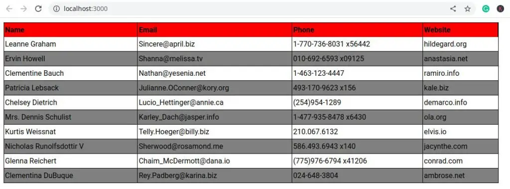
Let’s create React table using the react-table library, here is a screenshot of our example.
The react-table library is a lightweight library, we can fully customize a table. Here are some of the features of React-table.
- Lightweight (5kb – 14kb+ depending on features used and tree-shaking)
- Headless (100% customizable, Bring-your-own-UI)
- Auto out of the box, fully controllable API
- Row Selection
- Row Expansion
- Column Ordering
- Animatable
- Virtualizable
- Sorting (Multi and Stable)
- Filters
- Pivoting & Aggregation
Let’s first create React project and install Axios, the react-table library in our project.
npx create-react-app react-table-app
cd react-table-app
npm i axios
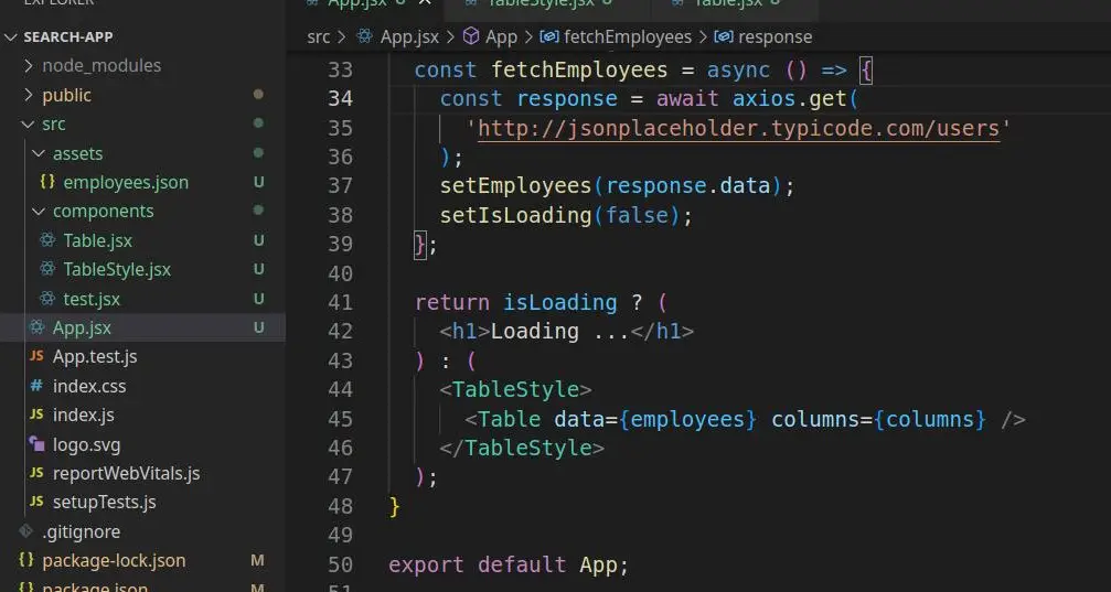
npm i react-tableHere is our project folder structure Table component, and TableStyle component.
Step 1: Create React table component
Let create folder components and add a file called Table.jsx. In Table.jsx let add code for React table component. We need to import useTable from react-table library.
import { useTable } from 'react-table'

const Table = ({ columns, data }) => {
  const { getTableProps, getTableBodyProps, headerGroups, rows, prepareRow } =
    useTable({ columns, data });

  return (
    <table {...getTableProps()}>
      <thead>
        {headerGroups.map((headerGroup) => (
          <tr {...headerGroup.getHeaderGroupProps()}>
            {headerGroup.headers.map((column) => (
              <th {...column.getHeaderProps()}>{column.render('Header')}</th>
            ))}
          </tr>
        ))}
      </thead>
      <tbody {...getTableBodyProps()}>
        {rows.map((row, i) => {
          prepareRow(row);
          return (
            <tr {...row.getRowProps()}>
              {row.cells.map((cell) => {
                return <td {...cell.getCellProps()}>{cell.render('Cell')}</td>;
              })}
            </tr>
          );
        })}
      </tbody>
    </table>
  );
};

export default Table;
Now we can use this Table component any number of times in our React application. We need to pass columns or heading of the table and data as props to the React Table component. The useTable hook provides the behavior and accessibility implementation for a table component.
Step 2: React table style component
Let’s create another component called TableStyle.jsx inside the component folder, this component contains a table style component. We added a red background for the table heading row and gray background for all even rows. Let’s add components/TableStyle.jsx
import styled from "styled-components";

export const TableStyle = styled.div`
  table {
    top: 20px;
    margin: 10px;
    width: 80%;
    border-spacing: 0;
    border: 1px solid black;
    tr {
      :nth-child(even) {
        background: gray;
      }
      :last-child {
        td {
          border-bottom: 0;
        }
      }
    }
    th {
      background-color: red;
      padding: 6px 2px;
      text-align: left;
      border-right: 1px solid black;
    }
    td {
      margin: 0;
      padding: 6px 2px;
      border-bottom: 1px solid black;
      border-right: 1px solid black;
      :last-child {
        border-right: 0;
      }
    }
  }
`;
Step 3: Retrieve data and pass to the Table component as props
We use Axios to retrieve data from https://jsonplaceholder.typicode.com/users and we need to create a column for our table. Inside the App.js we need to import axios, and our custom Table component.
import { useState, useEffect } from 'react';
import Table from './components/Table';
import { TableStyle } from './components/TableStyle';
import axios from 'axios';

const columns = [
  {
    Header: 'Name',
    accessor: 'name',
  },
  {
    Header: 'Email',
    accessor: 'email',
  },
  {
    Header: 'Phone',
    accessor: 'phone',
  },
  {
    Header: 'Website',
    accessor: 'website',
  },
];

function App() {
  const [employees, setEmployees] = useState([]);
  const [isLoading, setIsLoading] = useState(true);

  useEffect(() => {
    fetchEmployees();
  }, []);

  // react axios get method
  const fetchEmployees = async () => {
    const response = await axios.get(
      'http://jsonplaceholder.typicode.com/users'
    );
    setEmployees(response.data);
    setIsLoading(false);
  };

  return isLoading ? (
    <h1>Loading ...</h1>
  ) : (
    <TableStyle>
      <Table data={employees} columns={columns} />
    </TableStyle>
  );
}

export default App;
Conclusion
Finally, we have completed the React table, and table component in detail. I hope you got some idea on how to create the table in this tutorial, if so then please consider it sharing with others.
Related Post