React material UI grid components allow us to create a list or two-dimension lists. We used a material grid to create a list or table to display our data. In this article, we’ll explore how to use a material ui grid and we’ll demonstrate a few examples of how to create different grid lists. What we are learning.
- Different breakpoints in the grid for responsive ui.
- Grid layout and a column direction
- Available props in the Grid component
How does React material UI Grid work?
We can create a Grid layout in React application using CSS flexbox. If you are using Material UI, then instead of creating your own and wasting time. We can use React material Grid component, Material Grid behind use uses CSS’s Flexible Box module for high flexibility.
In the Grid component, we have two types of layout containers and items. For the Grid item, we can add padding to create spacing between individual items.
We can control the Grid layout and responsiveness using the number of columns and breakpoint. Material Grid component has 12 columns and we can use the different values on breakpoint to break the flow of content on a different screen.
React Material UI Grid example
Let’s first create a Material UI grid project and install the Material UI library.
npx create-reat-app grid-app
cd grid-app
npm install @mui/material @emotion/react @emotion/styled
If you have not yet installed material then, check our previous tutorial on how to configure and install Material UI in React project.
Let’s demonstrate the Material Grid example, we have six Grid item elements we want to display on the screen.
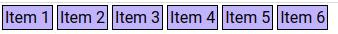
For our basic Grid example let’s add the following code for the above example in your component.
import React from "react";
import Grid from "@mui/material/Grid";

const styles = {
  gridItem: {
    border: "1px solid black",
    margin: "2px",
    padding: "2px",
    backgroundColor: "#c2b3ff",
  },
};


const ExampleGrid = () => {
  return (
    <Grid container>
      <Grid item sx={styles.gridItem}>
        Item 1
      </Grid>
      <Grid item sx={styles.gridItem}>
        Item 2
      </Grid>
      <Grid item sx={styles.gridItem}>
        Item 3
      </Grid>
      <Grid item sx={styles.gridItem}>
        Item 4
      </Grid>
      <Grid item sx={styles.gridItem}>
        Item 5
      </Grid>
      <Grid item sx={styles.gridItem}>
        Item 6
      </Grid>
    </Grid>
  );
};

export default ExampleGrid;
Creating responsive grid using Material UI Grid breakpoints
The grid component has 12 columns by default, we can increment columns by assigning different values to column props. As our application is running on different devices, we can have a different layout design by controlling the breakpoint for different devices.
The grid component has the following breakpoint pros for its corresponding screen width.
- xs Extra Small: For small screens like mobile it can have a width of less than 600px
- sm Small: Device screen between 600 to 960px.
- md medium: Device screen between 960 to 1280px
- lg: Large Device screen between 1280 to 1920px
- xl Extra large: Device screen greater than 1920px
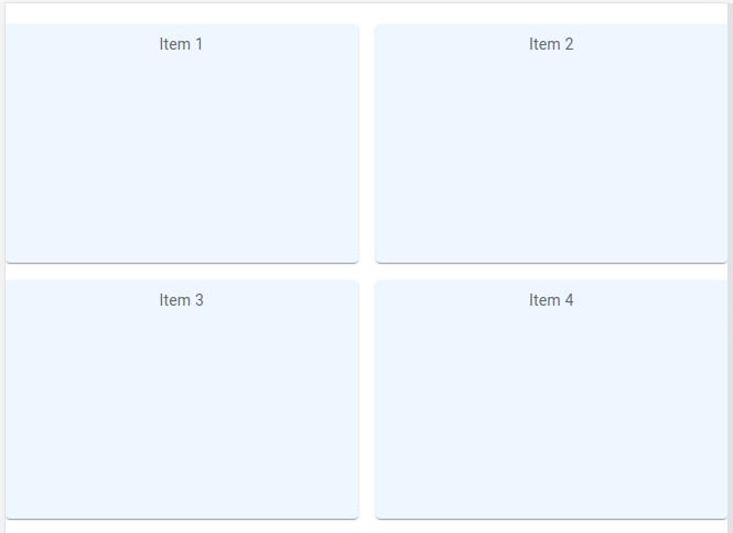
In our second example, demonstrate the Material UI grid breakpoint. Our example Grid item consumes all 12 columns in a small device, 6 columns in screen width 600 to 960px, and 4 columns in a device greater than 960 px. Here is a screenshot of our breakpoint example.
import React from "react";
import Grid from "@mui/material/Grid";
import Paper from "@mui/material/Paper";
import { styled } from "@mui/material/styles";

const Item = styled(Paper)(({ theme }) => ({
  backgroundColor: theme.palette.mode === "dark" ? "#1A2027" : "#fff",
  ...theme.typography.body2,
  padding: theme.spacing(1),
  textAlign: "center",
  color: theme.palette.text.secondary,
}));

const ExampleGrid = () => {
  return (
    <Grid container spacing={2}>
      <Grid item xs={12} sm={6} md={4}>
        <Item>Item 1</Item>
      </Grid>
      <Grid item xs={12} sm={6} md={4}>
        <Item>Item 2</Item>
      </Grid>
      <Grid item xs={12} sm={6} md={4}>
        <Item>Item 3</Item>
      </Grid>
      <Grid item xs={12} sm={6} md={4}>
        <Item>Item 4</Item>
      </Grid>
      <Grid item xs={12} sm={6} md={4}>
        <Item>Item 5</Item>
      </Grid>
      <Grid item xs={12} sm={6} md={4}>
        <Item>Item 6</Item>
      </Grid>
    </Grid>
  );
};

export default ExampleGrid;
A mobile Grid item takes 100% width thus on an item per row, a small device bigger than a mobile grid item takes 50%, and in device medium device and larger Grid item take 33.33% percentage, just three Grid items per row. Using these breakpoint props we can control the responsiveness of the layout.
In the breakpoint props, we can use auto instead of column number, assigning auto, will try to fit as many items as possible in a row based on available width and item size. Let’s change the above example with auto as value for breakpoint props.
<Grid container spacing={2}>
      <Grid item xs="auto" sm="auto" md="auto">
        <Item>Item 1</Item>
      </Grid>
      <Grid item xs="auto" sm="auto" md="auto">
        <Item>Item 2</Item>
      </Grid>
      <Grid item xs="auto" sm="auto" md="auto">
        <Item>Item 3</Item>
      </Grid>
      <Grid item xs="auto" sm="auto" md="auto">
        <Item>Item 4</Item>
      </Grid>
      <Grid item xs="auto" sm="auto" md="auto">
        <Item>Item 5</Item>
      </Grid>
      <Grid item xs="auto" sm="auto" md="auto">
        <Item>Item 6</Item>
      </Grid>
</Grid>
How do you style a grid in material UI?
In the above two examples, we also learn how to apply Style to Grid component, as makeStyles is depreciated, we can use the following ways to add Style to Grid in Material UI.
- By creating a style component using a styled component from “@mui/material/styles”; Check our second example we demonstrate an example of it.
- Define const object and assign all CSS styles, check our first example.
- Creating Grid style in global theme component.
Let’s demonstrate an example to change grid item component heigh and background.
import React from "react";
import Grid from "@mui/material/Grid";
import Paper from "@mui/material/Paper";
import { styled } from "@mui/material/styles";

const Item = styled(Paper)(({ theme }) => ({
  backgroundColor: '#a8d9ff33',
  ...theme.typography.body2,
  padding: theme.spacing(1),
  textAlign: "center",
  color: theme.palette.text.secondary,
  height: '200px'
}));

const ExampleGrid = () => {
  return (
    <Grid container spacing={2}>
      <Grid item xs={12} sm={6} md={4}>
        <Item>Item 1</Item>
      </Grid>
      <Grid item xs={12} sm={6} md={4}>
        <Item>Item 2</Item>
      </Grid>
      <Grid item xs={12} sm={6} md={4}>
        <Item>Item 3</Item>
      </Grid>
      <Grid item xs={12} sm={6} md={4}>
        <Item>Item 4</Item>
      </Grid>
      <Grid item xs={12} sm={6} md={4}>
        <Item>Item 5</Item>
      </Grid>
      <Grid item xs={12} sm={6} md={4}>
        <Item>Item 6</Item>
      </Grid>
    </Grid>
  );
};

export default ExampleGrid;
Nested Grid with Material UI grid column direction
In our previous example, we saw all material grid items having the same height, in some situations we might need a different height and different layout. In this example, we’ll learn the Grid column direction and assign different heights for different Grid items. Here is a screenshot of our example.
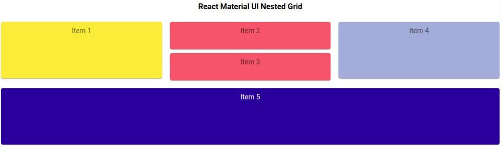
In the above example Grid item 2 and item 3 are inside on Grid container or its nested Grid. I change the default Grid container direction from row to column and assign smaller heights to items 2 and three so that they can have the same height as Grid item 1 and item 4.
By default, Grid items flow from left to right or horizontal, Grid has two layout attributes container and item. We should wrap the Grid items inside the Grid container and by applying different direction values we can change the direction of the Grid.
By adding a container attribute to the Grid component, the component will have the flex container behavior. Just change the direction we can have different directions like flex. We have listed the direction values we can use.
- column-reverse
- column
- row-reverse
- row
Let’s add code for our Grid direction example.
import React from 'react';
import Grid from '@mui/material/Grid';
import Paper from '@mui/material/Paper';
import { styled } from '@mui/material/styles';

const styles = {
  item1: {
    backgroundColor: '#FBEC39',
    height: '100px',
  },
  innerGrid: {
    height: '40px',
    backgroundColor: '#F6546A',
  },
  item4: {
    backgroundColor: '#A4ACDA',
    height: '100px',
  },
  item5: {
    backgroundColor: '#2A009D',
    height: '100px',
    color: '#ffffff',
  },
};

const Item = styled(Paper)(({ theme }) => ({
  ...theme.typography.body2,
  padding: theme.spacing(1),
  justifyItems: 'center',
  textAlign: 'center',
  color: theme.palette.text.secondary,
}));

const ExampleGrid = () => {
  return (
    <div style={{margin: '5px'}}>
      <h4 style={{ textAlign: 'center' }}>React Material UI Nested Grid</h4>
      <Grid container spacing={2}>
        <Grid item xs={12} sm={6} md={4}>
          <Item sx={styles.item1}>Item 1</Item>
        </Grid>
        <Grid container direction='column' spacing={1}
          item xs={12} sm={6} md={4} >
          <Grid item xs={12} sm={6}>
            <Item sx={styles.innerGrid}>Item 2</Item>
          </Grid>
          <Grid item xs={12} sm={6}>
            <Item sx={styles.innerGrid}>Item 3</Item>
          </Grid>
        </Grid>

        <Grid item xs={12} sm={6} md={4}>
          <Item sx={styles.item4}>Item 4</Item>
        </Grid>
        <Grid item xs={12} sm={12}>
          <Item sx={styles.item5}>Item 5</Item>
        </Grid>
      </Grid>
    </div>
  );
};

export default ExampleGrid;
React Material UI Grid spacing
In Grid container, we have a list of Grid items, we can use spacing props to control the space between Grid items. The value of spacing props is a positive number including decimal. We already used spacing props in our previous example on Grid containers like this spacing={1} in this case we want the same gap on both row and column.
Instead of using spacing props as common, We can also specify different spacing for rows and columns gap between Grid item, using the following spacing props
- rowSpacing: Space between Grid item row.
- colSpacing: Space between Grid item column.
Here is our example where we used rowSpacing 2 and colSpacing 2, I guess 1 is 8px and 2 is 16 px, thus row has a 16px gap and the column has an 8px gap.
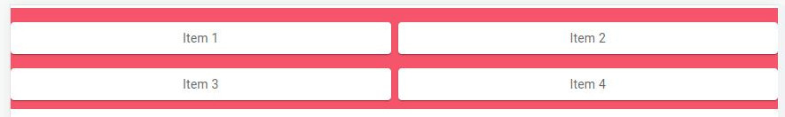
Let’s add code for our example of UI material UI grid spacing example.
import React from "react";
import Grid from "@mui/material/Grid";
import Paper from "@mui/material/Paper";
import { styled } from "@mui/material/styles";

const Item = styled(Paper)(({ theme }) => ({
  ...theme.typography.body2,
  padding: theme.spacing(1),
  textAlign: "center",
  color: theme.palette.text.secondary,
}));

const ExampleGrid = () => {
  return (
    <Grid
      container
      rowSpacing={2}
      columnSpacing={1}
      style={{ backgroundColor: "#F6546A", paddingBottom: "10px" }}
    >
      <Grid item xs={12} sm={6}>
        <Item>Item 1</Item>
      </Grid>
      <Grid item xs={12} sm={6}>
        <Item>Item 2</Item>
      </Grid>
      <Grid item xs={12} sm={6}>
        <Item>Item 3</Item>
      </Grid>
      <Grid item xs={12} sm={6}>
        <Item>Item 4</Item>
      </Grid>
    </Grid>
  );
};

export default ExampleGrid;
Conclusion
To display table data, you can use Data Grid instead of the Grid component, use Grid where you want some layout design. I hope you have learned something, if so please share it on social networks or with your friends.