We have seen color pickers in many applications, including Photoshop, Gimp, and more. We can easily add a react color picker to React Application. There are plenty of third-party libraries to add color picker components to our React project.
In this tutorial, we will learn and demonstrate some of the best React color picker libraries. We have a few objectives in this color picker In this React tutorial, we have fews main objectives we are learning as follows.
- Different available libraries to implement Color picker in React application.
- React-color library to demonstrate photoshop, block, circle, and sketch color picker
- React-color library using React typescript
- Demonstrate React Material color picker example
- Three examples of Color pickers with Stackblitz live code.
Best React color picker libraries in React
As we have discussed that there are plenty of third parties libraries to implement react color pickers. We’ll list here some, that you can select based on your requirement.
| Name | Description |
| react-colorful | The react-colorful is a tiny color picker component for React and Preact apps. This is one of the most downloaded color picker libraries and has a size of about 380 kB and a weekly download of 2,771,156. |
| material-ui-color | Collections of color components for material-ui. This library has 256KB and a weekly download of 9,591. |
| react-color | This library has 13 Different Pickers – Sketch, Photoshop, Chrome, and many more. It has a weekly download of 1,389,401 but didn’t update for one year. |
| react-color-palette | It is a lightweight color picker library of a size of 47.6 kB and has a weekly download of 6,170 approximately. |
| react-linear-gradient-picker | This package takes any color picker for your choice And wraps it as a gradient picker. This plays well with the package angle picker, which allows your users to play with the gradient angle. It has a size of 350KB and a weekly download of 1,811. |
React-color picker library to implement Color picker
The React-color picker library offers a collection of Color Pickers from Sketch, Photoshop, Chrome, Github, Twitter, Material Design & more. It has 13 different color pickers and we can create our own custom color picker from it. Even though it has a lot of options, this library hasn’t been updated in the last 2 years.
Let’s used this powerful library to implement the following color picker option in our first color picker example.
- Color picker example using Photoshop color picker
- Sketch color picker example
- Circle color picker example
- Block color picker example
Let’s get started with this project by creating our project and installing the react-color library as follow.
npx create-react-app color-picker-app
cd color-picker-app
npm i react-color --save
Here is a screenshot of the first color picker example.
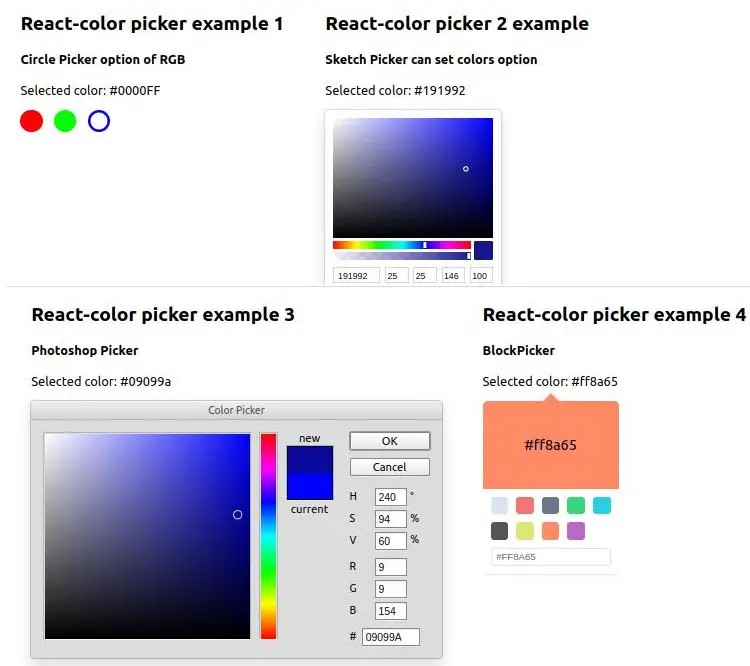
Let’s add code for the above example in the App.js file, we also used circle color to change the page background to Red, Green, or Blue.
import { useState } from "react";
import {
  BlockPicker,
  CirclePicker,
  PhotoshopPicker,
  SketchPicker,
} from "react-color";
import "./App.css";

function App() {
  const [circleColor, setCircleColor] = useState("#FFF");
  const [sketchColor, setSketchColor] = useState("#0000FF");
  const [photoshopColor, setphotoshopColor] = useState("#0000FF");
  const [blockPickerColor, setBlockPickerColor] = useState("#0000FF");

  return (
    <div style={{ backgroundColor: circleColor, transition: "ease all 500ms" }}>
      <div className="container">
        <div className="circlePicker">
          <h2>React-color picker example 1</h2>
          <h4>Circle Picker option of RGB</h4>
          <p>Selected color: {circleColor}</p>
          <CirclePicker
            color={circleColor}
            colors={["	#FF0000", "#00FF00", "#0000FF"]}
            onChange={(e) => setCircleColor(e.hex)}
          />
        </div>

        <div className="sketchpicker">
          <h2>React-color picker 2 example</h2>
          <h4>Sketch Picker can set colors option</h4>
          <p>Selected color: {sketchColor}</p>
          <SketchPicker
            color={sketchColor}
            onChange={(e) => setSketchColor(e.hex)}
          />
        </div>
      </div>
      <hr />
      <div className="container">
        <div className="photoshoppicker">
          <h2>React-color picker example 3</h2>
          <h4>Photoshop Picker </h4>
          <p>Selected color: {photoshopColor}</p>
          <PhotoshopPicker
            color={photoshopColor}
            onChangeComplete={(color) => {
              setphotoshopColor(color.hex);
            }}
          />
        </div>

        <div className="blockpicker">
          <h2>React-color picker example 4</h2>
          <h4>BlockPicker</h4>
          <p>Selected color: {blockPickerColor}</p>
          <BlockPicker
            color={blockPickerColor}
            onChange={(color) => {
              setBlockPickerColor(color.hex);
            }}
          />
        </div>
      </div>
    </div>
  );
}

export default App;
We have used div with class name container to have two pickers in one row, here is the CSS style for the container in App.css
.container {
  display: flex;
  justify-content: space-around
}
The React-color library has the following function to handle events.
- onChange: Call every time the color is changed.
- onChangeComplete : Call once a color change is complete.
Following color picker option we can use and we need to import in our React project.
AlphaPickerBlockPickerChromePickerCirclePickerCompactPickerGithubPickerHuePickerMaterialPickerPhotoshopPickerSketchPickerSliderPickerSwatchesPickerTwitterPicker
The example of the above color picker options is added in stackblitz.com and here is both the code and preview.
React-color library in React typescript
For the above example of react-color, let’s implement it in React typescript project, first, we need to create a project in typescript and add react-color with typescript as follows.
npx create-react-app color-picker-app
cd color-picker-app

#Install Color picker library
npm install --save typescript @types/node @types/react @types/react-dom @types/jest

#install react-color library
npm i --save-dev @types/react-color
Now in the App.tsx let’s add our code in React typescript project as follow.
import React, { useState } from 'react';
import {
  BlockPicker,
  CirclePicker,
  PhotoshopPicker,
  SketchPicker,
} from "react-color";
import './App.css';

function App() {
  const [circleColor, setCircleColor] = useState("#FFF");
  const [sketchColor, setSketchColor] = useState("#0000FF");
  const [photoshopColor, setphotoshopColor] = useState("#0000FF");
  const [blockPickerColor, setBlockPickerColor] = useState("#0000FF");


  return (
    <div style={{ backgroundColor: circleColor, transition: "ease all 500ms" }}>
    <div className="container">
      <div className="circlePicker">
        <h2>React-color picker example 1</h2>
        <h4>Circle Picker option of RGB</h4>
        <p>Selected color: {circleColor}</p>
        <CirclePicker
          color={circleColor}
          colors={["	#FF0000", "#00FF00", "#0000FF"]}
          onChange={(e) => setCircleColor(e.hex)}
        />
      </div>

      <div className="sketchpicker">
        <h2>React-color picker 2 example</h2>
        <h4>Sketch Picker can set colors option</h4>
        <p>Selected color: {sketchColor}</p>
        <SketchPicker
          color={sketchColor}
          onChange={(e) => setSketchColor(e.hex)}
        />
      </div>
    </div>
    <hr />
    <div className="container">
      <div className="photoshoppicker">
        <h2>React-color picker example 3</h2>
        <h4>Photoshop Picker </h4>
        <p>Selected color: {photoshopColor}</p>
        <PhotoshopPicker
          color={photoshopColor}
          onChangeComplete={(color) => {
            setphotoshopColor(color.hex);
          }}
        />
      </div>

      <div className="blockpicker">
        <h2>React-color picker example 4</h2>
        <h4>BlockPicker</h4>
        <p>Selected color: {blockPickerColor}</p>
        <BlockPicker
          color={blockPickerColor}
          onChange={(color) => {
            setBlockPickerColor(color.hex);
          }}
        />
      </div>
    </div>
  </div>
  );
}

export default App;
React color picker example one using react-colorful
Step 1: Let’s first create our color picker project and name our project the colorPickerApp.
npx create-react-app colorPickerApp
cd colorPickerApp
npm start
Step 2: Install the color picker library
We’ll demonstrate a color picker using a third-party library the react-colorful. Here we first need to install this library in our project by following the command.
npm install react-colorfulHere is a screenshot of our first example of a color picker using the react-colorful library.
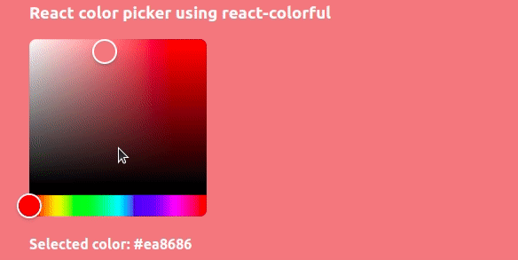
After installing our react-colorful library and using this library in our react project, we need to import HexColorPicker from the ‘react-colorful’ library file and let add it to your component. In our case, we’ll add it in App.js’
React dynamic style to change the background using the color picker component
In our App.js file, we have used useRef hooks to get a reference to the div container, so that whenever we have selected dynamic color from color-picker will change our ref div background. Whenever we change the color of HexColorPicker component we call onSetBackground() function on onChange event. In onSetBackground we apply a newly selected color to our selected useRef div element to change its background.
import './App.css';
import { HexColorPicker } from "react-colorful";
import { useState, useRef } from 'react';

const myInlineCss = {
  backgroundColor: 'blue',
  padding: '12px',
  color: 'white'
}

function App() {
  const divRef = useRef(null);

  const [color, setColor] = useState('');

  function onSetBackground(selectedColor) {
    divRef.current.style.background = selectedColor;
    setColor(selectedColor);
  }

  return (
    <div style={myInlineCss} ref={divRef}>
      <h3>React color picker using react-colorful</h3>
      <HexColorPicker color={color} onChange={onSetBackground} />
      <h4>Selected color: {color}</h4>

    </div>
  );
}
export default App;
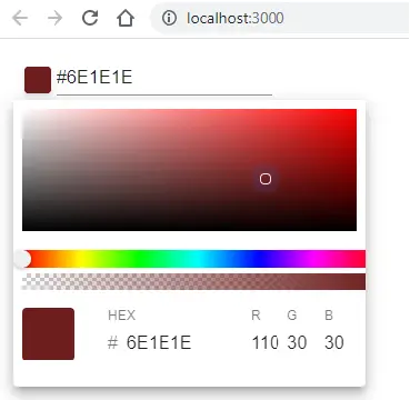
React color picker example one using material-ui-color
We’ll demonstrate a color picker using third-party library material-ui-color. Here we first need to install this library in our project by following the command.
npm i material-ui-color --saveThis library has dependent on the following.
"@material-ui/core": "^4.11.2",
"material-ui-popup-state": "^1.7.1",
"prop-types": "^15.7.2",
"react": "^17.0.1",
"react-dom": "^17.0.1",
Here is a screenshot of our first example of the color picker component using the material-ui-color library.
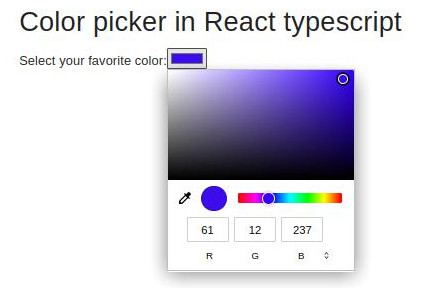
Color picker from HTML color input in React typescript project
We can also use regular HTML color input elements like this, let’s add this in the typescript project and add React MUI, we have a tutorial on how to install and configure Material MUI in React. Here is a screenshot of our HTML color input in the Typescript project.
<label for="favcolor">Select your favorite color:</label>
<input type="color" id="favcolor" name="favcolor" value="#ff0000" />
Let’s add HTML color input to our App.tsx file
import React, { useState } from "react";
import { createTheme, ThemeProvider } from "@mui/material";
import CssBaseline from "@mui/material/CssBaseline";
import Container from "@mui/material/Container";
import Typography from "@mui/material/Typography";
import Box from "@mui/material/Box";
import "./App.css";

const theme = createTheme({
..
});

function App() {
  const [color, setColor] = useState('#FBA1A1');

  const handleChange = (newValue: any) => {
    setColor(newValue.target.value)
  };

  return (
<ThemeProvider theme={theme}>
      <CssBaseline />
      <Container maxWidth="sm">
        <Box my={4}>
          <Typography variant="h4" component="h1" gutterBottom>
            Color picker in React typescript
          </Typography>
          <div>
            <label htmlFor="favcolor">Select your favorite color:</label>
            <input type="color" id="favcolor" name="favcolor" value={color}
            onChange={(e) => handleChange(e)} />
          </div>
        </Box>
      </Container>
    </ThemeProvider>
  );
}

export default App;
Conclusion
We have completed three examples of how to add a color picker to our React application. The third parties libraries provide more options for selecting colors of different formats, even we can use the HTML color input element also. I hope you got some idea how to use the color picker in React project, if you learn something, then please share it with your friend or on the social network. Thanks
Related posts
- How to implement React routing using react-route- dom 6?
- Guide to Using and Creating React material UI grid.
- React material UI App Bar in detail with examples
- How to implement React table and its component?
- When and how to use React Context API?
- React Axios for HTTP method with REST API
- React router navigate outside component.
- How to implement React routing using react-router-dom?