React material UI Drawer components are the most used component and allow us to create swappable or sidebar navigation. We have seen in mobile apps sidebar menu is the Drawer component in Material UI. We can have swappable navigation from all four directions left, right, top and bottom.
We have three main objectives in this Material UI Drawer tutorial,
- Different types of Material Drawer
- The material the useMediaQuery and breakpoint to show responsive navigation based on device size.
- How to change MUI Drawer component width ?
- How to apply the style to the Drawer component ?
What is the Material UI Drawer component?
The Drawer component is mainly used to provide a navigation controller, especially it is used for sidebar kind of navigation on desktop or toggle sidebar navigation on mobile devices. We can pull Navigation Drawer from the left, right, top, and bottom. Is mostly used on the left and right sides of the page. The Drawer component mostly contains navigation links but it can contain other components or elements like profile images, images, text, and more.
There are three main types of Material Drawer components that we can use in an application, as follows:
- Temporary: Drawer that appears like a modal and disappears or closes when the user clicks on any of the navigation actions. We can have a boolean value that controls the toggle of the Drawer, show only when the boolean value is true, and close when the boolean value is false.
- Persistent: A drawer that is always open, until we explicitly closed it. As it is almost open, we need to give space for the component on a page.
- Permanent: As the name suggested Drawer is always open and it needs space on a page. It is not closed when we click on any of its navigation actions.
Abstract Step for creating React Drawer
Let’s first demonstrate the React Drawer example using the Material MUI Drawer component, here we had listed the abstract step for creating the Drawer example.
- Step 1: Create a project and install a Material MUI Library
- Step 2: Create a Drawer component with navigation with different pages.
- Step 3: Configure React routing in the App.js file
- Step 4: Demonstrate Drawer direction types and styling of Drawer component
npx create-react-app drawer-app
cd drawer-app

#Need react router dom
npm install --save react-router-dom

#Installing Material UI library and Material Icon
npm install @mui/material @emotion/react @emotion/styled
npm install @mui/icons-material
Material UI prefers and recommends using Roboto font in mind. So be sure to follow these instructions. We need to add Google Web Fonts and Google font icons in the head section of public/index.html
<link rel="stylesheet"
      href="https://fonts.googleapis.com/css?family=Roboto:300,400,500,700&display=swap"/>
<link rel="stylesheet" href="https://fonts.googleapis.com/icon?family=Material+Icons"/>
Material UI Drawer example
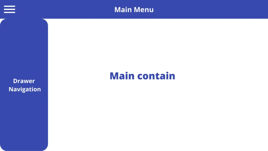
Let’s demonstrate the first example of the MUI Drawer basic example, here is a screenshot of our basic example.

Clicking on the Show Drawer button will set the open value to true, this shows the visibility Drawer on the screen. Clicking on any of the Drawer navigation buttons will set the open value to false and hide the Drawer component.
We need to create a pages folder with 3 pages, About.jsx, Contact.jsx and Home.jsx. Let’s first create and configure React routing in the App.js file.
import { BrowserRouter as Router, Routes, Route } from "react-router-dom";
import About from "./pages/About";
import Contact from "./pages/Contact";
import Home from "./pages/Home";
import DrawerNavigate from "./components/DrawerNavigate";


function App() {
  return (
    <Router>
      <DrawerNavigate />
      <Routes>
        <Route exact path="/" element={<Home />} />
        <Route path="/about" element={<About />} />
        <Route path="/contact" element={<Contact />} />
      </Routes>
    </Router>
  );
}

export default App;
We need to import all pages, and our DrawerNavigate to demonstrate Drawer basic example. Let’s now create the DrawerNavigate component in the components folder. Here we need to import the Link component and material Drawer related component into our custom drawer component. If you want to know how to configure React routing, then check our previous tutorial on React Routing using the react-router-dom library.
import React, { useState } from "react";
import Drawer from "@mui/material/Drawer";
import Grid from "@mui/material/Grid";
import Button from "@mui/material/Button";
import List from "@mui/material/List";
import ListItem from "@mui/material/ListItem";
import ListItemText from "@mui/material/ListItemText";
import { Link } from "react-router-dom";

const DrawerNavigate = ({ variant, ...props }) => {
  const [open, setOpen] = useState(false);

  return (
    <Grid container justifyContent="flex-start" alignItems="center">
      <Grid item>
        <Drawer
          variant={variant}
          {...props}
          open={open}
          onClose={() => setOpen(false)}
        >
          <List>
            <ListItem button onClick={() => setOpen(false)}>
              <ListItemText>
                <Link style={{ textDecoration: "none" }} to="/">
                  Home
                </Link>
              </ListItemText>
            </ListItem>
            <ListItem button onClick={() => setOpen(false)}>
              <ListItemText>
                <Link style={{ textDecoration: "none" }} to="/about">
                  About Us
                </Link>
              </ListItemText>
            </ListItem>
            <ListItem button onClick={() => setOpen(false)}>
              <ListItemText>
                <Link style={{ textDecoration: "none" }} to="/contact">
                  Contact Us
                </Link>
              </ListItemText>
            </ListItem>
          </List>
        </Drawer>
      </Grid>

      <Grid item>
        <Button onClick={() => setOpen(!open)}>
          {open ? "Hide" : "Show"} Drawer
        </Button>
      </Grid>
    </Grid>
  );
};

export default DrawerNavigate;
The MUI drawer component has props that allow us to control, the direction of the navigation slide, Drawer variant, event, and more. Here we have listed all props and events we can use inside MUI Drawer.
| S.no | Props|Event | Value | Description |
| 1 | variant | Temporary, permanent and persistent | The visibility status of the Drawer component, by default, is temporary. |
| 2 | anchor | Left, Right, Top and Bottom | Direction flow of Drawer component when it becomes visible and default direction is left. |
| 3 | open | Boolean true|false | This property controls the visibility of the Drawer, open true to show the drawer component and false will hide the Drawer component. |
| 4 | onClose | Event or function | This function call when the Drawer component is closed and we set the open attribute to false so that we can hide the drawer. |
Let’s demonstrate the anchor props example by setting the anchor value bottom, clicking on the SHOW Drawer button will show the Drawer component from the bottom.
<DrawerNavigate anchor='bottom' variant='permanent'/>
Material UI Drawer width and styling
Like all Material MUI components, we can add style and change the default design of the Drawer component also. Let’s change the Material UI Drawer width, and background and add a Material icon also. Here is our screenshot of the different custom styles of drawer components.

Let’s add MUI Drawer with a width of 500px and background color in our custom Drawer component DrawerNavigate.jsx Let import three different MUI icons. To add style to the Drawer component, we need to add and use PaperProps pros with style.
import React, { useState } from "react";
import Drawer from "@mui/material/Drawer";
import Grid from "@mui/material/Grid";
import Button from "@mui/material/Button";
import List from "@mui/material/List";
import ListItem from "@mui/material/ListItem";
import ListItemIcon from "@mui/material/ListItemIcon";
import { Link } from "react-router-dom";
import HomeIcon from "@mui/icons-material/Home";
import InfoIcon from "@mui/icons-material/Info";
import ContactsIcon from "@mui/icons-material/Contacts";

const DrawerNavigate = ({ variant, ...props }) => {
  const [open, setOpen] = useState(false);

  return (
    <Grid container justifyContent="flex-start" alignItems="center">
      <Grid item>
        <Drawer
          variant={variant}
          {...props}
          open={open}
          onClose={() => setOpen(false)}
          PaperProps={{
            sx: {
              backgroundColor: "#3749ad",
              width: 500,
            },
          }}
        >
          <List>
            <ListItem button onClick={() => setOpen(false)}>
              <ListItemIcon>
                <ListItem
                  component={Link}
                  style={{
                    textDecoration: "none",
                    color: "#fff",
                    fontWeight: "bolder",
                  }}
                  to="/"
                >
                  <HomeIcon sx={{ color: "white" }} /> Home
                </ListItem>
              </ListItemIcon>
            </ListItem>
            <ListItem button onClick={() => setOpen(false)}>
              <ListItemIcon>
                <ListItem
                  component={Link}
                  style={{
                    textDecoration: "none",
                    color: "#fff",
                    fontWeight: "bolder",
                  }}
                  to="/about"
                >
                  <InfoIcon sx={{ color: "white" }} />
                  About Us
                </ListItem>
              </ListItemIcon>
            </ListItem>
            <ListItem button onClick={() => setOpen(false)}>
              <ListItemIcon>
                <ListItem
                  component={Link}
                  style={{
                    textDecoration: "none",
                    color: "#fff",
                    fontWeight: "bolder",
                  }}
                  to="/contact"
                >
                  <ContactsIcon sx={{ color: "white" }} /> Contact Us
                </ListItem>
              </ListItemIcon>
            </ListItem>
          </List>
        </Drawer>
      </Grid>

      <Grid item>
        <Button onClick={() => setOpen(!open)}>
          {open ? "Hide" : "Show"} Drawer
        </Button>
      </Grid>
    </Grid>
  );
};

export default DrawerNavigate;
React Material UI Swipeable Drawer
We can make the MUI Drawer swipeable with the SwipeableDrawer component. Here is a screenshot of our swipeable drawer example.
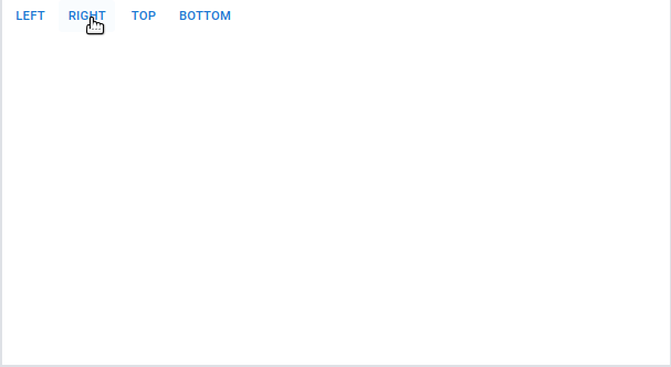
I have taken this example from React Material UI, here is the code for Swipeable Drawer code in components/SwipeableDrawe1r.jsx
import * as React from 'react';
import Box from '@mui/material/Box';
import SwipeableDrawer from '@mui/material/SwipeableDrawer';
import Button from '@mui/material/Button';
import List from '@mui/material/List';
import Divider from '@mui/material/Divider';
import ListItem from '@mui/material/ListItem';
import ListItemButton from '@mui/material/ListItemButton';
import ListItemIcon from '@mui/material/ListItemIcon';
import ListItemText from '@mui/material/ListItemText';
import InboxIcon from '@mui/icons-material/MoveToInbox';
import MailIcon from '@mui/icons-material/Mail';

const SwipeableDrawer1 = () => {
  const [state, setState] = React.useState({
    top: false,
    left: false,
    bottom: false,
    right: false,
  });

  const toggleDrawer = (anchor, open) => (event) => {
    if (
      event &&
      event.type === 'keydown' &&
      (event.key === 'Tab' || event.key === 'Shift')
    ) {
      return;
    }

    setState({ ...state, [anchor]: open });
  };

  const list = (anchor) => (
    <Box
      sx={{ width: anchor === 'top' || anchor === 'bottom' ? 'auto' : 250 }}
      role="presentation"
      onClick={toggleDrawer(anchor, false)}
      onKeyDown={toggleDrawer(anchor, false)}
    >
      <List>
        {['Inbox', 'Starred', 'Send email', 'Drafts'].map((text, index) => (
          <ListItem key={text} disablePadding>
            <ListItemButton>
              <ListItemIcon>
                {index % 2 === 0 ? <InboxIcon /> : <MailIcon />}
              </ListItemIcon>
              <ListItemText primary={text} />
            </ListItemButton>
          </ListItem>
        ))}
      </List>
      <Divider />
      <List>
        {['All mail', 'Trash', 'Spam'].map((text, index) => (
          <ListItem key={text} disablePadding>
            <ListItemButton>
              <ListItemIcon>
                {index % 2 === 0 ? <InboxIcon /> : <MailIcon />}
              </ListItemIcon>
              <ListItemText primary={text} />
            </ListItemButton>
          </ListItem>
        ))}
      </List>
    </Box>
  );

  return (
    <div>
      {['left', 'right', 'top', 'bottom'].map((anchor) => (
        <React.Fragment key={anchor}>
          <Button onClick={toggleDrawer(anchor, true)}>{anchor}</Button>
          <SwipeableDrawer
            anchor={anchor}
            open={state[anchor]}
            onClose={toggleDrawer(anchor, false)}
            onOpen={toggleDrawer(anchor, true)}
          >
            {list(anchor)}
          </SwipeableDrawer>
        </React.Fragment>
      ))}
    </div>
  );
}

export default SwipeableDrawer1
MUI Drawer Subheader
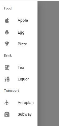
We can group Drawer navigation into related navigation, here we have used ListSubheader or Divider component from the Material MUI library. Here is our Drawer grouping navigation example screenshot.
import React, { useState } from 'react';

import Drawer from '@mui/material/Drawer';
import Grid from '@mui/material/Grid';
import Button from '@mui/material/Button';
import List from '@mui/material/List';
import ListItem from '@mui/material/ListItem';
import ListItemIcon from '@mui/material/ListItemIcon';
import ListItemText from '@mui/material/ListItemText';
import ListSubheader from '@mui/material/ListSubheader';
import Typography from '@mui/material/Typography';
import AppleIcon from '@mui/icons-material/Apple';
import EggIcon from '@mui/icons-material/Egg';
import LocalPizzaIcon from '@mui/icons-material/LocalPizza';
import EmojiFoodBeverageIcon from '@mui/icons-material/EmojiFoodBeverage';
import LiquorIcon from '@mui/icons-material/Liquor';
import FlightIcon from '@mui/icons-material/Flight';
import SubwayIcon from '@mui/icons-material/Subway';

const ListItems = ({ items, onClick }) =>
  items
    .filter(({ hidden }) => !hidden)
    .map(({ label, disabled, Icon }, i) => (
      <ListItem button key={i} disabled={disabled} onClick={onClick(label)}>
        <ListItemIcon>
          <Icon />
        </ListItemIcon>
        <ListItemText>{label}</ListItemText>
      </ListItem>
    ));

const DrawerSections = ({ classes }) => {
  const [open, setOpen] = useState(false);
  const [content, setContent] = useState('Home');
  const [items] = useState({
    food: [
      { label: 'Apple', Icon: AppleIcon },
      { label: 'Egg', Icon: EggIcon },
      { label: 'Pizza', Icon: LocalPizzaIcon },
    ],
    drink: [
      { label: 'Tea', Icon: EmojiFoodBeverageIcon },
      { label: 'Liquor', Icon: LiquorIcon },
    ],
    transport: [
      { label: 'Aeroplan', Icon: FlightIcon },
      { label: 'Subway', Icon: SubwayIcon },
    ],
  });
  const onClick = (content) => () => {
    setOpen(false);
    setContent(content);
  };

  return (
    <Grid container justify='space-between'>
      <Grid item>
        <Typography>{content}</Typography>
      </Grid>
      <Grid item>
        <Drawer open={open} onClose={() => setOpen(false)}>
          <List>
            <ListSubheader>Food</ListSubheader>
            <ListItems items={items.food} onClick={onClick} />
            <ListSubheader>Drink</ListSubheader>
            <ListItems items={items.drink} onClick={onClick} />
            <ListSubheader>Transport</ListSubheader>
            <ListItems items={items.transport} onClick={onClick} />
          </List>
        </Drawer>
      </Grid>
      <Grid item>
        <Button onClick={() => setOpen(!open)}>
          {open ? 'Hide' : 'Show'} Drawer
        </Button>
      </Grid>
    </Grid>
  );
};

export default DrawerSections;
Mui Responsive Appbar navigation
In our previous articles, we learn how to use the Material MUI Appbar component, let’s demonstrate MUI Responsive Appbar navigation. In the example below we are achieving the following.
- Horizontal navigation with logo using Material MUI Tabs component in the Desktop browser.
- SwipeableDrawer component menu with menu icon in Mobile browser
- We use the useMediaQuery to check breakpoint sm if the screen is less than 597 px then show the Drawer menu and if more than 597 px then show the horizontal Tabs menu.
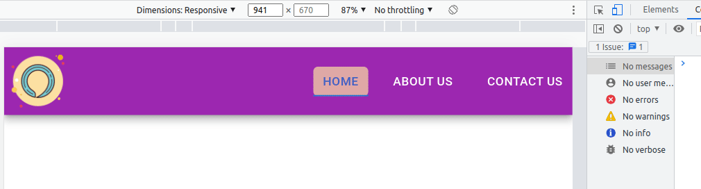
Here is our example of React Material MUI responsive menu,
Step 1: Create a Header component in the components folder
In our previous example, we already add Material MUI, MUI icon, and react-router-dom libraries in our project, and create a folder called Header in the components folder. In components/Header.jsx we have three function components and each has the following function.
- DesktopNavigation component to show horizontal navigation in Desktop or medium size devices.
- MobileNavigation component to show SwipeableDrawer component in mobile devices.
- Header components have Appbar component and using the useMediaQuery to determine is a mobile mode or desktop mode on theme.breakpoints.down(“sm”) if mobile mode then displays MobileNaviation or in desktop display DesktopNavigation component.
We have this code in the Appbar component to determine what menu to display based on the device’s screen size.
{isMobileMode ? <MobileNavigation /> : <DesktopNavigation />}Let add code to implement above functionalityties in components/Header.jsx
import React, { Fragment, useState } from "react";
import { Link } from "react-router-dom";
import AppBar from "@mui/material/AppBar";
import Box from "@mui/material/Box";
import Button from "@mui/material/Button";
import Toolbar from "@mui/material/Toolbar";
import Tabs from "@mui/material/Tabs";
import Tab from "@mui/material/Tab";
import logo from "../assets/logo.png";
import { theme } from "./Theme";
import SwipeableDrawer from "@mui/material/SwipeableDrawer";
import Paper from "@mui/material/Paper";
import List from "@mui/material/List";
import ListItem from "@mui/material/ListItem";
import ListItemText from "@mui/material/ListItemText";
import MenuIcon from "@mui/icons-material/Menu";
import IconButton from "@mui/material/IconButton";
import useMediaQuery from "@mui/material/useMediaQuery";

const styles = {
  toolbarMargin: {
    ...theme.mixins.toolbar,
    marginBottom: "3em",
    [theme.breakpoints.down("md")]: {
      marginBottom: "2em",
    },
    [theme.breakpoints.down("xs")]: {
      marginBottom: "1.25em",
    },
  },
  logo: {
    height: "8em",
    [theme.breakpoints.down("md")]: {
      height: "7em",
    },
    [theme.breakpoints.down("xs")]: {
      height: "5.5em",
    },
  },
  logoContainer: {
    padding: 0,
    "&:hover": {
      backgroundColor: "transparent",
    },
  },
  tabs: {
    marginLeft: "auto",
    "& .MuiButtonBase-root.MuiTab-root": {
      fontSize: 20,
    },
    "& .Mui-selected": {
      backgroundColor: "#fce0a2",
      color: "#000",
      opacity: 0.7,
      borderRadius: 2,
    },
  },
  tab: {
    ...theme.typography.tab,
    minWidth: 10,
    marginLeft: "25px",
    color: "white",
  },

  hamburgerMenuIcon: {
    height: "50px",
    width: "50px",
  },
  menuIconContainer: {
    marginLeft: "auto",
    color: 'white',
    "&:hover": {
      opacity: 1,
    },
  },
  appbar: {
    zIndex: theme.zIndex.modal + 1,
  },
};


// Desktop mode : screen size greater than 597px
const DesktopNavigation = () => {
  const [value, setValue] = useState(0);

  const handleChange = (event, newValue) => {
    setValue(newValue);
  };
  return (
    <Tabs
      value={value}
      onChange={handleChange}
      aria-label="nav tabs example"
      sx={styles.tabs}
    >
      <Tab sx={styles.tab} label="Home" component={Link} to="/" />
      <Tab sx={styles.tab} label="About us" component={Link} to="/about" />
      <Tab sx={styles.tab} label="Contact us" component={Link} to="/contact" />
    </Tabs>
  );
};


// Mobile mode : screen size less than 597px show drawer menu
const MobileNavigation = () => {
  const [openDrawer, setOpenDrawer] = React.useState(false);

  const iOS =
    typeof navigator !== "undefined" &&
    /iPad|iPhone|iPod/.test(navigator.userAgent);

  return (
    <React.Fragment>
      <SwipeableDrawer
        disableBackdropTransition={!iOS}
        disableDiscovery={iOS}
        open={openDrawer}
        onClose={() => setOpenDrawer(false)}
        onOpen={() => setOpenDrawer(true)}
      >
        <Box sx={styles.toolbarMargin} />
        <Paper>
          <List disablePadding>
            <ListItem
              divider
              button
              component={Link}
              to="/"
              onClick={() => setOpenDrawer(false)}
            >
              <ListItemText disableTypography>Home</ListItemText>
            </ListItem>
            <ListItem
              divider
              button
              component={Link}
              to="/about"
              onClick={() => setOpenDrawer(false)}
            >
              <ListItemText disableTypography>About us</ListItemText>
            </ListItem>
            <ListItem
              divider
              button
              component={Link}
              to="/contact"
              onClick={() => setOpenDrawer(false)}
            >
              <ListItemText disableTypography>Contact us</ListItemText>
            </ListItem>
          </List>
        </Paper>
      </SwipeableDrawer>
      <IconButton
        sx={styles.menuIconContainer}
        onClick={() => setOpenDrawer(!openDrawer)}
        disableRipple
      >
        <MenuIcon sx={styles.hamburgerMenuIcon} />
      </IconButton>
    </React.Fragment>
  );
};

// Main Header component
const Header = () => {
  const isMobileMode = useMediaQuery(theme.breakpoints.down("sm"));

  return (
    <Fragment>
      <AppBar
        position="fixed"
        sx={styles.appbar}
        color="secondary"
        elevation={9}
      >
        <Toolbar disableGutters={true}>
          <Button
            disableRipple
            component={Link}
            to="/"
            sx={styles.logoContainer}
          >
            <Box
              component="img"
              sx={styles.logo}
              src={logo}
              alt="company logo"
            />
          </Button>
          {isMobileMode ? <MobileNavigation /> : <DesktopNavigation />}
        </Toolbar>
      </AppBar>
    </Fragment>
  );
};

export default Header;
MUI tabs background color
MUI tabs background and color can be primary, secondary, and inherited using textColor props, to add our custom MUI background and color we used styles array object with the following values.
const styles = {
 ...
  tabs: {
    marginLeft: "auto",
    "& .MuiButtonBase-root.MuiTab-root": {
      fontSize: 20,
    },
    "& .Mui-selected": {
      backgroundColor: "#fce0a2",
      color: "#000",
      opacity: 0.7,
      borderRadius: 2,
    },
  },
  tab: {
    ...theme.typography.tab,
    minWidth: 10,
    marginLeft: "25px",
    color: "white",
  },
}
Step 2: Import and add the Header component to the router configuration.
To make navigation work with React router dom, we need to add this inside BrowserRouter in the router configuration component, and in our case it is App.jsx
import { BrowserRouter as Router, Routes, Route } from "react-router-dom";
import About from "./pages/About";
import Contact from "./pages/Contact";
import Home from "./pages/Home";
import Header from "./components/Header";

function App() {
  return (
    <Router>
      <Header />
      <Routes>
        <Route exact path="/" element={<Home />} />
        <Route path="/about" element={<About />} />
        <Route path="/contact" element={<Contact />} />
      </Routes>
    </Router>
  );
}

export default App;
Step 3: Create a custom theme for the MUI design
We need to add theme.js in the component, here we can add all our custom and global style of our Material UI.
import { createTheme } from "@mui/material/styles";;

export const theme = createTheme({
  mixins: {
    toolbar: {
      minHeight: 60,
    },
  },
});
I added React Material MUI responsive menu on stackblitz.com
Conclusion
In this tutorial, we learn the Material UI Drawer component, in detail and how to create Drawer navigation. We also learn how to customize its styles and how to create responsive MUI navigation. I hope you got some idea if you really like it please share it with others and on social networks, this will boost me to add more content.
Related React Tutorial
- Guide to Using and Creating React material UI grid.
- React material UI App Bar in detail with examples
- How to implement React table and its component?
- When and how to use React Context API?
- React Axios for HTTP method with REST API
- React router navigate outside component.
- How to implement React routing using react-router-dom?