In web applications, Angular carousel and Angular image slider are interchangeable. Both are the same in most cases, we used the most popular third parties libraries to create both. Angular carousel is a slideshow for cycling through a series of content, content can be image or text, or any other.
An angular slider or carousel is used for interactive content and visually appealing to the page content with slideshows and animations.
In this tutorial, we will discuss the different libraries for adding an Angular image slider or Angular carousels. First, we will list some of the best available third parties libraries, and second, we’ll demonstrate some examples. So let’s get started.
Best Angular carousel libraries in Angular.
As we have discussed that there are plenty of third parties libraries to implement Angular slider or carousel. We’ll list here some, that you can select based on your requirement.
| Name | Description |
| ng-bootstrap carousel | This component comes with an ng-bootstrap library, which we can use when we are using bootstrap for your Angular project UI. |
| ngx-owl-carousel-o | The ngx-owl-carousel-o is built for Angular >=6.0.0. It doesn’t use jQuery. This library has a size of 1.45 MB and a weekly download of 20,797 approximately. |
| angular-responsive-carousel | This library has a size of 814 kB and it has a weekly download of 9,134 approximately. |
| ng-image-slider | An Angular responsive image slider with a lightbox popup. Also, support youtube and mp4 video URLs. It has a 1.16 MB size and a weekly download of 5,027 approximately. |
I have listed the above based on a recent update and the total number of downloads per week. There are other libraries for adding carousels and slides in Angular.
Setting up and configuring the Angular carousel project
Let’s first create our Angular slider or carousel project and we have three examples of Angular sliders. Run the following command to create our example project.
ng new carouselApp
cd carouselApp
Angular carousel example one using ngx-owl-carousel-o
We’ll demonstrate the Angular slider example using the third-party library ngx-owl-carousel-o. Here we first need to install this library in our project by following the command.
npm i ngx-owl-carousel-o --saveHere is a screenshot of Angular slider example 1.

In the Angular owl carousel example, we have two buttons that will allow us to navigate between the angular image slider. We can also configure how many slides are displayed, width, height, autoplay, dot pagination, and more.
Let’s add the configuration of the Angular slide in the app.component.ts file.
import { Component } from '@angular/core';
import { OwlOptions } from 'ngx-owl-carousel-o';

@Component({
  selector: 'app-root',
  templateUrl: './app.component.html',
  styleUrls: ['./app.component.scss']
})
export class AppComponent {
  images = [
    { path: '../assets/images/1.jpeg', id: '1', title: 'Image 1' },
    { path: '../assets/images/2.jpeg', id: '2', title: 'Image 2' },
    { path: '../assets/images/3.jpeg', id: '3', title: 'Image 3' },
    { path: '../assets/images/4.jpeg', id: '4', title: 'Image 4' },
    { path: '../assets/images/5.jpeg', id: '5', title: 'Image 5' },
    { path: '../assets/images/6.jpeg', id: '6', title: 'Image 6' }
  ];

  customOptions: OwlOptions = {
    loop: true,
    autoplay: true,
    center: true,
    dots: false,
    navSpeed: 70,
    autoHeight: true,
    autoWidth: true,
    responsive: {
      0: { items: 2 },
      600: { items: 2 },
      1000: { items: 2 }
    }
  }

}
In the app.component.html template, we have added the #owlCar reference on the Angular owl carousel component. So that we can enable the previous and next buttons on the Angular owl carousel component. So that we can enable the previous and next buttons.
<div class="wrapper">
  <owl-carousel-o [options]="customOptions" #owlCar>
    <ng-container *ngFor="let slide of images">
      <ng-template carouselSlide>
        <img style="height: 500px" [src]="slide.path" [alt]="slide.id"[title]="slide.title">
      </ng-template>
    </ng-container>
  </owl-carousel-o>
</div>

<div class="center">
  <button role="presentation" class="owl-prev" (click)="owlCar.prev()">
   Previous
  </button>
  <button role="presentation" class="owl-next" (click)="owlCar.next()">
   Next
  </button>
</div>
Note: To customize the Angular slider item width and height, we need to add style for width and height inline or use the class name.
Angular carousel example two using angular-responsive-carousel
To use angular-responsive-carousel we need to install it first and also import its module in the app.component.ts file.
npm i angular-responsive-carousel --saveimport { NgModule } from '@angular/core';
import { BrowserModule } from '@angular/platform-browser';
import { AppRoutingModule } from './app-routing.module';
import { AppComponent } from './app.component';
import { IvyCarouselModule } from 'angular-responsive-carousel';
@NgModule({
declarations: [
AppComponent
],
imports: [
BrowserModule,
AppRoutingModule,
IvyCarouselModule
],
providers: [],
bootstrap: [AppComponent]
})
export class AppModule { }Here is our screenshot of Angular slider example 2.

We have an images array object containing a list of images, which we iterate through an Angular slider.
images = [
  { path: '../assets/images/1.jpeg' },
  { path: '../assets/images/2.jpeg' },
  { path: '../assets/images/3.jpeg' },
  { path: '../assets/images/4.jpeg' },
  { path: '../assets/images/5.jpeg' },
  { path: '../assets/images/6.jpeg' }
];
Once we had a list of images, let’s now add this to our Angular carousel component.
<carousel [images]="images" [cellsToShow]="4" [loop]="true" [autoplay]="true"
 [autoplayInterval]="3000"></carousel>
<router-outlet></router-outlet>
Angular bootstrap carousel example
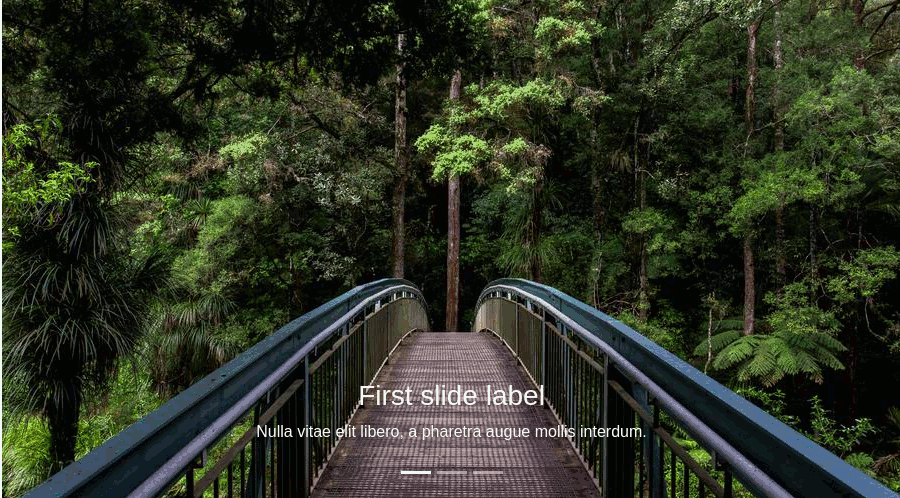
Last we’ll demonstrate how to use the angular bootstrap carousel, as ng-bootstrap has a carousel component to implement it in our Angular, Here is a screenshot of our example of the angular bootstrap carousel.
Let’s edit our component to add a carousel to our project.
<ngb-carousel *ngIf="images" class="text-lg-center">
  <ng-template ngbSlide>
    <div class="picsum-img-wrapper">
      <img [src]="images[0]" alt="Random first slide">
    </div>
    <div class="carousel-caption">
      <h3>First slide label</h3>
      <p>Nulla vitae elit libero, a pharetra augue mollis interdum.</p>
    </div>
  </ng-template>
  <ng-template ngbSlide>
    <div class="picsum-img-wrapper">
      <img [src]="images[1]" alt="Random second slide">
    </div>
    <div class="carousel-caption">
      <h3>Second slide label</h3>
      <p>Lorem ipsum dolor sit amet, consectetur adipiscing elit.</p>
    </div>
  </ng-template>
  <ng-template ngbSlide>
    <div class="picsum-img-wrapper">
      <img [src]="images[2]" alt="Random third slide">
    </div>
    <div class="carousel-caption">
      <h3>Third slide label</h3>
      <p>Praesent commodo cursus magna, vel scelerisque nisl consectetur.</p>
    </div>
  </ng-template>
</ngb-carousel>
Add image array object in component typescript file as below.
images = [944, 1011, 984].map((n) => `https://picsum.photos/id/${n}/900/500`);Note: We need to add class=”text-lg-center” to the carousel component so we can make the ng-bootstrap carousel center.
Related Articles