The ionic segments component displays a group of related buttons, sometimes known as segmented controls, in a horizontal row. They can be displayed inside of a toolbar or the main content. The functionality of the Ionic segment is the same as Ionic tabs, where you select the one tab that will deselect all other tabs. Like the segment component, Ionic has lots of pre-built components like action sheets, loading, toast, and slides.
In this article, we’ll learn how to use and demonstrate an example of the Ionic segment component. We can easily change setting CSS style for our needs and the segment can be scrollable we have d an example of it.
Prerequisites:
To create and run an Ionic project, We need nodejs and Ionic CLI already install in our system, if not then check how to install nodejs and Ionic in Ubuntu. Ionic CLI allows us to create an Ionic project, generate application and library code, and perform a variety of ongoing development tasks such as testing, bundling, and deployment. To install the Ionic CLI, open a terminal, and run the following command:
npm install -g @ionic/cliSeting up and configure an Ionic segment project
With the release of ionic version 4, the Ionic framework is no longer limited to angular, we can create the ionic projects in different front-end frameworks like Angular, Vue, and React. Let’s first create a blank Ionic Angular project.
ionic start segmentApps blank --type=angular
cd segmentApps
Here’s a quick screenshot of what we’ll be building.
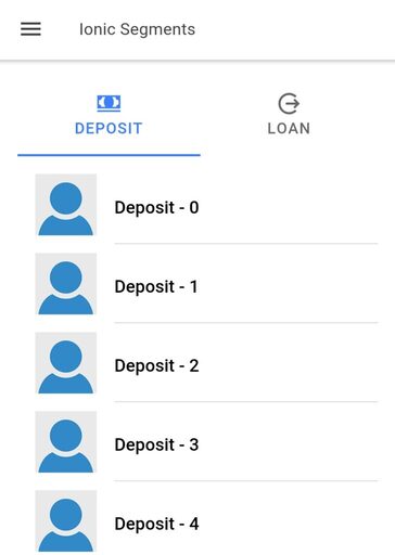
How to add ionic segment component in page ?
The segment component allows a user to toggle between different views inside of the content of the same page. When we are navigating between different pages, then we can use the Ionic tab component instead.
<ion-header>
  <ion-toolbar>
    <ion-title size="small">Ionic Segments</ion-title>
  </ion-toolbar>
</ion-header>

<ion-content class="ion-padding">
  <ion-segment color="primary" [(ngModel)]="type" (ionChange)="segmentChanged($event)" scrollable>
    <ion-segment-button value="deposit" checked>
      <ion-label>Deposit</ion-label>
      <ion-icon name="cash"></ion-icon>
    </ion-segment-button>
    <ion-segment-button value="loan">
      <ion-label>Loan</ion-label>
      <ion-icon name="log-out"></ion-icon>
    </ion-segment-button>
  </ion-segment>

<div [ngSwitch]="type">
    <ion-list *ngSwitchCase="'deposit'">
      <ion-item *ngFor="let item of [].constructor(20); let i = index">
        <ion-thumbnail slot="start">
          <img src="https://avatars.io/instagram/unknown">
        </ion-thumbnail>
        <h6>Deposit - {{ i }}</h6>
      </ion-item>
    </ion-list>

    <ion-list *ngSwitchCase="'loan'">
      <ion-item>
        <ion-thumbnail slot="start">
          <img src="https://avatars.io/instagram/unknown">
        </ion-thumbnail>
        <h6>Loan 2</h6>
      </ion-item>
    </ion-list>
  </div>
</ion-content>
How to used Ionic segment change event ?
We have an ionChange event on the ionic segment. This event is emitted when the value property of the segment has changed and any dragging pointer has been released from ion-segment. The checked attribute in ion-segment-button didn’t work for the first time when the component is the load, to solve these issues we will set the default ion-segment value inside our component as.
import { Component } from '@angular/core';

@Component({
  selector: 'app-home',
  templateUrl: 'home.page.html',
  styleUrls: ['home.page.scss'],
})
export class HomePage {
  type = 'deposit';

  constructor() {}

  segmentChanged(ev: any) {
    console.log('Segment changed', ev);
  }
}
How to set default ion-segment-button in active state ?
When you have a few ion-segment-button and we can set the default ion-segment-button to a particular segment button. For that, we need to set the default active segment value in our component typescript. For our above example, we have set deposit as ionic segment default active segment by using ion-segment switch type value to deposit in ngOnInt method.
How to make Ionic segment scrollable ?
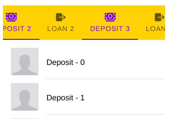
Ionic Segment components are not scrollable by default. Each segment width is determined by dividing the number of segment buttons by the screen width. Segment labels may get cut off when we have more numbers segments or segments have a longer label. We can solve this issue by using segment scrollable property to true or by adding attribute scrollable on the segment. This will cause the segment to scroll horizontally but will allow each segment button to have a variable width.
Apply CSS style to an Ionic segment
We can apply a different background color to the segment with help of Ionic CSS properties called –background. In our case, we have applied a warning color to the ionic segment background. Segment font color can be controlled by using color properties directly in the segment. Here’s a quick screenshot of how we can change the segment color of the font and background.
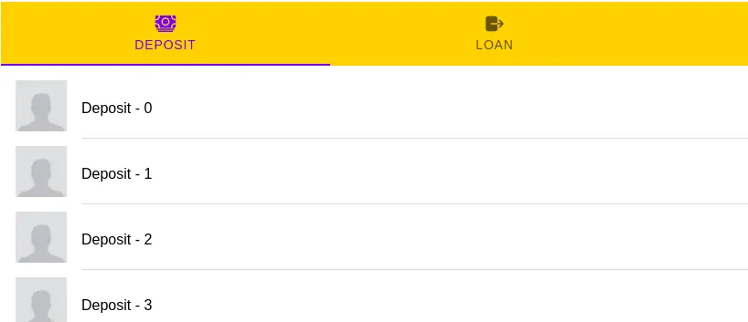
ion-segment {
  --background:#ffc409;
}
The ionic segment has only one CSS custom properties background and but we have lots of custom CSS properties for the ionic segment button which we will discuss later in this article. To edit the font color of the segment, apply color properties inside the segment.
  <ion-segment color="tertiary">
    <ion-segment-button value="deposit" checked>
      <ion-label>Deposit</ion-label>
      <ion-icon name="cash"></ion-icon>
    </ion-segment-button>
    <ion-segment-button value="loan">
      <ion-label>Loan</ion-label>
      <ion-icon name="log-out"></ion-icon>
    </ion-segment-button>
  </ion-segment>
We can ionic segment by using the following attribute values.
| Properties | Description | Value |
|---|---|---|
| Color | Font color of the segment can use from your application’s color palette. | “primary”, “secondary”, “tertiary”, “success”, “warning”, “danger”, “light”, “medium”, and “dark” |
| Scrollable | If true, the segment buttons will overflow and the user can swipe and scroll horizontally. | The default value is false, To have a horizontal scroll add the value boolean true. |
| Mode | The mode determines which platform styles to use. | ios for Iphone and md for Android style. |
We have another example of how to customize the Ionic segment by applying CSS style on the ion-segment-button child component of the ion-segment. We can use any other HTML element or Ionic component with an ionic segment. Here is a gif image of our segment style.
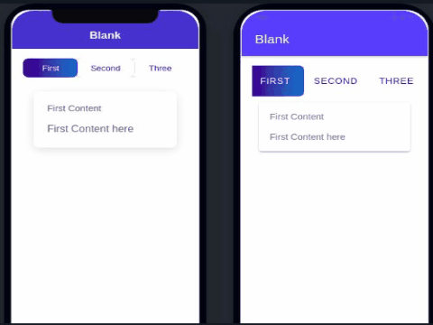
We have three ionic segment buttons and we can apply CSS style for the Ionic segment and let edit home.page.html file.
<ion-content class="ion-padding">

  <ion-segment [(ngModel)]="segment" scrollable>
    <ion-segment-button value="first">
      First
    </ion-segment-button>
    <ion-segment-button value="second">
      Second
    </ion-segment-button>
    <ion-segment-button value="third">
      Three
    </ion-segment-button>
    <ion-segment-button value="first">
      First
    </ion-segment-button>
    <ion-segment-button value="second">
      Second
    </ion-segment-button>
    <ion-segment-button value="third">
      Three
    </ion-segment-button>
  </ion-segment>


  <div [ngSwitch]="segment">
    <ion-card *ngSwitchCase="'first'">
      <ion-card-header>
        First Content
      </ion-card-header>
      <ion-card-content>
        First Content here
      </ion-card-content>
    </ion-card>

    <ion-card *ngSwitchCase="'second'">
      <ion-card-header>
        Second Header
      </ion-card-header>
      <ion-card-content>
        Second content here
      </ion-card-content>
    </ion-card>

    <ion-card *ngSwitchCase="'third'">
      <ion-card-header>
        Third Header
      </ion-card-header>
      <ion-card-content>
        Third content
      </ion-card-content>
    </ion-card>
  </div>
</ion-content>
We need to import FormsModule in the app.module.ts file and let add segment component in our component template.
import { Component } from '@angular/core';

@Component({
  selector: 'app-home',
  templateUrl: 'home.page.html',
  styleUrls: ['home.page.scss'],
})
export class HomePage {
  segment = 'second';

  constructor() {}
}
Let edit the home.page.scss to apply style for our above segment.
ion-segment-button {
  --indicator-box-shadow: transparent !important;
  --background:white;
  --color:#2d2e87;
  --background-checked: linear-gradient(to right, #2d2e87, #0083CB)!important;
  --color-checked: white;
  border-radius: .5rem !important;
  padding: 2px;
  margin: 0;
}
The ionic segment button provides us with lots of custom CSS properties to apply different CSS styles for the segment button and here we have a list of custom CSS properties of the ionic segment button which we can use.
| Name | Description |
|---|---|
--background |
Background of the segment button |
--background-checked |
Background of the checked segment button |
--background-hover |
Background of the segment button on hover |
--background-hover-opacity |
Opacity of the segment button background on hover |
--border-color |
Color of the segment button border |
--border-radius |
Radius of the segment button border |
--border-style |
Style of the segment button border |
--border-width |
Width of the segment button border |
--background-focused |
Background of the segment button when focused with the tab key |
--background-focused-opacity |
Opacity of the segment button background when focused with the tab key |
--color |
Color of the segment button |
--color-checked |
Color of the checked segment button |
--color-focused |
Color of the segment button when focused with the tab key |
--color-hover |
Color of the segment button on hover |
--indicator-box-shadow |
Box shadow on the indicator for the checked segment button |
--indicator-color |
Color of the indicator for the checked segment button |
--indicator-height |
Height of the indicator for the checked segment button |
--indicator-transform |
Transform of the indicator for the checked segment button |
--indicator-transition |
Transition of the indicator for the checked segment button |
--margin-bottom |
Bottom margin of the segment button |
--padding-bottom |
Bottom padding of the segment button |
--padding-end |
Right padding if direction is left-to-right, and left padding if direction is right-to-left of the segment button |
--padding-start |
Left padding if direction is left-to-right, and right padding if direction is right-to-left of the segment button |
--padding-top |
Top padding of the segment button |
--transition |
Transition of the segment button |
--margin-end |
Right margin if direction is left-to-right, and left margin if direction is right-to-left of the segment button |
--margin-start |
Left margin if direction is left-to-right, and right margin if direction is right-to-left of the segment button |
--margin-top |
Top margin of the segment button |
Conclusion
We have explored how to make an ionic segment with an example. We have also looked at how to control the segment style and I hope you got some idea of how to use the segment.
Related posts