Ionic item slider is one of many pre-made components available in the Ionic framework. The ionic sliding item component contains child items that can be dragged to reveal action. All options to reveal should be placed in the item options element.

In the app’s screenshot of the ionic item slider, we have the image on the left side of the page title and descriptions. We have to upload images in the assets folder of our apps.
Installing the Ionic CLI
If you have not yet installed an Ionic CLI on your system. Then we need to install an Ionic CLI first. Ionic CLI allows us to create an Ionic project, generate application and library code, and perform a variety of ongoing development tasks such as testing, bundling, and deployment. In our previous articles, we have discussed how to install Ionic and fix npm permission. To install the Ionic CLI, open a terminal, and run the following command:
npm install -g @ionic/cliSetting up Ionic item Slider Apps
Make sure you must have the latest version of Ionic CLI installed on your system. With the release of ionic version 4, no longer limited to angular, we can create the ionic projects in different front-end frameworks like Angular, Vue, and React. In these articles, we will learn Ionic and create an Ionic slider based on an Angular.
ionic start itemSlider blank --type=angular
cd itemSlider
Example of the Ionic item slider and add the following code to home.page.html
<ion-header>
  <ion-toolbar color="primary">
    <ion-title>
      Ionic Item Sliding
    </ion-title>
  </ion-toolbar>
</ion-header>

<ion-content>
  <div class="ion-padding">
    <ion-list>
      <ion-item-sliding *ngFor="let page of pages" routerLink="{{page.link}}">
        <ion-item-options side="start">
          <ion-item-option color="danger" (click)="share(item)">Share </ion-item-option>
        </ion-item-options>

        <ion-item slot="top">
          <ion-avatar>
            <img src="{{ page.thumb }}">
          </ion-avatar>
          <ion-label>{{ page.title }}</ion-label>
        </ion-item>

        <ion-item-options slot="end">
          <ion-button color="primary" (click)="edit(page.title)">
          <ion-icon name="text"></ion-icon>Edit</ion-button>
          <ion-button color="danger" (click)="delete(page.title)">
          <ion-icon name="call"></ion-icon>Delete</ion-button>
        </ion-item-options>
      </ion-item-sliding>
    </ion-list>
  </div>
</ion-content>
Step 3: Add the following code in home.ts
import { Component } from '@angular/core';
import { Route } from '@angular/compiler/src/core';
import { Router } from '@angular/router';

@Component({
  selector: 'app-home',
  templateUrl: 'home.page.html',
  styleUrls: ['home.page.scss'],
})
export class HomePage {
  public isSuccess: boolean;
  public isError: boolean;
  public isWarning: boolean;
  public canProceed: boolean;
  public pages: Array<{ title: string, thumb: string, description: string, link: any }>;

  constructor() {
    this.pages = [
      {
        title: 'About',
        thumb: './assets/images/about.png',
        description: 'Who we are. What we do. Why we’re here',
        link: "/about"
      },
      {
        title: 'Contact Us',
        thumb: './assets/images/contact.png',
        description: 'Drop us a line and get in touch we’d love to hear from you!',
        link: "/contact"
      },
      {
        title: 'Technologies',
        thumb: './assets/images/tech.png',
        description: 'Third party resources used by this app',
        link: "/technology"
      },
      {
        title: 'Tweets',
        thumb: 'assets/images/twitter.png',
        description: 'The latest news updates from our Twitter account',
        link: "TweetsPage"
      }
    ];
  } // End of constructor

  edit(page) {
    console.log(`I could do a lot more than just print out this message for the ${page} page to the browser console`);
  }

  delete(page) {
    console.log(`Yep, I’m an under-performer for the ${page} page too :(`);
  }
}
Step 4: Add the following code in the home.scss
ion-list {
    --ion-background-color:#b0c4de;
    --ion-background-color-rgb:   176, 196, 222;
}
Here we had listed what are subcomponents of the Ionic item slider component.
| Components | Description |
ion-item-sliding | This is the root component of the Ionic item slider and contains a list of sliding slider options and items. |
ion-item-options | It is a subcomponent of the ionic slider item, we can add an action button inside it and it has a slot attribute to add this subcomponent at start or end. |
ion-item | It is a subcomponent of ion-item-sliding and here we add what data we want to display to the user. |
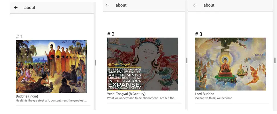
On continuing our previous example, we are creating an about page where we will be displaying an image and text through ion-slides. The Slides component allows multiple contents to be loaded (e.g images, video, or text), as individual slides, into a single container that can then be swiped through. The Slides component is a multi-section container. Each section can be swiped or dragged between. It contains any number of Slide components.
Step 5: Add the following code in about.page.html
<ion-header>
  <ion-toolbar color="primary">
    <ion-title>About - Sliding</ion-title>
  </ion-toolbar>
</ion-header>

<ion-content>
    <ion-slides #picSlider (ionSlideDidChange)="onSlideMoved($event)" [options]="slideOpts">
      <ion-slide>
          <h1># 1</h1>
          <img src="./assets/images/slide1.jpg">
          <h2>Buddha (India)</h2>
          Health is the greatest gift, contentment the greatest wealth, faithfulness the best relationship.
        </ion-slide>
        <ion-slide>
            <h1># 2</h1>
            <img src="./assets/images/slide2.jpg">
            <h2>Yeshi Tsogyal (8 Century)</h2>
            What we understand to be phenomena. Are but the magical projections of the mind.
        </ion-slide>
        <ion-slide>
          <h1># 3</h1>
          <img src="./assets/images/slide3.jpg">
          <h2>Lord Buddha</h2>
          What we think, we become
        </ion-slide>
      </ion-slides>
</ion-content>
Step 6: Add the following code in about.ts. We need to import slides and viewChilde. In an angular, we have @ViewChild decorator which allows us to interact with parent and child components. ViewChild helps us to get access to a component and its methods of the parent component.
We create an object called slideOpts which store the configuration options for our Slides component (these are part of the Slides component API – the pager property defines the speed property defines, in milliseconds, how long the transition between slides will last
import { Component, ViewChild } from '@angular/core';
import { IonSlides } from '@ionic/angular';

@Component({
  selector: 'app-about',
  templateUrl: './about.page.html',
  styleUrls: ['./about.page.scss'],
})
export class AboutPage {
  @ViewChild('picSlider',  {static: false}) viewer: IonSlides;

  constructor() { }

  slideOpts = {
    initialSlide: 1,
    speed: 400,
    autoplay:true
  };

  onSlideMoved(event) {
    /** isEnd true when slides reach at end slide */
    event.target.isEnd().then(isEnd => {
      console.log('End of slide', isEnd);
    });

    event.target.isBeginning().then((istrue) => {
      console.log('End of slide', istrue);
    });
  }

}
Conclusion
Finally, we have completed the Ionic slider tutorial with an example. In this tutorial, we learned how to make an Ionic slider with an image in the Ionic app.
Related posts