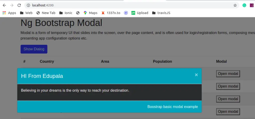
Angular bootstrap modal is a temporary UI that slides into the screen over the page content, is often used for notification, completely custom content, login/registration forms, composing messages, or presenting app configuration options for example.
In this tutorial we have three goals behind this chapter. First, we will learn how to use Angular bootstrap modal. Secondly, how to send data to|form modal. At last we will learn how to add style to our modal. Let’s get started.
Setting up and configure Angular bootstrap modal project.
Let first create our Angular bootstrap modal project and we’ll demonstrate two examples of the modal. Before starting an angular project you need to install nodejs and Angular CLI in your system.
ng new bootstrapApp
ng add @ng-bootstrap/ng-bootstrap
Before angular 9, installing bootstrap in angular, we manually need to add NgbModule from angular ng-bootstrap in app.module.ts file but this is not the case in angular 9 and above. We just run the command below only to install and configure bootstrap in angular.
We need to create two components basic-modal and country-modal to demonstrate the Angular bootstrap modal example. Let create two components.
ng g component components/modal/basic
ng g component components/modal/country-modal
We need dummy data to pass data from component to modal and let create a data folder and countries.json file.
[
    {
        "id": "1",
        "name": "Russia",
        "flag": "f/f3/Flag_of_Russia.svg",
        "area": 17075200,
        "population": 146989754
    },
    {
        "id": "2",
        "name": "France",
        "flag": "c/c3/Flag_of_France.svg",
        "area": 640679,
        "population": 64979548
    },
    {
        "id": "3",
        "name": "India",
        "flag": "4/41/Flag_of_India.svg",
        "area": 3287263,
        "population": 1324171354
    },
    {
        "id": "4",
        "name": "Germany",
        "flag": "b/ba/Flag_of_Germany.svg",
        "area": 357114,
        "population": 82114224
    },
    {
        "id": "5",
        "name": "Portugal",
        "flag": "5/5c/Flag_of_Portugal.svg",
        "area": 92090,
        "population": 10329506
    },
    {
        "id": "4",
        "name": "Canada",
        "flag": "c/cf/Flag_of_Canada.svg",
        "area": 9976140,
        "population": 36624199
    },
    {
        "id": "6",
        "name": "Vietnam",
        "flag": "2/21/Flag_of_Vietnam.svg",
        "area": 331212,
        "population": 95540800
    }
]
Let create folder models in the app folder and add an interface for the country.
export interface ICountry {
    name: string;
    flag: string;
    area: number;
    population: number;
}
Angular bootstrap modal basic example
First, we will demonstrate a simple Angular bootstrap modal without sending any data from and to the modal.

In our app component let add a button to open a basic modal, in this modal we have to look at how we can change the background color of the header, footer, and background color to our modal.
<div class="container">
  <h1>Ng Bootstrap Modal</h1>
  <p>
    Modal is a form of temporary UI that slides into the screen, over the page
    content, and is often used for login/registration forms, composing messages, or
     presenting app configuration options etc.
  </p>
  <button class="btn btn-primary" (click)="openModal()">Show Dialog</button>
 </div>
In our app component typescript, we will inject bootstrap modal objects.
import { Component, OnInit, ViewEncapsulation } from '@angular/core';
import { NgbModal } from '@ng-bootstrap/ng-bootstrap';
import { BasicModalComponent } from './components/modal/basic-modal/modal.component';

@Component({
  selector: 'app-root',
  templateUrl: './app.component.html',
  styleUrls: ['./app.component.scss'],
  encapsulation: ViewEncapsulation.None,
})
export class AppComponent implements OnInit {

  constructor(private modalService: NgbModal) { }

  openModal() {
    const modalRef = this.modalService.open(BasicModalComponent, {
      size: 'xl',
      centered: true,
      windowClass: 'dark-modal'
    });
  }
}
We can configure our modal component, the ngbModal object has an open method where we have to pass which modal we want to open. We can also pass the configuration of the modal.
| Properties | Description |
| size | We can change the size of the modal using the size property it can have values of sm, lg, and xl. |
| scrollable | Value can be true or false. If true then we can have scrolling if the modal height is larger than the screen. |
| centered | To align the modal at the center of the page. |
| windowClass | Add our custom CSS class name to add style to the modal. |
Angular bootstrap modal basic example
Once the user clicks on openModal button in our app component, it will open our basic modal component. In our basic modal component, we have injected NgbActiveModal in our modal component. Let edit the basic-modal.component.ts file
import { Component } from '@angular/core';
import { NgbActiveModal } from '@ng-bootstrap/ng-bootstrap';

@Component({
  selector: 'app-basic-modal',
  templateUrl: './basic-modal.component.html',
  styleUrls: ['./basic-modal.component.scss']
})
export class BasicModalComponent {

  constructor(
    public activeModal: NgbActiveModal
  ) { }

}
In our basic modal component template, we have a close button to dismiss our modal component. Let’s edit the basic-modal.component.html file to add the header, footer, and content of the modal.
<div class="modal-header bg-info">
<h4 class="modal-title">HI From Edupala</h4>
<button type="button" class="close" aria-label="Close" (click)="activeModal.dismiss('Cross click')">
<span aria-hidden="true">×</span>
</button>
</div>
<div class="modal-body">
<p>Believing in your dreams is the only way to reach your destination.</p>
</div>
<div class="modal-footer bg-info">
<h6>Boostrap basic modal example</h6>
</div>We can see from the modal template we have used bg with a color name class name to apply background color to the header and footer.
Angular bootstrap modal : To sent data to modal and send back data from modala to component
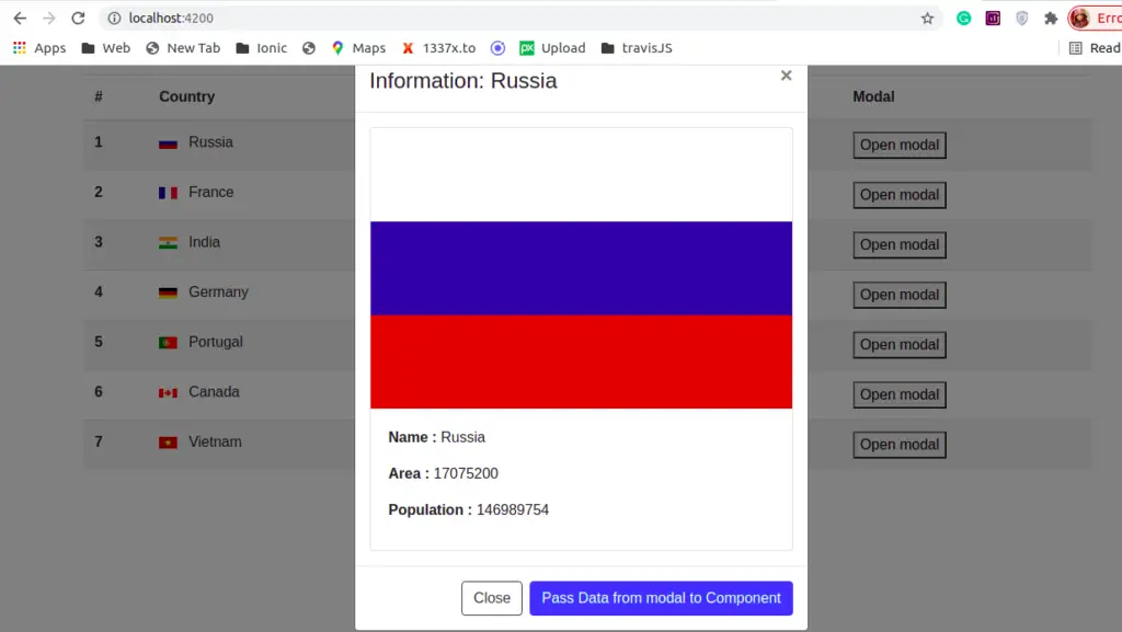
In the second example, we will demonstrate how we can send data to the bootstrap modal component. Here is a screenshot of our example.

In our app component, we retrieve a list of countries from dummy data, clicking the open modal button will open the country-modal and will pass country data from component to country-modal component.
import { Component, OnInit, ViewEncapsulation } from '@angular/core';
import { ModalDismissReasons, NgbModal } from '@ng-bootstrap/ng-bootstrap';
import { CountryModalComponent } from './components/modal/country-modal/country-modal.component';
import { ICountry } from './modal/country.model';
@Component({
  selector: 'app-root',
  templateUrl: './app.component.html',
  styleUrls: ['./app.component.scss'],
  encapsulation: ViewEncapsulation.None,
})
export class AppComponent implements OnInit {
  countries: ICountry[] = [];
  modalCloseResult: string | undefined;

  constructor(private modalService: NgbModal) { }

  ngOnInit(): void {
    fetch('./assets/data/countries.json').then(res => res.json())
      .then(json => {
        this.countries = json;
      });
  }

  open(country: ICountry) {
    const modalRef = this.modalService.open(CountryModalComponent);
    modalRef.componentInstance.country = country;

    //set modalCloseResult to empty string
    this.modalCloseResult = '';

    modalRef.componentInstance.passEntry.subscribe((data: any) => {
      this.modalCloseResult = data;
    });
  }
}
We have sent country data to the modal, on the modal component we can send back data to the component. Let’s edit the app component template to iterate through the countries list and add a button to open the country.
<div class="container">
  <div *ngIf="modalCloseResult">
    Data from modal: {{ modalCloseResult | json}}
  </div>
  <table class="table table-striped">
    <thead>
      <tr>
        <th scope="col">#</th>
        <th scope="col">Country</th>
        <th scope="col">Area</th>
        <th scope="col">Population</th>
        <th scope="col">Modal</th>
      </tr>
    </thead>
    <tbody>
      <tr *ngFor="let country of countries; index as i">
        <th scope="row">{{ i + 1 }}</th>
        <td>
          <img [src]="'https://upload.wikimedia.org/wikipedia/commons/' + country.flag" class="mr-2"
            style="width: 20px">
          {{ country.name }}
        </td>
        <td>{{ country.area | number }}</td>
        <td>{{ country.population | number }}</td>
        <td><button (click)="open(country)">Open modal</button></td>
      </tr>
    </tbody>
  </table>
</div>


<router-outlet></router-outlet>
Retrieve data from modal component
To retrieve data in the modal component, we have used the @Input decorator and to send data from the modal to the component we have used the @Output decorator. Let’s edit the country-modal.component.ts file.
import { Component, EventEmitter, Input, Output } from '@angular/core';
import { NgbActiveModal } from '@ng-bootstrap/ng-bootstrap';
import { ICountry } from 'src/app/modal/country.model';

@Component({
  selector: 'app-country-modal',
  templateUrl: './country-modal.component.html',
  styleUrls: ['./country-modal.component.scss']
})
export class CountryModalComponent {
  @Input() country: ICountry | undefined;
  @Output() passEntry: EventEmitter<any> = new EventEmitter();

  constructor(public activeModal: NgbActiveModal) { }

  passDateFromModal(): void {
    let modalData = { from: 'edupala', message: 'Back from modal' };
    this.passEntry.emit(modalData);
    this.activeModal.dismiss();
  }
}
In our modal component template, display the detail of the country and edit the country-modal.component.html file.
<div class="modal-header">
<h4 class="modal-title">Information: {{ country?.name }}</h4>
<button type="button" class="close" aria-label="Close" (click)="activeModal.dismiss('Cross click')">
<span aria-hidden="true">×</span>
</button>
</div>
<div class="modal-body">
<div class="card country-border">
<img class="card-img-top" [src]="'https://upload.wikimedia.org/wikipedia/commons/' + country?.flag"
alt="Card image cap">
<div class="card-body">
<p class="card-text"><b>Name : </b>{{ country?.name }}</p>
<p class="card-text"><b>Area : </b>{{ country?.area }}</p>
<p class="card-title"><b>Population : </b>{{ country?.population }}</p>
</div>
</div>
</div>
<div class="modal-footer">
<button class="btn btn-outline-dark" (click)="activeModal.close('Close
click')">
Close
</button>
<button class="btn btn-primary" (click)="passDateFromModal()">
Pass Data from modal to Component
</button>
</div>In our country modal we have two buttons, the close button will dismiss the modal, and passing data from the modal to a component will send data back to the component.
Conclusion
We have completed our Angular bootstrap modal example and demonstrated two examples of how we can send and receive data from the modal using the @Input and @Output decorator. Angular bootstrap modal we can add any HTML element like video, audio, image, and more.
Related Articles