Ionic comes with a number of pre-built components like modals, loading, toast, and more. The ionic card is one of the pre-built components of the Ionic framework and allows us to create a great way to display an important piece of data in an organized manner. The card has quickly emerged as a core design pattern for modern web and apps. Cards have used design patterns of choice for many companies, including companies like Google, Twitter, and Spotify.
In this tutorial, we will explore how to used the Ionic card component. We first demonstrate basic card component example, card list, how to set card background, card collapsable, ionic card slider, and card footer.
What is an ion card or Ionic card component?
The ionic cards component allows us to a standard piece of UI that serves as an entry point to more detailed information. The card is a flexible and extensible content container. We can easily configure a card by adding an optional subcomponent like ion-card-content, ion-card-header, ion-card-title, and ion-card-subtitle. The card is a single component and can have the following subcomponents which we can control its color and mode properties.
| Subcomponents | Description |
|---|---|
| ion-card-content | Here we add text content for a card. |
| ion-card-header | Header component for ion-card. |
| ion-card-title | card titles for ion-card. |
| ion-card-subtitle | ion-card-subtitle is ion-card. |
Seting up an Ionic Card project
With the release of ionic version 4, the Ionic framework is no longer limited to angular, we can create the ionic projects in different front-end frameworks like Angular, Vue, and React. Let first create a blank Ionic Angular project.
ionic start cardExample blank --type=angularIonic card example One – basic usage of all card subcomponent
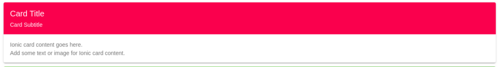
Let’s create the first example of the card, where we’ll include all subcomponents of the card. We can change the card header by using color properties.
Here’s a quick screenshot of what we’ll be building.
  <ion-card>
    <ion-card-header color="danger">
      <ion-card-title>Card Title</ion-card-title>
      <ion-card-subtitle>Card Subtitle</ion-card-subtitle>
    </ion-card-header>

    <ion-card-content class="ion-margin-top">
      Card content goes here.<br/>
      Add some text or image for card content.
    </ion-card-content>
  </ion-card>
Ionic card with an image and Ionic card footer
The Ionic card component can contain text, a list, video, and images. In the example below, we have added an image on the ionic header. We don’t have an Ionic card footer subcomponent but we can use an ion-footer component to add a footer to the card. In the Ionic footer, we have a row with two columns containing an Ionic icon for likes and comments as below.

  <ion-card>
    <ion-card-header class="ion-no-padding">
      <img src="./assets/images/avatar-2.png">
    </ion-card-header>

    <ion-card-content>
      Keep close to Nature's heart... and break clear away, once in awhile,
      and climb a mountain or spend a week in the woods. Wash your spirit clean.
    </ion-card-content>

    <ion-footer color="danger">
      <ion-row>
        <ion-col size="6" class="ion-text-center">
          <ion-button fill="clear" color="light" class="ion-text-capitalize">
            <ion-icon name="thumbs-up"></ion-icon>
            <div>1.5k Likes</div>
          </ion-button>
        </ion-col>
        <ion-col size="6" class="ion-text-center">
          <ion-button fill="clear" color="light" class="ion-text-capitalize">
            <ion-icon name="document-text"></ion-icon>
            <div>4 Comments</div>
          </ion-button>
        </ion-col>
      </ion-row>
    </ion-footer>
  </ion-card>
Replace the Ionic header image with your own image. We can easily add icons, buttons, and list items to the card. We can use color properties to set color to card background color. Color properties can apply to all card sub-components like ion-card-header, ion-card-content, and other subcomponents of a card,
Ionic card list example
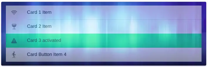
The ionic card is flexible, we can add almost all content types like text, icons, and lists. Below the example, we had a card with a list of items. Ionic lists are made up of multiple rows of items that can contain text, buttons, toggles, icons, thumbnails, and much more. We have also set the background image to a card also.
Here’s a quick screenshot of what we’ll be building.
  <ion-card class="ion-card-list">
    <ion-card-content>
      <ion-item href="#">
        <ion-icon name="wifi" slot="start"></ion-icon>
        <ion-label>Card 1 Item</ion-label>
      </ion-item>

      <ion-item href="#">
        <ion-icon name="wine" slot="start"></ion-icon>
        <ion-label>Card 2 Item</ion-label>
      </ion-item>

      <ion-item class="ion-activated">
        <ion-icon name="warning" slot="start"></ion-icon>
        <ion-label>Card 3 activated</ion-label>
      </ion-item>

      <ion-item>
        <ion-icon name="walk" slot="start"></ion-icon>
        <ion-label>Card Button Item 4</ion-label>
      </ion-item>
    </ion-card-content>
  </ion-card>
We have added a custom class name to our Ionic card list, by using this class name we can set the background image to our card. Edit home.scss for an apply an Ionic background image.
.ion-card-list {
    --background: url(../../assets/images/background.jpeg) no-repeat 100% 100%;
    background-size: cover;
    --color: red;
    background-color: #6DB3F2;
    ion-item {
        opacity: 0.5;
    }
}
Ionic card properties
By using color properties on the Ionic card subcomponent, we can control the card subcomponent’s background color. Card support many properties below, we can add button property to make a card clickable or tappable.
| Properties | Description |
|---|---|
| button | If true, a button tag will be rendered and the card will be tappable. |
| color | The color to use from your application’s color palette to set the background color to card subcomponents. Default options are: “primary”, “secondary”, “tertiary”, “success”, “warning”, “danger”, “light”, “medium”, and “dark” |
| disabled | If true, the user cannot interact with the card. |
| href | Contains a URL or a URL fragment that the hyperlink points to. If this property is set, an anchor tag will be rendered. |
| mode | The mode determines which platform styles to use. |
| rel | Specifies the relationship of the target object to the link object. The value is a space-separated list of link types. |
| routerAnimation | When using a router, it specifies the transition animation when navigating to another page using href. |
| routerDirection | When using a router, it specifies the transition direction when navigating to another page using href. |
| target | Specifies where to display the linked URL. Only applies when an href is provided. Special keywords: “_blank”, “_self”, “_parent”, “_top”. |
| type | The type of the button. Only used when an onclick or button property is present. |
Ionic collapsible card
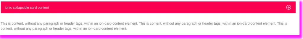
Using the card component, *ngIf directive, and click event, we can make the card collapsible. Below the screenshot, we have the Ionic card collapsible. Card header’s right side we have icons of arrow-down and arrow-up. When the user clicks on the icon it will toggle isCardCollapse to 0 or 1. If isCardCollapse is zero we hide card content and show card content when isCardCollapse is one.
  <ion-card button class="card-2">
    <ion-card-header (click)="isCardCollapse == 1 ? isCardCollapse = 0 : isCardCollapse = 1">
      <ion-item color="danger" lines="none">
        <ion-label>Ionic collapsible card content</ion-label>
        <ion-icon slot="end" [name]="isCardCollapse ? 'arrow-down-circle-outline' : 'arrow-up-circle-outline'">
        </ion-icon>
      </ion-item>
    </ion-card-header>

    <ion-card-content [hidden]="!isCardCollapse" class="ion-margin-top ion-padding">
      This is content, without any paragraph or header tags,
      within an ion-card-content element. This is content, without any paragraph or header tags,
      within an ion-card-content element. This is content, without any paragraph or header tags,
      within an ion-card-content element.
    </ion-card-content>
  </ion-card>
We have also added a button property on the card to make it tappable. By using isCardCollapse variable value 0 or 1 we can control the ionic card collapsable state. In our home.page.ts we need to declare isCardCollapse to 1 as.
isCardCollapse = 1;Ionic card shadow
We can also add shadow to our Ionic card. In the above example, you can see a pink shadow on our card. Ionic card shadow can achieve by adding custom class names to our card and then adding CSS using a custom class. In our case, we have added an ion-card-list class name to our Ionic card list.
.ion-card-list {
    --background: url(../../assets/images/background.jpeg) no-repeat 100% 100%;
    background-size: cover;
    --color: red;
    background-color: #6DB3F2;
    ion-item {
        opacity: 0.5;
    }
}
Ionic card *ngFor loop
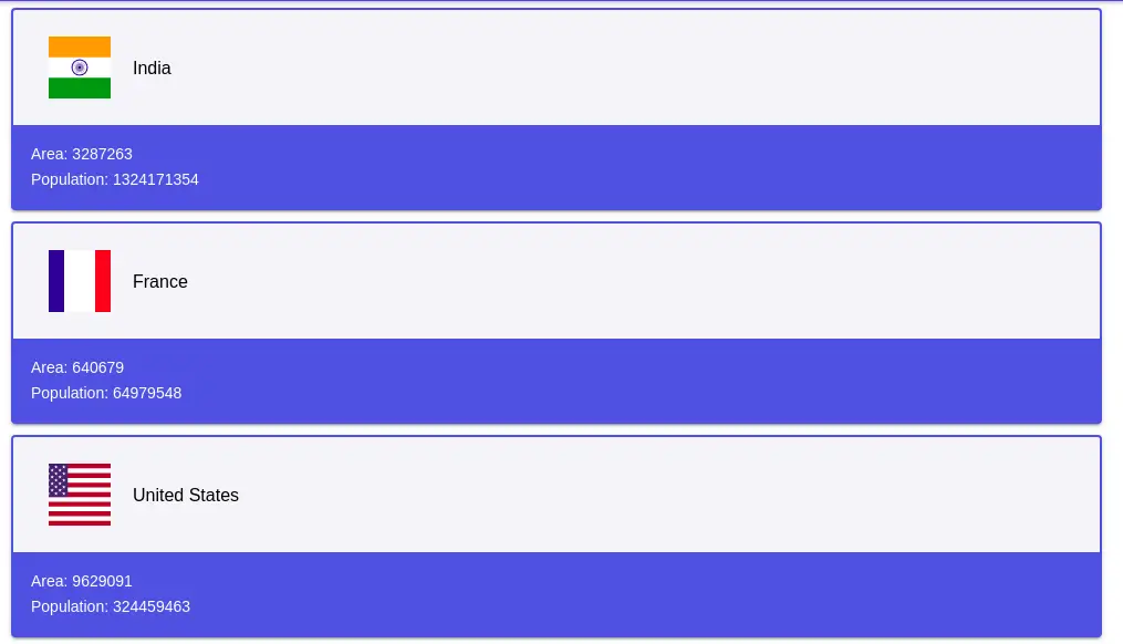
We can use looping on a card, to loop through the card, we need dummy data. Let’s create folder data in assets and add a file countries.json file for dummy data for the Ionic card loop.
[
  {
    "name": "India",
    "flag": "4/41/Flag_of_India.svg",
    "area": 3287263,
    "population": 1324171354
  },
  {
    "name": "France",
    "flag": "c/c3/Flag_of_France.svg",
    "area": 640679,
    "population": 64979548
  },
  {
    "name": "United States",
    "flag": "a/a4/Flag_of_the_United_States.svg",
    "area": 9629091,
    "population": 324459463
  },
  {
    "name": "Russia",
    "flag": "f/f3/Flag_of_Russia.svg",
    "area": 17075200,
    "population": 146989754
  },
  {
    "name": "Germany",
    "flag": "b/ba/Flag_of_Germany.svg",
    "area": 357114,
    "population": 82114224
  },
  {
    "name": "Canada",
    "flag": "c/cf/Flag_of_Canada.svg",
    "area": 9976140,
    "population": 36624199
  },
  {
    "name": "Vietnam",
    "flag": "2/21/Flag_of_Vietnam.svg",
    "area": 331212,
    "population": 95540800
  },
  {
    "name": "Mexico",
    "flag": "f/fc/Flag_of_Mexico.svg",
    "area": 1964375,
    "population": 129163276
  }
]
  <ion-card *ngFor="let country of countries">
    <ion-card-header color="light">
      <ion-item color="light" lines="none">
        <ion-thumbnail>
          <img [src]="'https://upload.wikimedia.org/wikipedia/commons/' + country.flag">
        </ion-thumbnail>
        <ion-label>{{ country.name }}</ion-label>
      </ion-item>
    </ion-card-header>
    <ion-card-content class="ion-margin-top">
      <p>Area: {{ country.area }}</p>
      <p>Population: {{ country.population }}</p>
    </ion-card-content>
  </ion-card>
Ionic card slider
We can combine both ionic slider and ionic card components to create an Ionic card slider. In the example below, we have used ionic slides as parent components and we have 4 child card components. In each child card component, we have an image, title, and container. Here is a screenshot of the Ionic card slider example.
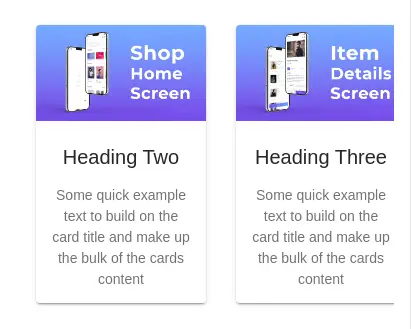
In the assets folder, we have created an images folder containing 4 images for each card component. Let’s edit the home.page.ts file to include data for our four card components.
import { Component } from '@angular/core';

@Component({
  selector: 'app-home',
  templateUrl: 'home.page.html',
  styleUrls: ['home.page.scss'],
})
export class HomePage {
  data = [
    {
      imageUrl: './assets/images/image-1.png',
      title: 'Heading One',
      description: 'Some quick example text to build on the card title and make up the bulk of the cards content'
    },
    {
      imageUrl: './assets/images/image-2.png',
      title: 'Heading Two',
      description: 'Some quick example text to build on the card title and make up the bulk of the cards content'
    },
    {
      imageUrl: './assets/images/image-3.png',
      title: 'Heading Three',
      description: 'Some quick example text to build on the card title and make up the bulk of the cards content'
    },
    {
      imageUrl: './assets/images/image-4.png',
      title: 'Heading Four',
      description: 'Some quick example text to build on the card title and make up the bulk of the cards content'
    },
  ];

  slideOpts = {
    initialSlide: 0,
    spaceBetween: 0,
    slidesPerView: 'auto',
  };

}
We need to edit the home.page.html template to iterate over data to display our data in Ionic slides and ionic card components.
<ion-content class="ion-padding">
  <div class="item-slider">
    <ion-slides [options]="slideOpts">
      <ion-slide *ngFor="let item of data">
        <ion-col>
          <ion-card class="ion-margin-top">
            <ion-card-header class="ion-no-padding">
              <ion-img [src]="item.imageUrl"></ion-img>
              <ion-card-title class="ion-padding">{{ item.title }}</ion-card-title>
            </ion-card-header>

            <ion-card-content>
              {{ item.description }}
            </ion-card-content>

          </ion-card>
        </ion-col>
      </ion-slide>
    </ion-slides>
  </div>
</ion-content>
We have an ionic column inside the ionic slide, we need to add an ionic slide component, let’s edit the home.page.scss file.
.item-slider {
  ion-slide {
      width: 200px !important;
      ion-col {
          height: 100%;
          display: flex;
          justify-content: center;
          align-items: center;
      }
  }
}
Conclusion
We have explored different examples of Ionic cards. We can easily configure the Ionic card style by adding a background image, setting the different background colors, and adding shadow colors to the Ionic card.
Related Post