Ionic grid components allow us to create a responsive list or table. Ionic grid is composed of three units: ion-grid, ion-row, and ion-col(s) for creating a grid-based layout. While working with an Ionic framework we often have to create a list or table to display our data.
Each row in the Ionic grid has a 12 column layout with different breakpoints based on the screen size. We can easily control the number of columns in a particular row and we can add up to 12 columns as maximum.
In this articles, we’ll explore who to used ionic grid and we have demonstrated how to create ionic responsive grid using size attribute of ion-col tag.
Ionic grid example
Let’s first create a simple Ionic grid example. Ionic grid component is a powerful mobile-first flexbox system for building custom layouts. The ionic framework has lots of pre-built components like alert card, loading, toast, modal, action sheet, and more.
Setting up Ionic grid example project
With the release of ionic version 4, the Ionic framework is no longer limited to angular. We can create ionic projects in different front-end frameworks like Angular, Vue, and React. Let first create a blank Ionic Angular project for our ionic grid example
ionic start ionicGrid --type=angular
In the above image is a screenshot of our first ionic grid example. Once we have created our ionic project, let’s edit the home.page.html and add three rows and each can have a different number of columns. In an Ionic grid, we can add a maximum of 12 columns in each row. The first row has 6 columns, the second row has 3 columns and the last row have two columns.
An Ionic grid will automatically try to allocate column width based on the number of columns in a row. We can see that the first-row columns have a smaller width than other columns in the second and third rows as the first row has more numbers columns than other rows.
<ion-header [translucent]="true">
  <ion-toolbar color="primary">
    <ion-title>
      Ionic Grid
    </ion-title>
  </ion-toolbar>
</ion-header>

<ion-content [fullscreen]="true">
  <ion-grid>
    <ion-row>
      <ion-col>Row : 1 Col: 1</ion-col>
      <ion-col>Row : 1 Col: 2</ion-col>
      <ion-col>Row : 1 Col: 3</ion-col>
      <ion-col>Row : 1 Col: 4</ion-col>
      <ion-col>Row : 1 Col: 5</ion-col>
      <ion-col>Row : 1 Col: 5</ion-col>
    </ion-row>
    <ion-row>
      <ion-col>Row : 2 Col: 1</ion-col>
      <ion-col>Row : 2 Col: 2</ion-col>
      <ion-col>Row : 2 Col: 3</ion-col>
    </ion-row>
    <ion-row>
      <ion-col>Row : 3 Col: 1</ion-col>
      <ion-col>Row : 3 Col: 2</ion-col>
    </ion-row>
  </ion-grid>
</ion-content>
Ionic grid example with different data
Like any other HTML element, we can add anything inside the Ionic grid column. We will demonstrate our second example of an Ionic grid to display different information types like text and images. We can also add video, buttons, and any other data types in our columns.
Creating Ionic grid for displaying JSON data
We’ll continue our example on the previous project and let add a folder called data in the assets folder and create a file called countries.json. Add the following JSON data in the assets/data/countries.json file to display in our ionic grid.
[
    {
      "name": "India",
      "flag": "4/41/Flag_of_India.svg",
      "area": 3287263,
      "population": 1324171354
    },
    {
      "name": "France",
      "flag": "c/c3/Flag_of_France.svg",
      "area": 640679,
      "population": 64979548
    },
    {
      "name": "United States",
      "flag": "a/a4/Flag_of_the_United_States.svg",
      "area": 9629091,
      "population": 324459463
    },
    {
        "name": "Russia",
        "flag": "f/f3/Flag_of_Russia.svg",
        "area": 17075200,
        "population": 146989754
      },
      {
        "name": "Germany",
        "flag": "b/ba/Flag_of_Germany.svg",
        "area": 357114,
        "population": 82114224
      },
      {
        "name": "Canada",
        "flag": "c/cf/Flag_of_Canada.svg",
        "area": 9976140,
        "population": 36624199
      },
      {
        "name": "Vietnam",
        "flag": "2/21/Flag_of_Vietnam.svg",
        "area": 331212,
        "population": 95540800
      },
      {
        "name": "Mexico",
        "flag": "f/fc/Flag_of_Mexico.svg",
        "area": 1964375,
        "population": 129163276
      }
    ]
We need to import the HTTClient module to retrieve JSON data from source data and in our case, we have dummy JSON data called countris.json. Let’s add the HTTPClient module in the app.module.ts file.
import { NgModule } from '@angular/core';
import { BrowserModule } from '@angular/platform-browser';
import { RouteReuseStrategy } from '@angular/router';
import { IonicModule, IonicRouteStrategy } from '@ionic/angular';
import { AppComponent } from './app.component';
import { AppRoutingModule } from './app-routing.module';
import { HttpClientModule } from '@angular/common/http';


@NgModule({
  declarations: [AppComponent],
  entryComponents: [],
  imports: [BrowserModule, IonicModule.forRoot(), AppRoutingModule, HttpClientModule],
  providers: [{ provide: RouteReuseStrategy, useClass: IonicRouteStrategy }],
  bootstrap: [AppComponent],
})
export class AppModule {}
Edit home.page.ts file, we need to first retrieve our data from API using the HttpClient GET method. We have an interface of Country to indicate our data model and for the real application, it’s recommended to keep all models in one folder.
import { HttpClient } from '@angular/common/http';
import { Component, OnInit } from '@angular/core';

interface ICountry {
  name: string;
  flag: string;
  area: number;
  population: number;
}

@Component({
  selector: 'app-home',
  templateUrl: 'home.page.html',
  styleUrls: ['home.page.scss'],
})
export class HomePage implements OnInit {
  countries: ICountry[];

  constructor(private http: HttpClient) { }

  ngOnInit(): void {
    this.http.get('./assets/data/countries.json').subscribe((data: any[]) => {
      this.countries = data;
    });
  }
}
Once we retrieve our data and we are assigning it to our countries array object and it will be used in our component template to display for the user.
<ion-header [translucent]="true">
<ion-toolbar color="primary">
<ion-title>
Ionic Grid
</ion-title>
</ion-toolbar>
</ion-header>
<ion-content [fullscreen]="true">
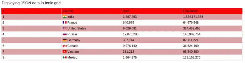
<h4>Displaying JSON data in Ionic grid</h4>
<ion-grid>
<ion-row id="grid-heading">
<ion-col>
#
</ion-col>
<ion-col>
Country
</ion-col>
<ion-col>
Area
</ion-col>
<ion-col>
Population
</ion-col>
</ion-row>
<ion-row *ngFor="let country of countries index as i">
<ion-col>
{{ i + 1 }}
</ion-col>
<ion-col>
<img [src]="'https://upload.wikimedia.org/wikipedia/commons/' + country.flag" class="mr-2" style="width: 20px">
{{ country.name }}
</ion-col>
<ion-col>
{{ country.area | number }}
</ion-col>
<ion-col>
{{ country.population | number }}
</ion-col>
</ion-row>
</ion-grid>
</ion-content>We have used the IMG HTML element to display the country flag image and if you want to add styling for your Ionic grid-like above example. Then add the following style to the home.page.scss file as.
ion-grid {
  font-family: arial, sans-serif;
  border-collapse: collapse;
  width: 98%;

  #grid-heading {
    background-color: red;
    border: 1px solid red;
  }
  ion-row {
    border: 1px solid #dddddd;
  }
  ion-row:nth-child(even) {
    background-color: #d3a7a7;
  }
  ion-col {
    border-right: 1px solid #dddddd;
  }
}
Ionic row inside row
We can create a grid inside the grid, In some situations, we may want to add a row inside a row. As we have discussed we can add any data type inside our Ionic grid-column and for example below we will demonstrate how to add rows inside rows.

In the screenshot above, we have one row and it has five columns in the first column, we have added another row containing two columns. Let’s edit our home.page.html files as
  <ion-grid>
    <ion-row>
      <ion-col size="8" style="background: red;">
        <ion-row>
          <ion-col *ngFor="let number of [1,2,3,4,5,6,7,8,9,10,11,12]">
            {{ number }}
          </ion-col>
        </ion-row>
      </ion-col>
      <ion-col *ngFor="let number of [9,10,11,12]">
        column - {{ number }}
      </ion-col>
    </ion-row>
  </ion-grid>
Ionic responsive grid: Ionic column
Ionic grids by default have flexibility in terms of responsiveness and try it best to adjust with almost all screen sizes. We have complete control over the breakpoint of each ionic responsive grid using the grid size attribute. Grid is the main container containing rows and columns.
The size-{breakpoint} attributes can apply to the column and it indicates the number of columns to use out of the default 12 per row. So, size=”4″ can be added to a column in order to take up 1/3 of the grid, or 4 of the 12 columns.
We can have different numbers of columns using grid size attribute values. There are five grid tiers, one for each responsive breakpoint: all breakpoints (extra small), small, medium, large, and extra-large. Breakpoint indicates screen size and follows.
| Breakpoint name | Value or Screen Size | Description |
| xs | 100% | Indicate very small screen device like small mobile. |
| sm | 540px | Set grid width to 540px when (min-width: 576px) |
| md | 720px | Set grid width to 720px when (min-width: 768px) |
| lg | 960px | Set grid width to 960px when (min-width: 992px) |
| xl | 1140px | Set grid width to 1140px when (min-width: 1200px) |
We’ll demonstrate how we can control the width of the column for the different screens using grid size. Here is what we are building.

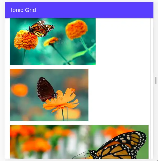
We have two different screenshots for displaying three different images for different screens. For desktop, each image takes 4 columns and for small screens like mobile, each image has consumed 12 columns.
This can be achieved easily, by using grid attributes on columns. We can use the same technique to apply different breakpoints for your requirement.
Grid tiers are based on minimum widths. It means they apply to their tier and all those larger than them (e.g., size-sm=”4″ applies to small, medium, large, and extra-large devices).
For the above example, you need three images and add all images in folder assets/images. Once we have an image then we need to add code for our example.
<ion-header [translucent]="true">
  <ion-toolbar color="primary">
    <ion-title>
      Ionic Grid Responsive
    </ion-title>
  </ion-toolbar>
</ion-header>

<ion-content [fullscreen]="true">
  <ion-grid>
    <ion-row>
      <ion-col size-lg="4" size-xs="12">
        <img [src]="'./assets/images/image-1.jpeg'">
      </ion-col>
      <ion-col size-lg="4" size-xs="12">
        <img [src]="'./assets/images/image-2.jpeg'">
      </ion-col>
      <ion-col size-lg="4" size-xs="12">
        <img [src]="'./assets/images/image-3.jpg'">
      </ion-col>
    </ion-row>
  </ion-grid>
</ion-content>
Grid Ionic Column offset
An offset is used to push columns over for more spacing. Like grid size breakpoint we can have different screen size column offset using offset with the breakpoint.
  <ion-grid>
    <ion-row>
      <ion-col size-md="3">
        <div>
          1 of 3
        </div>
      </ion-col>
      <ion-col size-md="3" offset-md="3" style="background-color: red;">
        <div>
          2 of 3
        </div>
      </ion-col>
      <ion-col size-md="3">
        <div>
          3 of 3
        </div>
      </ion-col>
    </ion-row>
  </ion-grid>

We can see that the second Ionic column was pushed right by 3 columns using offset in screen medium and above. We can have different offsets for each screen using the breakpoint name.
Grid css custom properties
The ionic grid has lots of built-in CSS custom properties which we can use on grids of different sizes. Here we have a list of Grid CSS custom properties.
| Name | Description |
|---|---|
--ion-grid-padding |
Padding for the Grid |
--ion-grid-padding-lg |
Padding for the Grid on lg screens |
--ion-grid-width |
Width of the fixed Grid |
Like –ion-grid-padding-lg we can add different breakpoints like xs, sm, md, etc to both –ion-grid-padding and –ion-grid-width. Grid columns have padding between individual columns, however, the padding can be removed from the grid and columns by adding the ion-no-padding class to the grid.
Conclusion
We have learned how the Ionic grid is used and how to implement it by keeping grid responsiveness. With a grid, we can create a responsive table and list in our ionic project. We can apply different ionic custom CSS styles like margin, padding, and alignment to grid components.
Related posts