We have seen an Angular datepicker example in our input field in many applications, especially in travel, hotel, and many management application.
In this tutorial, we will discuss the three different libraries we can use to add Angular datepicker. We will demonstrate how to use Angular material datepicker, bootstrap datepicker and last ng2-date-picker. We’ll demonstrate a few examples of ng3-date-picker. So let’s get started.
What is Datepicker in angular?
The date picker component allows users to enter a date either through text input or by clicking on input to select a date from the calendar. Angular date picker library or components is made up of components, directives, and the date implementation module that work together.
How to use Angular datepicker?
As we have discussed that there are plenty of third parties libraries to implement to add Angular datepicker. We had listed here some, that you can select based on your requirement.
| Library Name | Description |
| ng2-date-picker | This is a configurable date-picker build for Angular applications. Is one of the most popular libraries for date pickers and it has only 1.19 MB of package size. |
| material-datePicker | This component comes with an Angular material module or library. If you are using Material design for UI, then it is suited to use for your project. |
| bootstrap-datePicker | This component comes with the ng-bootstrap library, which we can use when we are using bootstrap for our Angular project UI. |
We have articles on how to install and configure bootstrap and material in our Angular project.
Setting up and configuring Angular datepicker project
Let’s first create our Angular date picker project. Before starting an angular project you need to install nodejs and Angular CLI in your system. We have a tutorial on how to install Nodejs and angular in Ubuntu.
ng new datePickerAppAngular datepicker example using ng2-date-picker
We’ll demonstrate Angular date picker using the third-party library ng2-date-picker. Here we first need to install this library in our project by following the command.
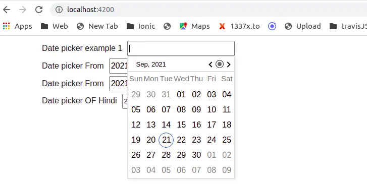
npm i ng2-date-picker --saveHere is a screenshot of our first example of Angular datepicker first example.
After installing our ng2-date-picker library, to use this library in our angular project, we need to import DpDatePickerModule in our app.module.ts file and let us edit the app.module.ts file.
....
import { DpDatePickerModule } from 'ng2-date-picker';
import { FormsModule } from '@angular/forms';

@NgModule({
  declarations: [
    AppComponent
  ],
  imports: [
    ..
    FormsModule,
    DpDatePickerModule,
  ],
 ...
})
export class AppModule { }
Once we have imported the ng2-date-picker module, then we are ready to use it in our angular project. I have to install dayjs library in our project to display the initial date in the date picker component. Let install dayjs library a small min javascript library to display and manipulate date objects.
npm i dayjs --saveTo add and used date we have first added a form field, and second, we can configure datepicker object from the ng2-date-picker library. Let’s edit our component typescript file.
import { Component } from '@angular/core';
import * as dayjs from 'dayjs';

@Component({
  selector: 'app-root',
  templateUrl: './app.component.html',
  styleUrls: ['./app.component.scss']
})
export class AppComponent {
  dateTo = dayjs();
  dateFrom;

  constructor() {
    this.dateFrom = dayjs('10.30.2021');
  }

  datePickerConfig = {
    format: 'YYYY-MM-DD HH:mm',
    monthFormat: 'MMM, YYYY',
    startDate: '01.01.2012',
  }


  validatorsChanged() {
    console.log('Change date');
  }
}
Here we had configured datepicker option object, and we have added only 3 fields. The first format, monthFormat, and starteDate. We can add many more options to it and will discuss them later.
Now let’s add our datepicker component of ng2-date-picker to our component template.
<div class="container">

  <div>
    <label for="datePicker" class="form-label">Date picker example 1</label>
    <dp-date-picker theme="dp-material" [config]="datePickerConfig"
      placeholder="Enter date">
    </dp-date-picker>
  </div>
  <div>
    <label lass="form-label">Date picker To</label>
    <dp-date-picker [(ngModel)]="dateTo" name="dateTo" [config]="datePickerConfig">
    </dp-date-picker>
  </div>

  <div>
    <label class="form-label">Date picker From</label>
    <dp-date-picker [(ngModel)]="dateFrom" name="dateFrom [config]="datePickerConfig"></dp-date-picker>
  </div>
</div>
In our first datepicker example we used dp-material theme and we have used the default themes of ng2-date-picker.
As we have discussed, ng2-date-picker configuration objects can have many options. Now let’s add configure to display a date in hind language, as shown below.
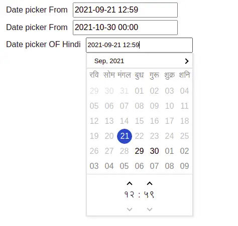
We only have to add locale: ‘hi-in’, an attribute in our date picker component, as shown below.
....
export class AppComponent {
  ...
  locaDate = dayjs();


  config = {
    monthFormat: 'MMM, YYYY',
    disableKeypress: false,
    allowMultiSelect: false,
    closeOnSelect: undefined,
    closeOnSelectDelay: 100,
    onOpenDelay: 0,
    weekDayFormat: 'ddd',
    appendTo: document.body,
    showNearMonthDays: true,
    showWeekNumbers: false,
    enableMonthSelector: true,
    format: "YYYY-MM-DD HH:mm",
    yearFormat: 'YYYY',
    showGoToCurrent: true,
    dayBtnFormat: 'DD',
    monthBtnFormat: 'MMM',
    hours12Format: 'hh',
    hours24Format: 'HH',
    meridiemFormat: 'A',
    minutesFormat: 'mm',
    minutesInterval: 1,
    secondsFormat: 'ss',
    secondsInterval: 1,
    showSeconds: false,
    showTwentyFourHours: true,
    timeSeparator: ':',
    multipleYearsNavigateBy: 10,
    showMultipleYearsNavigation: false,
    locale: 'hi-in',
    min: '2021-09-29 11:10',
  };
}
We have added many optional configure for date pickers along with locale. In our component template, we have to add an Angular datepicker for Hindi.
  <div>
    <label class="form-label">Date picker OF Hindi</label>
    <dp-date-picker theme="dp-material" [(ngModel)]="locaDate"
       mode='daytime' [config]='config'
      (ngModelChange)="validatorsChanged()" #datePicker>
    </dp-date-picker>
  </div>
Example 2: Angular date picker using bootstrap
We’ll demonstrate an Angular date picker example two using the Bootstrap UI framework. Here we first need to install bootstrap in our project by following the command.
ng add @ng-bootstrap/ng-bootstrap --saveHere is a screenshot of the Angular bootstrap datepicker.
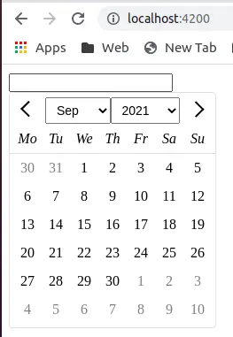
- Inline Bootstrap date picker
- Input popup Bootstrap date picker.
Let’s edit our component to add our bootstrap date picker code.
import { Component, ViewChild } from '@angular/core';
import { NgbCalendar, NgbDate, NgbDateAdapter, NgbDateNativeAdapter, NgbDatepicker, NgbDateStruct } from '@ng-bootstrap/ng-bootstrap';

@Component({
  selector: 'app-root',
  templateUrl: './app.component.html',
  styleUrls: ['./app.component.scss'],
  // providers: [{ provide: NgbDateAdapter, useClass: NgbDateNativeAdapter }]
})
export class AppComponent {
  @ViewChild('d1') datePopup? : NgbDatepicker;
  model: NgbDateStruct;
  // date: { year: number, month: number };
  date = new NgbDate(2020, 19, 2);

  constructor(private calendar: NgbCalendar) {
    this.model = { year: 1789, month: 7, day: 14 };
    this.selectToday();
  }

  selectToday() {
    this.model = this.calendar.getToday();
  }
}
<div class="container">
<div class="row">
<div class="col-sm">
<!-- 1. inline datepicker -->
<ngb-datepicker #d2></ngb-datepicker>
</div>
<div class="col-sm">
<!-- 2. datepicker in the popup -->
<input type="text" ngbDatepicker #d1="ngbDatepicker"
[(ngModel)]="model" name="model" (focus)="d1.open()" (dblclick)="d1.close()" />
</div>
</div>
</div>Example 3: Angular material datepicker
In the last example we will demonstrate the Angular material datepicker and now let’s add the Angular material design datepicker to our angular project.
ng add @angular/materialHere is a screenshot of the angular material date picker between the two ranges.

To use this module, we have to import the Angular material date module in our app.module.ts file.
..
import { BrowserAnimationsModule } from '@angular/platform-browser/animations';
import { MatDatepickerModule } from '@angular/material/datepicker';

@NgModule({
  declarations: [
    AppComponent
  ],
  imports: [
    ...
    BrowserAnimationsModule,
    MatDatepickerModule
  ],
  providers: [],
  bootstrap: [AppComponent]
})
export class AppModule { }
Now let’s add code for the Angular material design datepicker example. Let’s edit our component.
import {Component} from '@angular/core';
import {FormGroup, FormControl} from '@angular/forms';
...
export class AppComponent {
  campaignOne: FormGroup;

  constructor(private http: HttpClient) {
    const today = new Date();
    const month = today.getMonth();
    const year = today.getFullYear();

    this.campaignOne = new FormGroup({
      start: new FormControl(new Date(year, month, 13)),
      end: new FormControl(new Date(year, month, 16))
    });

 }
<mat-form-field class="example-form-field" appearance="fill">
<mat-label>First campaign</mat-label>
<mat-date-range-input
[formGroup]="campaignOne"
[rangePicker]="campaignOnePicker"
[comparisonStart]="campaignOne.value.start"
[comparisonEnd]="campaignOne.value.end">
<input matStartDate placeholder="Start date" formControlName="start">
<input matEndDate placeholder="End date" formControlName="end">
</mat-date-range-input>
<mat-datepicker-toggle matSuffix [for]="campaignOnePicker">
</mat-datepicker-toggle>
<mat-date-range-picker #campaignOnePicker></mat-date-range-picker>
</mat-form-field>Conclusion
We have completed demonstrated three different ways we can add a date picker in our Angular application. I hope you got some idea of how to implement Angular date picker.
Related posts