Angular components are one of the building blocks of the angular. A typical Angular application is represented by a tree of elements starting with a single root component. An Angular framework allows us to develop applications in a component-based approach.
Components bring reusability to a view. Once we have created a component, we can use it any number of times. This allows code reusability and reduces duplicate code. A component should be responsible for a particular view of the application.
In this article, we’ll learn how to create our own Angular custom component in Angular. Components are directive without templates. The directives and components aren’t completely the same. A component requires a view, for example, whereas a directive doesn’t. Directives don’t have a template.
Angular allows us to perform common functionality like reaping templates, hiding and showing elements, and so on. We discuss with directives like ngIf, ngSwitch, and ngFor of how they are used in our Angular project.
How to create an Angular component?
Angular components are the class, with an HTML template. For our custom component have a decorator that is @Component, to add metadata to a class to describe the component. The easiest and quickest create a component is using Angular CLI. To generate an Angular component, we need to run the following command:
ng generate component component-Name
// We can also add path
ng generate component components/newComponentName
/// Where components/ is folder where we create our component newComponentName
Example of an angular custom component or Angular custom tags
We can create our own custom component, that can be used anywhere in our application. Angular components have a lifecycle that begins with their initial instantiation and continues with their rendering until they’re destroyed and removed from the application.
We’ll use our own custom component or custom tags called <app-person> and used it in the app.component.html template. Let’s first create an Angular project and add our own custom component called person.
ng new customComponent
ng generate component person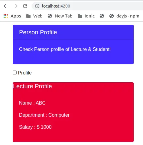
When we generate components using Angular CLI, it will generate a minimum of three files associated with each component.
- Template: Where we can add HTML element of component for UI of our component
- Controller: It contains all properties and methods of components, and most of the logic of components is written here.
- Style: Here we write style or CSS for components.
Edit our own Angular custom component called person.
In our person component, we have a checkbox called Profile to toggle information between lecture and student information based on the toggle boolean value. We have a *ngIf directive to toggle information between lecture and student information in our custom component. Let’s first edit our angular custom component: person.compnent.html
<div class="checkbox border-top border-bottom">
    <label class="checkbox-inline">
        <input type="checkbox" data-toggle="toggle" (click)="isClicked(data.myToggle)" [(ngModel)]="data.myToggle">
        Profile
    </label>
</div>
<div *ngIf="data.myToggle; then student else lecture"></div>


<ng-template #student>
    <div class="card text-white bg-danger mb-3" style="max-width: 25rem;">
        <h5 class="card-title">Student Profile</h5>
        <div class="card-body">
            <p>Name : xyz</p>
            <p>Course : Bachelor of Computer</p>
            <p>Year : 2nd Year</p>
        </div>
    </div>
</ng-template>

<ng-template #lecture>
    <div class="card text-white bg-danger mb-3" style="max-width: 25rem;">
        <h5 class="card-title">Lecture Profile</h5>
        <div class="card-body">
            <p>Name : ABC</p>
            <p>Department : Computer</p>
            <p>Salary : $ 1000</p>
        </div>
    </div>
</ng-template>
Edit person.component.ts file to declare and initialize data variable object containing myProfile value to true and by default, we’re displaying student profile. We also have isClicked method to toggle the display between lecture and student.
import { Component, OnInit } from '@angular/core';

@Component({
  selector: 'app-person',
  templateUrl: './person.component.html',
  styleUrls: ['./person.component.scss']
})
export class PersonComponent implements OnInit {
  data: any = { myToggle: true };

  constructor() { }

  ngOnInit(): void {
  }

  isClicked(toggle) {
    this.data.myToggle = !toggle;
  }

}
Note:
The @Component decorator is on top of the class file and adding this decorator makes the TypeScript class an Angular component. The decorator has a JSON object as an argument and the fields in this object define the metadata for the component. Where we have selector name of a component, template, style for component and we can other options in it.
How to use the angular custom components in other component templates ?
Now we can use our custom component anywhere in our application, and add an angular custom component tag in our root component called app.component.html.
<div class="container">
  <div class="card text-white bg-primary mb-3" style="max-width: 25rem;">
    <h5 class="card-header">Person Profile</h5>
    <div class="card-body">
        <p>Check Person profile of Lecture & Student!</p>
    </div>
  </div>
  <app-person></app-person>
</div>

<router-outlet></router-outlet>Conclusion
We have learned how to create and used Angular custom components. Angular components are the directive with an HTML template. Check Angular official documentation on the Angular custom component.
Related posts