The ionic framework provides us with lots of pre-built components, the Ionic button is one of the pre-built Ionic components. We can control the button style easily by using pre-built Ionic button attributes.
Buttons allow your visitor to trigger actions on our Ionic project, from launching and uploading the form data to the server, routing to different components and loading modal controller, and more. In this tutorial, we’ll learn,
In this article, we explore how to implement ionic buttons with its different button attributes, how we can change ionic button background color and size, add our own custom background color, how to used an ionic button with an icon, and text. At last, we will explore different button events.
Setting up and configure project for Ionic Button
With the release of ionic version 4, the Ionic framework is no longer limited to angular, we can create the ionic projects in different front-end frameworks like Angular, Vue, and React. Let first create a blank Ionic Angular project.
ionic start buttonsApp --type=angularIonic button properties
The button element is clickable and has text between the button to indicate the button name. Like native HTML elements, Ionic buttons have the same attribute and some extra attributes from the Ionic framework. We’ll discuss and demonstrate Ionic attributes that have already been made available for us use by the Ionic team. Ionic provides lots of attributes for button styling and here we have listed some.
| Attribute | Description | Value |
|---|---|---|
| shape | Button shape. | round | undefined |
| size | Button size. | default | large | small |
| routerDirection | When using a router, it specifies the transition direction when navigating to another page using href. | back | forward | root, By default forward |
| fill | Button filling. “clear” for a transparent button. “outline” for a transparent button with a border, or to “solid”. The default style is “solid” except inside of a toolbar, where the default is “clear”. | clear | default | outline | solid | undefined |
| expand | Set to “block” for a full-width button or to “full” for a full-width button without left and right borders. | “block” | “full” | undefined |
| color | Background color of button. | primary, secondary, tertiary, success, warning, danger, light, medium, and dark. |
| strong | If true, activates a button with a heavier font weight. | Boolean, by default false |
| type | Type of button, it can be “button” | “reset” | “submit” | By default button |
| disabled | If true, the user cannot interact with the button. | Boolean. By default is false |
Button shape Attribute
By default button has no rounded shape, we can apply a rounded shape on the button using the shape attribute.
  <ion-button>
    No round Button
  </ion-button>

  <ion-button shape="round">
    Rounded Button
  </ion-button>
Button size attribute
We can easily control the button size using the size attribute. Setting this attribute will change the height and padding of a button. Here’s a quick screenshot of the button size attribute.
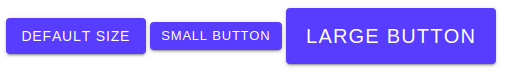
  <div class="ion-padding">
    <ion-button>Default Size</ion-button>
    <ion-button size="small">Small Button</ion-button>
    <ion-button size="large">Large Button</ion-button>
  </div>
Button icon with slot attribute
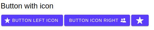
Ionic allows us to add icons with buttons and slot attributes allow us to control the position of the icon to the button text. Here’s a quick screenshot of the button slot attribute.
The Ionic button allows us to add an ionic icon as a child component. We have complete control of where to align the icon position(left and right) of a button text and we also add buttons only. If you want to add Icons to buttons, Ionic provides lots of premade premium ionic icons. Check the link here to check the ionic icon needed for your purpose.
  <div class="ion-padding">
    <h2>Button with icon</h2>
    <ion-button>
      <ion-icon slot="start" name="star"></ion-icon>
      Button Left Icon
    </ion-button>

    <ion-button>
      Button Icon right
      <ion-icon slot="end" name="people"></ion-icon>
    </ion-button>
    <ion-button>
      <ion-icon slot="icon-only" name="star"></ion-icon>
    </ion-button>
  </div>
Button fill attribute
By default, buttons have a solid background unless the button is inside of a toolbar component, in which case it has a transparent background. The outline button has no background and only a border. By using this attribute we can control the button style of the background and border. Here’s a quick screenshot of the button fill attribute.
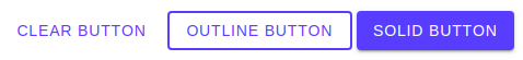
  <div class="ion-padding">
    <ion-button fill="clear">Clear Button</ion-button>
    <ion-button fill="outline">Outline Button</ion-button>
    <ion-button fill="solid">Solid Button</ion-button>
  </div>
Button expand attribute
By default, buttons have inline-block. By using this attribute we can control the width of the button. Expand value can be a default, block, and full. Block has full width with a round corner and full value has a full-width button with a square shape with no border on right and left. Here’s a quick screenshot of the button expand attribute.
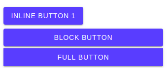
  <div class="ion-padding">
    <ion-button>Inline Button 1</ion-button>
    <ion-button expand="block">
      Block Button
    </ion-button>
    <ion-button expand="full">
     Full Button
    </ion-button>
  </div>
Ionic Button color attribute
We can set the ionic button background color, we just need to add an appropriate color attribute. By default, buttons have primary color if we have not added a color attribute.
The ionic framework has lots of colors option for our buttons and checks ionic color options from the variables.scss. Here’s a quick screenshot of the button color attribute which we can use to set the ionic button background color.

  <div class="ion-padding">
    <ion-button>Default Button</ion-button>
    <ion-button color="primary">Primary Button</ion-button>
    <ion-button color="secondary">Secondary Button</ion-button>
    <ion-button color="danger">Danger Button</ion-button>
    <ion-button color="tertiary">Teritiary Button</ion-button>
    <ion-button color="warning">Warning Button</ion-button>
    <ion-button color="dark">Dark Button</ion-button>
    <ion-button color="light">Light Button</ion-button>
  </div>
You can use any of the below color attribute values to give a color of your choice to buttons.
| Color Value | Description | Result |
|---|---|---|
| Primary Button | To be used for primary color | |
| Success Button | To be used for success color | |
| Secondary Button | To be used for secondary color | |
| Danger Button | To be used for danger color | |
| Tertiary Button | To be used for tertiary color | |
| Warning Button | To be used for warning color | |
| Medium Button | To be used for medium color | |
| Light button | To be used for light color | |
| Dark button | To be used for dark color |
How to create Ionic button custom color
We have listed all button colors available in the ionic framework. Ionic allows us to create our own custom color and let’s create a color name called favorite. Ionic has a page specifically for generating new colors for the Ionic project.
In the new color create option, you can add a color name and select your color, it will generate a new color code for you. Here’s a quick screenshot of the Ionic page for the color generator.
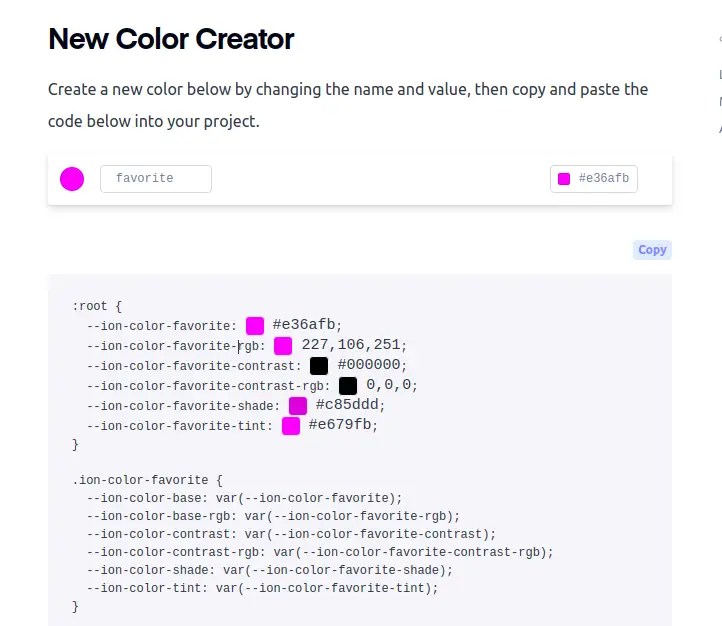
We need to import our custom code in variables.scss file and in :root block add the following code.
:root {
  /** primary **/
  /** CODE OF ALL OTHER COLOR */
  /** Existing code - Don't edit*/
  /** favorite */
  --ion-color-favorite: #e36afb;
  --ion-color-favorite-rgb: 227,106,251;
  --ion-color-favorite-contrast: #000000;
  --ion-color-favorite-contrast-rgb: 0,0,0;
  --ion-color-favorite-shade: #c85ddd;
  --ion-color-favorite-tint: #e679fb;
}
At the end of the variable.scss add a second color code of the custom color.
.ion-color-favorite {
  --ion-color-base: var(--ion-color-favorite);
  --ion-color-base-rgb: var(--ion-color-favorite-rgb);
  --ion-color-contrast: var(--ion-color-favorite-contrast);
  --ion-color-contrast-rgb: var(--ion-color-favorite-contrast-rgb);
  --ion-color-shade: var(--ion-color-favorite-shade);
  --ion-color-tint: var(--ion-color-favorite-tint);
}
Now we can use our Ionic button custom color.
<ion-button color="favorite">Custom color Button</ion-button>
Ionic button alignment
We can use CSS inline directly to control button alignment or we can use Ionic utilities CSS to control alignment.
  <div class="ion-padding">
    <ion-button>Default left Align Button</ion-button>
    <ion-button class="ion-float-right">Right align Button</ion-button>

  </div>
  <div class="ion-text-right">
    <ion-button>Right align Button</ion-button>
  </div>
  <div class="ion-text-center">
    <ion-button color="danger">Align Center Button</ion-button>
  </div>
Ionic button events
When the user interacts with a button, it will trigger an event. When a visitor clicks the button, nothing happens by default. We need to add an event handler method to the button event.
  <div class="ion-padding">
    <h3>Button event</h3>
    <ion-button (click)="clickMethod($event)">Click Event</ion-button>
    <ion-button (ionBlur)="blurMethod($event)">Blur Event</ion-button>
    <ion-button (ionFocus)="focusMethod($event)">Blur Event</ion-button>
  </div>
In typescript, we need to handle button events.
  clickMethod(event) {
    console.log(event);
  }

  blurMethod(event) {
    console.log(event);
  }

  focusMethod(event) {
    console.log(event);
  }
How to add Ionic button image
We can add an Ionic button image, there is a different way of creating an ionic image button. Adding button image is the same as normal HTML native element. We can use an anchor tag, image with a link.
Ionic provides lots of Ionic icons, if you need a button with an icon image, then you can use the Ionic button with an icon as we have discussed above. Here we have demonstrated ionic button image by using ion-button and ion-image elements. Here is a screenshot of our example.

  <ion-button (click)="onClick()" shape="round">
    <ion-img src='https..link'></ion-img>
  </ion-button>
In ion-img src, you can add your own image link.
We can also use an ionic button image using an anchor tag with an image of your choice and here we have the example code.
  <a routerLink="/user/details" routerDirection="forward">
    <img src='assets/images/icon.png' />
  </a>
How to create ionic circular button | ionic round button ?
We can easily create an ionic circular button using the ion-fab-button element. Let’s create a few examples of an Ionic circular button using the ion-fab-button element. Like the ion-button element, we can add color and click events on the ion-fab-button element.

 <ion-fab-button color="primary">
    Home
 </ion-fab-button>
 <ion-fab-button color="secondary">
   Contact
 </ion-fab-button>
 <ion-fab-button color="danger">
   About
</ion-fab-button><br/>
Conclusion:
We have completed our ionic button attribute in detail with an example. We can have different UI libraries for Ionic like bootstrap, material design, and others. But Ionic default is an excellent UI for mobile and desktop applications. Like a button component, we can easily control the style of the default Ionic UI.
Related posts