The ionic action sheet component shows a dialog containing a native list of options the user can choose from. It’s a great tool to use when you need to have multiple actions that are discoverable, but not immediately available.
In this article, we’ll learn how to use the Ionic action sheet component and also learn how to customize the action sheet design. Let’s get started.
What is Ionic action sheet?
An action sheet is a specific style of alert that allows users with a set of two or more choices related to the current context. As we have seen an alert comes from the bottom in mobile devices. An action sheet can have a title, an additional message, and a list of actions to choose from.
We have seen an action sheet example like a button that will display on top of a current page with an option like select from a camera, Gallery. Or we can have a list of social networking options to select. Ionic 4 and above ionic framework is are not mobile-specific, because of the capacitor we built a cross-platform web application.
Action sheet is built specifically for mobile devices, since space is limited, these are pretty useful. It appears on top of the page content and must be manually dismissed by the user before they can resume interaction with the app. In these articles, we will learn how to add an ionic action sheet to our ionic project.
Setting up Ionic action sheet example.
With the release of ionic version 4, the Ionic framework is no longer limited to angular, we can create the ionic projects in different front-end frameworks like Angular, Vue, and React. Let’s first create a blank Ionic Angular project for an action sheet.
ionic start actionSheet blank --type=angularIonic Action sheet controller basic example
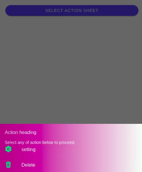
Let’s create an Ionic action sheet controller example to use basic usage of alert component options. In order to make an action sheet controller, we need to import AlertController from the ionic/angular module. Here is a screenshot of our first example.

We have a button in our home template and clicking on it will call the action sheet controller. We have also customized our action sheet controller and we will discuss later how to customize the action sheet style. In this example, we have used most properties available on the action sheet create method.
Let’s edit the home.page.ts file to implement our basic example.
import { Component } from '@angular/core';
import { ActionSheetController } from '@ionic/angular';

@Component({
  selector: 'app-home',
  templateUrl: 'home.page.html',
  styleUrls: ['home.page.scss'],
})
export class HomePage {
  constructor(
    private actionSheetController: ActionSheetController) { }

  async selectActionSheet() {
    const actionSheet = await this.actionSheetController.create({
      header: 'Action heading',
      subHeader: 'Select any of action below to proceed.',
      cssClass: 'basicActionSheet',
      buttons: [{
        text: 'setting',
        icon: 'settings',
        cssClass: 'settingActionSheet',
        handler: () => {
          console.log('Selected setting option');
        }
      },
      {
        text: 'Delete',
        icon: 'trash',
        role: 'destructive',
        cssClass: 'deleteActionSheet',
        handler: () => {
          console.log('Selected delete action');
        }
      }]
    });
    await actionSheet.present();
  }

}
Ionic action sheet example two to select list of social network options.
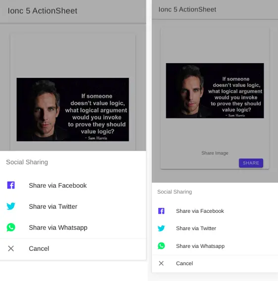
Here is a screenshot of what we are demonstrating for our action sheet example. In our example, we have an image and button in our home template. Clicking on the share button will invoke our Ionic action sheet which allows us to select a choice from the list.

Let’s edit our home.page.html template, and add the share button.
<ion-header>
  <ion-toolbar color="primary">
    <ion-title>Ionic action sheet</ion-title>
  </ion-toolbar>
</ion-header>

<ion-content>
  <div class="ion-padding">
    <ion-card>
      <ion-card-content>
        <ion-img style="width: 100%; height: 350px;"
          src="./assets/imgs/quote.jpg"></ion-img>
        <p text-center> Share Image </p>
        <ion-button size="small" (click)="shareSocialNw()">Share</ion-button>
      </ion-card-content>
    </ion-card>
  </div>
</ion-content>
Import Ionic action sheet component in page
To implement the Ionic action sheet component we need to import and inject the action sheets into our home constructor. Add the following code in the home.page.ts file
import { Component } from '@angular/core';
import { ActionSheetController } from '@ionic/angular';

@Component({
  selector: 'app-home',
  templateUrl: 'home.page.html',
  styleUrls: ['home.page.scss'],
})
export class HomePage {
  constructor(
    private actionSheetController: ActionSheetController) { }

  async shareSocialNw() {
    const actionSheet = await this.actionSheetController.create({
      header: 'Social Sharing',
      buttons: [{
        text: 'Share via Facebook',
        role: 'destructive',
        icon: 'logo-facebook',
        cssClass: 'facebookIcon',
        handler: () => {
          console.log('Facebook share');
        }
      }, {
        text: 'Share via Twitter',
        icon: 'logo-twitter',
        cssClass: 'twitterIcon',
        handler: () => {
          console.log('Share clicked');
        }
      }, {
        text: 'Share via Whatsapp',
        icon: 'logo-whatsapp',
        cssClass: 'whatsappIcon',
        handler: () => {
          console.log('Favorite clicked');
        }
      }, {
        text: 'Cancel',
        icon: 'close',
        role: 'cancel',
        handler: () => {
          console.log('Cancel clicked');
        }
      }]
    });
    await actionSheet.present();
  }
}
The ionic action sheet controller comes with a number of options. We can edit and configure the Ionic action sheet using create method and here is a list of properties in create method.
| Name | Description |
| header | Title for the action sheet. |
| subHeader | Subtitle for the action sheet. |
| mode | The mode determines which platform styles to use “ios” | “md” |
| cssClass | Additional classes to apply for custom CSS. If multiple classes are provided they should be separated by spaces. |
| buttons | An array of buttons for the action sheet. |
| enterAnimation | Animation to use when the action sheet is presented. |
| animated | If true, the action sheet will animate. |
| leaveAnimation | Animation to use when the action sheet is dismissed. |
| keyboardClose | If true, the keyboard will be automatically dismissed when the overlay is presented. |
| backdropDismiss | If true, the action sheet will be dismissed when the backdrop is clicked. |
Ionic action sheet has buttons that have the following properties.
| Param | Type | Details |
|---|---|---|
| text | string | The labels for the buttons. |
| role | string | Can be either destructive or cancel, the destructive button is red in color and always at the top and cancel at the last of the action list |
| icon | string | Ionic icon |
| cssClass | class name | To apply a custom style for each button on the action list |
| handler | function | Handler function, where you add your code when the corresponding button in the action list is clicked. |
What are the method of action sheet ?
Like the Ionic alert, and modal component, the Ionic action sheet has a list of the method we can use and some of the most important methods include.
- create: This method allows us to create an action sheet and configure the setting of the action sheet.
- present: To display the action sheet.
- dismiss: To close the action sheet, but in most cases, we are not using it, as the action sheet is closed automatically when we select our option from the action sheet list.
How to customize Ionic action sheet style ?
We can customize the Ionic action sheet style. To add to the color of the icon of the ionic action sheet, we need to custom CSS for each element in the ionic action sheet and the corresponding style in src/global.scss as
/** Custom scss */
.facebookIcon {
  ion-icon{
    color:  var(--ion-color-primary) !important;
  }
}
.whatsappIcon {
  ion-icon {
    color: var(--ion-color-success) !important;
  }
}
.twitterIcon {
  ion-icon{
    color: var(--ion-color-secondary) !important;
  }
}
Here is our first basic example action sheet style which we have to customize and let’s add our first example style in the gobal.scss file.
.basicActionSheet {
  --backdrop-opacity: 0.6;
  --background: linear-gradient(90deg, rgb(167, 26, 136) 1%, rgb(248, 255, 248) 100%);
  .action-sheet-title.sc-ion-action-sheet-md, .action-sheet-title.sc-ion-action-sheet-ios {
      font-size: 16;
      color: var(--ion-color-light);
  }

  .action-sheet-button.sc-ion-action-sheet-md, .action-sheet-button-inner.sc-ion-action-sheet-md {
    --color: var(--ion-color-success);
    color: white !important;
  }
Conclusion
We have explored and demonstrated how to use an Ionic action sheet. We can easily configure the Ionic card style by adding a background image, setting the different background colors, and adding shadow colors to the Ionic card.
Related posts