Angular select elements from material design, ng-bootstrap, and third parties libraries allow us to create a drop-down list. This element is most often used in an angular form, to collect user input. The angular framework doesn’t have a select component, we can either use native HTML select or third parties UI libraries.
In this tutorial, we’ll explore different ways we can implment select option input in Angular and we’ll demonstrate an example on Angular select component using ng-bootstrap select component and ng-select libraries.
Step 1: Setting up and configure Angular select project
Let’s first create our Angular select project and we have two examples of it. Before starting an angular project you need to install Node js and Angular CLI in your system.
ng new selectApp
cd selectApp
Let’s install ng-select and ng-bootstrap libraries into our project by running the following commands.
npm install @ng-select/ng-select --save
npm install @ng-select/ng-select --save
As we are using ng-select autocomplete on the input field of our form. To use the ng-select library, we need to import forms and ng-select modules. Let’s import the above module in the app.module.ts file. We also, need to import HttpClientModule to retrieve our data from static dummy JSON data or server.
import { NgModule } from '@angular/core';
import { BrowserModule } from '@angular/platform-browser';
import { AppRoutingModule } from './app-routing.module';
import { AppComponent } from './app.component';
import { FormsModule, ReactiveFormsModule } from '@angular/forms';
import { NgSelectModule } from '@ng-select/ng-select';
import { HttpClientModule } from '@angular/common/http';

@NgModule({
  declarations: [
    AppComponent
  ],
  imports: [
    BrowserModule,
    AppRoutingModule,
    FormsModule,
    ReactiveFormsModule,
    HttpClientModule,
    NgSelectModule,
  ],
  providers: [],
  bootstrap: [AppComponent]
})
export class AppModule { }
Angular select example using native HTML element.
We had already configured the required task to demonstrate Angular select input. Here we have a screenshot of our Angular select element using native HTML.

Let’s add a form with an HTML select input option, also add input, and a button to add a new item to our select options. Let’s edit the app component template.
  <section>
    <form #f="ngForm">
      <select [(ngModel)]="selected" name="valueCheck"
        (change)="valueChange($event)">
        <option [ngValue]="undefined" disabled>Select Any </option>
        <option *ngFor="let framework of frameworks"
         [value]="framework" [selected]="framework == selected">
          {{ framework }}
        </option>
      </select>
    </form>
    <h3>{{ selected }} </h3>

    <div>
      <input [(ngModel)]="framworkName">
      <button (click)="addFramwork()">Add</button>
    </div>
  </section>
Let’s add form and Angular select form fields in our component typescript.
import { HttpClient } from '@angular/common/http';
import { Component } from '@angular/core';
import { FormGroup } from '@angular/forms';

@Component({
  selector: 'app-root',
  templateUrl: './app.component.html',
  styleUrls: ['./app.component.scss']
})
export class AppComponent {
  frameworks: string[] = ['Angular', 'Reactjs', 'Vue'];
  selected = 'Angular';
  framworkName = '';

  valueChange(event: any) {
    console.log("selected value",
     event.target.value, 'value of selected', this.selected);
    this.selected = event.target.value;
  }

  addFramwork() {
    if (this.framworkName) {
      const ifExist = this.frameworks.find(el => el === this.framworkName);
      if (!ifExist) {
        this.frameworks.push(this.framworkName);
      }
    }
  }
}
Different ways to implment Angular material select
The native HTLM has a select element, but it doesn’t allow us to multiple select and auto-complete. In angular, we have different options to implement Angular select and provide additional features like auto-complete.
| Library Name | Downloaded per Week | Size |
|---|---|---|
| ng-select | More or nearly 170,253 | 1.47 MB |
| ng-bootstrap | Bootstrap has the drop-down component to implement select options. The ng-bootstrap is a bootstrap framework built for Angular. | It will come with ng-bootstrap libraries. |
| Angular material select | Material design has a drop-down component. | We can import individual components in material design. |
Angular option selected example
Sometimes we need to add an initial or selected value on the Angular option selected. We’ll demonstrate two examples of it in both reactive and template form.
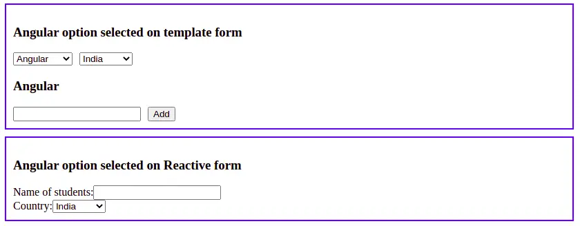
In the first example, we have extra input and a button to add a new option element in Angular select elements. We set the Angular select default value to Angular, India in both angular form types.

Whether you reload or refresh the page, the value of the option is selected. Let’s add our form code to the component and we had also demonstrated the Angular option selected in the ngFor loop.
  <section>
    <h3>Angular option selected on template form</h3>
    <form #f="ngForm">
      <select [(ngModel)]="selected" name="valueCheck" (change)="valueChange($event)" value='Angular'>
        <option [ngValue]="undefined" disabled>Select Any </option>
        <option *ngFor="let framework of frameworks" [value]="framework" [selected]="framework == selected">
          {{ framework }}
        </option>
      </select>
      <select>
        <option value="india" selected="selected">India</option>
        <option value="france">France</option>
        <option value="germany">Germany</option>
        <option value="canada">Canada</option>
      </select>
    </form>
    <h3>{{ selected }} </h3>

    <div>
      <input [(ngModel)]="framworkName">
      <button (click)="addFramwork()">Add</button>
    </div>
  </section>

  <section>
    <h3>Angular option selected on Reactive form</h3>
    <form [formGroup]="studentForm">
      <div class="form-group">
        <label>Name of students:</label>
        <input type="number" class="form-control" formControlName="number" />
      </div>
      <div class="form-group">
        <label>Country:</label>
        <select formControlName="country">
          <option value="india">India</option>
          <option value="france">France</option>
          <option value="germany">Germany</option>
          <option value="canada">Canada</option>
        </select>
      </div>
    </form>
  </section>
import { Component } from '@angular/core';
import { FormBuilder, FormGroup } from '@angular/forms';
@Component({
selector: 'app-root',
templateUrl: './app.component.html',
styleUrls: ['./app.component.scss']
})
export class AppComponent {
frameworks: string[] = ['Angular', 'Reactjs', 'Vue'];
selected = 'Angular';
country = '';
framworkName = '';
form!: FormGroup;
// //reactive form
studentForm = new FormGroup({});
constructor(private fb: FormBuilder) {
this.studentForm = this.fb.group({
name: '',
country: ['india']
});
}
valueChange(event: any) {
console.log("selected value", event.target.value, 'value of selected', this.selected);
this.selected = event.target.value;
}
addFramwork() {
if (this.framworkName) {
const ifExist = this.frameworks.find(el => el === this.framworkName);
if (!ifExist) {
this.frameworks.push(this.framworkName);
}
}
}
}Angular select example using ng-select
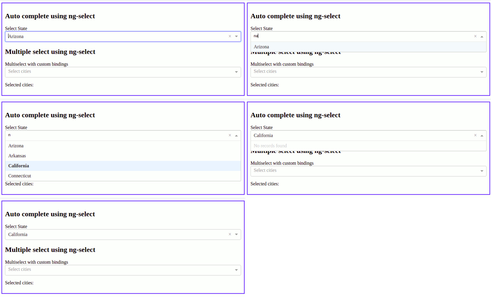
In our second example, we’ll ng select to demonstrate multiple select and angular select default values to California

Let’s implement the above example by adding the following code in our angular component template and typescript files.
<div class="container">
  <section>
    <div class="form-group">
      <form [formGroup]="form">
        <div class="ng-select">
          <h2>Auto complete using ng-select</h2>
          <label>Select State</label>
          <ng-select [items]="states | async" bindLabel="name" formControlName="name" notFoundText="No records found"
            (keyup)="getStatesName($event)">
          </ng-select>
        </div>

      </form>

      <div class="multiSelect">
        <h2>Multiple select using ng-select</h2>
        <label>Multiselect with custom bindings</label>
        <ng-select [items]="cities2" bindLabel="name" bindValue="name" [multiple]="true" placeholder="Select cities"
          [(ngModel)]="selectedCityNames">
        </ng-select>
        <p>
          Selected cities: {{ selectedCityNames }}
        </p>
      </div>
    </div>
  </section>
</div>
import { HttpClient } from '@angular/common/http';
import { Component } from '@angular/core';
import { FormBuilder, FormControl, FormGroup } from '@angular/forms';
import { Observable } from 'rxjs';
import { TypeaheadService } from './services/typeahead.service';
@Component({
selector: 'app-root',
templateUrl: './app.component.html',
styleUrls: ['./app.component.scss']
})
export class AppComponent {
form!: FormGroup;
states: Observable<string[]> | undefined;
name = new FormControl();
// //reactive form
studentForm = new FormGroup({});
selectedCityNames = [];
cities2 = [
{ id: 1, name: 'New Delhi' },
{ id: 2, name: 'Mumbai' },
{ id: 3, name: 'New York', disabled: true },
{ id: 4, name: 'Paris' },
{ id: 5, name: 'London' }
];
constructor(private fb: FormBuilder, private typeahead: TypeaheadService) {
this.form = this.fb.group({
name: ['California'],
country: ['india']
})
}
getStatesName(event: any): void {
this.states = this.typeahead.getStates(event.target.value);
}
}Conclusion
We have learned how to implement Angular select elements. Based on your requirement and UI framework, choose a select library, If you are using material design then use its drop-down component and so if you are using bootstrap use its drop-down component.
Related Articles