React custom hooks or React hooks are reusable functions in React. When different components in our application have the same logic, then we can extract the common code and create a reusable React custom hook. Is like a normal function in Javascript, we can call it any number of times, and calling each time has its own state, the state in custom hooks is not shared.
In this tutorial, we’ll have three objectives, first learn how to create React custom hooks, an example of a custom hook called useTypecode to fetch different 3 API endpoints to jsonplaceholder.typicode.com, and useLocalStorage custom hooks for local storage and we can use this hook to store currently selected theme mode in local storage.
Why do we need React custom hooks?
In the old tradition of React, Class components are the first-class citizen because it has state and life cycle hooks, React function component is just for presentation and dumb which doesn’t have life cycle hooks.
React hooks allow us to mimic lifecycle hooks and use the state without writing a class. With React 16 onward, we have useEffect react hooks based on array dependency with three cases, with useEffect, it allows us to mimic the Class component life cycle in React function component.
I’m new to React, with an Angular background, last few months I start learning React as much as possible. Is really amazing library, and allows us to develop the project very first. If I’m wrong about the bundle size of this percentage, please let me know in the comments.
Function component codes are cleaner, leaner, and easier to understand, so in the Function component, we can almost do what we are doing in the Class component. If our application has some logic that is used again and again across many components, then we can create reusable React custom hooks for it. Each custom hook can maintain its own state, whatever it needs to perform its duties.
In React, hooks start with use word, we have hooks like useState, useEffect, useMemo, useContext, useReducer, etc. So whenever you start creating your own custom hook, is a convention to start your hook’s name with the use word.
Here are some amazing examples of custom hooks, that are ready to use, check this website usehooks.com they have plenty of React custom hooks examples.
- useFirestoreQuery
- useToggle
- useMemoCompare
- useAsync
- useRequireAuth
- useRouter
- useAuth
- useWhyDidYouUpdate
- seEventListener
- useDarkMode
React custom hooks example
To deeper understanding of React hooks, let’s create two an example of custom hooks. Frist is like useFetch or I called it useTypecode, which is fetching data from jsonplaceholder.typicode.com free API, we can send different URL arguments to retrieve separate data for users, photos, and albums in different components.
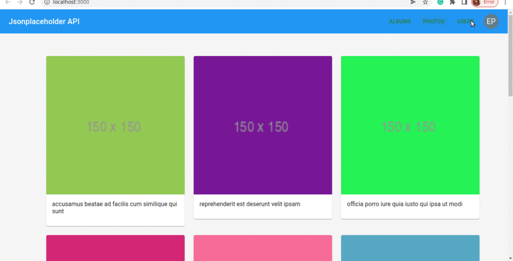
Let’s first create react project, I have used React material for UI, and we have 4 components, Navbar, Albums, Photos, Users, and Main content component.
Let’s first create our apis folder in src, to add all our API base URLs, we are using Axios, you can use fetch API for it. In src/apis/typicodeAPI.js let’s add the following code here just to set the base URL, as all our components are using the same base URL.
import axios from 'axios';

export default axios.create({
    baseURL: 'https://jsonplaceholder.typicode.com',
    params: {
        _limit: 10
    }
});
Step 1: Let’s create react custom hooks – src/hooks/useTypecode.js, we know react custom hooks are functions, you can send any argument and return some data from it like what we do with normal functions.
import { useEffect, useState } from "react";
import typicodeAPI from "../apis/typicodeAPI";

const useTypecode = (category) => {
  const [data, setData] = useState([]);

  useEffect(() => {
    const fetchData = async () => {
      try {
        const response = await typicodeAPI.get(`/${category}`);
        setData(response.data);
      } catch (error) {
        console.log(error);
      }
    }
    fetchData();
  }, [category]);

  return data;
};

export default useTypecode;
Step 2: Call custom hooks in consumer components, custom hooks like normal Function accept arguments and returns some value. In our component Photos, Users, and Albums are using this custom hook to fetch different API data only by changing is last URL part by using category. So we have call custom hooks with some value and get some return values.
//In Photo component
const data = useTypecode("photos");  where photos is argument of type category
Inside hooks it will convert to
https://jsonplaceholder.typicode.com/photos

// Same in Users component
const data = useTypecode("users");
Inside hooks it will convert to
https://jsonplaceholder.typicode.com/users

// Same in albums component
const data = useTypecode("albums");
Inside hooks it will convert to
https://jsonplaceholder.typicode.com/albums
I will demonstrate the Photo, Albums component, and Users components have the same logic. In the src/component/Photos.jsx we have to import we react custom hooks.
import React from "react";
import Card from "@mui/material/Card";
import Typography from "@mui/material/Typography";
import CardMedia from "@mui/material/CardMedia";
import CardContent from "@mui/material/CardContent";
import Container from "@mui/material/Container";
import Grid from "@mui/material/Grid";
import useTypecode from "../../hooks/useTypecode";

const Photos = () => {
  const data = useTypecode("photos"); //Fetch api data

  if (!data) {
    <div className="progress">
      <h1>Data loading</h1>
    </div>;
  }

  return (
    <Container fixed>
      <Grid container spacing={3} columns={12} sx={{ margin: "20px 0" }}>
        {renderPhotos(data)}
      </Grid>
    </Container>
  );
};

const renderPhotos = (photos) => {
  return photos.map((user) => (
    <Grid item key={user.id} xs={12} sm={12} md={4} lg={4}>
      <Card sx={{ maxWidth: 500 }}>
        <CardMedia component="img" image={user.thumbnailUrl} alt={user.title} />
        <CardContent>
          <Typography gutterBottom variant="p" component="p">
            {user.title}
          </Typography>
        </CardContent>
      </Card>
    </Grid>
  ));
};

export default Photos;
In the src/components/Albums.jsx we have to import our common custom hook that is useTypecode.
import useTypecode from "../../hooks/useTypecode";
import Avatar from "@mui/material/Avatar";
import Grid from "@mui/material/Grid";
import Card from "@mui/material/Card";
import { blue } from "@mui/material/colors";
import CardHeader from "@mui/material/CardHeader";

const Albums = () => {
  const data = useTypecode("albums"); // Reusable custom hooks

  if (!data) {
    return <h1>Not album record found</h1>;
  }

  return (
    <Grid
      container
      spacing={1}
      columns={12}
      sx={{ margin: "20px 0", height: "100%" }}
    >
      {renderAlbums(data)}
    </Grid>
  );
};

const renderAlbums = (albums) => {
  return albums.map((album) => (
    <Grid item key={album.id} xs={12} sm={12} md={4} lg={4}>
      <Card sx={{ maxWidth: 330 }}>
        <CardHeader
          avatar={
            <Avatar sx={{ bgcolor: blue[500] }} aria-label="recipe">
              {album.id}
            </Avatar>
          }
          title={album.title}
        />
      </Card>
    </Grid>
  ));
};

export default Albums;
React custom hooks for local storage React theming
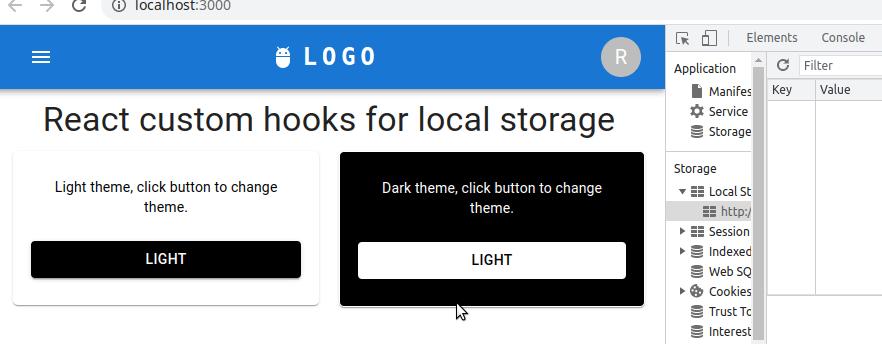
Above is a screenshot of React local storage hook for react theming. We have 2 Card components with a button to change the theme, changing theme mode is saved into the browser window local storage.
Next time the user visits the site again he/she can see what theme they had selected from local storage. Let’s first create src/hooks/useLocalStorage.js
import { useState, useEffect } from "react";

const useLocalStorage = (key, initialValue) => {
    const [value, setValue] = useState(() => {
        const savedValue = window.localStorage.getItem(key);
        if (savedValue !== null) {
            return JSON.parse(savedValue);
        }
        return initialValue;
    });

    // Save storage when value change
    useEffect(() => {
        window.localStorage.setItem(key, JSON.stringify(value));
    }, [value]);

    return [value, setValue]
}

export default useLocalStorage;
To create custom hooks we need other React hooks, here in useState hooks we can not only pass values but also have functions as arguments. Here we have used this custom hook for React theming, we know that hooks are reusable, and we can store other information like cart, or any object values. So what we are doing in the useLocalStorage hooks.
- useState hooks, we pass the arrow function to check if or theme selected is exist in local storage using its key, if so then set it to value otherwise set initialValue which we got from an argument.
- The useffect, allow us to listen to change to value by adding dependency array on value variable. Whenever we add a new value using setValue will add to local storage, local storage is key and value pair, we can only set string.
Our theme is just string, we don’t need to convert to JSON stringify but our useLocalStorage is a general-purpose or reusable local storage hook or function, so we may pass objects.
In our application, we have App, Card, and Navbar components, let how to add React theming code in the App.js file.
import { useState } from 'react';
import './App.css';
import { useEffect } from 'react';
import { createTheme, ThemeProvider, Box } from '@mui/material';
import { Typography } from '@mui/material';
import NavBar from './components/Navbar';
import Cards from './components/Cards';
import useLocalStorage from './hooks/useLocalStorage';


function App() {
  const [mode, setMode] = useState('light');
  const [value, setValue] = useLocalStorage('theme', 'light');

  const darkTheme = createTheme({
    palette: {
      mode: mode,
    },
  });

  useEffect(() => {
    setMode(value);
  }, []); //[] important call once on component mount

  const onThemeChange = (color) => {
    setMode(color);
    setValue(color);
  }


  return (
  <ThemeProvider theme={darkTheme}>
      <Box height='100vh' bgcolor={'background.default'} color={'text.primary'}>
      <NavBar />
      <Typography variant='h4' component='h2' sx={{textAlign: 'center', mt: '10px'}}>
        React custom hooks for local storage
      </Typography>
      <Cards onModeChange = {onThemeChange} />
      </Box>
    </ThemeProvider>
  );
}

export default App;
In our App.js we have mode, setMode, and mode containing the currently selected theme color either light or dark. The value and setValue are variable and function from our useLocalStorage function. Whenever we change a theme from the Card component, we call the onThemeChange function here we set the change theme mode and add the selected React theme to local storage using useLocalStorage hook.
Let add code for Card component, src/components/Card.jsx
import * as React from 'react';
import Button from '@mui/material/Button';
import Card from '@mui/material/Card';
import CardContent from '@mui/material/CardContent';
import CardActions from '@mui/material/CardActions';
import { styled } from '@mui/material/styles';
import Typography from '@mui/material/Typography';

const CardContainer = styled('div')(({ theme }) => ({
  padding: '0 10px',
  margin: '10px',
  display: 'flex',
  gap: '20px',
}));

const StyledCard = styled(Card)({
  padding: '10px',
  height: '20vh',
  textAlign: 'center',
  borderRadius: '5px',
});

const Cards = ({ onModeChange}) => {
  const modeChange = (mode) => {
    onModeChange(mode);
  }

  return (
    <CardContainer>
      <StyledCard sx={{ bgcolor: 'white' }} >
        <CardContent>
          <Typography variant='body2' color='black'>
            Light theme, click button to change theme.
          </Typography>
        </CardContent>
        <CardActions disableSpacing>
          <Button onClick={() => modeChange('light')}
            variant='contained'
            sx={{ width: '100%', color: 'white', bgcolor: 'black' }} >
            Light
          </Button>
        </CardActions>
      </StyledCard>

      <StyledCard sx={{ bgcolor: 'black', border: '1px solid white' }} >
        <CardContent>
          <Typography variant='body2' color='white'>
            Dark theme, click button to change theme.
          </Typography>
        </CardContent>
        <CardActions disableSpacing>
          <Button onClick={() => modeChange('dark')}
            sx={{ width: '100%', color: 'black', bgcolor: 'white' }}
            variant='contained'>
            Dark
          </Button>
        </CardActions>
      </StyledCard>
    </CardContainer>
  );
};

export default Cards;
Let’s add code for Navbar, which is just to see React theme effect, our aim is to demonstrate React custom hooks, useLocalStorage and App.js have our logic for creating custom hooks, setting, and getting value from custom hooks.
Let’s create a Navbar in the components folder and add the following values.
import * as React from 'react';
import AppBar from '@mui/material/AppBar';
import Box from '@mui/material/Box';
import Toolbar from '@mui/material/Toolbar';
import IconButton from '@mui/material/IconButton';
import Typography from '@mui/material/Typography';
import Menu from '@mui/material/Menu';
import MenuIcon from '@mui/icons-material/Menu';
import Container from '@mui/material/Container';
import Avatar from '@mui/material/Avatar';
import Button from '@mui/material/Button';
import Tooltip from '@mui/material/Tooltip';
import MenuItem from '@mui/material/MenuItem';
import AdbIcon from '@mui/icons-material/Adb';

const pages = ['Products', 'Pricing', 'Blog'];
const settings = ['Profile', 'Account', 'Dashboard', 'Logout'];

const NavBar = () => {
  const [anchorElNav, setAnchorElNav] = React.useState(null);
  const [anchorElUser, setAnchorElUser] = React.useState(null);

  const handleOpenNavMenu = (event) => {
    setAnchorElNav(event.currentTarget);
  };
  const handleOpenUserMenu = (event) => {
    setAnchorElUser(event.currentTarget);
  };

  const handleCloseNavMenu = () => {
    setAnchorElNav(null);
  };

  const handleCloseUserMenu = () => {
    setAnchorElUser(null);
  };

  return (
    <AppBar position="static">
      <Container maxWidth="xl">
        <Toolbar disableGutters>
          <AdbIcon sx={{ display: { xs: 'none', md: 'flex' }, mr: 1 }} />
          <Typography
            variant="h6"
            noWrap
            component="a"
            href="/"
            sx={{
              mr: 2,
              display: { xs: 'none', md: 'flex' },
              fontFamily: 'monospace',
              fontWeight: 700,
              letterSpacing: '.3rem',
              color: 'inherit',
              textDecoration: 'none',
            }}
          >
            LOGO
          </Typography>

          <Box sx={{ flexGrow: 1, display: { xs: 'flex', md: 'none' } }}>
            <IconButton
              size="large"
              aria-label="account of current user"
              aria-controls="menu-appbar"
              aria-haspopup="true"
              onClick={handleOpenNavMenu}
              color="inherit"
            >
              <MenuIcon />
            </IconButton>
            <Menu
              id="menu-appbar"
              anchorEl={anchorElNav}
              anchorOrigin={{
                vertical: 'bottom',
                horizontal: 'left',
              }}
              keepMounted
              transformOrigin={{
                vertical: 'top',
                horizontal: 'left',
              }}
              open={Boolean(anchorElNav)}
              onClose={handleCloseNavMenu}
              sx={{
                display: { xs: 'block', md: 'none' },
              }}
            >
              {pages.map((page) => (
                <MenuItem key={page} onClick={handleCloseNavMenu}>
                  <Typography textAlign="center">{page}</Typography>
                </MenuItem>
              ))}
            </Menu>
          </Box>
          <AdbIcon sx={{ display: { xs: 'flex', md: 'none' }, mr: 1 }} />
          <Typography
            variant="h5"
            noWrap
            component="a"
            href=""
            sx={{
              mr: 2,
              display: { xs: 'flex', md: 'none' },
              flexGrow: 1,
              fontFamily: 'monospace',
              fontWeight: 700,
              letterSpacing: '.3rem',
              color: 'inherit',
              textDecoration: 'none',
            }}
          >
            LOGO
          </Typography>
          <Box sx={{ flexGrow: 1, display: { xs: 'none', md: 'flex' } }}>
            {pages.map((page) => (
              <Button
                key={page}
                onClick={handleCloseNavMenu}
                sx={{ my: 2, color: 'white', display: 'block' }}
              >
                {page}
              </Button>
            ))}
          </Box>

          <Box sx={{ flexGrow: 0 }}>
            <Tooltip title="Open settings">
              <IconButton onClick={handleOpenUserMenu} sx={{ p: 0 }}>
                <Avatar alt="Remy Sharp" src="/static/images/avatar/2.jpg" />
              </IconButton>
            </Tooltip>
            <Menu
              sx={{ mt: '45px' }}
              id="menu-appbar"
              anchorEl={anchorElUser}
              anchorOrigin={{
                vertical: 'top',
                horizontal: 'right',
              }}
              keepMounted
              transformOrigin={{
                vertical: 'top',
                horizontal: 'right',
              }}
              open={Boolean(anchorElUser)}
              onClose={handleCloseUserMenu}
            >
              {settings.map((setting) => (
                <MenuItem key={setting} onClick={handleCloseUserMenu}>
                  <Typography textAlign="center">{setting}</Typography>
                </MenuItem>
              ))}
            </Menu>
          </Box>
        </Toolbar>
      </Container>
    </AppBar>
  );
};
export default NavBar;
Related Articles