Angular Flex Layout provides a sophisticated layout API using Flexbox CSS + mediaQuery. The use of flexbox ensures that elements behave predictably when the page layout must accommodate different screen sizes and different display devices.
Flex layouts are single-dimensional layouts (row or column), whereas Angular gird and table are 2 dimensional containing both row and column.
What is Angular flex layout module
Angular Flex Layout module, allow us to create page layouts using CSS Flexbox with a set of directives available to use in our templates. Flex layout module contains a set of the directive, media query observable, breakpoint, and injected DOM flexbox CSS Stylings, this allows us to create different layouts for different devices sizes.
The real power of Flex-Layout, however, is its responsive engine. The Responsive API enables developers to easily specify different layouts, sizing, visibilities for different viewport sizes and display devices.
Step 1 : Setup and configure Angular flex layout project
Let first create a flex project, we only need to install the Angular flex layout library package. This library is written in pure TypeScript, has no dependency on any other library, we don’t need Angular material style and any other external stylesheet is needed.
ng new flexApp
cd flexApp
npm install @angular/flex-layout --save
To use flex layout we need to import the Angular flex layout module. Open the app.module.ts and replace the existing code with the code shown below.
import { NgModule } from '@angular/core';
import { BrowserModule } from '@angular/platform-browser';
import { AppRoutingModule } from './app-routing.module';
import { AppComponent } from './app.component';
import { FlexLayoutModule } from '@angular/flex-layout';
// import {FlexModule} from '@angular/flex-layout/flex';
// import {GridModule} from '@angular/flex-layout/grid';

@NgModule({
  declarations: [
    AppComponent
  ],
  imports: [
    BrowserModule,
    AppRoutingModule,
    FlexLayoutModule
  ],
  providers: [],
  bootstrap: [AppComponent]
})
export class AppModule { }
The FlexLayoutModule contains both FlexModule and GridModule, we can install them separately but is best practice to import FlexLayoutModule.
Angular flex layout exampel 1
Let first demonstrate flex layout example basic and will learn what is the flex directive we can use in Angular flex.
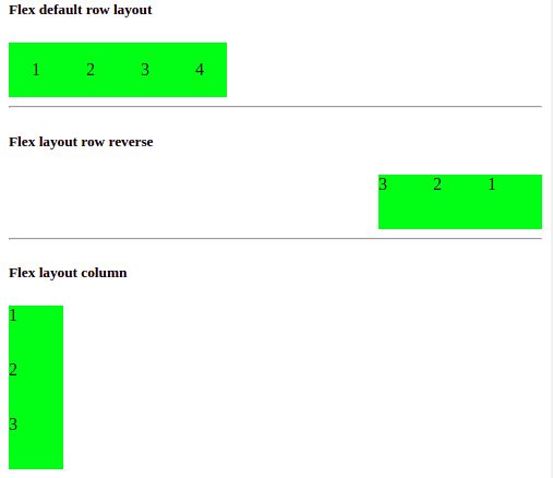
Let add our three examples on flex layout, add the following in our component template. All flex layouts have the same number of content, only different in their layout direction.
<h5>Flex default row layout</h5>
<div fxLayout>
  <div fxLayoutAlign="center center" class="item">1</div>
  <div fxLayoutAlign="center center" class="item">2</div>
  <div fxLayoutAlign="center center" class="item">3</div>
  <div fxLayoutAlign="center center" class="item">4</div>
</div>
<hr/>

<h5>Flex layout row reverse</h5>
<div fxLayout="row-reverse" class="flex-container">
  <div class="item">1</div>
  <div class="item">2</div>
  <div class="item">3</div>
</div>
<hr/>

<h5>Flex layout column</h5>
<div fxLayout="column" class="flex-container">
  <div class="item">1</div>
  <div class="item">2</div>
  <div class="item">3</div>
</div>
<hr/>
We had applied background color, width, height, and margin on each flex item. Let add CSS style for flex items.
.item {
  width: 50px;
  height: 50px;
  background-color: #62f003;
}
Angular Flex layout directives
In the above example, we have used only one flex directive, to use flex layout properly, Angular provides a large number of other flex directives which we’ll discuss now.
| Directive name | Description |
| fxLayout | The directive defines the layout of the element, We have to apply this directive to the container of the flex item. We can have the following values row, column, row-reverse, column-reverse. By default fxLayout is row. |
| fxLayoutGap | This directive defines the gap between the children items within a flexbox container and we specified its value in pixel. |
| fxLayoutAlign | fxLayoutAlign directive defines the alignment of children elements within the flexbox parent container. |
| FxFlex | This attribute we can use on children elements within the flexbox parent container. To custom width or layout of each children item. |
Angular flex layout example 2
In the second example, we will use fxLayoutGap and fxLayout reverse column example. In our first example already demonstrate an example of fxLayout.
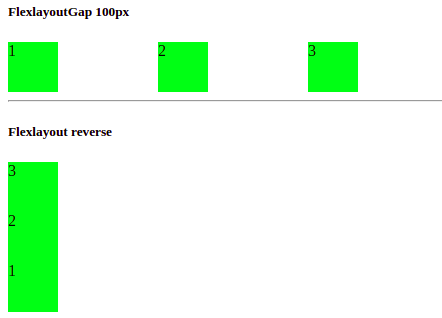
<h5>FlexlayoutGap 100px</h5>
<div fxLayout="row" fxLayoutGap="100px" class="flex-container">
  <div class="item">1</div>
  <div class="item">2</div>
  <div class="item">3</div>
</div>
<hr/>
<h5>Flexlayout reverse</h5>
<div fxLayout="column-reverse" class="flex-container">
  <div class="item">1</div>
  <div class="item">2</div>
  <div class="item">3</div>
</div>
Flexlayout alignment directive
The flexlayoutAlign directive defines the alignment of the internal flex elements in a flex container.
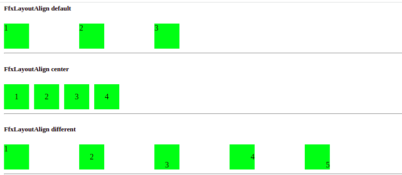
In the second example, we have aligned the flex child element at the center. The fxLayoutAlign directive has the following value center, end, space-around, space-between, and space-evenly.
<h5>FfxLayoutAlign default</h5>
<div fxLayout="row" fxLayoutGap="100px" class="flex-container">
  <div class="item">1</div>
  <div class="item">2</div>
  <div class="item">3</div>
</div>
<hr/>

<h5>FfxLayoutAlign center</h5>
<div fxLayout fxLayoutGap="10px">
  <div fxLayoutAlign="center center" class="item">1</div>
  <div fxLayoutAlign="center center" class="item">2</div>
  <div fxLayoutAlign="center center" class="item">3</div>
  <div fxLayoutAlign="center center" class="item">4</div>
</div>
<hr/>

<h5>FfxLayoutAlign different </h5>
<div fxLayout fxLayoutGap="100px">
  <div class="item">1</div>
  <div fxLayoutAlign="center center" class="item">2</div>
  <div fxLayoutAlign="center end" class="item">3</div>
  <div fxLayoutAlign="end center" class="item">4</div>
  <div fxLayoutAlign="end end" class="item">5</div>
</div>
<hr/>
The fxFlex directive
The fxFlex attribute is used with the children element of flexLayout container and is one of the most useful and powerful APIs in Angular flex layout. This attribute is responsible for resizing flex children elements. We can set the layout or width of individual flex-item along the main-axis of the layout.
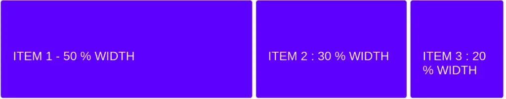
In the above example, we have set item 1 to 50% width, item 2 to 30% width, and the remaining width to item 3. This can be achieved by using the fxFlex attribute by specifying the value on it.
<div class="container" fxLayout fxLayoutAlign="center" fxLayoutGap="10px" fxLayoutGap.xs="0">
  <div class="item" fxFlex="50%">
    Item 1 - 50 % width
  </div>
  <div class="item" fxFlex="30%">
    Item 2 : 30 % width
  </div>
  <div class="item" fxFlex>
    Item 3 : 20 % width
  </div>
</div>
FxFlex and fxHide diretive
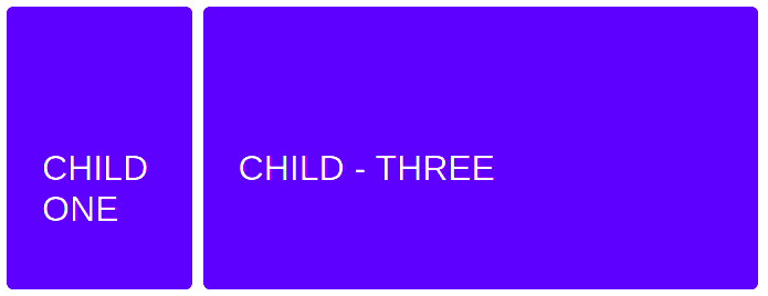
In the above example, we have three children elements in the flex container and each has given a different width size. We can also use fxFlex with a number instead of a percentage. We have also used fxHide directive to hide Child – Two elements in small and extra small devices by using the following flex layout.
<div fxLayout="row" fxLayoutGap="10px">
  <div fxFlex="20" class="item">Child One </div>
  <div fxFlex="20" class="item" fxHide.lt-md> Child - Two </div>
  <div fxFlex="60" class="item">Child - Three</div>
</div>
Angular flex layout allocate different column width
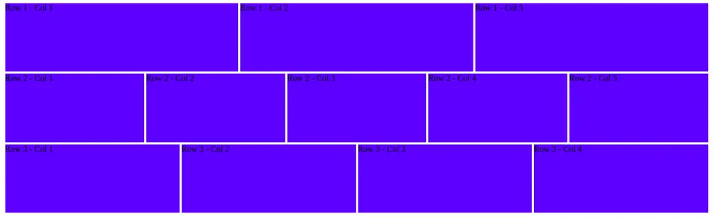
In the last example, we will allocate different numbers of columns for each row. For example, the first row has 3 columns,s and second have 5 columns and the third have four columns.
<div style="height: 400px; background-color: yellow" fxLayout="row wrap" fxLayoutAlign="start space-evenly">
  <div style="background-color: blue; border: 2px solid white;" fxFlex="0 0 33.33%">
    Row 1 - Col 1
  </div>
  <div style="background-color: blue; border: 2px solid white;" fxFlex="0 0 33.33%">
    Row 1 - Col 2
  </div>
  <div style="background-color: blue; border: 2px solid white;" fxFlex="0 0 33.33%">
    Row 1 - Col 3
  </div>
  <div style="background-color: blue; border: 2px solid white;" fxFlex="0 0 20%">
    Row 2 - Col 1
  </div>
  <div style="background-color: blue; border: 2px solid white;" fxFlex="0 0 20%">
    Row 2 - Col 2
  </div>
  <div style="background-color: blue; border: 2px solid white;" fxFlex="0 0 20%">
    Row 2 - Col 3
  </div>
  <div style="background-color: blue; border: 2px solid white;" fxFlex="0 0 20%">
    Row 2 - Col 4
  </div>
  <div style="background-color: blue; border: 2px solid white;" fxFlex="0 0 20%">
    Row 2 - Col 5
  </div>
  <div style="background-color: blue; border: 2px solid white;" fxFlex="0 0 25%">
    Row 3 - Col 1
  </div>
  <div style="background-color: blue; border: 2px solid white;" fxFlex="0 0 25%">
    Row 3 - Col 2
  </div>
  <div style="background-color: blue; border: 2px solid white;" fxFlex="0 0 25%">
    Row 3 - Col 3
  </div>
  <div style="background-color: blue; border: 2px solid white;" fxFlex="0 0 25%">
    Row 3 - Col 4
  </div>
</div>Conclusion
In this tutorial, we learn how to use Angular flex layout, We have demonstrated the basics of flex layout and it has more on it. I hope you have got some idea of how to use the Angular flex layout. I had pushed the Angular flex layout example on Github, for references.
Related Articles