React Native, a widely used framework for building cross-platform applications, provides a variety of UI components to accomplish this objective. The Modal is component of React Native, which are a type of pop-up window that can be used to display information or gather input from users. In this article, we will delve into the world of React Native modals, understanding their significance and exploring best practices for seamless user interaction.
The main objective of this article is to teach you how to implement React Native modals using best practices. Learn through two practical examples, covering modal animation, styling, and even the creation of a React Native bottom modal. Master the art of modal implementation with this comprehensive guide.
Table of Contents
What Are React Native Modals?
Developers can use React Native Modals to display content above the current screen, resulting in a focused and interactive user experience. A modal is a type of pop-up window that appears on top of the current screen. They are commonly used for tasks such as form submissions, alerts, confirmations, and multimedia presentations. It is used to provide additional information or gather input from users without navigating to a new screen.
How do Modals work in React Native?
In React Native, modals are implemented as a component that can be used like any other component. To display a modal, you can use the Modal component provided by the React Native library. The Modal component takes a few props, including visible, which determines whether the modal should be displayed or not.
React Native Modal example
Here is our screenshot of our first React native modal example, we had also add react native modal custom style also to add width, height, background and more.

Implementing React Native Modals: Step-by-Step Guide
Creating Your First Modal
We can create custom modal component, in this example, we will create modal inside App component. We need to import Modal component from the react-native.
In this example, we create a state variable called modalVisible which determines whether the modal should be displayed or not. We then use Button component that, when pressed, sets the modalVisible state to true. The Modal component is then rendered with a visible prop set to the value of modalVisible. Here is our code for react native modal.
import React, { useState } from "react";
import {
  StyleSheet,
  Modal,
  Text,
  View,
  Button,
  TouchableOpacity,
} from "react-native";

export default function App() {
  const [modalVisible, setModalVisible] = useState(false);

  const handleToggleModal = () => {
    setModalVisible(!modalVisible);
  };

  const handleConfirm = () => {
    // Do something on confirm
    alert("Confirmed!");
  };

  const handleCancel = () => {
    // Do something on cancel
    alert("Cancelled!");
  };

  return (
    <View style={styles.container}>
      <Button title="Toggle Modal" onPress={handleToggleModal} />
      <Modal animationType="slide" transparent={true} visible={modalVisible}>
        <TouchableOpacity
          style={styles.modalOverlay}
          activeOpacity={1}
          onPressOut={() => setModalVisible(false)}
        >
          <View style={styles.modalBox}>
            <Text style={styles.modalText}>This is a modal with actions!</Text>
            <View style={styles.btnContainer}>
              <Button title="Confirm" onPress={handleConfirm} />
              <Button title="Cancel" onPress={handleCancel} />
            </View>
          </View>
        </TouchableOpacity>
      </Modal>
    </View>
  );
}

const styles = StyleSheet.create({
  container: {
    flex: 1,
    padding: 60,
  },
  modalOverlay: {
    flex: 1,
    backgroundColor: "rgba(0, 0, 0, 0.7)",
    justifyContent: "center",
    alignItems: "center",
  },
  modalBox: {
    backgroundColor: "white",
    width: "80%",
    height: 150,
    padding: 20,
    borderRadius: 10,
    alignItems: "center",
    shadowColor: "#000",
    shadowOffset: { width: 0, height: 2 },
    shadowOpacity: 0.8,
    shadowRadius: 4,
    elevation: 5,
  },
  modalText: {
    marginBottom: 20,
    fontSize: 18,
    textAlign: "center",
  },
  btnContainer: {
    flexDirection: "row",
    justifyContent: "space-around",
    width: "100%",
  },
});
Note: The onRequestClose prop of the Modal component is a callback function that is triggered when the modal is closed. This can happen when the user clicks the outside of the modal, or when the user presses the back button on Android devices or dismiss modal on IOS.
 <Modal
          animationType="slide"
          transparent={true}
          visible={modalVisible}
          onRequestClose={() => setModalVisible(false)}
        >
Customizing Modal Appearance
Modals are component that we can customise it, inside the modal we can add our contain and we can used React native component View, Button, Text and any other custom component. We can customs it style like any othe component we do in React native. The Modal component provides a range of styles that can be used to customize its appearance. Some of the styles that can be applied to the React Native Modal component are:
- backgroundColor: This style is used to set the background color of the modal.
- borderRadius: This style is used to set the border radius of the modal.
- borderWidth: This style is used to set the border width of the modal.
- borderColor: This style is used to set the border color of the modal.
- padding: This style is used to set the padding of the modal.
- margin: This style is used to set the margin of the modal.
- shadowColor: This style is used to set the color of the shadow of the modal.
- shadowOffset: This style is used to set the offset of the shadow of the modal.
- shadowOpacity: This style is used to set the opacity of the shadow of the modal.
- shadowRadius: This style is used to set the radius of the shadow of the modal.
React Native Modal Animations and Transitions
We can add animation on React Native modale. By default, modals slide up from the bottom of the screen and slide back down when dismissed. However, we can customize animation behavior to create a more visually appealing and engaging user experience.
React Native modal animation that slides in from the bottom of the screen and slides back down when dismissed involves utilizing the Animated API from React Native. Modal animation fade, will fade the modal from the view. Note that the pageSheet presentation style and transparent value are not currently supported for modals in React Native.
<Modal animationType="slide" presentationStyle="pageSheet" visible={modalVisible}>The formSheet and pageSheet presentation styles for modals are specific to iOS.
The formSheet and pageSheet presentation styles for modals are specific to iOS and are not currently supported by React Native. However, you can create custom modal components that simulate these styles using the Animated API.
Here’s a comparison of the formSheet and pageSheet presentation styles:
formSheet:
- A narrow-width view centered on the screen (only on larger devices)
- Slightly overlaps the bottom of the screen
- Has a darker background than the
pageSheetpresentation style
pageSheet:
- A portrait-width view centered on the screen (only on larger devices)
- Doesn’t overlap the bottom of the screen
- Has a lighter background than the
formSheetpresentation style
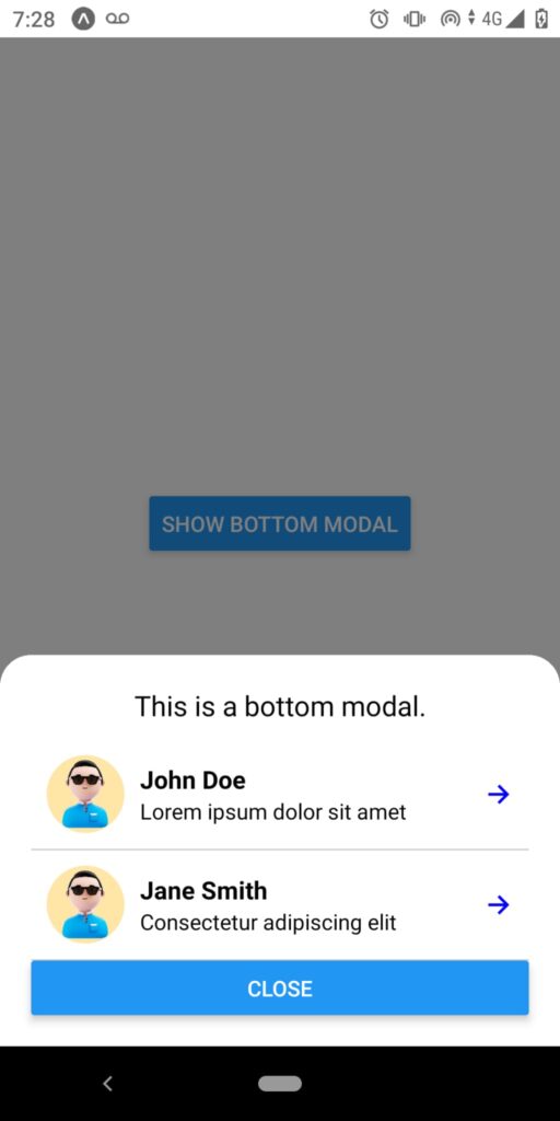
React native bottom Modal
In our second example, let’s demonstrate a React Native bottom modal containing a list of users with various components, such as image avatars, views, texts, and icons. Here is a screenshot of our React Native modal example.
Here is code of our above example bottom modal code.
import React, { useState } from "react";
import {
  StyleSheet,
  View,
  Text,
  Button,
  Modal,
  Image,
  TouchableOpacity,
  FlatList,
} from "react-native";
import { Ionicons } from "@expo/vector-icons";

const data = [
  {
    id: "1",
    name: "John Doe",
    text: "Lorem ipsum dolor sit amet",
  },
  {
    id: "2",
    name: "Jane Smith",
    text: "Consectetur adipiscing elit",
  },
  // Add more data items as needed
];

const ListItem = ({ item }) => (
  <View style={styles.listItem}>
    <Image source={require("./assets/images/avatar.png")} style={styles.avatar} />
    <View style={styles.textContainer}>
      <Text style={styles.name}>{item.name}</Text>
      <Text style={styles.text}>{item.text}</Text>
    </View>
    <Ionicons
      name="ios-arrow-forward"
      size={20}
      color="blue"
      style={styles.icon}
    />
  </View>
);

const App = () => {
  const [modalVisible, setModalVisible] = useState(false);

  const toggleModal = () => {
    setModalVisible(!modalVisible);
  };

  return (
    <View style={styles.container}>
      <Button title="Show Bottom Modal" onPress={toggleModal} />
      <Modal animationType="slide" transparent={true} visible={modalVisible}>
        <TouchableOpacity
          style={styles.modalContainer}
          onPress={toggleModal}
          activeOpacity={1}
        >
          <View style={styles.modal}>
            <Text style={styles.modalText}>This is a bottom modal.</Text>
            <FlatList
              data={data}
              keyExtractor={(item) => item.id}
              renderItem={({ item }) => <ListItem item={item} />}
            />
            <Button title="Close" onPress={toggleModal} />
          </View>
        </TouchableOpacity>
      </Modal>
    </View>
  );
};

const styles = StyleSheet.create({
  container: {
    flex: 1,
    justifyContent: "center",
    alignItems: "center",
  },
  modalContainer: {
    flex: 1,
    justifyContent: "flex-end",
    backgroundColor: "rgba(0, 0, 0, 0.5)",
  },
  modal: {
    backgroundColor: "white",
    padding: 20,
    borderTopLeftRadius: 20,
    borderTopRightRadius: 20,
  },
  modalText: {
    fontSize: 18,
    marginBottom: 10,
    textAlign: "center",
  },

  listItem: {
    flexDirection: "row",
    alignItems: "center",
    padding: 10,
    borderBottomWidth: 1,
    borderBottomColor: "#ccc",
  },
  avatar: {
    width: 50,
    height: 50,
    borderRadius: 25,
  },
  textContainer: {
    flex: 1,
    paddingLeft: 10,
  },
  name: {
    fontSize: 16,
    fontWeight: "bold",
  },
  text: {
    fontSize: 14,
  },
  icon: {
    marginLeft: 10,
  },
});

export default App;
Conclusion
By integrating React Native modals into your mobile applications, user interaction and overall usability can be significantly improved. By learning how to create, customize, and optimize modal components, developers can create visually appealing and user-friendly interfaces that captivate and engage their audience.
Related Articles