Angular tooltip can be implemented by different libraries. A tooltip is small pop-up information or message that appears when the user moves the mouse pointer over an element like an image, button, anchor tag, div, etc. In the tooltip, we can display small information that can contain text, images, anchors, or any HTML element.
In this tutorial, we will discuss some of the best Angular tooltip libraries. We’ll demonstrate two examples of tooltip using ng2-tooltip-directive and angular bootstrap tooltip component. At last, we’ll learn how to style this tooltip component. So let’s get started.
Best Angular tooltip libraries in Angular
Here we have listed three different ways we can implement a tooltip. We can select this library based on your UI library and requirement. If you are using Angular material or ng-bootstrap then you can select the tooltip component from this library only.
Angular Material has a tooltip component and so as in the ng-bootstrap library.
| Name of libraries | Description |
| ng2-tooltip-directive | This is one of the most downloaded tooltip libraries and has a size of about 320 kB. |
| matTooltip | If you are using Angular material design UI framework, then it is best to use its own component. |
| ng-bootstrap tooltip | If you are using bootstrap UI in your project, then bootstrap has a tooltip component built for angular. |
Setting up and configuring the Angular tooltip example project
Let’s first create our tooltip project and we have two examples of a tooltip. Before starting an angular project you need to install Nodejs and Angular CLI in your system. Step 1 Create an Angular project
ng new toolTipApp
cd toolTipApp
Step 2: Angular tooltip example using ng2-tooltip-directive
We’ll demonstrate the Angular tooltip example using the third-party library the ng2-tooltip-directive. This library has both free and pro, for most cases free is enough for us to add a tooltip in our project.
To demonstrate both the ng2-tooltip-directive and bootstrap tooltip components, let’s install both packages together.
npm i ng2-tooltip-directive --save
ng add @ng-bootstrap/ng-bootstrap
After installing libraries, we need to TooltipModule in the app.module.ts file, we don’t need to import the ng-bootstrap module, it will add automatically in the app.module.ts file. Let’s edit the app.module.ts file.
import { NgModule } from '@angular/core';
import { BrowserModule } from '@angular/platform-browser';
import { AppRoutingModule } from './app-routing.module';
import { AppComponent } from './app.component';
import { TooltipModule } from 'ng2-tooltip-directive';
import { NgbModule } from '@ng-bootstrap/ng-bootstrap';

@NgModule({
  declarations: [
    AppComponent
  ],
  imports: [
    BrowserModule,
    AppRoutingModule,
    TooltipModule,
    NgbModule
  ],
  providers: [],
  bootstrap: [AppComponent]
})
export class AppModule { }
Angular tooltip example basic
Let’s first demonstrate a simple example, to know how to use ng2-tooltip-directive in our project. Here is a screenshot of our example.
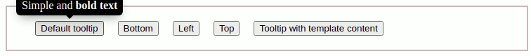
In our component template let’s add this code.
<button tooltip="Simple and <b>bold text</b>">Default tooltip</button>The ng2-tooltip-directive properties
We can control and configure the ng2-tooltip-directive tooltip position, delay, theme, style, and more. Here we have listed only a few properties of this library.
| Name | Description |
| placement | The placement of the tooltip. It can have values top, left, right and bottom. By default position value is top. |
| showDelay | The delay is in milliseconds before showing the tooltip. |
| hideDelay | The delay is in milliseconds before removing the tooltip. By default 300 milliseconds. |
| theme | The theme of tooltip background and text. It can be light and dark. By default is a dark theme. We can change the background color it using CSS style. |
| contentType | The content type is passed to the tooltip. The string is by default, we can other content types like “html’, “template” |
| trigger | Specifies how the tooltip is triggered. Control the closing time with “hide-delay”. It can have the value of hovering and clicking. By default hover. |
Angular tooltip example on different position
As we have discussed there are different positions we can align the tooltip on a button or any HTML element. Let’s add all different positions on the tooltip.
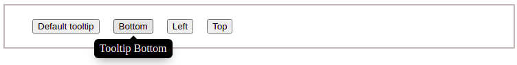
I have seen that sometimes top tooltip positions are not showing, for that we need to add enough width and height for the tooltip button or element. Angular tooltip on hover is the default behavior of this library but we can change it to click by using the trigger attribute.
<button tooltip="Simple and <b>bold text</b>">Default tooltip</button>
<button tooltip="Tooltip Bottom" [options]="bottomOptions">Bottom</button>
<button tooltip="Tooltip on left" [options]="leftOptions">Left</button>
<button tooltip="Tooltip Rt" placement="top">Top</button>
We can configure the tooltip position from both template and component typescript files by using the options attribute. Let’s edit the typescript file.
...
export class AppComponent {
  leftOptions = {
    'placement': 'left',
    'showDelay': 500
  };

  topOptions = {
    'placement': 'top',
    'showDelay': 500,
  };
  bottomOptions = {
    'placement': 'bottom',
    'showDelay': 500
  }
}
Angular tooltip HTML example
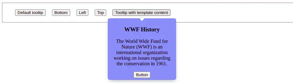
The ng2-tooltip-directive allow us to add custom tooltip HTML, that can contain image, button, text, and more. Here is a screenshot of our example.
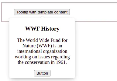
  <ng-template #HtmlContent>
    <h3>WWF History</h3>
    <p>
     The World Wide Fund for Nature (WWF) is an international organization
     working on issues regarding the conservation in 1961.</p>
    <button>Button</button>
  </ng-template>

  <button [tooltip]="$any(HtmlContent)" trigger='click'
    theme='light' contentType="template">
    Tooltip with template content
  </button>
Here we have also used a few properties like a trigger, light theme, and tooltip to add a reference to add Angular tooltip HTML. In our Angular tooltip HTML, we have used H3, buttons, and paragraph elements. You can add an image or any element of your choice.
Angular tooltip background color
As we have seen that ng2-tooltip-directive, allows us to change the tooltip background color to either dark or light. We can use tooltipClass properties to change the tooltip background color.
We’ll use the previous example, but the only difference is that we change the Angular tooltip background color by using tooltipClass.
<ng-template #HtmlContent>
    <h3>WWF History</h3>
    <p>The World Wide Fund for Nature (WWF) is an international organization
       working on issues regarding the conservation in 1961.</p>
      <button>Button</button>
  </ng-template>

  <button [tooltip]="$any(HtmlContent)" trigger='click'
    tooltipClass='ngTemplateTips' contentType="template">
    Tooltip with template content
  </button>
Here we add ngTemplateTips class on our button, now let’s edit the tooltip background color to light blue. We need to add a tooltip CSS style at global value by adding CSS style in style.scss
.ngTemplateTips {
    background-color: rgb(129, 166, 247) !important;
}
Angular bootstrap tooltip example
Now let’s demonstrate and learn how to use the Angular bootstrap tooltip component. There are different ways we can add bootstrap to angular, but the ng-bootstrap is best and built specifically for Angular.
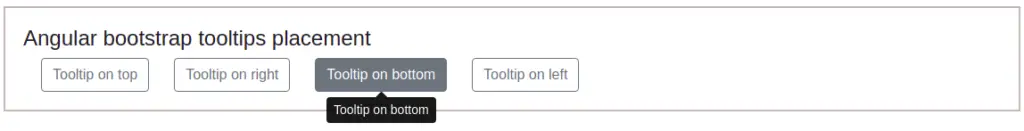
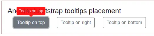
Angular tooltip on hover is the default behavior of the Angular bootstrap tooltip. Let’s add our first example of Angular bootstrap tooltip with position attribute and let’s add this to our template.
<section>
  <h4>Angular bootstrap tooltips placement</h4>
  <button type="button" class="btn btn-outline-secondary mr-2" placement="top"
    ngbTooltip="Tooltip on top">
      Tooltip on top
    </button>
    <button type="button" class="btn btn-outline-secondary mr-2"
     placement="right"  ngbTooltip="Tooltip on right">
      Tooltip on right
    </button>
    <button type="button" class="btn btn-outline-secondary mr-2"
     placement="bottom" ngbTooltip="Tooltip on bottom">
      Tooltip on bottom
    </button>
    <button type="button" class="btn btn-outline-secondary mr-2"
     placement="left" ngbTooltip="Tooltip on left">
      Tooltip on left
    </button>
  </section>
Angular bootstrap tooltip properties
We can control and configure tooltip position, delay, theme, style, and more. Here we have listed only a few properties of this library.
| Name | Description |
| placement | The position of the tooltip. It can have values top, left, right and bottom. By default position value is top. |
| triggers | Specifies how the bootstrap tooltip is triggered. By default hover. |
| closeDelay | The delay is in milliseconds before closing the tooltip. |
| tooltipClass | By default tooltip background is dark, we can add a CSS class name to control its style-like background. |
Angular tooltip background color or Style of tooltip
We can use tooltipClass attribute to edit the background color of the tooltip. Here is a screenshot of our example.
 <button type="button" tooltipClass="edupala-tooltip" ngbTooltip="Tooltip on top">
    Tooltip on top
 </button>
Let’s add the “edupala-tooltip” CSS in our component style file.
.edupala-tooltip .arrow::before{
    border-top-color: red;
}

.edupala-tooltip .tooltip-inner{
    background-color: red;
}
Let’s use the Angular tooltip openDelay and closeDelay on our bootstrap tooltip component. Let’s use the Angular tooltip openDelay and closeDelay on our bootstrap tooltip component.
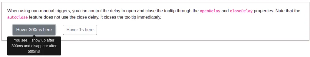
We have taken this example directly from ng-bootstrap documentation to demonstrate its example. To learn more about the bootstrap component check its official documentation of ng-bootstrap.
<section>
  <p>
   When using non-manual triggers, you can control the delay to open and close the
   tooltip through the <code>openDelay</code> and <code>closeDelay</code>
   properties. Note that the <code>autoClose</code> feature does not use the close
   delay, it closes the tooltip immediately.
  </p>

  <button type="button" class="btn btn-outline-secondary mr-2"
    ngbTooltip="You see, I show up after 300ms and disappear after 500ms!"
    placement="bottom" [openDelay]="300" [closeDelay]="500">
      Hover 300ms here
  </button>
  <button type="button" class="btn btn-outline-secondary mr-2"
      ngbTooltip="You see, I show up after 1s and disappear after 2s!"
      [openDelay]="1000" [closeDelay]="2000">
      Hover 1s here
    </button>
  </section>
Angular tooltip HTML content in bootstrap tooltip
Let us demonstrate our last example, to add HTML content in a tooltip, and here is a screenshot of this example from the ng-bootstrap tooltip component.
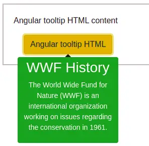
Angular tooltip html example
<section>
    <p>Angular tooltip HTML content</p>

    <ng-template #tipContent>
      <h3>WWF History</h3>
      <p>
        The World Wide Fund for Nature (WWF) is an international organization
        working on issues regarding the conservation in 1961.</p>
    </ng-template>


    <button class="btn btn-warning" tooltipClass="edupala-tooltip"
      [ngbTooltip]="tipContent" triggers="click">
      Angular tooltip HTML
    </button>
  </section>
Conclusion
We have completed two examples of tooltip libraries, we have learned how to add HTML elements in the tooltip and how to configure its position and background color.
Related posts