While working with an Ionic framework for creating mobile applications, we have often seen a welcome page with an ionic slider. Ionic slides component composed of one sub-component ion-slide which we can include any Ionic component or HTML elements like heading, p, img and etc. We’ll create a few examples of ionic slider examples to learn about ionic slider with image, pagination styling, and ionic slider pager position.
In this tutorial, we will explore how to use Ionic slider component. We have fews example of Ionic slider, learn different methods of slide, properties and how to configure ionic slides by change its slides options. At last we will explore how to add pagination of ionic slides.
What is ionic slider
The ionic slider component is a multi-section container. Each section can be swiped between each other. We can have any number of sliders inside the slides. Like the Ionic slides component, ionic has lots of other prebuild components like modal, action sheet, card, and so many other components. The Slides component allows multiple contents to be loaded (e.g images, video, or text), as individual slides, into a single container that can then be swiped through. The Slides component is a multi-section container. Each section can be swiped or dragged between. It contains any number of Slide components.
An Ionic slider example with an image
Let’s first create an Ionic slide with an image slider, we have three slides each containing title, image, and description of the slide. With the release of Ionic version 4, ionic is not limited only to Angular, we can create ionic in Vue and React also. In this example, we are using an ionic with angular and generate a blank ionic template.
ionic start slider blank --type=”angular” 
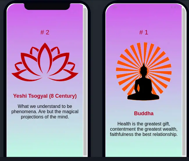
In the above image is a screenshot of our first ionic slider example. Once we have created our ionic project, let’s edit the home.page.html and add an ionic slider with three slides. Add the following code in the HTML home page template.
<ion-content>
  <ion-slides #slidesRef (ionSlideDidChange)="onSlideMoved($event)" [options]="slideOpts">
    <ion-slide>
      <h1># 1</h1>
      <img src="./assets/images/slide-1.png">
      <h2>Buddha</h2>
      <p>Health is the greatest gift, contentment the greatest wealth, faithfulness the best relationship.</p>
    </ion-slide>
    <ion-slide>
      <h1># 2</h1>
      <img src="./assets/images/slide-2.png">
      <h2>Yeshi Tsogyal (8 Century)</h2>
      <p>What we understand to be phenomena. Are but the magical projections of the mind.</p>

    </ion-slide>
    <ion-slide>
      <h1># 3</h1>
      <img src="./assets/images/slide-3.png">
      <h2>Lord Buddha</h2>
      <p>What we think, we become.</p>
    </ion-slide>
  </ion-slides>
</ion-content>
For image, you create folder images in the assets folder and add your own image for the slider. We have added local reference #slidesRef in ion-slides component. We can access and manipulate ion-slide components using ViewChild and local reference. With ViewChild reference we can access events that occur in our ionic slides. Here we have not used the ngFor directive and it is recommended to used ngFor for slides having more than two slides.
Ion-slides come with some events like onSlideChangeStar and ionSlideDidChange event binding of ionic on the ion-slides directive. Add the following code in home-page.ts
import { Component, ViewChild } from '@angular/core';
import { IonSlides } from '@ionic/angular';

@Component({
  selector: 'app-slide2',
  templateUrl: './slide2.page.html',
  styleUrls: ['./slide2.page.scss'],
})
export class HomePage {

  @ViewChild('slidesRef') slides: IonSlides;

  constructor() { }

  slideOpts = {
    initialSlide: 1,
    speed: 400,
    autoplay: true
  };

  onSlideMoved(event) {
    /** isEnd true when slides reach at end slide */
    event.target.isEnd().then(isEnd => {
      console.log('End of slide', isEnd);
    });

    event.target.isBeginning().then((istrue) => {
      console.log('End of slide', istrue);
    });
  }

}
We need to import Ionic slides and ViewChild.
Ionic slider methods
Once we have ionic slides object reference we can use all methods defined on Ionic slides. For example, we have moved to the next slide and the previous slide by using the following method on our slides object. These methods can activate by using an ionic button.
previousSlide(): void {
    this.slides.slidePrev();
 }

 goNext(): void {
   this.slides.slideNext();
 }
There are many methods we can used on slides object, check the ionic slides component for more.
Ionic slide autoplay
By default, ionic slides are not autoplay. We have an ionic slider option where we can specify the ionic slider autoplay option. We create an object called slideOpts object which stores the configuration options for our Slides component. Options that we can specify slides option like the pager property defines the speed property defines, in milliseconds, and autoplay on or off. We need to assign this slideOpts value to the [options] properties of our Ionic slides component. Ionic slides have lots of events, we’ll discuss it later. Value of ionic slider option we have.
    initialSlide: 1,
    speed: 400,
    autoplay: true
    spaceBetween: 0,
    slidesPreview: 2,
    slidesOffsetBefore: 6,
    slidesPerView: 'auto',
    zoom: true,
    grabCursor: true,
    direction: 'vertical' | 'horizontal',
    pagination: {} as object
By default ionic slide direction properties are horizontal, if we change direction to vertical, then we can vertically slide instead of horizontal. Let say we have the Ionic slide options value following.
  slideOpts = {
    initialSlide: 1,
    speed: 400,
    autoplay: true,
    spaceBetween: 0,
    direction: 'vertical'
  };
Here is a screenshot of our result of the horizontal direction of slide options.

Styling ionic slides
Add the following code on home-page.scss, in scss file we have to add .swiper-slide { display: block; } to get an image and other elements like heading and paragram element in block display. We have assigned an image background to our ionic slides.
ion-content {
    --background: url(../../assets/images/slides-bg.png) 0 0/100% 100% no-repeat !important;

    ion-slides {
        height: 100%;
        margin-top: 25%;
        h1 {
            font-size: 22px;
            color: brown;
        }

        h2 {
            font-size: 18px;
            color: brown;
            font-weight: bold;
        }
        p {
            font-size: 16px;
        }

    }
    .swiper-slide {
        display: block;
    }
}
Ionic card slider
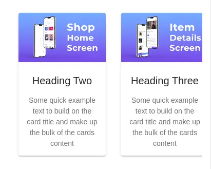
We can combine both ionic slider and ionic card components to create an Ionic card slider. In the example below, we have used ionic slides as parent components and we have 4 child card components. Here is a screenshot of the Ionic card slider example.

In the assets folder, we have created an images folder containing 4 images for each card component. Let’s create another page called cardSlide by running the following command.
ionic generate page cardSlideEdit the cardSlide.page.ts file to include our data for a card.
import { Component } from '@angular/core';

@Component({
  selector: 'app-cardSlide',
  templateUrl: 'cardSlide.page.html',
  styleUrls: ['cardSlide.page.scss'],
})
export class CardSlidPage {
  data = [
    {
      imageUrl: './assets/images/image-1.png',
      title: 'Heading One',
      description: 'Some quick example text to build on the card title and make up the bulk of the cards content'
    },
    {
      imageUrl: './assets/images/image-2.png',
      title: 'Heading Two',
      description: 'Some quick example text to build on the card title and make up the bulk of the cards content'
    },
    {
      imageUrl: './assets/images/image-3.png',
      title: 'Heading Three',
      description: 'Some quick example text to build on the card title and make up the bulk of the cards content'
    },
    {
      imageUrl: './assets/images/image-4.png',
      title: 'Heading Four',
      description: 'Some quick example text to build on the card title and make up the bulk of the cards content'
    },
  ];

  slideOpts = {
    initialSlide: 0,
    spaceBetween: 0,
    slidesPerView: 'auto',
  };

}
We need to edit cardSlide.page template to iterate over data to display our data in Ionic slides and ionic card component.
<ion-content class="ion-padding">
  <div class="item-slider">
    <ion-slides [options]="slideOpts">
      <ion-slide *ngFor="let item of data">
        <ion-col>
          <ion-card class="ion-margin-top">
            <ion-card-header class="ion-no-padding">
              <ion-img [src]="item.imageUrl"></ion-img>
              <ion-card-title class="ion-padding">{{ item.title }}</ion-card-title>
            </ion-card-header>

            <ion-card-content>
              {{ item.description }}
            </ion-card-content>

          </ion-card>
        </ion-col>
      </ion-slide>
    </ion-slides>
  </div>
</ion-content>
We have an ion column inside the ionic slide, we need to add an ionic slide component, let’s edit cardSlide.page.scss file.
.item-slider {
  ion-slide {
      width: 200px !important;
      ion-col {
          height: 100%;
          display: flex;
          justify-content: center;
          align-items: center;
      }
  }
}
Ionic slides properties
Io the above example we have used ionic slides properties like options. Slides component comes with few properties like pagination on or off. Here we have a list of properties of ionic slides/
| Attribute | Type | Description |
| mode | “ios” | “md” | The mode determines which platform styles to use. |
| options | object {} optional | Options to pass to the swiper instance. |
| pager | boolean | If true, show the pagination and default value is false. |
| scrollbar | boolean | If true, show the scrollbar and the default value is false. |
Ionic slides with pagination
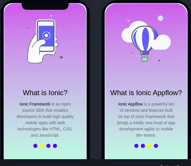
Let add one more page called slidesPager. Here we had used ionic conference template slides and editing it slides by adding pagination and customizing slide pagination. Here is a screenshot of our second slider example.

Lets edit our second page slides-pager.page.html.html and you need to add navigate to this page in home.page.html. aWe have used the ngFor directive to iterate our slides.
<ion-content>
  <div class="slider-container">
    <ion-slides #slides (ionSlideWillChange)="onSlideChangeStart($event)" pager="true">
      <ion-slide *ngFor="let slide of slidesData">
        <img src="assets/images/{{slide.image}}.png" class="slide-image" />
        <h2 class="slide-title">
          {{ slide.title }}
        </h2>
        <p> {{ slide.description }}</p>
      </ion-slide>
    </ion-slides>
  </div>
</ion-content>
We have set our ionic slides page to true so that we can edit its style and let edit slides-pager.page.ts file.
import { Component, OnInit, ViewChild } from '@angular/core';
import { IonSlides } from '@ionic/angular';

@Component({
  selector: 'app-slides-pager',
  templateUrl: './slides-pager.page.html',
  styleUrls: ['./slides-pager.page.scss'],
})
export class SlidesPagerPage implements OnInit {
  @ViewChild('slides') slides: IonSlides;
  slidesData = [];

  constructor() { }

  ngOnInit(): void {
    this.slidesData = [
      {
        title: 'Welcome to ICA',
        image: 'ica-slidebox-img-1',
        description: 'The ionic conference app is a practical preview of the ionic framework in action, and a demonstration of proper code use.'
      },
      {
        title: 'What is Ionic?',
        image: 'ica-slidebox-img-2',
        description: 'Ionic Framework is an open source SDK that enables developers to build high quality mobile apps with web technologies like HTML, CSS, and JavaScript.'
      },
      {
        title: 'What is Ionic Appflow ?',
        image: 'ica-slidebox-img-3',
        description: 'Ionic Appflow is a powerful set of services and features built on top of Ionic Framework that brings a totally new level of app development agility to mobile dev teams.'
      }
    ];
  }

  onSlideChangeStart(event) {
  }
}
We have already discussed ViewChild, to edit the ionic slider bullet size and color we can use the ionic predefine class on the ion-slides components like.
ion-slides {
  --bullet-background: blue;
  --bullet-background-active: yellow;
}
ionic slider pager position and style
To change the ionic slider pager position. In our example, we had placed the slider paginator at the bottom. To achieve it we need to follow two steps. The first step is by adding a height of 100% to both our slider container and ion-slides in slides-pager.page.scss, .
ion-content {
    --background: url(../../assets/images/slides-bg.png) 0 0/100% 100% no-repeat !important;

    .slider-container {
        height: 100%;
        ion-slides {
            margin-top: 10%;
            height: 100%;
            --bullet-background: blue;
            --bullet-background-active: yellow;
        }
        .swiper-slide {
            display: block;
        }

        .slide-title {
            margin-top: 2.8rem;
        }

        .slide-image {
            margin: auto;
            width: 60%;
            border: 3px solid #73AD21;
            padding: 10px;
        }
    }
}
In a second step we need a slider bottom value in global.scss. If we add bottom value in page scss is not working. In global.scss add the following code at end.
.slider-container {
    ion-slides {
        .swiper-pagination-bullet {
            opacity: 1;
            width: 14px;
            height: 14px;
        }
    }
    .swiper-container-horizontal>.swiper-pagination-bullets {
        bottom: 100px !important;
    }
  }
We can also increase the size of the ionic slider paginator button by changing the width and height value in .swiper-pagination-bullet class in global.scss.
We have used a few ionic slider custom css properties, we can used other custom css properties to edit our slider style. Here is a list of ionic slider custom CSS properties.
| Name | Description |
|---|---|
--bullet-background | Background of the pagination bullets |
--bullet-background-active | Background of the active pagination bullet |
--progress-bar-background | Background of the pagination progress-bar |
--progress-bar-background-active | Background of the active pagination progress-bar |
--scroll-bar-background | Background of the pagination scroll-bar |
--scroll-bar-background-active | Background of the active pagination scroll-bar |
Customize Ionic pagination option value
We have discussed the ionic slider options object which has configuration options for our Slides component. Slider options have a property called pagination objects. We can configure pagination object values to add different pagination values, clickable or non-clickable options, and more. Let’s see two different screenshots of Ionic custom slider pagination result.


We have two different pagination images, the first with Ionic slider pagination with a number that is clickable, and the other is a slider with fraction pagination. Let now edit our home.page.ts file for Ionic slider pagination.
import { Component } from '@angular/core';

@Component({
  selector: 'app-home',
  templateUrl: 'home.page.html',
  styleUrls: ['home.page.scss'],
})
export class HomePage {
  slideOpts = {
    initialSlide: 0,
    slidesPerView: 2,
    autoplay: true,
    pagination: {
      el: '.swiper-pagination',
      clickable: true,
      renderBullet: (index: number, classSlidePagination: string) => {
        return '<span class="' + classSlidePagination + '">' + (index + 1) + '</span>';
      },
    }
  }

  data = [
    {
      imageUrl: './assets/images/image-1.png',
      title: 'Heading One',
      description: 'Some quick example text to build on the card title and make up the bulk of the cards content'
    },
    {
      imageUrl: './assets/images/image-2.png',
      title: 'Heading Two',
      description: 'Some quick example text to build on the card title and make up the bulk of the cards content'
    },
    {
      imageUrl: './assets/images/image-3.png',
      title: 'Heading Three',
      description: 'Some quick example text to build on the card title and make up the bulk of the cards content'
    },
    {
      imageUrl: './assets/images/image-4.png',
      title: 'Heading Four',
      description: 'Some quick example text to build on the card title and make up the bulk of the cards content'
    },
  ];
}
Now we need to add slides to iterate on data for each slide, let’s edit the home.page.html file and we need to pager value to true.
<ion-content class="ion-padding">

  <ion-slides #slidesRef [options]="slideOpts" pager="true">
    <ion-slide *ngFor="let item of data">
      <ion-card class="ion-margin-top">
        <ion-card-header class="ion-no-padding">
          <ion-img [src]="item.imageUrl"></ion-img>
          <ion-card-title class="ion-padding">{{ item.title }}</ion-card-title>
        </ion-card-header>

        <ion-card-content>
          {{ item.description }}
        </ion-card-content>

      </ion-card>
    </ion-slide>
  </ion-slides>
For the slider pagination numbers, we have set the active slide number to red color, to achieve that we need to add style for pagination. First edit home.page.scss file to set background none for ionic pagination bullet and slide height to 100 percent so that slide data will arrange in the middle of the page.
ion-slides {
  --bullet-background: none;
  --bullet-background-active: none;
}

ion-slides {
  height: 100%;
}
Now we need to add red color to pagination number, for that we need to add following style at the end of global.scss.
ion-slides {
    .swiper-pagination-bullet-active {
        color: red;
    }
}
To get fraction numbers on the slider, we are using the same slider data and template. We only need to change the slider pagination value type to a fraction.
  slideOpts = {
    initialSlide: 0,
    slidesPerView: 2,
    autoplay: true,
    pagination: {
      el: '.swiper-pagination',
      type: 'fraction',
    }
  }
Adding animation for ionic slides
By default, Ionic slides use the built-in slide animation effect. The ionic team has created custom animations like a cube, like and fade, etc that can be used via the options property. A screenshot of some of the ionic slide animations can be found below.


To make animation we only need to change our slideObject option value to one of the custom animation code. To demonstrate we’ll use cube animation on our home.page.ts file. Edit following code to add cube custom animation code.
import { Component, OnInit, ViewChild } from '@angular/core';
import { IonSlides } from '@ionic/angular';

@Component({
  selector: 'app-home',
  templateUrl: 'home.page.html',
  styleUrls: ['home.page.scss'],
})
export class HomePage implements OnInit {
  @ViewChild('slidesRef') viewer: IonSlides;
  slideOpts = {};

  constructor() { }

  ngOnInit() {
    // this.slideOpts = {
    //   initialSlide: 1,
    //   speed: 400,
    //   autoplay: true
    // };
    this.slideOpts = {
      grabCursor: true,
      cubeEffect: {
        shadow: true,
        slideShadows: true,
        shadowOffset: 20,
        shadowScale: 0.94,
      },
      on: {
        beforeInit: function () {
          const swiper = this;
          swiper.classNames.push(`${swiper.params.containerModifierClass}cube`);
          swiper.classNames.push(`${swiper.params.containerModifierClass}3d`);

          const overwriteParams = {
            slidesPerView: 1,
            slidesPerColumn: 1,
            slidesPerGroup: 1,
            watchSlidesProgress: true,
            resistanceRatio: 0,
            spaceBetween: 0,
            centeredSlides: false,
            virtualTranslate: true,
          };

          this.params = Object.assign(this.params, overwriteParams);
          this.originalParams = Object.assign(this.originalParams, overwriteParams);
        },
        setTranslate: function () {
          const swiper = this;
          const {
            $el, $wrapperEl, slides, width: swiperWidth, height: swiperHeight, rtlTranslate: rtl, size: swiperSize,
          } = swiper;
          const params = swiper.params.cubeEffect;
          const isHorizontal = swiper.isHorizontal();
          const isVirtual = swiper.virtual && swiper.params.virtual.enabled;
          let wrapperRotate = 0;
          let $cubeShadowEl;
          if (params.shadow) {
            if (isHorizontal) {
              $cubeShadowEl = $wrapperEl.find('.swiper-cube-shadow');
              if ($cubeShadowEl.length === 0) {
                $cubeShadowEl = swiper.$('<div class="swiper-cube-shadow"></div>');
                $wrapperEl.append($cubeShadowEl);
              }
              $cubeShadowEl.css({ height: `${swiperWidth}px` });
            } else {
              $cubeShadowEl = $el.find('.swiper-cube-shadow');
              if ($cubeShadowEl.length === 0) {
                $cubeShadowEl = swiper.$('<div class="swiper-cube-shadow"></div>');
                $el.append($cubeShadowEl);
              }
            }
          }

          for (let i = 0; i < slides.length; i += 1) {
            const $slideEl = slides.eq(i);
            let slideIndex = i;
            if (isVirtual) {
              slideIndex = parseInt($slideEl.attr('data-swiper-slide-index'), 10);
            }
            let slideAngle = slideIndex * 90;
            let round = Math.floor(slideAngle / 360);
            if (rtl) {
              slideAngle = -slideAngle;
              round = Math.floor(-slideAngle / 360);
            }
            const progress = Math.max(Math.min($slideEl[0].progress, 1), -1);
            let tx = 0;
            let ty = 0;
            let tz = 0;
            if (slideIndex % 4 === 0) {
              tx = -round * 4 * swiperSize;
              tz = 0;
            } else if ((slideIndex - 1) % 4 === 0) {
              tx = 0;
              tz = -round * 4 * swiperSize;
            } else if ((slideIndex - 2) % 4 === 0) {
              tx = swiperSize + (round * 4 * swiperSize);
              tz = swiperSize;
            } else if ((slideIndex - 3) % 4 === 0) {
              tx = -swiperSize;
              tz = (3 * swiperSize) + (swiperSize * 4 * round);
            }
            if (rtl) {
              tx = -tx;
            }

            if (!isHorizontal) {
              ty = tx;
              tx = 0;
            }

            const transform$$1 = `rotateX(${isHorizontal ? 0 : -slideAngle}deg) rotateY(${isHorizontal ? slideAngle : 0}deg) translate3d(${tx}px, ${ty}px, ${tz}px)`;
            if (progress <= 1 && progress > -1) {
              wrapperRotate = (slideIndex * 90) + (progress * 90);
              if (rtl) wrapperRotate = (-slideIndex * 90) - (progress * 90);
            }
            $slideEl.transform(transform$$1);
            if (params.slideShadows) {
              // Set shadows
              let shadowBefore = isHorizontal ? $slideEl.find('.swiper-slide-shadow-left') : $slideEl.find('.swiper-slide-shadow-top');
              let shadowAfter = isHorizontal ? $slideEl.find('.swiper-slide-shadow-right') : $slideEl.find('.swiper-slide-shadow-bottom');
              if (shadowBefore.length === 0) {
                shadowBefore = swiper.$(`<div class="swiper-slide-shadow-${isHorizontal ? 'left' : 'top'}"></div>`);
                $slideEl.append(shadowBefore);
              }
              if (shadowAfter.length === 0) {
                shadowAfter = swiper.$(`<div class="swiper-slide-shadow-${isHorizontal ? 'right' : 'bottom'}"></div>`);
                $slideEl.append(shadowAfter);
              }
              if (shadowBefore.length) shadowBefore[0].style.opacity = Math.max(-progress, 0);
              if (shadowAfter.length) shadowAfter[0].style.opacity = Math.max(progress, 0);
            }
          }
          $wrapperEl.css({
            '-webkit-transform-origin': `50% 50% -${swiperSize / 2}px`,
            '-moz-transform-origin': `50% 50% -${swiperSize / 2}px`,
            '-ms-transform-origin': `50% 50% -${swiperSize / 2}px`,
            'transform-origin': `50% 50% -${swiperSize / 2}px`,
          });

          if (params.shadow) {
            if (isHorizontal) {
              $cubeShadowEl.transform(`translate3d(0px, ${(swiperWidth / 2) + params.shadowOffset}px, ${-swiperWidth / 2}px) rotateX(90deg) rotateZ(0deg) scale(${params.shadowScale})`);
            } else {
              const shadowAngle = Math.abs(wrapperRotate) - (Math.floor(Math.abs(wrapperRotate) / 90) * 90);
              const multiplier = 1.5 - (
                (Math.sin((shadowAngle * 2 * Math.PI) / 360) / 2)
                + (Math.cos((shadowAngle * 2 * Math.PI) / 360) / 2)
              );
              const scale1 = params.shadowScale;
              const scale2 = params.shadowScale / multiplier;
              const offset$$1 = params.shadowOffset;
              $cubeShadowEl.transform(`scale3d(${scale1}, 1, ${scale2}) translate3d(0px, ${(swiperHeight / 2) + offset$$1}px, ${-swiperHeight / 2 / scale2}px) rotateX(-90deg)`);
            }
          }

          const zFactor = (swiper.browser.isSafari || swiper.browser.isUiWebView) ? (-swiperSize / 2) : 0;
          $wrapperEl
            .transform(`translate3d(0px,0,${zFactor}px) rotateX(${swiper.isHorizontal() ? 0 : wrapperRotate}deg) rotateY(${swiper.isHorizontal() ? -wrapperRotate : 0}deg)`);
        },
        setTransition: function (duration) {
          const swiper = this;
          const { $el, slides } = swiper;
          slides
            .transition(duration)
            .find('.swiper-slide-shadow-top, .swiper-slide-shadow-right, .swiper-slide-shadow-bottom, .swiper-slide-shadow-left')
            .transition(duration);
          if (swiper.params.cubeEffect.shadow && !swiper.isHorizontal()) {
            $el.find('.swiper-cube-shadow').transition(duration);
          }
        },
      }
    }

  }

  onSlideMoved(event) {
    /** isEnd true when slides reach at end slide */
    event.target.isEnd().then(isEnd => {
      console.log('End of slide', isEnd);
    });

    event.target.isBeginning().then((istrue) => {
      console.log('End of slide', istrue);
    });
  }

}
Conclusion
Finally, we have completed the Ionic slider tutorial with two examples. We can easily customize the ionic slider for your needs. Here is an ionic slider repository of an example and you can view code in our Github repository.