The Angular tag input allows us, to select one or more than one item from lists of options. It also allows us to add, remove, and manage tags on input. We can implement add tags input in different ways. There are different third-party libraries to implement Angular tags input.
- Angular tags examples without any existing data.
- Change default tags enter key separately to different keyboard key codes.
- Angular tags with the drop-down option from API.
- The ngx-chip adds and removes events.
The ngx-chip is one of the most download and popular tag components. This library is flexible and we can have tags input on strings and objects.
Setting up and configuring the project for Angular autocomplete
Let’s first create our angular project and we’ll demonstrate the tags component using the ngx-chips library. Install the Angular ngx-chips tags input component library and we are also adding a component called ngChips in ng-chips folder.
ng new angularTagsComponet
npm i ngx-chips --save
ng g component ng-chips/ngChips
Import the TagInput Module and Forms module in our Angular tags project.
As we are using ngx-chips tags component on the input field of our form. To use the ngx-chips tags library, we need to import forms and tag input modules. Let import the above module in the app.module.ts file. We also, add our custom chip component and need to import HttpClientModule to retrieve our data from static JSON or server.
import { NgModule } from '@angular/core';
import { FormsModule, ReactiveFormsModule } from '@angular/forms';
import { BrowserModule } from '@angular/platform-browser';
import { TagInputModule } from 'ngx-chips';
import { HttpClientModule } from '@angular/common/http';
import { AppRoutingModule } from './app-routing.module';
import { AppComponent } from './app.component';
import { NgChipsComponent } from './ng-chips/ng-chips/ng-chips.component';
import { BrowserAnimationsModule } from '@angular/platform-browser/animations';

@NgModule({
  declarations: [
    AppComponent,
    NgChipsComponent
  ],
  imports: [
    BrowserModule,
    AppRoutingModule,
    BrowserAnimationsModule,
    FormsModule,
    ReactiveFormsModule,
    HttpClientModule,
    TagInputModule
  ],
  providers: [],
  bootstrap: [AppComponent]
})
export class AppModule { }
Create Dummy data for Angular autocomplete.
We will create dummy data states.json containing a few US state names and we need this data for the tags component dropdown. Create folder data, and create a new file states.json. Add the following few state names in assets/data/states.json as.
{
    "states": [
        { "name": "Alabama" },
        { "name": "Alaska" },
        { "name": "Arizona" },
        { "name": "Arkansas" },
        { "name": "California" },
        { "name": "Colorado" },
        { "name": "Connecticut" },
        { "name": "Delaware" },
        { "name": "Florida" },
        { "name": "Georgia" },
        { "name": "Hawaii" },
        { "name": "Idaho" }
    ]
}
Example of Angular tags component using ngx-chips.
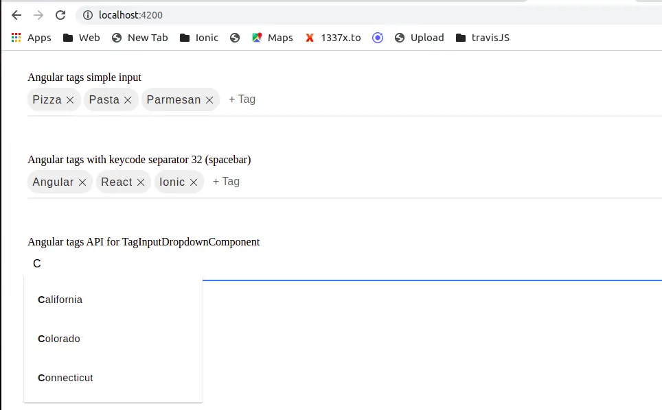
We have already configured the required task for tags input. We’ll demonstrate three an example on the tags component. The first one is on a string array, the second on an array of objects, and the third example is on Angular tags dropdown data from remote or static data.
We’ll demonstrate here’s a quick screenshot of what we’ll be building.

Implement tags input component, in the ng-chips.component.ts typescript we have three methods. The requestAutocompleteItems Observable methods to retrieve data from API. Let’s edit the ng-chips.component.ts file.
import { Component } from '@angular/core';
import { HttpClient } from '@angular/common/http';
import { Observable, of } from 'rxjs';
import { filter, map } from 'rxjs/operators';
import { TagModel } from 'ngx-chips/core/tag-model';


@Component({
  selector: 'app-ng-chips',
  templateUrl: './ng-chips.component.html',
  styleUrls: ['./ng-chips.component.scss'],
})
export class NgChipsComponent {
  items = ['Pizza', 'Pasta', 'Parmesan'];
  name: any;
  itemsAsObjects = [
    { value: 0, name: 'Angular' },
    { value: 1, name: 'React' },
  ];

  constructor(private http: HttpClient) {}

  requestAutocompleteItems = (text: any): Observable<any> => {
    const url = `./assets/data/states.json?q=${text}`;
    return this.http.get(url).pipe(
      map((data: any) => {
        return data.states;
      })
    );
  };

  onAdding(tag: TagModel): Observable<TagModel> {
    const confirm = window.confirm('Do you really want to add this tag?');
    return of(tag).pipe(filter(() => confirm));
  }

  onRemoving(tag: any): Observable<TagModel> {
    const confirm = window.confirm(
      'Do you really want to remove this tag?' + tag.name
    );
    return of(tag).pipe(filter(() => confirm));
  }
}
In the ng-chips.component.html template, we have three tags input fields.
<div style="margin: 30px;">
    <div class="form-group">
        <label>Angular tags simple input </label>
        <tag-input [(ngModel)]='items'></tag-input>
    </div>

    <div class="form-group">
        <label>Angular tags with keycode separator 32 (spacebar)</label>
        <tag-input [ngModel]="itemsAsObjects" [displayBy]="'name'"
             (onAdd)="onAdding($event)"
            (onRemove)="onRemoving($event)" [separatorKeyCodes]="[32]">
        </tag-input>
    </div>

    <div class="form-group">
        <label>Angular tags API for TagInputDropdownComponent</label>
        <tag-input [ngModel]="name" [onlyFromAutocomplete]="true">
            <tag-input-dropdown
             [autocompleteObservable]="requestAutocompleteItems" displayBy="name"
             identifyBy="name">
            </tag-input-dropdown>
        </tag-input>
    </div>
</div>
Change default Angular tags separator keycode
By default tags component, ngx-chips have entered the key code as an item separator. We can modify the default keycode separator by using ngx-chips properties called separatorKeyCodes. The separatorKeyCodes – [?number[]]: An array of keyboard keys with which is possible to define the key for separating terms. By default, only Enter is the defined key. In our example, we have added separatorKeyCodes as 32 which is a space bar key code.
Tags input event?
The ngx-chip have lots of events, in our typescript, we have demonstrated an example of added and removed item event on the ngx-chip tags component.
<tag-input [ngModel]="itemsAsObjects" [displayBy]="'name'"
   (onAdd)="onAdding($event)"
   (onRemove)="onRemoving($event)" [separatorKeyCodes]="[32]">
</tag-input>

 onAdding(tag: TagModel): Observable<TagModel> {
    const confirm = window.confirm('Do you really want to add this tag?');
    return of(tag).pipe(filter(() => confirm));
  }

  onRemoving(tag: TagModel): Observable<TagModel> {
    const confirm = window.confirm('Do you really want to remove this tag?' +
    tag.name);
    return of(tag).pipe(filter(() => confirm));
  }

Applying different tags-input style
The ngx-chips offer lots of predefined themes like bootstrap3-info, bootstrap, dark and minimal. If you don’t like how the default theme looks based on your UI select one of the above four themes.

<tag-input [(ngModel)]='items' theme='bootstrap'></tag-input>
<tag-input [(ngModel)]='items' theme='minimal'></tag-input>
<tag-input [(ngModel)]='items' theme='dark'></tag-input>
In Angular material design, we can use the material chips component to implement Angular tags. Here is a screenshot of material design chip inputs.

Conclusion:
We have completed our angular tags input using ngx-chips library. We also demonstrate three examples and have one example of tags input on API data. If your project has Angular material as UI, then you can use Angular material chips for tags input.
Related posts