We have seen color pickers in many applications, including Photoshop, Gimp, and more. We can easily add an angular color picker to our Angular project. There are plenty of third-party libraries to add color picker components to our Angular project. We might want to apply color to any input and drawings in our angular project.
In this tutorial, we will discuss some of best Angular color picker libraries. We’ll demonstrate two example of Angular color picker using ngx color picker and angular material color picker. So let’s get started.
5 Best Angular color picker libraries in Angular
As we have discussed that there are plenty of third parties libraries to implement Angular color pickers. We’ll list here some, that you can select based on your requirement.
| Name | Description |
| ngx-color-picker | This is one of the most downloaded color picker libraries and has a size of about 894 kB and a weekly download of around 162,462. |
| ngx-color | It has 13 different color pickers, iSketch, Photoshop, Chrome, Twitter, and many more. The size of the library is 1.92 MB and a weekly download of around 22,942. |
| mat-color-picker | MatColorPicker is created with Angular Material and CDK. But it hasn’t been updated for more than 4 years. |
| ngx-colors | A beautiful color picker for angular that lets you choose from a color palette and text input. It has a size of 670 kB and a weekly download of around 9,851. |
| np-ui-lib | Native Angular UI Components and Design Framework. It has a size of 3.83 MB. |
Setup and configure Angular color picker project
Let’s first create our Angular color picker project and we have two examples of Angular color pickers. Before starting an angular project you need to install Nodejs and Angular CLI in your system.
ng new colorPickerAppAngular color picker Example using the ngx-color-picker
We’ll demonstrate the Angular color picker using the third-party library the ngx-color-picker. Here we first need to install this library in our project by following the command.
npm i ngx-color-picker --saveHere is a screenshot of our first example of an Angular color picker using the ngx-color-picker library.
After installing the ngx-color-picker library and using this library in our angular project, we need to import ColorPickerModule in our app.module.ts file and let edit the app.module.ts file.
import { NgModule } from '@angular/core';
import { BrowserModule } from '@angular/platform-browser';
import { AppRoutingModule } from './app-routing.module';
import { AppComponent } from './app.component';
import { ColorPickerModule } from 'ngx-color-picker';

@NgModule({
  declarations: [
    AppComponent
  ],
  imports: [
    BrowserModule,
    AppRoutingModule,
    ColorPickerModule
  ],
  providers: [],
  bootstrap: [AppComponent]
})
export class AppModule { }
Implement Angular color picker using ngx color picker
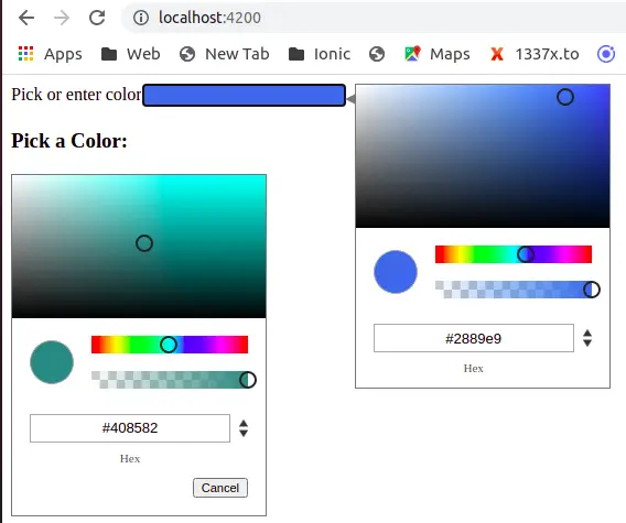
We have imported the ngx-color-picker module into our module. Let’s demonstrate four examples of ngx-color-picker in our Angular project. First, we need a variable that can hold color values and an array containing lists of colors. Here is our example of the ngx-color-picker screenshot.

Let’s edit the app.component.ts file and declare color and color list variables.
import { Component } from '@angular/core';

@Component({
  selector: 'app-root',
  templateUrl: './app.component.html',
  styleUrls: ['./app.component.scss']
})
export class AppComponent {
  title = 'colorPicker';
  color: string = '#2889e9'
  arrayColors: any = {
    color1: '#2883e9',
    color2: '#e920e9',
    color3: 'rgb(255,245,0)',
    color4: 'rgb(236,64,64)',
    color5: 'rgba(45,208,45,1)'
  };
  selectedColor: string = 'color1';
}
Let’s edit the app.component.html template to demonstrate our four examples on color pickers.
<form action="">
    <div class="form-group">
        <label>Pick or enter color</label>
        <input class="form-control" [(colorPicker)]="color" cpWidth='230px' cpHeight="100px"
            [style.background]="color" />
    </div>

    <div class="form-group">
        <label>Greyscale color mode</label>
        <input class="form-control" [(colorPicker)]="color" [cpColorMode]="'grayscale'" [style.background]="color" />

    </div>
    <div class="form-group">
        <label>Color Output format</label>
        <input class="form-control" [value]="color" [style.background]="color" [cpOutputFormat]="'rgba'"
            [(colorPicker)]="color" />
    </div>
</form>

<div class="colorPaletteContainer">
    <h3>Pick a Color:</h3>
    <span [style.background]="arrayColors[selectedColor]" [cpToggle]="true" [cpDialogDisplay]="'inline'"
        [cpCancelButton]="true" [(colorPicker)]="arrayColors[selectedColor]"></span>
    <div [style.background]="arrayColors['color1']" (click)="selectedColor='color1'"></div>
    <div [style.background]="arrayColors['color2']" (click)="selectedColor='color2'"></div>

</div>

<router-outlet></router-outlet>
Note: Here we have used different attributes and events on the color picker.
[cpWidth]: Use this option to set the color picker dialog width, not the input box.
[cpHeight]: Use this option to force color picker dialog height (‘auto’).
[cpToggle]: Sets the default open / close state of the color picker (false).
[cpColorMode]: Dialog color mode: ‘color’, ‘grayscale’, ‘presets’ (‘color’).
(colorPickerChange) // Changed color value, send when color is changed (value: string).
(colorPickerCancel) // Color select canceled, send when Cancel button is pressed (void).
Here we have listed a few ngx-color-picker attributes and events, you can check more detailed information on its official npmjs packages.
Angular color picker example using ngx-colors
We’ll demonstrate the Angular color picker using the third-party library ngx-colors. Here we first need to install this library in our project by following the command.
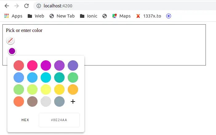
npm i ngx-colors --saveA beautiful color picker for angular that lets you choose from a color palette, using sliders (Hue, Lightness, Alpha sliders) or through text input(hex, rgba, hsla). We can easily change between different color modes. Here is a screenshot of our first example of an Angular color picker using the ngx-colors library.
After installing our ngx-colors library and using this library in our angular project, we need to import NgxColorsModule in our app.module.ts file and let us edit the app.module.ts file.
import { NgModule } from '@angular/core';
import { BrowserModule } from '@angular/platform-browser';
import { AppRoutingModule } from './app-routing.module';
import { AppComponent } from './app.component';
import { NgxColorsModule } from 'ngx-colors';
import { FormsModule } from '@angular/forms';

@NgModule({
  declarations: [
    AppComponent
  ],
  imports: [
    BrowserModule,
    AppRoutingModule,
    FormsModule,
    NgxColorsModule
  ],
  providers: [],
  bootstrap: [AppComponent]
})
export class AppModule { }
Let’s used the ngx-color component in our app.component.html template.
<form action="">
 <div class="form-group">
   <label>Pick or enter color</label>
   <ngx-colors ngx-colors-trigger [(ngModel)]="color"></ngx-colors>
   <ngx-colors ngx-colors-trigger style="display: inline-block; margin:5px;">
   </ngx-colors>
  </div>
</form>
Angular Material Color picker example
Angular Material Library doesn’t have a Color picker component, but we can use @angular-material-components/color-picker library to add a color picker for the Angular Material project, and we can use it as an Angular Material Color Picker.
Step to add Angular Material color in Angular project.
- Step 1: Create an Angular Material color picker project.
- Step 2: Install Material Library and @angular-material-components/color-picker
- Step 3: Import the Module @angular-material-components/color-picker in the app.module.ts
- Step 4: Used the ngx-mat-color-picker component with Material mat-form-field, mat-input.
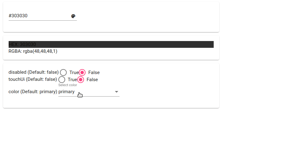
Here is a screenshot of our Material Color picker example.
In steps 1 to 3, we need to create and configure the Material color picker project.
ng new material-color-picker-app
cd material-color-picker-app
npm i @angular-material-components/color-picker
We need to import NgxMatColorPickerModule in the app.module.ts file
import { NgModule } from '@angular/core';
import { BrowserModule } from '@angular/platform-browser';
import { AppRoutingModule } from './app-routing.module';
import { AppComponent } from './app.component';
import {
  MAT_COLOR_FORMATS,
  NgxMatColorPickerModule,
  NGX_MAT_COLOR_FORMATS,
} from '@angular-material-components/color-picker';

import { FormsModule, ReactiveFormsModule } from '@angular/forms';
import { BrowserAnimationsModule } from '@angular/platform-browser/animations';

import { MatCardModule } from '@angular/material/card';
import { MatFormFieldModule } from '@angular/material/form-field';
import { MatInputModule } from '@angular/material/input';
import { MatRadioModule } from '@angular/material/radio';
import { MatSelectModule } from '@angular/material/select';
@NgModule({
  declarations: [AppComponent],
  imports: [
    BrowserModule,
    AppRoutingModule,
    FormsModule,
    ReactiveFormsModule,
    BrowserAnimationsModule,
    NgxMatColorPickerModule,
    MatCardModule,
    MatFormFieldModule,
    MatInputModule,
    MatFormFieldModule,
    MatRadioModule,
    MatSelectModule
  ],
  providers: [{ provide: MAT_COLOR_FORMATS, useValue: NGX_MAT_COLOR_FORMATS }],
  bootstrap: [AppComponent],
})
export class AppModule {}
In the above example, we have used form, this Material color picker has attributes like disabled to enable or disabled the color picker and toucheUI boolean value true or false. We need to define all these values inside the app.component.ts file
import { Component } from '@angular/core';
import { ThemePalette } from '@angular/material/core';

@Component({
  selector: 'app-root',
  templateUrl: './app.component.html',
  styleUrls: ['./app.component.scss'],
})
export class AppComponent {
  user = { color: '#234532' };

  disabled = false;
  selectedColor: ThemePalette = 'primary';
  touchUi = false;

  options = [
    { value: true, label: 'True' },
    { value: false, label: 'False' },
  ];

  listColors = ['primary', 'accent', 'warn'];

  constructor() {}
}
Now in the component template, let’s use the ngx-mat-color-picker tag with the mat-form-field component and matInput directive in the app.component.html file.
<div class="container">
  <form #userForm="ngForm">
    <mat-card class="zone zone-picker">
      <mat-form-field>
        <input
          matInput
          [ngxMatColorPicker]="picker"
          name="color"
          [(ngModel)]="user.color"
          [disabled]="disabled"
          colorCtrl="ngmodel"
        />
        <ngx-mat-color-toggle matSuffix [for]="picker"></ngx-mat-color-toggle>
        <ngx-mat-color-picker
          #picker
          [touchUi]="touchUi"
          [color]="selectedColor"
        ></ngx-mat-color-picker>
      </mat-form-field>
    </mat-card>
  </form>

  <mat-card class="zone zone-value">
    <div
      class="row"
      [style.background-color]="userForm.controls['color'].value?.rgba"
    >
      HEX: {{ userForm.controls["color"].value?.hex }}
    </div>
    <div class="row">RGBA: {{ userForm.controls["color"].value?.rgba }}</div>
  </mat-card>

  <mat-card class="zone zone-config">
    <div class="config-wrapper">
      <span class="label">disabled (Default: false) </span>
      <mat-radio-group aria-label="Select an option" [(ngModel)]="disabled">
        <mat-radio-button
          class="example-radio-button"
          *ngFor="let option of options"
          [value]="option.value"
        >
          {{ option.label }}</mat-radio-button
        >
      </mat-radio-group>
    </div>

    <div class="config-wrapper">
      <span class="label">touchUi (Default: false) </span>
      <mat-radio-group aria-label="Select an option" [(ngModel)]="touchUi">
        <mat-radio-button
          class="example-radio-button"
          *ngFor="let option of options"
          [value]="option.value"
        >
          {{ option.label }}</mat-radio-button
        >
      </mat-radio-group>
    </div>

    <div class="config-wrapper">
      <span class="label">color (Default: primary) </span>
      <mat-form-field>
        <mat-label>Select color</mat-label>
        <mat-select [(ngModel)]="selectedColor">
          <mat-option *ngFor="let item of listColors" [value]="item">
            {{ item }}
          </mat-option>
        </mat-select>
      </mat-form-field>
    </div>
  </mat-card>
  <router-outlet></router-outlet>
</div>
In the app.component.scss file let add style for component element.
div.container {
    margin: 10px;
}
mat-card {
    width: 50%;
    margin-bottom: 10px;
}
I uploaded the Material color picker example on stackblitz.com, if you want to take a reference, then you can check it.
Conclusion
We have completed two examples of how to add an Angular color picker to our Angular application using two different third-party libraries ngx-color-picker and ngx-colors library. I hope you had learned something, if so then please share it with others and on social networks, this will encourage me to add more content. Follow me on my GitHub collection, I had code on Angular, react, and Ionic framework.
Related posts
- How to add an Angular signature pad?
- How to install Angular material?
- How to implement CKEditor in Angular?
- How to implement Angular material grid .?
- How to implement an Angular bootstrap table with pagination and filter?
- How to implement an Angular search filter in Angular?
- How to calculate base64 image size in Angular
- How to install Angular material?
- How to use to implement HighCharts Angular?