Flexible boxes, or flexbox, is a new layout mode in CSS3. Flexbox provides tools to allow rapid creation of complex, flexible layouts, and features that historically proved difficult with CSS. Use of flexbox ensures that elements behave predictably when the page layout must accommodate different screen sizes and different display devices.
For a long time, the only reliable cross browser-compatible tools available for creating CSS layouts were things like floats and positioning. These are fine and they work, but in some ways, they are also rather limiting and frustrating.
The following simple layout requirements are either difficult or impossible to achieve with such tools, in any kind of convenient, flexible way:
- Vertically centering a block of content inside its parent.
- Making all columns in multiple column layouts adopt the same height even if they contain a different amount of content.
- Making all the children of a container take up an equal amount of the available width/height, regardless of how much width/height is available.
- Flexbox makes a lot of layout tasks much easier.
For many applications, the flexible box model provides an improvement over the block model in that it does not use floats, nor do the flex container’s margins collapse with the margins of its contents.
CSS3 Flexbox Concepts:-
Flexbox consists of flex containers and flex items. A flex container is declared by setting the display property of an element to either flex (rendered as a block) or inline-flex (rendered as inline) and inside a flex container, there are one or more flex items.
.container {
      display: flex; /* block or inline-flex */
}
In the flexbox layout system, we have to declare a parent div with a CSS property display: flex, which allows you to control how you want to position its children elements
Flex direction:
This establishes the main-axis, thus defining the direction flex items are placed in the flex container. Flexbox is (aside from optional wrapping) a single-direction layout concept. Think of flex items as primarily laying out either in horizontal rows or vertical columns.
.container {
      flex-direction: row | row-reverse | column | column-reverse;
}
justify-content
This defines the alignment along the main axis. It helps distribute extra free space left over when either all the flex items on a line are inflexible, or are flexible but have reached their maximum size. It also exerts some control over the alignment of items when they overflow the line.
.container {
  justify-content: flex-start | flex-end | center | space-between | space-around | space-evenly;
}
CSS – Flex justify-content

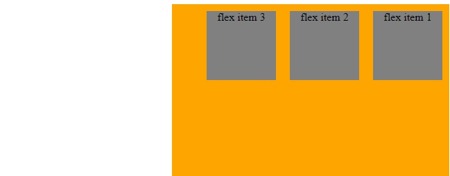
Flex items are positioned inside a flex container along a flex line. By default, there is only one flex line per flex container. The following example shows three flex items. They are positioned by default: along the horizontal flex line, from left to right:
<!DOCTYPE html>
<html>
<head>
<style>
body {
    direction: rtl;
}

.flex-container {
    display: -webkit-flex;
    display: flex;
    width: 400px;
    height: 250px;
    background-color: orange;
}

.flex-item {
    background-color: grey;
    text-align: center;
    width: 100px;
    height: 100px;
    margin: 10px;
}
</style>
</head>
<body>

<div class="flex-container">
  <div class="flex-item">flex item 1</div>
  <div class="flex-item">flex item 2</div>
  <div class="flex-item">flex item 3</div>
</div>

</body>
</html>
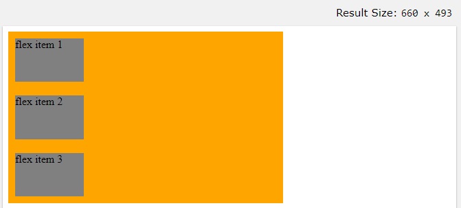
Example 2: The Second example shows the result of using the column value:
<!DOCTYPE html>
<html>
<head>
<style>
.flex-container {
    display: -webkit-flex;
    display: flex;
    -webkit-flex-direction: column;
    flex-direction: column;
    width: 400px;
    height: 250px;
    background-color: orange;
}

.flex-item {
    background-color: grey;
    width: 100px;
    height: 100px;
    margin: 10px;
}
</style>
</head>
<body>

<div class="flex-container">
  <div class="flex-item">flex item 1</div>
  <div class="flex-item">flex item 2</div>
  <div class="flex-item">flex item 3</div>
</div>

</body>
</html>
Note : Find more information on flex from css-tricks.com