In this tutorial, we’ll learn how to use the Angular animation module, and how we can apply animation to HTML elements or components without using any javascript, flash, or any other third-party library.
Angular Animation provides the illusion of motion on HTML elements by changing multiple style transformations over time. We can change element styles like color, size to grow or shrink, position, background color, and more.
In web or mobile applications, we can use animation to provide a good user experience like navigating between pages, or animation of sliding modal, and more.
In this tutorial, we’ll learn how to use the Angular animation module. Will demonstrate a few examples of it and what are steps to add the Animation effect on the element.
Setting up and configure Angular animation project
Let first create our Angular animation project. Before starting an angular project we need to install nodejs and Angular CLI in your system.
ng new animationApp
cd animationApp
To enable animation in Angular, we need to import BrowserAnimationsModule in our module. Let import this module in the app.module.ts file as below.
import { NgModule } from '@angular/core';
import { BrowserModule } from '@angular/platform-browser';
import { AppRoutingModule } from './app-routing.module';
import { AppComponent } from './app.component';
import { BrowserAnimationsModule } from '@angular/platform-browser/animations';

@NgModule({
  declarations: [
    AppComponent
  ],
  imports: [
    BrowserModule,
    AppRoutingModule,
    BrowserAnimationsModule
  ],
  providers: [],
  bootstrap: [AppComponent]
})
export class AppModule { }
Angular Animations example 1
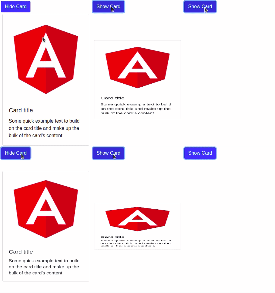
We have completed our configuration of the Angular animation project, let us now demonstrate an example of hiding or showing a card with scaling its y-axis. Here we have a screenshot of our first angular animation example.

Let edit the app.component.ts file to import function from @angular/animations. We used to trigger, state, and transition function to apply animation to our card section.
import { Component } from '@angular/core';
import { trigger, state, style, animate, transition, } from '@angular/animations';

@Component({
  selector: 'app-root',
  templateUrl: './app.component.html',
  styleUrls: ['./app.component.scss'],
  animations: [
    trigger('displayState', [
      state('inactive', style({
        transform: 'scaleY(0)'
      })),
      state('active', style({
        transform: 'scaleY(1)'
      })),
      transition('inactive => active', animate('500ms ease-in')),
      transition('active => inactive', animate('500ms ease-out'))
    ])
  ]
})
export class AppComponent {
  hideCard = false;
}
In a typescript file, the Animation metadata property we have displayState, is the name of the animation trigger, we have to apply to templates using special data bindings, which associate an animation trigger with an HTML element. The binding’s target tells Angular which animation trigger to apply to the element.
We have applied the animation trigger name @displayState at the HTML section tag, and a button will toggle the section to show or hide.
<button class="btn btn-primary" (click)="hideCard = !hideCard">
  <span>{{ hideCard === false ? 'Hide Card' : 'Show Card' }}</span>
</button>
<section [@displayState]="hideCard ? 'inactive': 'active'">
 <div class="card" style="width: 18rem;">
   <img class="card-img-top" src="../assets/images/angular-logo.png">
   <div class="card-body">
     <h5 class="card-title">Card title</h5>
     <p class="card-text">
       Some quick example text to build on the card title and make up the bulk of the
       card' content.
     </p>
   </div>
 </div>
</section>
Abstract step of adding Angular animation
We have demonstrated an example of Angular animation, here is an abstract step of adding animation to our Angular element.
- Step 1: Enabling or importing Animation module. import { BrowserAnimationsModule } from ‘@angular/platform-browser/animations’;
- Step 2: Importing animation function into our component . import { trigger, state, style, animate, transition, } from ‘@angular/animations’;
- Adding animation metadata property to define trigger in @component decorator.
- Defining animation function like state and transition.
- To get an animation to work, we must bind the animation to an element. Binding animation trigger to our element using special data binding with square bracket preceding with @ and animation trigger name.
- Event to invoke animation to element.
Functions used for Angular animation
To add Angular animation to the element we have used and import some functions | methods from @angular/animations. Angular animation metadata contains a list of functions and lets us learn some of the most common functions used in Angular Animation.
| Functions | Description |
| trigger | Each animation trigger accepts a unique name and inside this function, we specify animation implementation. |
| state | Creates a named set of CSS styles that should be applied on successful transition to a given state. Is called at the end of each transition. State function takes two arguments unique names for state and style function. |
| style | List of CSS styles to be applied. |
| transition | Defines the animation sequence between two named states. This function accepts two arguments. The first direction between the 2 states and the second argument has one or a series of animate. |
| animate | Animate function define length, delay, and easing of transition. |
animate (duration) or animate ('duration delay easing')The duration can be expressed in milliseconds as a number without quotes, or in seconds with quotes and a time specifier.
- As a plain number, in milliseconds:
100 - In a string, as milliseconds:
'100ms' - In a string, as seconds:
'0.1s'
The second optional argument delay in the animate function has the same syntax as duration. The third optional argument easing control of how the animation accelerated and decelerate during a runtime.
- ease-in: Cause animation to being slow and pickup speed at progress.
- ease-out: Start animation out fast and slowly decelerate to a resting point.
- ease-in-out: Start slow, accelerate at middle and then decelerate slowly at end.
Angular animations example 2
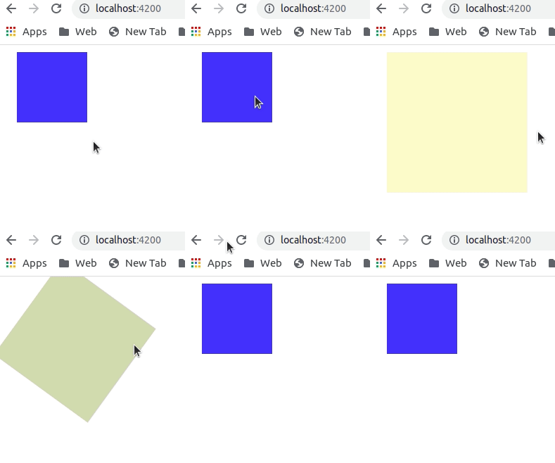
Now we have learned the basics of Angular animation, let us demonstrate Angular animations example 2. Here we demonstrate animation like rotation, changing div size, and background color of div element. Here is our screenshot of Angular animations example 2.

Let first add a div element to apply animation.
<div [@rotateBoxState]="rotate ? 'inactive': 'active'" class="box" (click)="rotate= !rotate"></div>Where @rotateBoxState is the animation trigger name,
Once we define and bind the trigger name of an element, let implement animation for it.
import { Component } from '@angular/core';
import { trigger, state, style, animate, transition, } from '@angular/animations';

@Component({
  selector: 'app-root',
  templateUrl: './app.component.html',
  styleUrls: ['./app.component.scss'],
  animations: [
    trigger('rotateBoxState', [
      state('inactive',
        style({
          height: '200px',
          width: '200px',
          opacity: 0.2,
          backgroundColor: '#ffc107',
          transform: 'rotate(0deg)'
        })),
      state('active', style({
        transform: 'rotate(360deg)',
        width: '100px',
        height: '100px',
        opacity: 1,
        backgroundColor: '#047afc'
      })),
      transition('inactive => active', animate('1000ms ease-in')),
      transition('active => inactive', animate('1000ms ease-out'))
    ])
  ]
})
export class AppComponent {
  rotate = false;
}
Angular animations example 3
In the last example, we will demonstrate image sliding with fading effecting by controlling CSS opacity value.

We have *ngFor loop to iterate through each image and we have two buttons Previous and Next to navigate between images. Clicking on the button we will see a fade transition.
import { Component } from '@angular/core';
import { trigger, state, style, animate, transition, useAnimation, } from '@angular/animations';


@Component({
  selector: 'app-root',
  templateUrl: './app.component.html',
  styleUrls: ['./app.component.scss'],
  animations: [
    trigger('fade', [
      transition('void => *', [
        style({ opacity: 0 }),
        animate(2000, style({ opacity: 1 }))
      ])
    ])
  ]
})
export class AppComponent {
  disabledNext = false;
  disabledPrev = true;

  counter = 0;
  slideItems = [
    { src: '../assets/images/image-1.jpg' },
    { src: '../assets/images/image-2.jpg' },
    { src: '../assets/images/image-3.jpg' }
  ];


  showNextImage() {
    if (this.counter < this.slideItems.length - 1) {
      this.counter += 1;
    }
    this.checkButtonStatus();
  }

  showPreviousImage() {
    if (this.counter >= 1) {
      this.counter = this.counter - 1;
    }
    this.checkButtonStatus();
  }

  checkButtonStatus() {
    this.disabledNext = (this.counter == this.slideItems.length - 1) ? true : false;
    this.disabledPrev = (this.counter == 0 ) ? true : false
  }
}
<section>
<div *ngFor="let item of slideItems;let i = index">
<img *ngIf="i == counter" @fade [src]="slideItems[i].src">
</div>
<div class="button-group">
<button class="btn btn-danger" (click)="showPreviousImage()"
[disabled]="disabledPrev">Previous</button>
<button class="btn btn-danger" (click)="showNextImage()"
[disabled]="disabledNext">Next</button>
</div>
</section>Conclusion
We have completed our Angular animation module tutorial with a few examples. I hope you got some idea of how to use the Angular animation module, we can also use third-party libraries like ngx-lottie to add animation to our angular project. To reference our example, I have uploaded the above example to the GitHub repository.
Related Articles